From Sketch to Design - MartijnKeesmaat/frontend-data GitHub Wiki
Sketch
This page illustrates the visual design choice I made. After watching the Skillshare course from Nadieh Bremer, I created this sketch which eventually became the design.
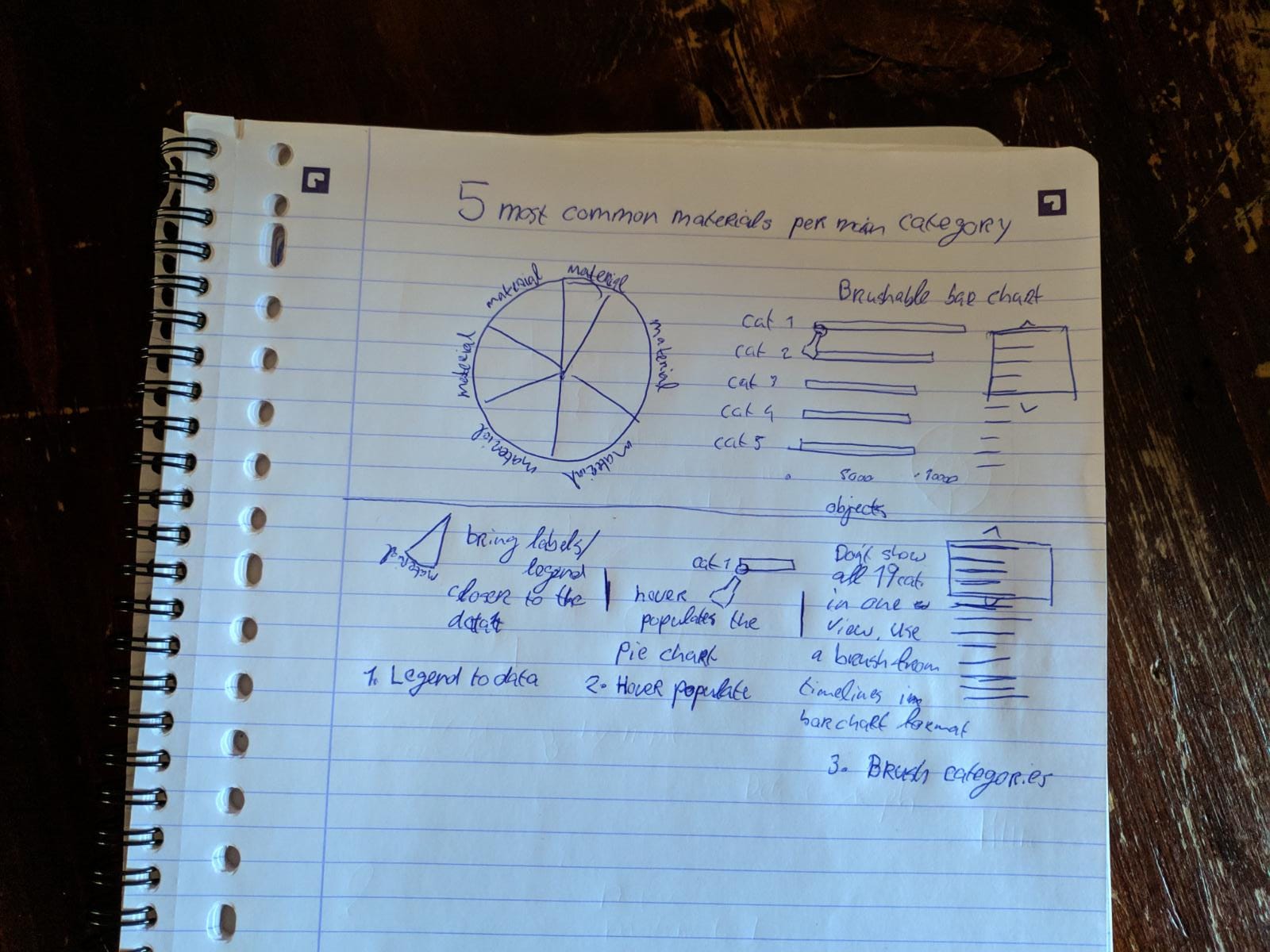
During the weekly checkup, Danny pointed me to the Skillshare course of Nadieh Bremer. In her course, Nadieh talks about the concepts she uses to create graphs. It's her goal to show interesting and visually pleasing visualizations. She goes beyond the basics and creates something unique. In my current design, I implemented the techniques she described in her course. An example of this is combining the brusher from a timeline graph with a horizontal bar chart.
Visual design

Layout & dominance
The layout is fairly straightforward. Since we read from left to right, I placed the bar chart first. This chart should be seen first. The most important inside the bar chart is the current category. The axes are minimally displayed. The other bars are also muted. This highlights the current bar well.
Color palette
The color palette I created is inspired by this color palette from ColorHunt. I was looking for a warm palette since I display materials like brick, paper, and wood. The palette from ColorHunt compliments this concept well. I then added another color and adjusted the yellow since it was a bit too bright. This made the color stand out too much.
Type-treatment
The type is kept simple. The type is not the element that should stand out in this UI, the visualization should. You notice that the type-treatment is muted which makes the graphs stand out more. The title does stand out. It's important that the users can quickly scan the title so that they can understand what they are looking at right away. Sans-serif is chosen since it comes across as more modern and works well for short pieces of text.