Examples & My work - MartijnKeesmaat/frontend-data GitHub Wiki
There are three cases of code samples I used
- Code in it's entirity - these are code blocks like the helper functions. An example of this is the wrap function which allows for text wrapping of svg text elements.
- Modified examples - I used three examples, two for the donut chart and one for the bar chart. These will be explained in this document.
- Acknowledgements - things like inspiration will acknowledged in the readme. These cover the courses and tutorials I followed and the inspiration for the design like the color palette.
Since I continued the work I did for functional-programming, I will continue this wiki page aswell. I will first explain switched and then reference the wiki page from the previous assignment.
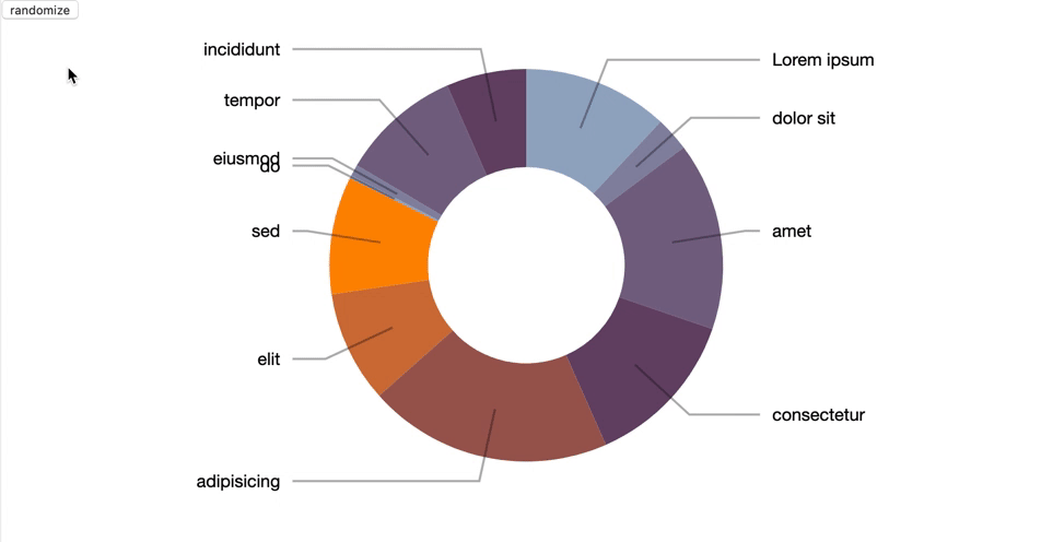
Second example of the donut chart
The interaction I wanted to create consists of a graph which updates another graph. Updating a bar graph seemed fairly simple. But the donut shape made it seem more difficult than it actually is. For that reason, I used an example as the base of the graph.
The example shows how you can update data when clicked on the button. It will populate the donut graph with random data.
I copied this example, populated it with my data, removed the button and labels.
I did keep the color scheme. It seemed to fit better to my concept than the previous scheme.
This is the code I used from the example and then transformed to the preferred outcome:
function change(data) {

	/* ------- PIE SLICES -------*/
	var slice = svg.select(".slices").selectAll("path.slice")
		.data(pie(data), key);

	slice.enter()
		.insert("path")
		.style("fill", function(d) { return color(d.data.label); })
		.attr("class", "slice");

	slice
		.transition().duration(1000)
		.attrTween("d", function(d) {
			this._current = this._current || d;
			var interpolate = d3.interpolate(this._current, d);
			this._current = interpolate(0);
			return function(t) {
				return arc(interpolate(t));
			};
		})

	slice.exit()
		.remove();

	/* ------- TEXT LABELS -------*/

	var text = svg.select(".labels").selectAll("text")
		.data(pie(data), key);

	text.enter()
		.append("text")
		.attr("dy", ".35em")
		.text(function(d) {
			return d.data.label;
		});

	function midAngle(d){
		return d.startAngle + (d.endAngle - d.startAngle)/2;
	}

	text.transition().duration(1000)
		.attrTween("transform", function(d) {
			this._current = this._current || d;
			var interpolate = d3.interpolate(this._current, d);
			this._current = interpolate(0);
			return function(t) {
				var d2 = interpolate(t);
				var pos = outerArc.centroid(d2);
				pos[0] = radius * (midAngle(d2) < Math.PI ? 1 : -1);
				return "translate("+ pos +")";
			};
		})
		.styleTween("text-anchor", function(d){
			this._current = this._current || d;
			var interpolate = d3.interpolate(this._current, d);
			this._current = interpolate(0);
			return function(t) {
				var d2 = interpolate(t);
				return midAngle(d2) < Math.PI ? "start":"end";
			};
		});

	text.exit()
		.remove();

	/* ------- SLICE TO TEXT POLYLINES -------*/

	var polyline = svg.select(".lines").selectAll("polyline")
		.data(pie(data), key);

	polyline.enter()
		.append("polyline");

	polyline.transition().duration(1000)
		.attrTween("points", function(d){
			this._current = this._current || d;
			var interpolate = d3.interpolate(this._current, d);
			this._current = interpolate(0);
			return function(t) {
				var d2 = interpolate(t);
				var pos = outerArc.centroid(d2);
				pos[0] = radius * 0.95 * (midAngle(d2) < Math.PI ? 1 : -1);
				return [arc.centroid(d2), outerArc.centroid(d2), pos];
			};
		});

	polyline.exit()
		.remove();
};
Cleaning
This is the update function which I then cleaned up. On the The update pattern in D3 wiki page I explain this pattern in depth. The examples at blocks.org consist often out of one giant function. To make this function more functional. Since these function don't rely too much on external data, they are pretty clean.
  const slice = addDonutSlices();
  addMouseEnterDonutSlices(slice);
  addMouseOutDonutSlices(slice);
  enterNewDataDonutSlices(slice);
  addTransitionDonutSlices(slice);
  removeDataDonutSlices(slice);
Sometimes it's too functional
In my code I did run into some ugly bits. I tried to write my functional by not creating global variables or mutating variables. The list of arguments grew over time. Some functions like the addBarsToBarChart contains multiple function calls.
The function itself requires things like the scale, svg-container and config. Since it also has events that update the donut chart, it also needs that information.
addBarsToBarChart(xScale, svg, categories, barConfig.height, barConfig.spacing, donutContainer, pie, donutConfig.colors, arc);
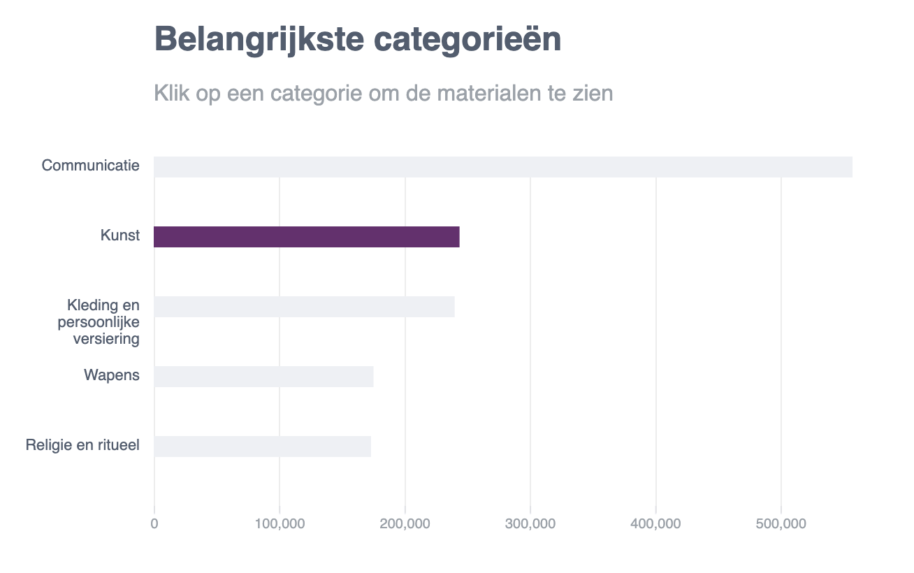
Adding functionality
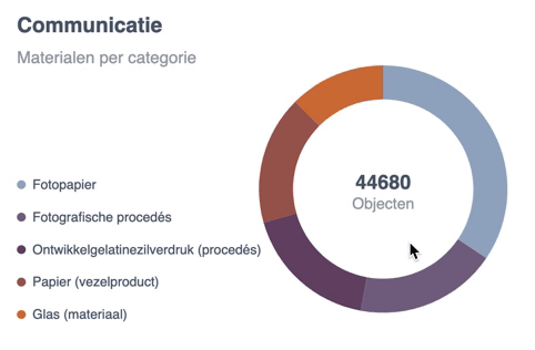
The donut chart example itself is pretty basic. I added interaction and extra information to communicate more clearly to the user what you are seeing on screen. Here is what I added:
- Meta data - the title and sub-title which update once the user hovers over a bar in the bar chart See update pattern here
- Data input - the data inside the donut chart now updates with real data. This process is now triggered by hovering over a bar inside the bar-chart See update pattern here
- Legend - the legend shows which materials there currently are displayed. It's also interactive to give feedback to the user of what the current material is.
- Inner value - inside the the donut chart you see the amount of objects total and when hovered of a specific material
The content below is a reference from the functional-progamming wiki
Bar chart
I learned how the build the most basic chart from FCC. Below you see the screenshot of how this chart looks.
Just 8 bars created with a rect elements that have a navy blue fill. Above those, you see the value of each bar displayed.
    svg.selectAll("rect")
       .data(dataset)
       .enter()
       .append("rect")
       .attr("x", (d, i) => i * 30)
       .attr("y", (d, i) => h - 3 * d)
       .attr("width", 25)
       .attr("height", (d, i) => 3 * d)
       .attr("fill", "navy")
This is the code that creates these bars. Since I followed the FCC course I gained the basic knowledge of how to use D3. Then I used that basic knowledge, created a custom design and coded the graph.
How I adopted the bar graph
 Here you see the result I created from the example.
- Changed the orientation of the bars to horizontal.
- Added labels to the side and wrapped it with a max-width
- Added a scale
- Added the x-axis
- Added gridlines
- Styled the graph according to the design
Change the orientation
This can be done by changing the x and y values. Here I also adjust the values to match the design. This is the code above which I adjusted to fit my needs.
const addBarsToBarChart = (xScale, svg, categories, barheight, barSpacing) => {
  svg
    .selectAll("rect")
    .data(categories)
    .enter()
    .append("rect")
    .attr("x", (d, i) => 100)
    .attr("y", (d, i) => i * barSpacing)
    .attr("width", d => xScale(d.value))
    .attr("height", barheight)
    .attr("class", "bar")
}
Add labels to the side
I wrote this code myself. Since I followed the FCC tutorial I knew how to dynamically add text elements. Using the same principles as the bar chart, I could now add the text. I wrote a capitalize function, which capitalizes each first letter of a string. Then I used a wrap function that I used from someone else. This is linked as a comment in the code.
const addLabelsToBarChart = (svg, categories, labelWidth, barSpacing) => {
  svg
    .selectAll("text")
    .data(categories)
    .enter()
    .append("text")
    .text(d => capitalize(d.name))
    .attr("x", (d, i) => 0)
    .attr("y", (d, i) => (i * barSpacing) + 10)
    .attr("class", "label")
    .attr("dy", 0)
    .attr("text-anchor", "end")
    .attr("transform", "translate(90," + 0 + ")")
    .call(wrap, labelWidth);
}
xScale
I used the scale from a later chapter in the tutorial. The example was from a scatter plot that had implemented a scale. What I did with this code is put it into a function that I later save in a variable. This makes the code more functional and reusable.
const addXScaleBarChart = (width, barSpacing, categories) => {
  return d3
    .scaleLinear()
    .domain([0, d3.max(categories, d => d.value)])
    .range([barSpacing, width - barSpacing]);
}
Gridlines
I wrote this code based on the D3 docs and then adapted it to the design.
const addGridlinesToBarChart = (svg, width, height, xScale) => {
  const x = xScale;

  svg.append("g")
    .attr("class", "grid")
    .attr("transform", "translate(50," + (height - 45) + ")")
    .attr("stroke", "#E9EBF1")
    .call(makeXGridlines(x)
      .tickSize(-height)
      .tickFormat("")
    )
}
Donut chart
Here you can see the example I used for the donut chart. I used an example for this chart since I didn't know how to create the arcs of the donut shape.
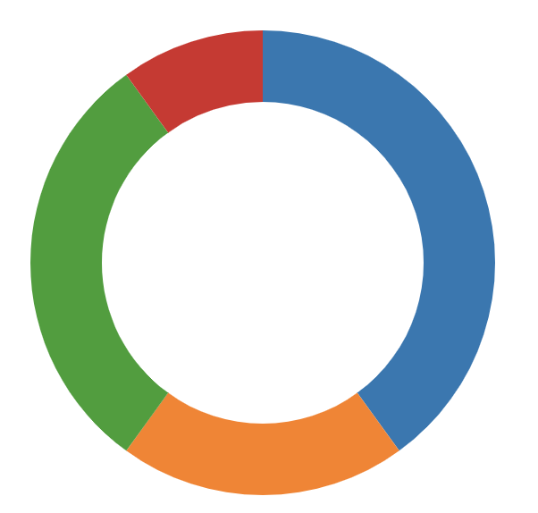
Here you see the main code that the donut chart uses to create the donut-like shape. This code is just one blob. There is no structure to it and lacks comments. It reminds me of the spaghetti code I used to write with jQuery. This code became the base of my code. I then added structure to it and adapted it to my design.
var radius = Math.min(width, height) / 2;
var color = d3.scaleOrdinal(d3.schemeCategory10);

var svg = d3.select("#chart")
.append('svg')
.attr('class', 'pie')
.attr('width', width)
.attr('height', height);

var g = svg.append('g')
.attr('transform', 'translate(' + (width/2) + ',' + (height/2) + ')');

var arc = d3.arc()
.innerRadius(radius - thickness)
.outerRadius(radius);

var pie = d3.pie()
.value(function(d) { return d.value; })
.sort(null);
How I adopted it
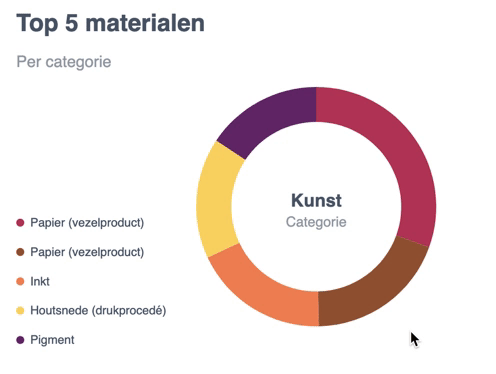
Instead of writing all the code in the global scope, I went for a more functional approach. Here you see my main function which contains a function for each step like storing the arcs in a variable and adding a legend.
export default function renderDonutChart(categories, size, thickness) {

  // Setup
  const width = size, height = size;
  const radius = Math.min(width, height) / 2;
  const colorPalette = addColorPalette();

  // Create donut
  const svg = addGlobalSvg(width + 180, height + 30)
  const arc = addArc(thickness, radius);
  const g = rotateArc(svg, width, height);
  const pie = addPieRadius();
  let path = createArcPaths(g, pie, categories);
  addLegend(categories, colorPalette);

  // Interactions
  showCategoryText(path);
  resetDonutText(path, categories);
  path = addFillToDonut(path, arc, colorPalette);
  addArcHover(path, colorPalette);
  addDefaultText(categories, width, height);
}
Then I adopted this donut chart to my design and added functionality.
Adopting the style
I added a custom color palette with D3, added the correct data and changed the dimensions.
const addColorPalette = () => {
  const colorArr = ['#B83B5E', '#995A3A', '#F08A5D', '#F9D769', '#6A2C70'];
  return d3.scaleOrdinal(colorArr);
}
Adding functionality
Default text
This function adds the text to the center of the donut. This text is later updated with a mouseover to show the value of the category.
function addDefaultText(categories, width, height) {
  const defaultText = d3
    .select('.pie')
    .append("g")
    .attr('class', 'default-text');

  defaultText.append("text")
    .attr("class", "donut-title")
    .text(truncator(categories[1].name, 1))
    .attr('text-anchor', 'middle')
    .attr('dx', width / 2 + 180)
    .attr('dy', height / 2)

  defaultText.append("text")
    .attr("class", "donut-sub-title")
    .text('Categorie')
    .attr('text-anchor', 'middle')
    .attr('dx', width / 2 + 180)
    .attr('dy', height / 2 + 20)
}
Adding a legend
I also created a legend that shows a text and a circle that corresponds with the donut-chart. For this, I could use the same principles I learned from the FCC tutorial.
const addLegend = (categories, colorPalette) => {
  const legend = d3
    .select('.pie')
    .append("g")
    .attr('class', 'legend');

  legend
    .selectAll("text")
    .data(categories[1].materials)
    .enter()
    .append("text")
    .text(d => capitalize(d.name))
    .attr("x", (d, i) => 14)
    .attr("y", (d, i) => 140 + (50 * (i / 1.7)))
    .attr("class", "legend-label")

  legend
    .selectAll("circle")
    .data(categories[1].materials)
    .enter()
    .append("circle")
    .attr("r", 4)
    .attr("cx", (d, i) => 4)
    .attr("cy", (d, i) => 140 + (50 * (i / 1.7)) - 4)
    .attr("class", "legend-color")
    .attr('fill', (d, i) => colorPalette(i))
}
Donut part hover
The original donut already had a hover effect. I removed this code and used my own. The code was removed since it simply had too much code for what it did.
const showCategoryText = el => {
  el.on("mouseover", function (d) {
    d3.select('.donut-title').text(truncator(d.data.name, 1));
    d3.select('.donut-sub-title').text(`${d.data.value} objecten`);
  })
}
This text is then reset by replacing the hover text with the default text. This is done on the mouseout event.
const resetDonutText = (el, categories) => {
  el.on("mouseout", function () {
    d3.select('.donut-title').text(truncator(categories[1].name, 1));
    d3.select('.donut-sub-title').text('Categorie');
  })
}
Darken donut color
The color of the donut is darkened with this mouseover function. I select the this element which updates the style element and uses this darken function. The link is placed in the javascript helpers.js file.
.on("mouseover", function (d) {
      d3.select(this)
        .style("cursor", "pointer")
        .style("fill", shadeColor(colorPalette(this._current), -20));
    })