Concept Process - MartijnKeesmaat/frontend-data GitHub Wiki
At the beginning of 2020, a small set-up will open in the Tropenmuseum about the mission and DNA of the Tropenmuseum. With a combination of objects, models, and graphics, we tell about the colonial origins of the institute and our collection.
This exhibition wants to make clear in an accessible and playful way what our collection consists of.
The exhibition consists of 3 parts:
- An interactive model that tells stories about the large and special building
- "The entire collection in 1 showcase": 25 objects that form a cross-section of the entire collection
- Wall graphic that tells you what the collection consists of with facts and infographics
The concept
For this project I created a dashboard which first shows the main categories of the NMVW organisation and second the materials of their respective category. The categories are displayed in a bar chart. This chart shows 5 categories. If the user scrolls he/she can view all categories. The user will be greeted with the materials of a category when clicked on a bar in the bar chart.
The process
It's useful to first look at what there is before we start pondering new concepts. Via the collectie.wereldculturen.nl site we can see what it is available in the collection. This is mainly for people who are knowledgable of the objects that reside in this collection. I say this because the data is hard to interpret for people like me who don't have this knowledge. It's our goal to make this data more accessible. We do this by visualizing.
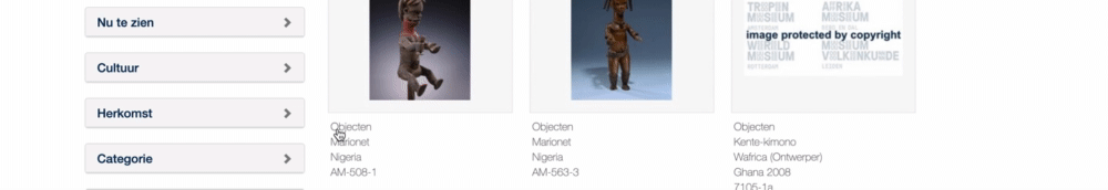
Collection site
The collection site already has one visualization which abstracts the given data. It is an abstraction of the geolocation data. It improves the usability of this filter. It is a confusing filter that has seemingly infinite dropdown.
Instead, you can also use this map view which shows all the items available per region. To make things easier you can zoom in on each location multiple times. The zooming replaces the toggling.
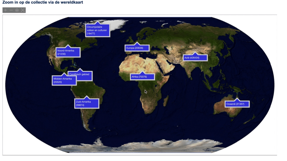
I can adopt this approach to my concept by looking at the collection site and abstracting it difficult to understand data.
Previous concepts
#00 Concepts from the client
Here are the three concepts they would like to see.
- Top 10 most common materials (Based on the thesaurus category Materials and Techniques, from wickerwork to earthenware with sheepskin)
- Top 10 most common categories (Based on the thesaurus category Functional categories, from death to communication)
- Top 10 most common keywords (Based on the thesaurus category Object keywords, from mask to the weapon)
- Top 10 most common objects/shapes
- From small to large (A size chart: an infographic with scale, from the smallest to the largest object)
These concepts are examples of which data they are interested in off seeing. These can be used as concepts, however, it would be more interesting to explore these concepts furthers to see what else is possible. For that purpose, I will be considering these concepts below.
#01 Behind the scenes
- How does one make people more aware of what happens behind the screens
- Maybe a comparison graph which shows first shows a current exhibition then compare that to all the items, then show all the items.
Neem een kijkje achter het scherm van Keiga shows how much work it can take to display certain props. For example this 8 piece panel from Japan. Which is made of cloth and difficult to repair. One of the few teams in Europe is working on it to fix it.
#02 Dashboard
Instead of showing one graph, it would be interesting to work with multiple types of graphs. Not only could this be interesting for the assignment, but me personally as well.
A dashboard which shows multiple stats which together show the entire view. See the example.
#03 Rik's exhibition
- Top 10 most common categories (Based on the thesaurus category Functional categories, from death to Becomes all categories
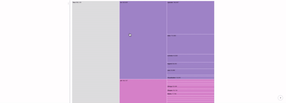
Examples
Sun burst
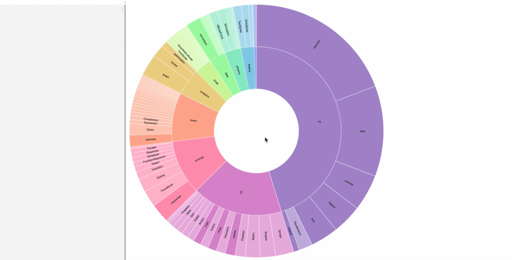
Tree map
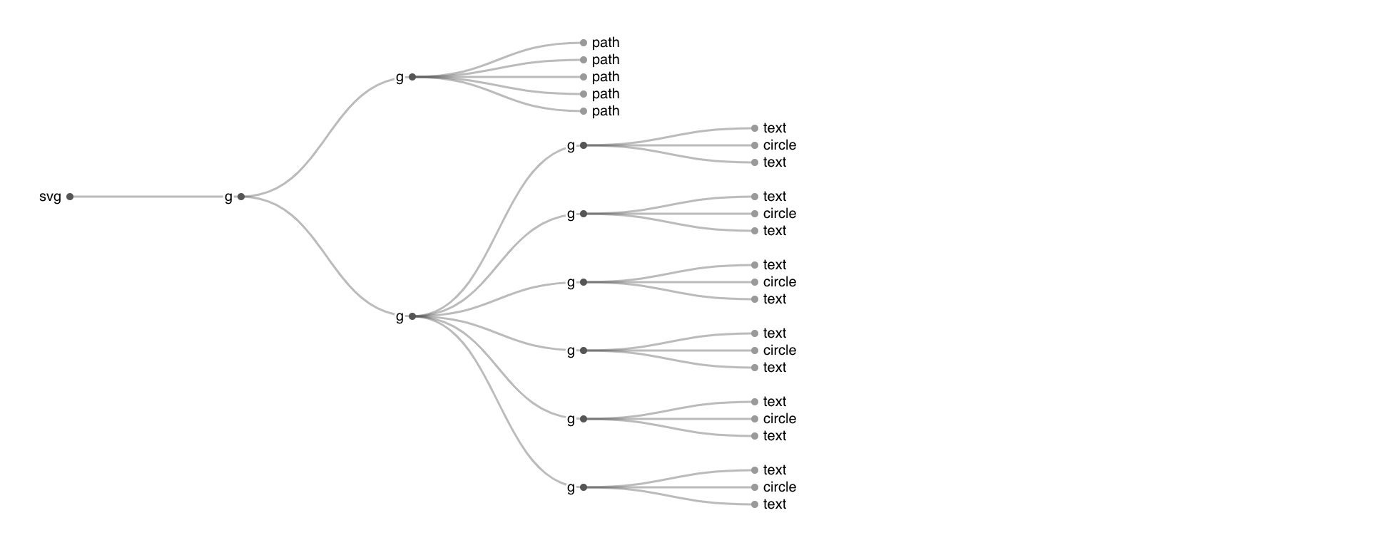
Tree
I asked Laurens to what degree can I follow this example. Conditions
- You should understand the code
- All the code you didn't write can't be evaluated
- Add extra functionality (controls(go back), data which shows current item)
So what I want is to display each category with their respective sub-categories.
Then show information based on each category. Information like the materials each category has.
This is a problem. It's a huge amount of data to process. I think it's wise to separate these categories. First focus on the categories and then when there is room to work with, we can improve that.
In short
- Help Rik with his exhibitions
- He asked us to visualize the most common categories
- Show all the major categories with sub-categories in one view
- Add interactions to guide the user and make the data more clear
- Another graph displays dynamic data which is based on the category graph
- So, in one view you see the category graph which enables the detail graph
- Problems which data do I show in the detail graph, how to retrieve that data and how do I not crash my site when retrieving all this data?