How to choose which colour map to use - MBravoS/scicm GitHub Wiki
The purpose behind SciCM
Before we present the rationale behind the colour maps included in SciCM, it's important to first establish why perceptually uniform colour maps are important for quantitative data visualisation. This will not be an exhaustive exploration of this topic but rather a quick primer, we highly recommend the sources linked in this Wiki's home page for an in-depth discussion on the topic.
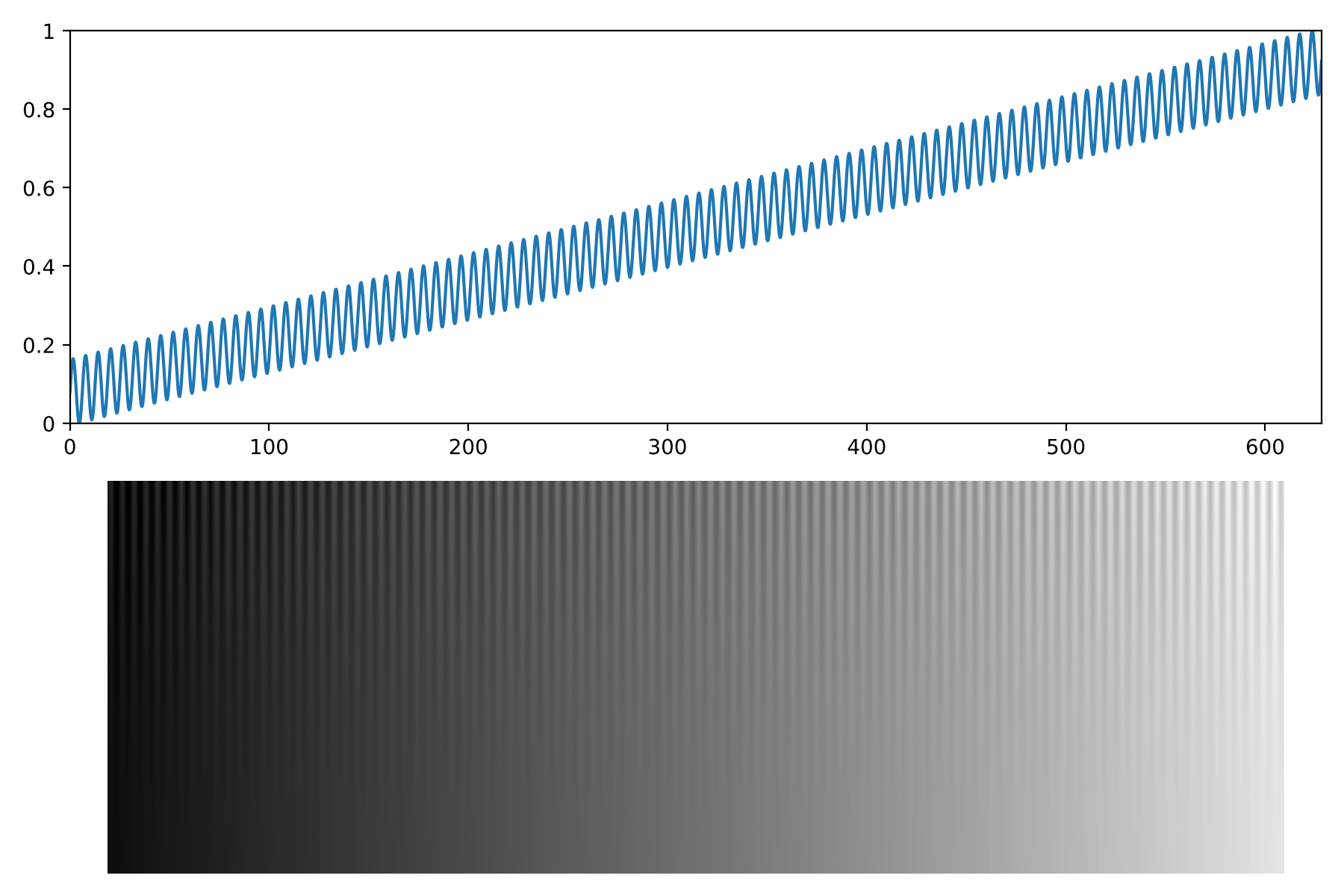
A good test image is the sinusoidal ramp introduced by Kovesi (2015), for which we present our example below. This image is created from a linear plus sinusoidal function, with a modulated amplitude for the sine component. The top panel shows this ramp at the maximum amplitude, which is 10% of the range of the linear component. The bottom panel shows the Kovesi (2015) test image, where the amplitude is modulated along the vertical axis with a square function. It should be clear that, along the x-axis, the expectation is for the perceived sinusoidal fluctuations to be similar, i.e., the sinusoid at the top-right corner should be perceived as having the same magnitude as in the top-left corner.
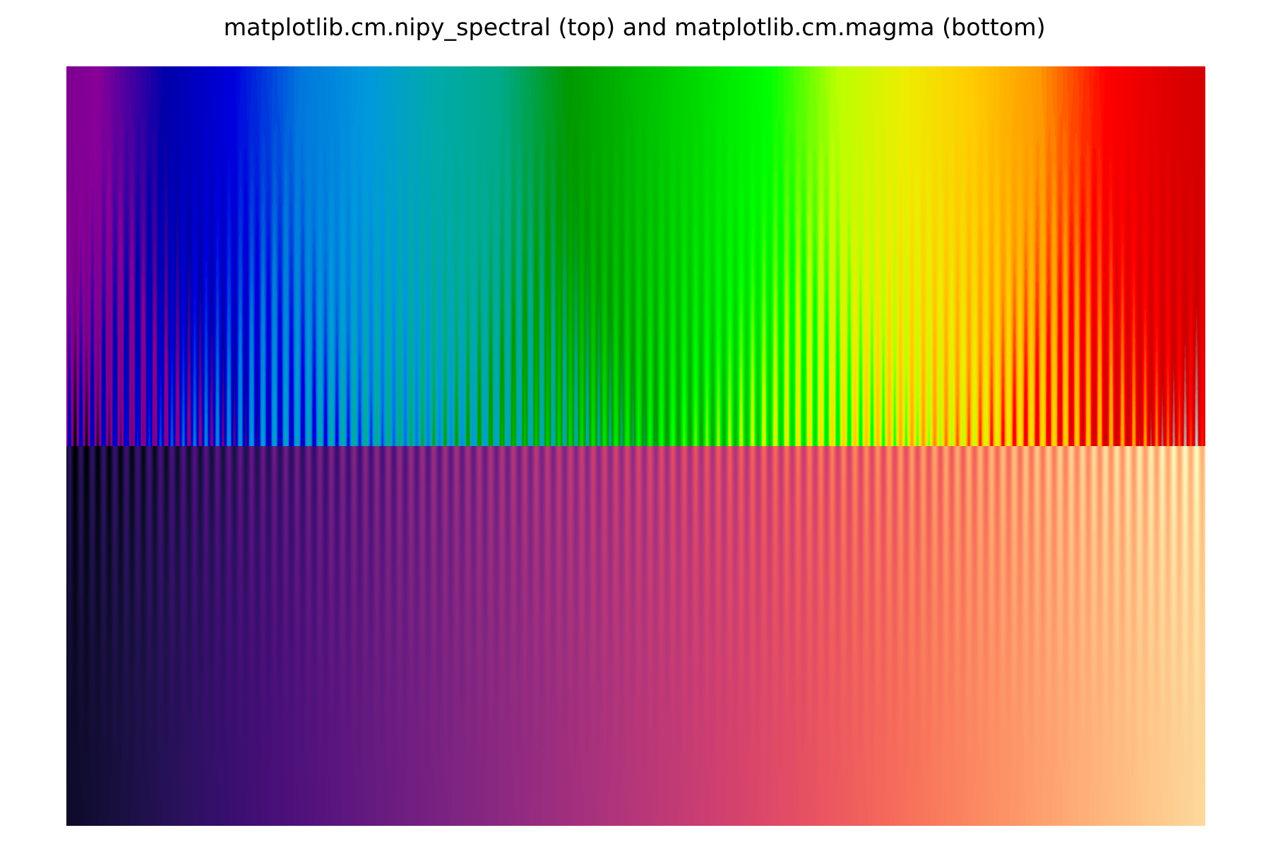
A perceptually non-uniform colour map then will introduce perceptual differences between fluctuations that are numerically the same. For the example below, we have chosen two colour maps from matplotlib: nipy_spectral and magma. Note that the test image is flipped along the vertical axis in the top panel to provide an easier comparison with the bottom panel. The former is among the most perceptually non-uniform colour maps included in matplotlib, while the latter is considered to be perceptually uniform. The differences in uniformity should be clear, with nipy_spectral over-exaggerating the differences in the colour transitions while suppressing the differences elsewhere.
While it should now be obvious why perceptually uniform maps are important, for historical reasons the vast majority of colour maps offered in matplotlib are non-uniform. As of matplotlib v3.5.1, 78 out of 83 available colour maps are non-uniform. This shortcoming has already been addressed by other packages, but to our knowledge only in a targeted manner. For example, cmocean provides a good variety of oceanographic-centric colour maps, and CMasher has focused on providing uniform alternatives to matplotlib's "miscellaneous" colour maps (which includes the now-infamous jet).
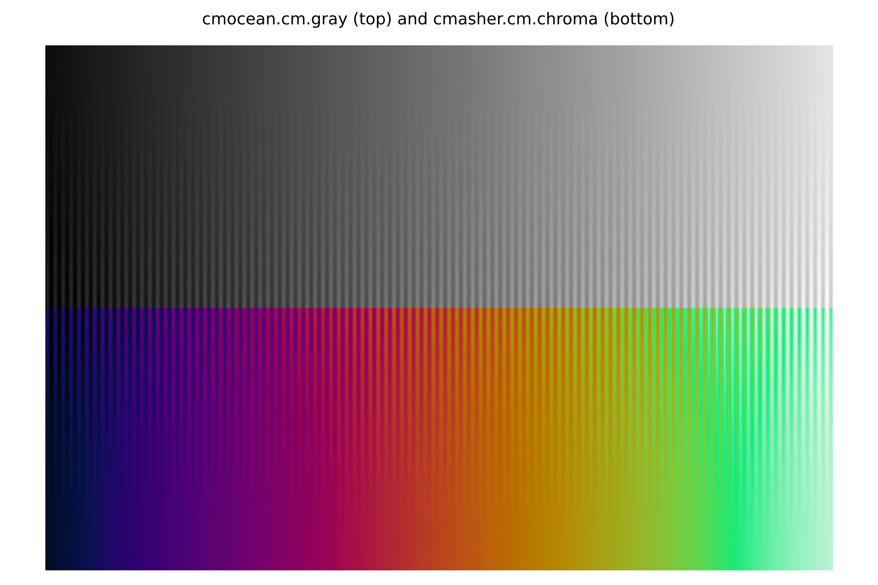
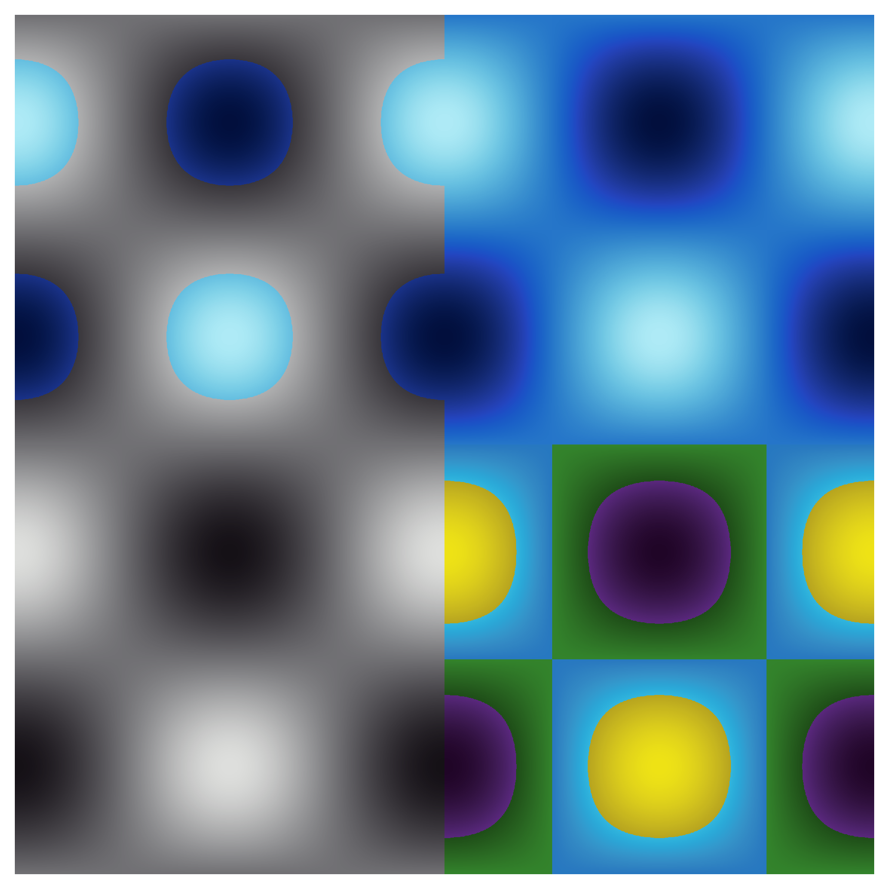
While uniform colour maps are the most appropriate for the visualisation of quantitative data, this does not mean that any two uniform maps provide the same visualisation of a given data set. The following images show as examples the same data visualised with two colour maps: the grayscale colour map from cmocean and the chroma colour map from CMasher. Our choice is not arbitrary, a greyscale is by definition the most "featureless" colour map possible, while chroma was constructed with a strong change in hue as a function of lightness. The result is that changes in chroma lead to the perception of different regions in the data that do not exist in grayscale. This is not to suggest that grayscale is the better colour map, but rather that different uniform colour maps can still lead to different interpretations.
Monochromatic colour maps
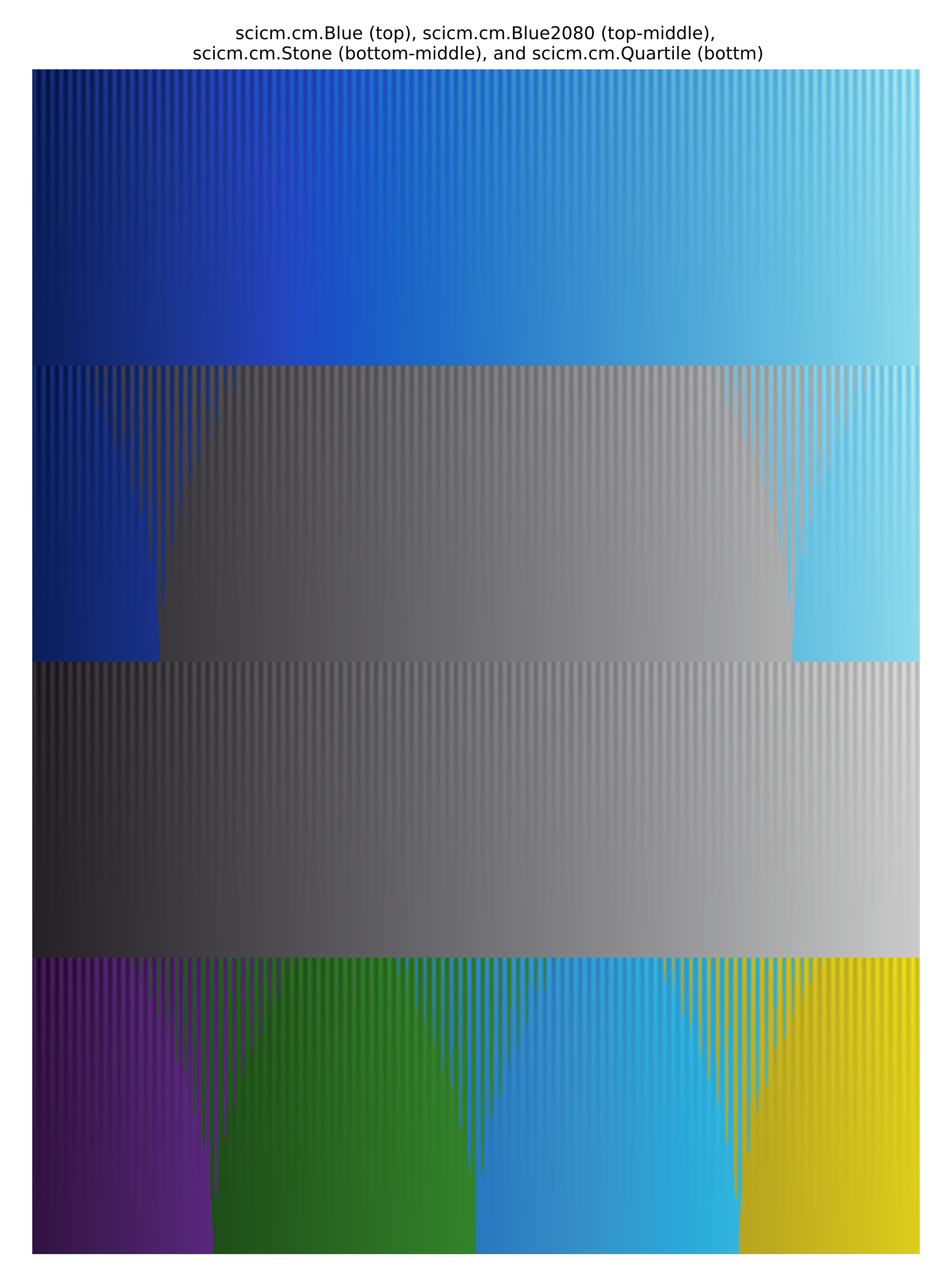
It is our view that the choice of a uniform colour map should be an informed one, where the author consciously chooses one that fairly highlights the relevant aspects of the data, without misleading the reader by accentuating certain value ranges in the data. The majority of available packages have been designed to replace legacy non-uniform colour maps, which has led to a relative sparsity of colour maps with small hue/chroma variations. This is one of the main design goals for SciCM: to increase the selection of "featureless" colour maps, which are those from the set of Monochromatic colourmaps and their Soft variants in SciCM. Below we show an example from each set, Blue and SoftBlue.
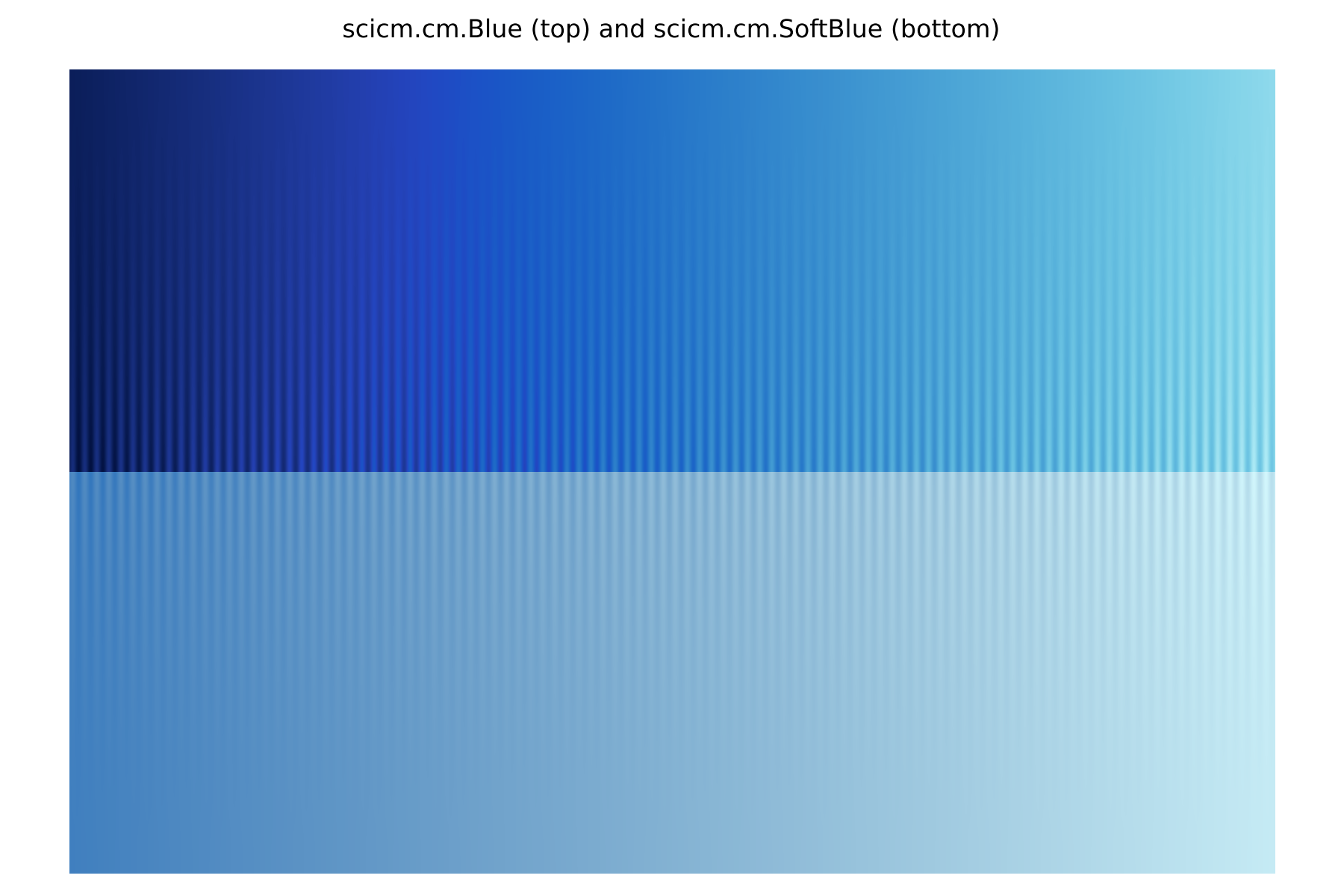
The main difference between the two sets of colour maps is the dynamic range of lightness, with the Monochromatic colour maps spanning a broader range than the Soft colour maps. From the figure above it should be clear that a wider dynamic range leads to a more perceptible difference between small fluctuations. Furthermore, the data used for the figure below contains a small amount of per-pixel scatter, which is less noticeable with SoftBlue than Blue. Hence, for simple visualisations, it is recommended to pick a colour map from the Monochromatic set over one from the Soft set.
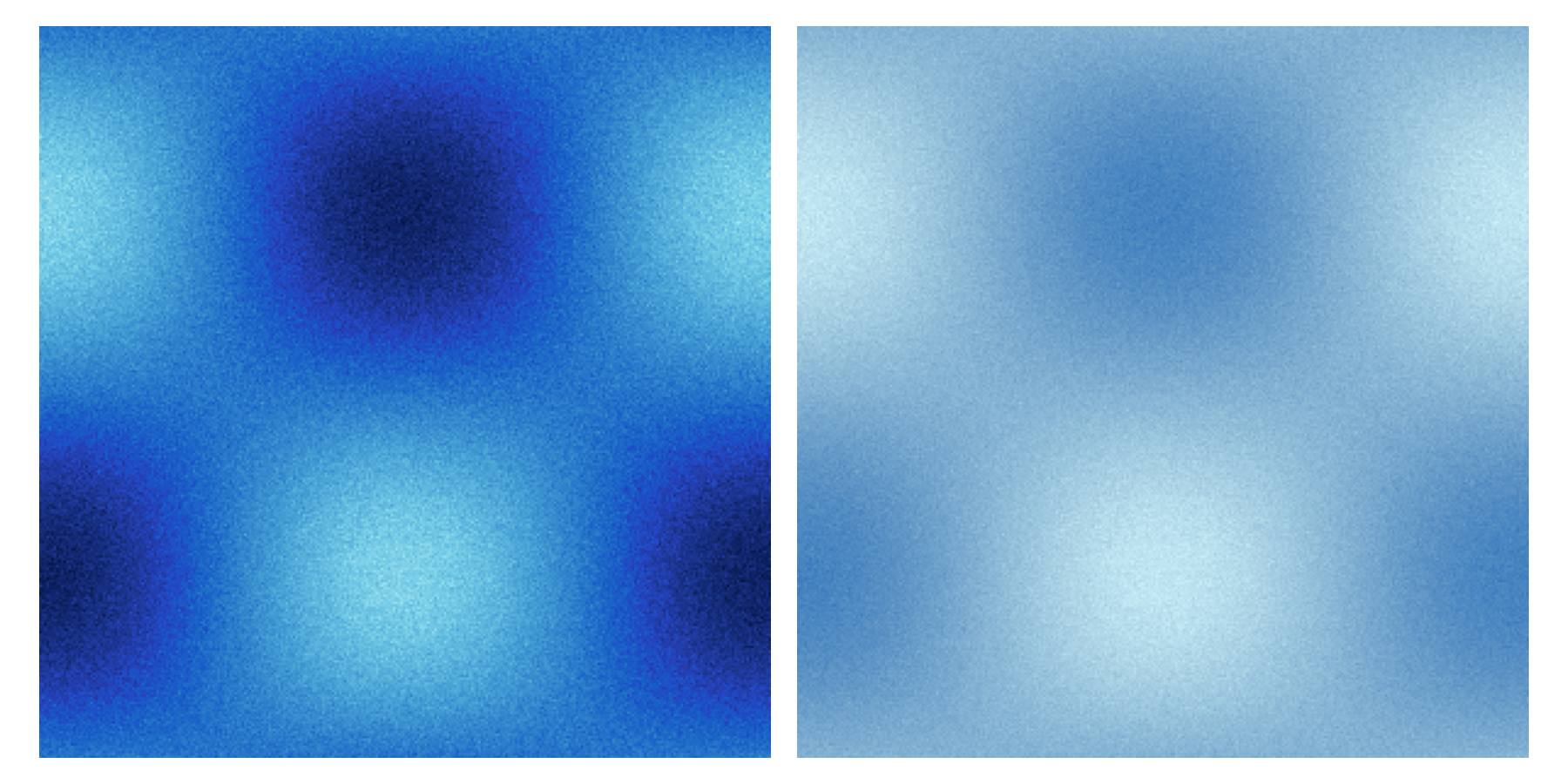
The main purpose of the Soft set is to serve as an alternative to the Monochromatic colour maps for which is easier to draw lines on top.
The decreased dynamic range, combined with a reduction in chroma, means that there is a good variety of colours to choose from for drawing additional contours and markers on top.
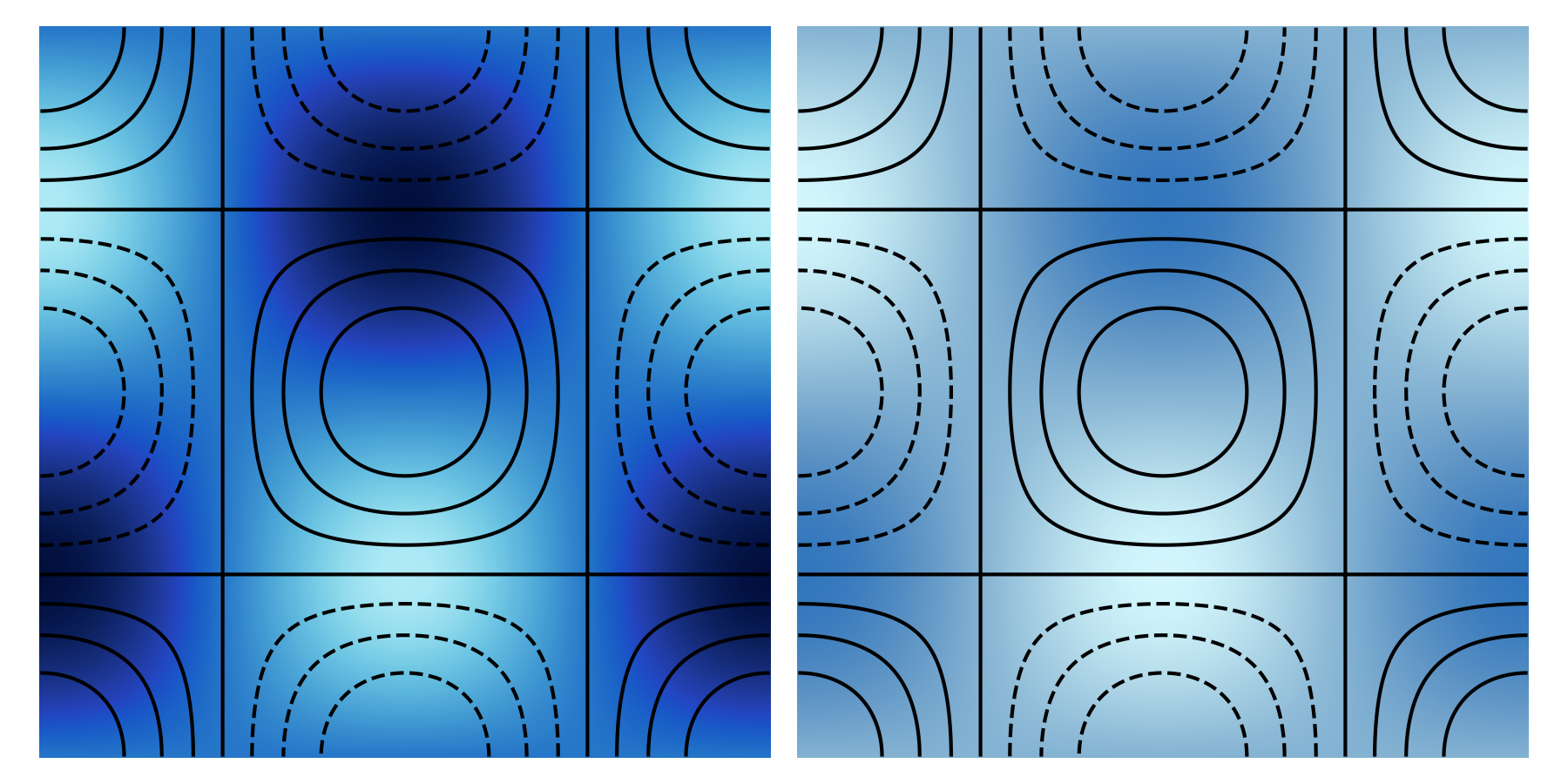
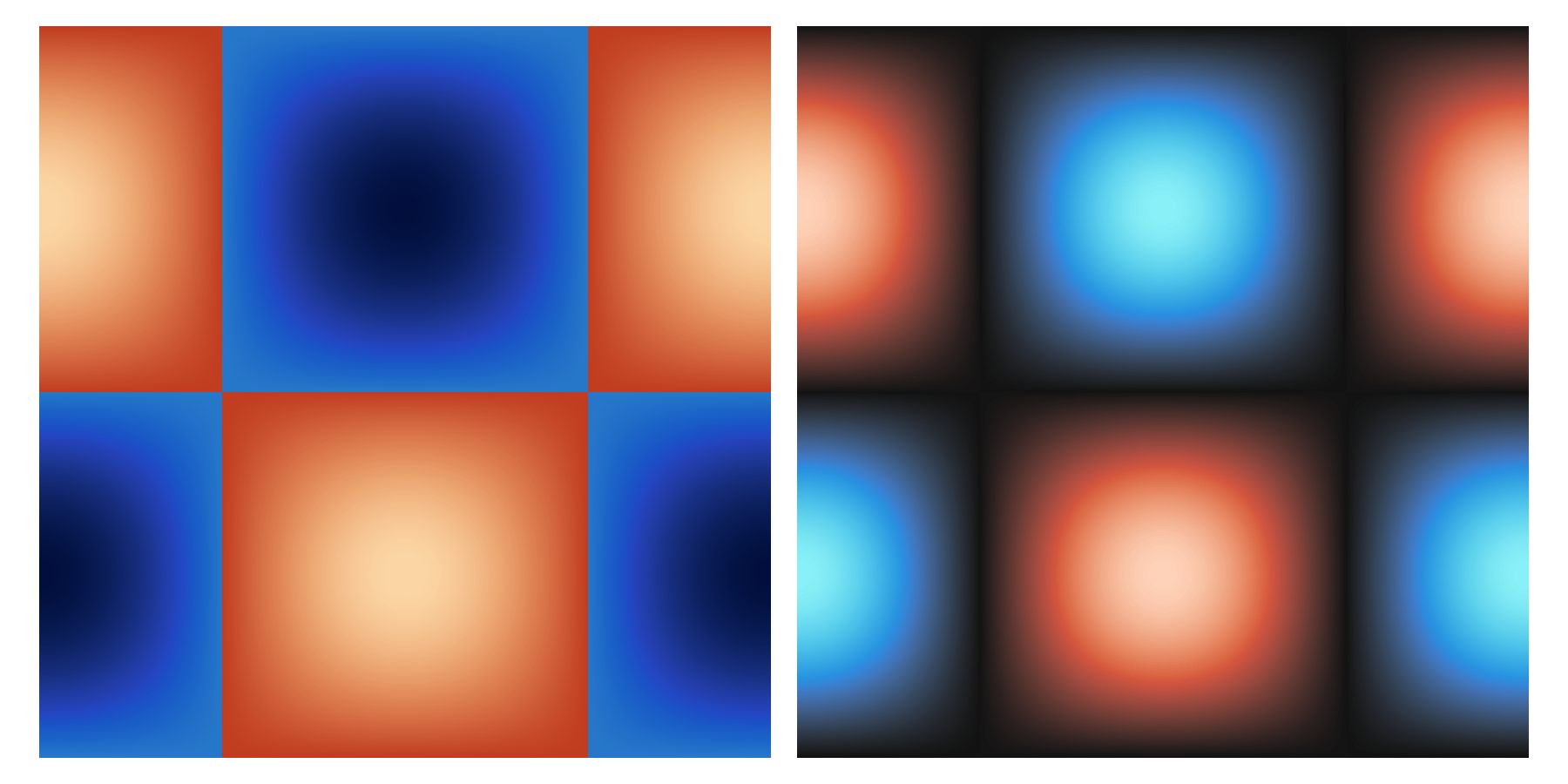
The figure below shows an example with a set of black contours drawn on top of Blue and SoftBlue, from which it is clear where the trade-off is being made.
While a somewhat similar effect can be reached through alpha compositing (i.e., passing alpha!=1 to the colour map object), this process is by definition non-linear in L*a*b*/L*C*h° space (the spaces that linearise uniform colour maps), so it is guaranteed to produce a non-uniform visualisation.
Bichromatic colour maps
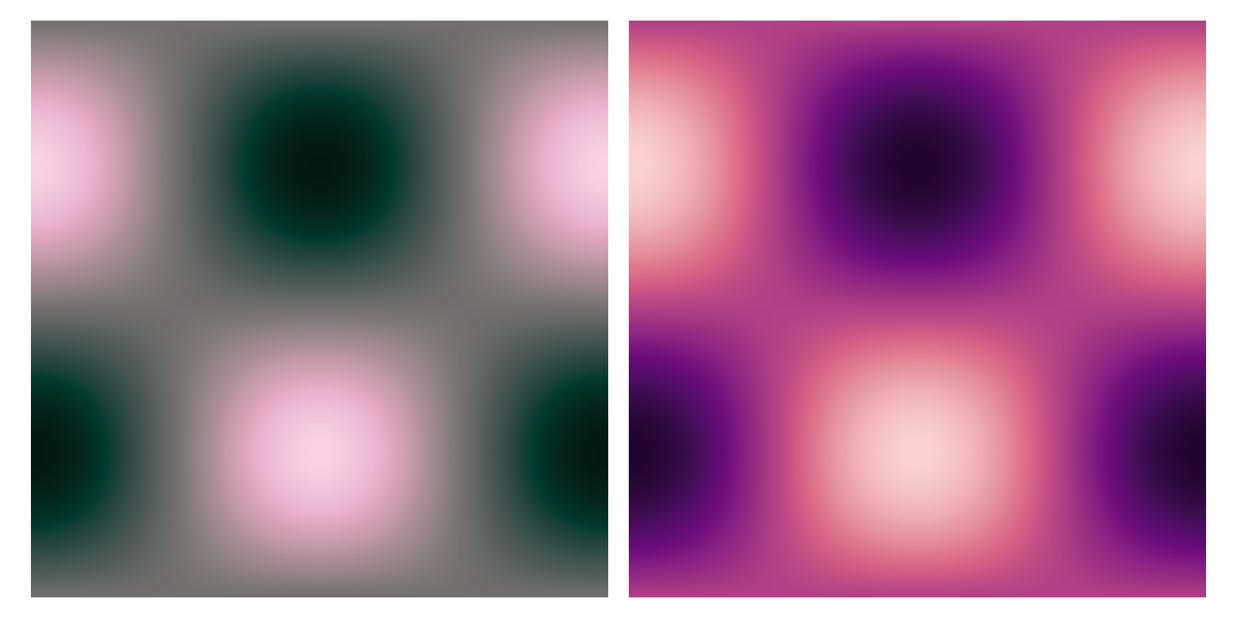
While the previous colour maps are designed to only small hue changes, there might be situations in which creating a larger visual contrast between high and low values would be justified. Such cases are the main motivation for the Bichromatic and Bichromatic (grey middle point) colour map sets. For the former, each colour map starts at one hue and ends at one of the neighbouring ones, which we have broadly defined in the a*b*/C*h° plane as blue-purple-magenta-red-orange-yellow-green-teal-blue. These colour maps have been designed such that the transition roughly lies at the middle of the colour map. The colour maps of the Bichromatic (grey middle point) set offer a more precise transition, as they have been created using the diverging-continuous colour map type in viscm. This ensures that the transition between one hue to the other lies exactly at the half of the colour map, with this transition point being a grey value (a*=b*=0 or C*=0). The following figures show examples from each of these colour maps sets.
Diverging colour maps
A subset of the previous case are situations in which the data has one known critical value, in which case one might desire to display a sharper transition in the colour map. Such a sharp feature will introduce some level of non-uniformity to the colour map, which is the main trade-off of these colour maps (hence why we recommend their use in only specific cases).
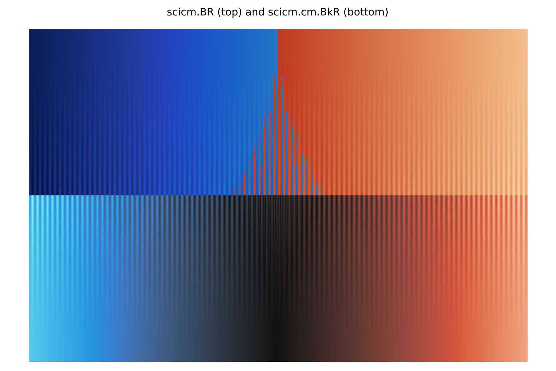
First, we offer two related colour map sets: Diverging (black middle point) and Diverging (white middle point). These two are non-uniform in that they are not monotonic in lightness, i.e., from 0 to 0.5 they decrease/increase in lightness, switching to increasing/decreasing from 0.5 to 1. viscm offers a control over how close to lineal values close to the middle point are, for which we have opted for the highest value (i.e., ensure linearity close to transition). In our opinion, this is the only general choice, as choosing any degree of of non-linearity in the transition implies an assumption of how trustworthy small fluctuations around the middle point are (how much to hide those differences). An important aspect of these sets is that they depend on hue to distinguish each half, which makes them unreadable for people with monochromatic vision, though the included selection in SciCM retains some level of distinction for most/all types of green-red colour blindness.
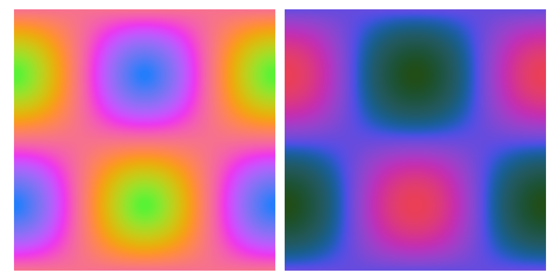
Another option is colour maps that retain linearity in lightness but instead feature large discontinuity in the a*b*/C*h° plane. Such a colour map has the benefit of being unambiguous for any type of colour blindness, though the difference between each half may disappear. These colour maps are part of the Diverging set in SciCM. As with the other two diverging colour map sets in SciCM, all of the colour maps included in the Diverging set have been chosen to retain a good level of perceptual separation for green-red colour blindness. The figure below shows blue-red colour map examples from the Diverging and Diverging (black middle point) sets.
Segmented colour maps
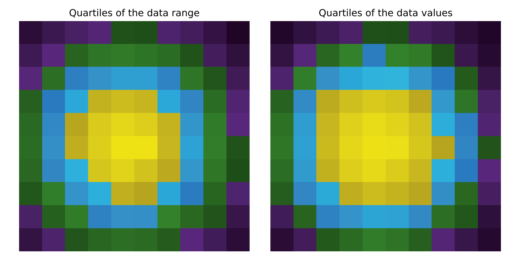
We use a similar approach to produce a set of more niche colour maps, using discontinuities in the a*b*/C*h° plane to clearly demark specific values. All but one of the colour maps in the Segmented set are mixes of the Stone colour map with the rest of the Monochromatic set, which is done in such a way that the colour maps transition to grayscale at a value of 0.2, and then back to colour at a value of 0.8, highlighting the lower and upper quintile of the value range (named colour2080). We note that this choice is highly arbitrary, with other obvious choices being grayscales spans of 0.1-0.9 (upper and lower deciles) and 0.16-0.84 (>1 sigma from a normal distribution centred at 0.5). The user should choose which one fits its purpose the better, we only provide this particular choice for convenience. We also provide a more complex segmented colour map, Quartile, in which the range is evenly divided in four colour segments, the order of which has been chosen so that the colour map remains fully readable for green-red colour blind people. The following figures show two examples from this set.
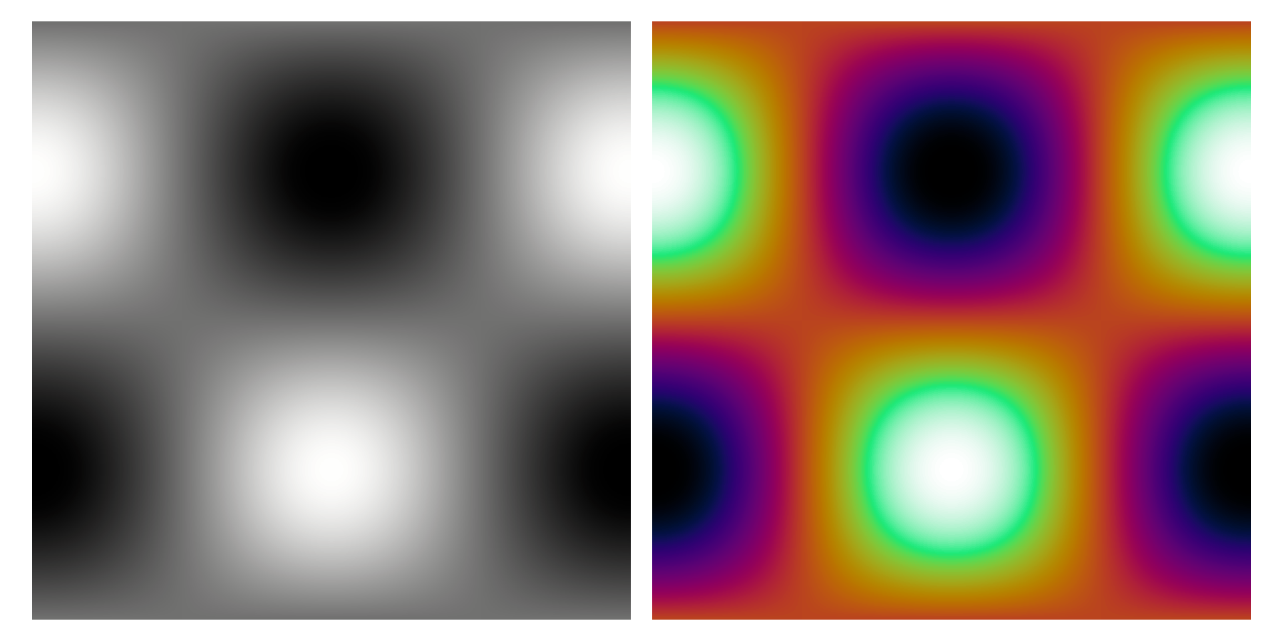
We should also remark that these colour maps highlight percentiles of the range of the values, not percentiles of the value distribution. To illustrate this point, the following figure shows on the left the 2D histogram of a symmetric 2D Normal distribution, from which it should be clear that the number of bins in the upper quartile (yellow) is significantly smaller than those in the lower quartile (purple). By performing a histogram equalisation to this data it is possible to visualise the quartile distributions of the bins, but we note that now the colour map doesn't reflect the true density of the distribution, just the relative ranking of the bins.
Miscellaneous colour maps
The final set of colour maps included in SciCM is a collection for a variety of niche uses.
Cyclic colour maps
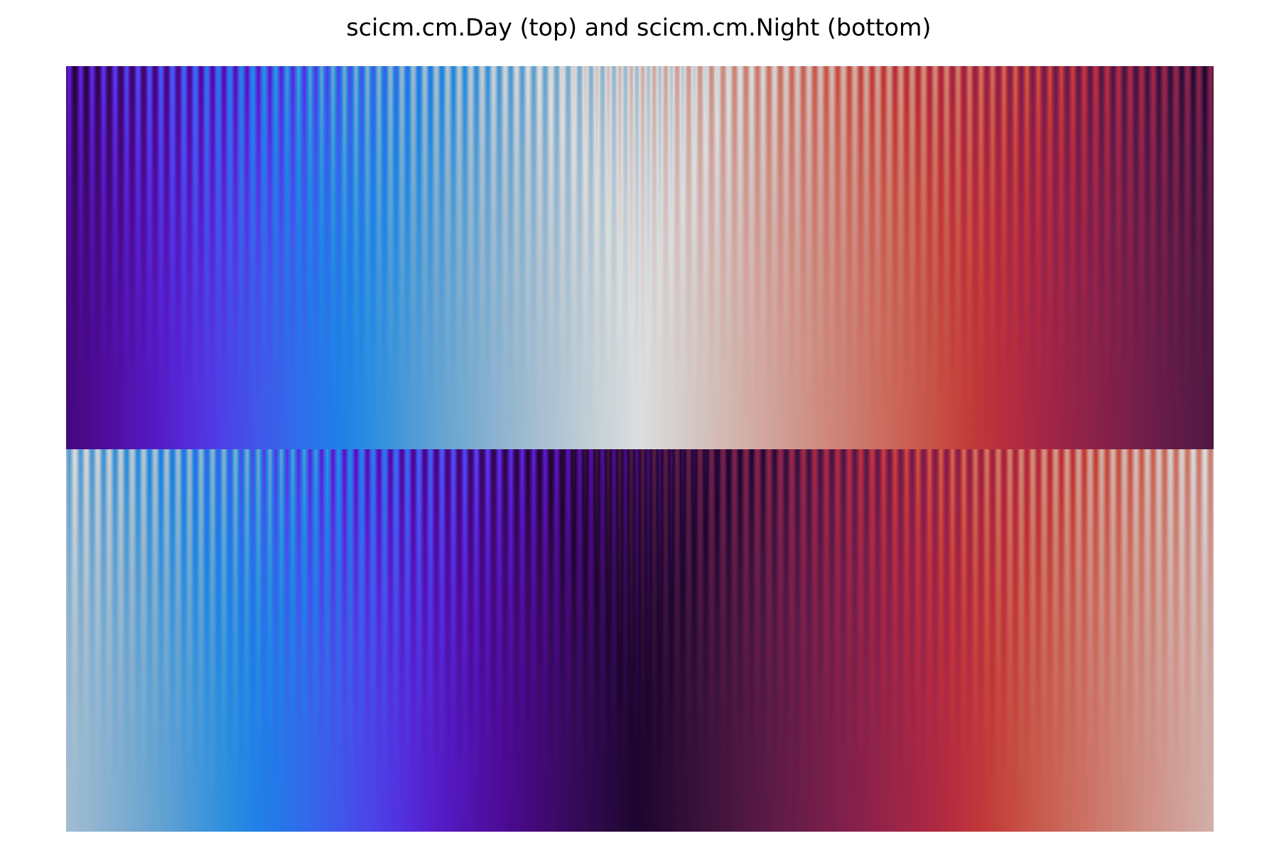
Cyclic colour maps produce the same colour for values 0 and 1, which is particularly useful when visualising data that is cyclic in nature (e.g., angles). Such maps are commonly non-uniform, as only cyclic maps with a fixed lightness for all values (i.e., an isoluminant map), which would decrease the usability of the maps. SciCM includes two cyclic colour maps, Day and Night, inspired by twilight and twilight_shifted from matplotlib but without the dead zone near the middle.
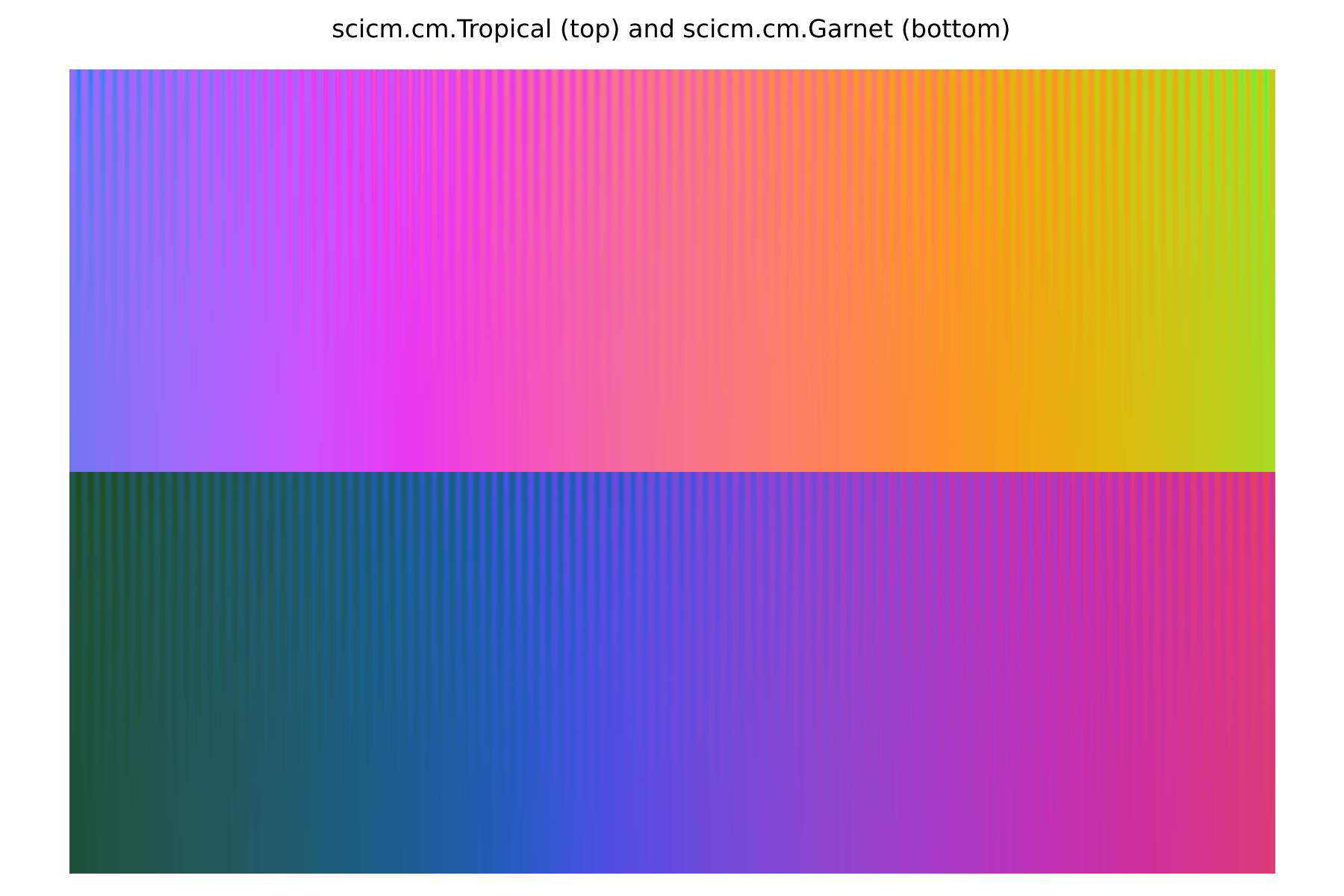
Polychromatic colour maps
While not the focus of SciCM, we include a small set of "jet-like" uniform colour maps. The dynamic range of these colour maps is smaller than the Monochromatic, Bichromatic, and Bichromatic (grey middle point), in an effort to maximise the chroma for all values. These colour maps are best used for colouring markers or lines.
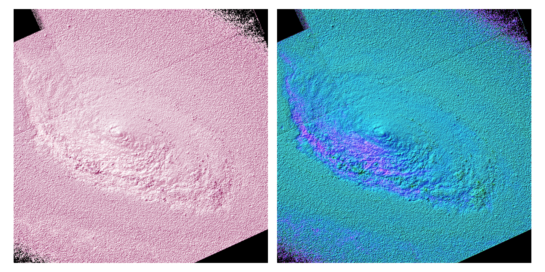
Isoluminant colour maps
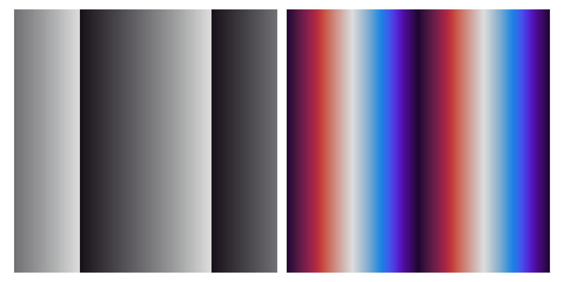
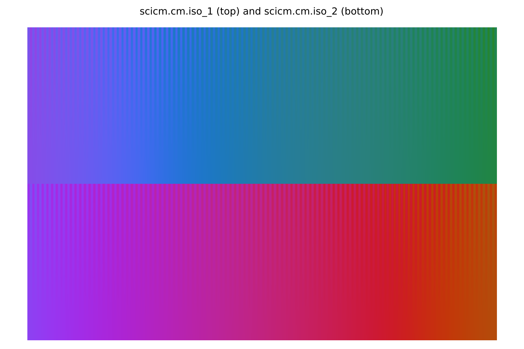
The last members of the Miscellaneous set are two isoluminant maps: iso_1 and iso_2. These colour maps offer no change in lightness, hence small fluctuations in value become significantly hard to spot. We highlight this lower of the two following figures, where the only difference between the left and right panels is the addition of small random fluctuations on the right.
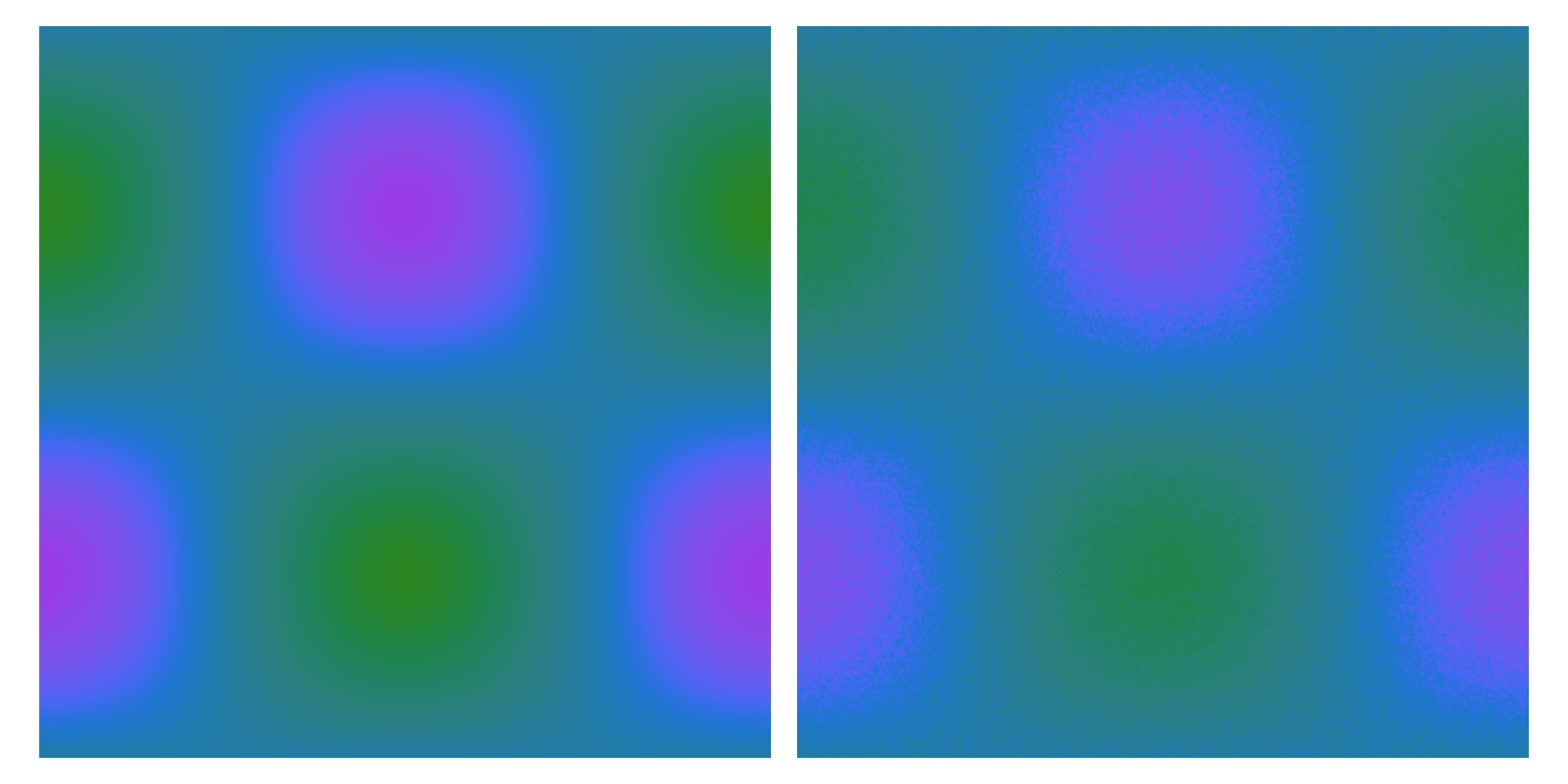
These colour maps are best used in combination with relief shading, as the fixed lightness of the colour map makes the shading unambiguous. In contrast, colour maps with lightness gradients can become hard to read, as a light area could be either due to the relief shading or a light colour from the map. We demonstrate a worst-case scenario on the left of the figure below, where the chosen colour map makes both shading and colour hard to read. In contrast, the panel on the right highlights the clarity provided by an isoluminant colour map.
While not meant as a guide, the Jupyter notebook used to generate these examples is included in the SciCM repository.