Fluid Web Design - MAliKhatri/Ali-khatri-Knowledge-Base GitHub Wiki

The world of web design has changed quite a bit over the years. As it continues to evolve, mobile-friendly design has become the rule rather than the exception. When it comes to choosing the right mobile-friendly layout for your website, there are a number of factors to keep in mind.
Websites used to be built with fixed dimensions . You could look at them on a smaller screen, but they were really only meant to be viewed on a desktop screen. These days website visitors need to be able to access to a functional (and, ideally, beautiful) version of your site on whatever device they have within reach. As a result, three web design options have been developed: responsive, adaptive, and fluid design. While these web design styles have similar features, they each have unique pros and cons that can help you decide which is right for your next website or website redesign.

Opposite to the fixed layout, fluid or liquid design has the width specified as a percentage. It is based on relative units and proportional widths, making pages scalable and adjustable to various screen sizes.
Standard screen size used to be 1024×768 pixels, but so many people have higher resolution screens nowadays. That is why fluid design is very helpful.
Whenever the screen size changes, elements of a fluid layout spread over the same percentage of space. Blocks of content, images and other elements are going to stretch or shrink according to the screen size.
Your website is often the first port of contact with a company or brand, therefore getting the web design right is more important than ever before. A good first impression is vital, so a high quality site is imperative.
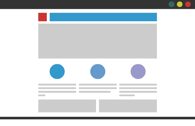
Although the main design decision comes down to the users' needs, the site owner's requirements, and the sort of content that will be included, many website developers and designers opt for a fluid web design. This is an approach that uses percentage based widths rather than pixels, as shown in the diagram below. This design style adapts to different screens and devices, enabling the site to stretch up and down to fit the page when resizing the browser window.
There is an endless list of reasons why a responsive website is the way forward and why this could be the difference between a successful business and an unsuccessful business. The first being that over 20% of Google searches are performed on a mobile device, and 25% of US residents only access the internet via smartphone. An element of responsiveness is having a high page speed, something a website definitely should have! If your site takes a long time to load there is a very big chance that users will click off, giving you a high bounce rate and low conversion rate. Furthermore, 55% of social media consumption happens on a mobile device, meaning that if website links are shared, for example via Twitter, that is a lot of people that are going to be clicking OFF your site if it's not responsive.
There are 2 types of element sizing properties, absolute and relative, when we use relative property we get the element in terms of the size of the screen we have opened the site on.
we use the following code for the example.
<html>
    <head>
        <title>My Website</title>
        <link rel="stylesheet" type="text/css" href="newcss.css">
    </head>
    <body>
        <h1 onclick="hello()">Example of a fluid web design</h1>
        <button class="buttons">A</button>
        <button class="buttons">B</button>
        <button class="buttons">C</button>
        <button class="buttons">D</button>
        <button class="buttons">E</button>
        <button class="buttons">F</button>
    </body>
</html>
body {
    color :saddlebrown;
    background-color:#48f771;
    background-image: linear-gradient(to right , red, blue);
}

.buttons{
    height: 50%;
    width: 30%;
    color: black;
    background-color: whitesmoke;
}


A fluid design can also create challenges depending on the size of the browser.
For instance, say you’re viewing a multi-column web layout on a smaller screen, like a mobile phone or a tablet. The content may look crowded and become difficult to read. On the opposite end of the spectrum, if you’re viewing the website on a large desktop or a smart TV, the content can look stretched. The styles and features of a website will affect fluid design, including how the amount of whitespace will depend on the size of the screen you’re viewing the website on.
