Windows11ButtonsRADStudio - Leghari-K/Win11ButtonsRADStudio GitHub Wiki
Windows 11 Style Buttons
Windows 11 brings beautiful UI innovations to the Windows operating system common controls, including an overhaul of Buttons. Windows 11 style buttons consist of slightly round edges on all four corners of the button and offer a new color scheme.
Windows 11 style Buttons no longer use the traditional **clBtnFace **and clBtnHighlight colors you know, love, and have been using in RAD Studio VCL application all along – with one exception though. The **clBtnFace **and clBtnHighlight colors are still used for inactive buttons on both light and dark schemes of Windows 11. The text used on these buttons is of **clGreyText **color.
The active buttons (the ones which you have recently clicked and no other button was recently clicked since then) present a different color scheme in Windows 11. These are either clHotLight (a darker blue) or a darker version matching a grey color (the equivalent of clWindowFrame or clGrayText in RAD Studio).
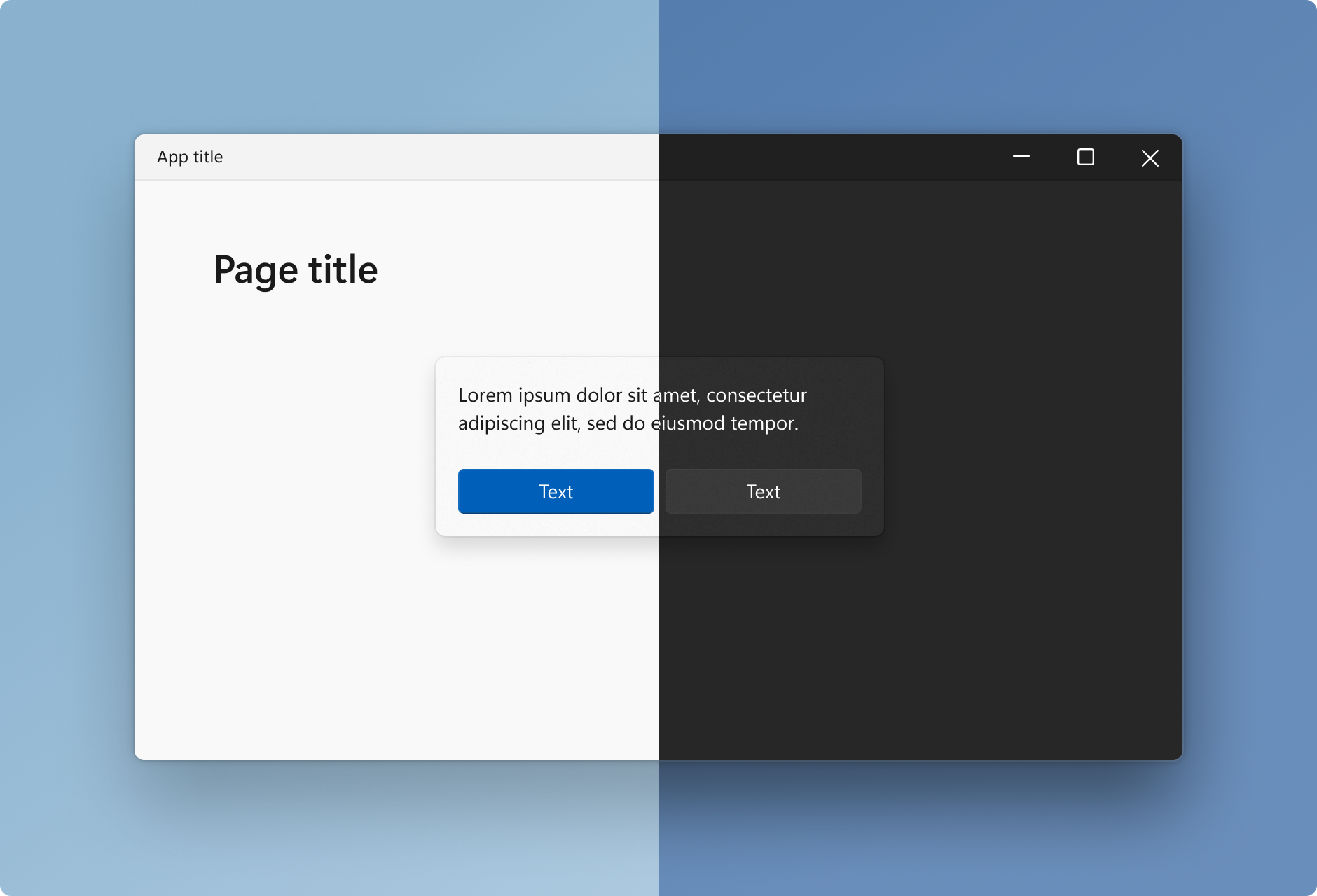
The following image shows Windows 11 style active buttons.

Windows 11 style active buttons, Source: Microsoft Windows 11 button example
And the inactive button (the white one) is as shown in the screenshot below,

Source: Microsoft
Windows 11 buttons get slightly brighter or darker depending on the Windows or application theme currently being used.
Windows 11 Style Buttons Support in RAD Studio
Windows 11 style buttons support is currently limited to Windows 11 specific UWP applications only. Microsoft may eventually enhance Mica support for traditional Win32 and .NET (WinForms, WPF) applications.
Since VCL is Windows-based and its implementations of common controls are wrappers of the Windows API, thus is close to the ground and fully native, the behavior of VCL applications is expected to be the same as the Win32 and .Net applications on Windows 11. This applies to both Delphi and C++ applications.
Windows provides rounded corners for buttons out of the box and RAD Studio 11 Buttons behave just as expected. However, there is no out-of-box support available from buttons looking and behaving exactly like Windows 11 style buttons.
VCL is very flexible and supports manually adjusting button colors, translucency, rounding, and other attributes to replicate almost similar results as the Windows 11 style buttons.
Challenges in using TButton
VCL button, the TButton, used in RAD studio (for both C++ and Delphi versions) is a thin wrapper around the Win32 Buttons. Even though it provides a color property, this property is completely overridden by the Operating System and Windows dictates the color to be used for Win32 buttons. This would be a great feature eventually when Microsoft enhances Win32 buttons to match Windows 11 theme. However, currently, it is a limiting factor. We can't change the background color of a TButton component directly, instead, we must use a third-party component or owner draw the button.

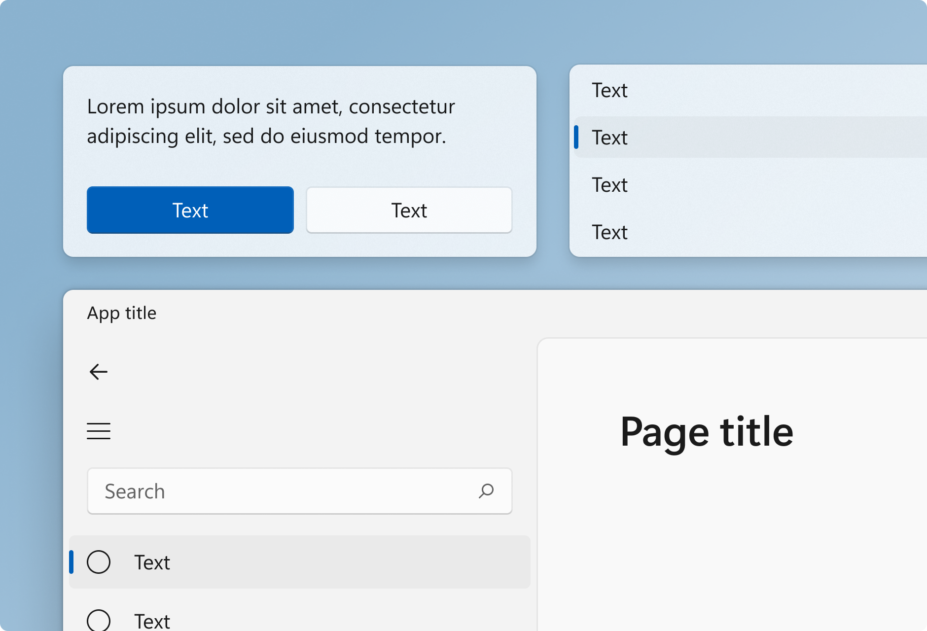
(Image: Default buttons in RAD Studio / VCL Forms application)
There are third-party solutions available for buttons with background color support, however, our goal is to create Windows 11 style buttons with what RAD Studio and VCL come with out of the box.
The approach we use is to put a TSpeedButton inside a TPanel component and adjust the properties to match Windows 11 styles, as demonstrated in various sections below.
Creating Windows 11 Style Buttons in RAD Studio 11
In the following sections, we’ll create four different projects in RAD Studio 11 to cover both Delphi and C++ with both Dark and Light Themes for creating Windows 11 styles buttons. The solutions also uses the mica styles we have demonstrated here.
Approach
The steps in various RAD Studio solutions created below goes as follows,
- Create a panel.
- Change panel's color to desired Windows 11 button style colors.
- Empty panel's caption.
- Create a SpeedButton inside the panel.
- Set SpeedButton's Flat property True.
- Set SpeedButton's Align property alClient.
- Handle MouseEnter and MouseLeave event for SpeedButton to match desired styles.
- Handle OnMouseUP event for SpeedButton to match desired styles.
Windows 11 Style Buttons (Light) VCL application, Delphi
To make the form look like a Windows 11 Mica style light theme, follow the steps in this tutorial.
To achieve the steps as listed under the approach above,
- Create a Delphi VCL application in RAD Studio.
- From Palette drag and drop a **TPanel **on your main Form (We call this Panel1)
- Under Object Inspector, on Properties tabs, Set Panel1’s BevelOuter to bvNone.
- Set Panel1’s Color property to clHotLight .
- Empty panel1’s Caption. Button text will be set using SpeedButton’s Caption.
- Adjust panel’s Top and Left properties to set its location as desired on your form.
- Adjust panel’s Height and Width properties to set its size.
- From Palette → Additional, drag and drop a TSpeedButton on top of Panel1.

(Setting TPanel properties)
- Set TSpeedButton1’s Align property to alClient.
- Set TSpeedButton’s Caption property to match your button’s desired Text/Caption.
- Set TSpeedButton1’s Flat property to True.
- Set Font → Color to clHighlightText.
- Set Font → Size to 14. (as per Microsoft Windows 11 design guidelines)

(Image: Setting TSpeedButton properties.)
We need to adjust the bevel property of the Panel hosting the SpeedButton upon mouse hover, mouse leave, and mouse up events.
The defined events are as follows,
OnMouseEnter event calls setHoverStyles. OnMouseLeave event calls setLeaveStyles. OnMouseUp event calls setMouseUp.

(Image: SpeedButton Events)
The corresponding callback functions are defined in Windo11ButtonsDelphiLight.pas (Hosted on Github).
Making Buttons round
TPanel’s are by default square and also doesn’t offer a built-in property to set the roundness. We created a custom procedure and call it providing Panel1 as a parameter to make the Panel round. Since button is hosted inside panel it would get rounded too accordingly.
The definition for MakeRounded function is defined in Windo11ButtonsDelphiLight.pas (Hosted on Github).
The steps above create a button with Blue background and white text (as per Windows 11 design guidelines).
Repeating the steps above one can create the buttons with Grey background and light backgrounds.
Samples are provided in Attached source code.
Following is the result of creating buttons demonstrated above.

(Image: Windows 11 style buttons. Light Theme Delphi Version) Windo11ButtonsDelphiLight.pas (Hosted on Github).
Windows 11 Style Buttons (Dark) VCL application, Delphi
The defining element of creating a Dark style theme is the form itself. To make the form look like a Windows 11 Mica style dark theme, follow the steps in thistutorial.
Buttons themselves can be created by following the steps same as Light version above.
Following is the result of Windows 11 style Buttons as rendering on top a dark theme form.

(Image: Windows 11 style buttons. Dark Theme Delphi Version). Windo11ButtonsDelphiDark.pas (Github).
Windows 11 Style Buttons (Light) VCL application, C++ Builder
To make the form look like a Windows 11 Mica style light theme, follow the steps in thistutorial.
The general steps and approach to follow in case of C++ is the same as given with examples in these sections above,
- Creating Windows 11 Style Buttons in RAD Studio 11
- Windows 11 Style Buttons (Light) VCL application, Delphi
Full source code and RAD Studio Project for C++ is provided here, ButtonsLight.cpp (Github)
Windows 11 Style Buttons (Dark) VCL application, C++ Builder
The defining element of creating a Dark style theme is the form itself.
To make the form look like a Windows 11 Mica style dark theme, follow the steps in thistutorial.
The general steps and approach to follow in case of C++ is the same as given with examples in these sections above,
- Creating Windows 11 Style Buttons in RAD Studio 11
- Windows 11 Style Buttons (Light) VCL application, Delphi
Full source code and RAD Studio Project for C++ Dark version is provided here, ButtonsDark.cpp (GitHub).
Sum up
Even though there is no direct support from Microsoft for using Windows 11 style buttons in applications other than UWP apps we can achieve the results using various tools provided in RAD Studio and VCL libraries.