Typography - KeynesYouDigIt/Knowledge GitHub Wiki

Typefaces
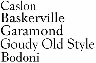
Serif- Traditional, respect, reliable
Sans Serif- Stability, objective, clean, modern

- Franklin Gothic
- Calibri
- Myriad Italic
- Univers
Modern- Strong, progressive, stylish, chic
- Futura
- ITC Avant Garde Extra Light
- Didot Italic
- Century Gothic
- Archer
- Trade Gothic
Script- Elegance, affectionate, creativity
- Bickham Script
- Edwardian Script
- Lavenderia
Display- Large, friendly, unique, expressive, amusing
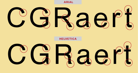
Comparison
Notes
- Use TrueType for web, PostScript for print PDFs
- Don't mix serif fonts in a layout
- Reversed text is special- not for body
- Indent OR line break
- Don't indent first line
- First few words after a drop-cap are small-cap
- Hang lines in a bulleted list
- Line length = 80 characters max
- Paragraphs should have straight left edges, ragged right edge
- Script fonts must be kerned