Gallery of Zika Visualizations Found Across the Web - JohnTigue/idots GitHub Wiki
This page is a collection of Zika outbreak visualizations found on the Web. All visualizations listed on this page are not based on Outbreak Time Series Specification and related software. This gallery is broken down into three sections according to the level of interactivity of the visualization.
Click on any image below to visit the original site where the visualization can be found.
Zika
- #outbreak_viz: a Twitter hashtag for outbreak visualizations, not specifically Zika related, but currently (mid-2016) many tweets tagged as such are about Zika
- PAHO's epicurve viz
- Simon B. Johnson
[Below here is Ebola stuff i.e. template out of which this doc was started]
Viz based on D3.js are by nature highly interactive. By collecting multiple D3 implementations together the audience can quickly get a feel for how D3-base viz compare to other non-D3 interactive visualizations.
(Note: D3 is permissively licensed open source based on open Web standards technology: HTML, CSS, JavaScript, and SVG. Proprietary Flash is not involved.)
NYTimes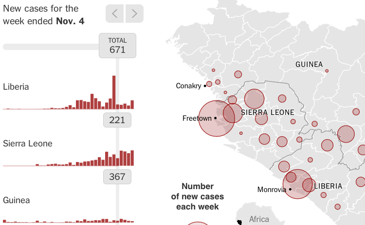
|
HDX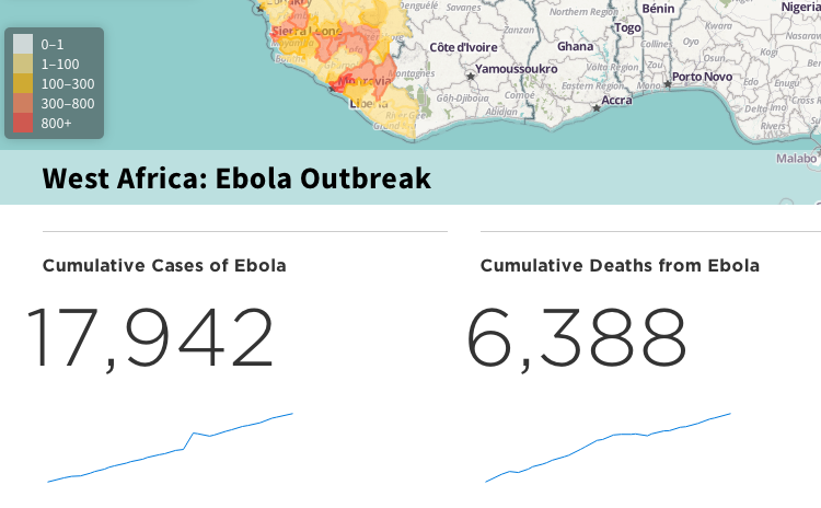
|
Healthmap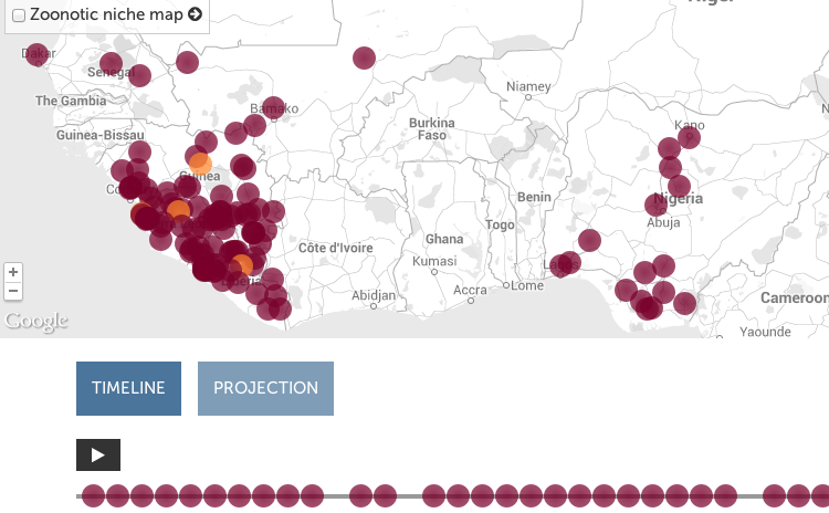
|
Simon Johnson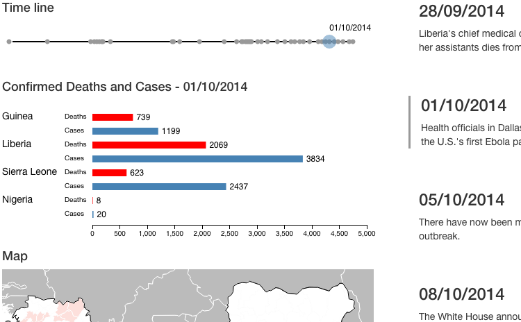
|
Simon Johnson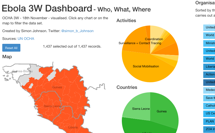
|
Simon Johnson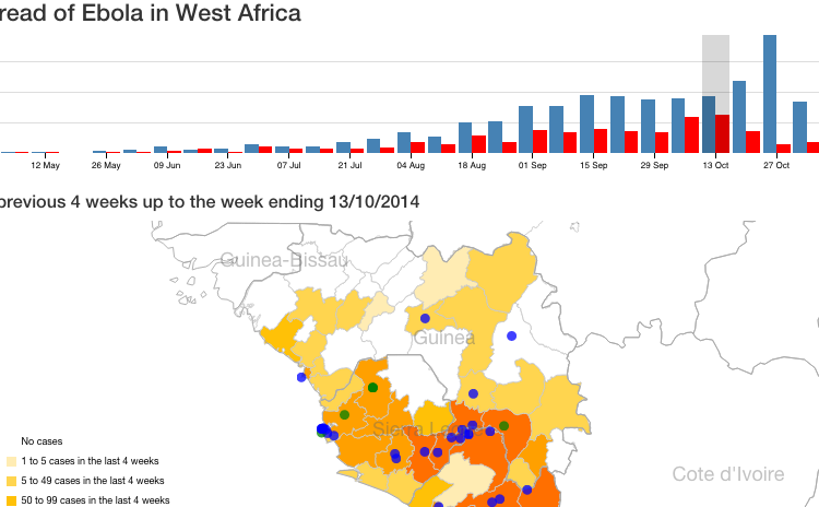
|
Simon Johnson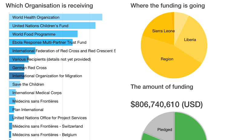
|
The Economist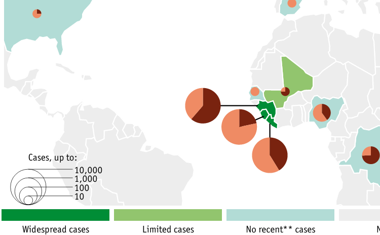
|
The WHO sit rep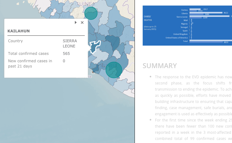
|
Items in this section cluster towards the highly interactive end of the spectrum yet they are not based on D3. Rather slightly older JavaScript libraries, such as jQuery, are used with or without SVG.
WHO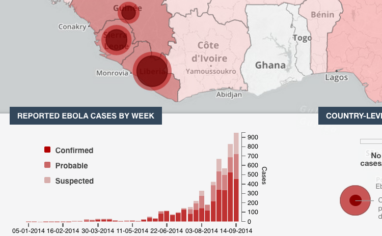
|
Google Public Data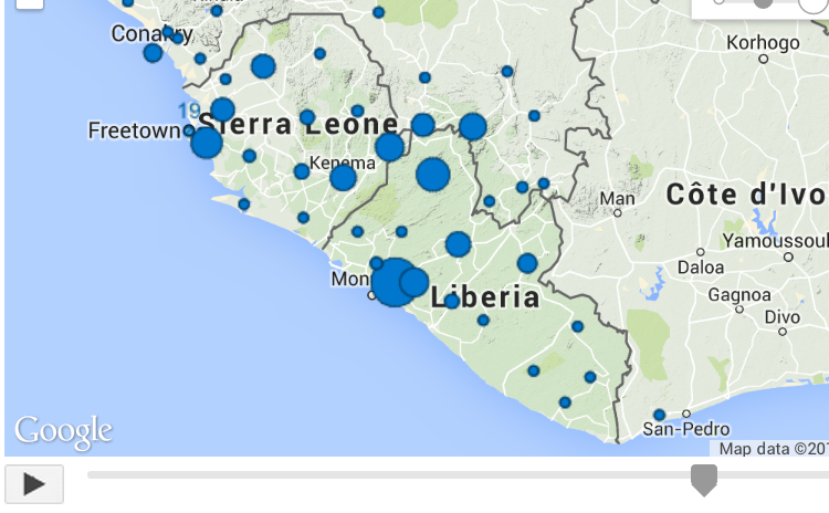
|
PBS Frontline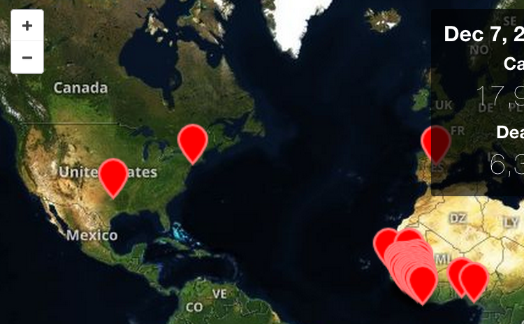
|
DataMarket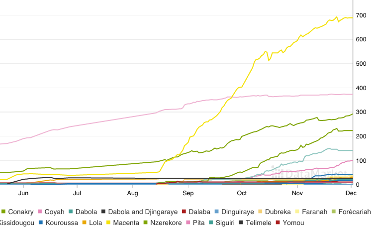
|
Simon Johnson
|
|
These viz are essentially static. Static viz can be very good and they have their place. But there are tons of those available so there really is not a problem that needs to be addressed with new tools. outbreak_mapper is all about open sourcing highly interactive outbreak visualizations. These viz are collected here because they each have at least one interesting technique that is worth considering for inclusion in the various outbreak_mapper-based visualizations.
The Economist
|
National Geographic
|
CDC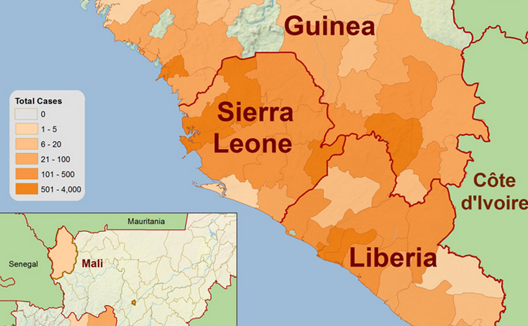
|
Views of the World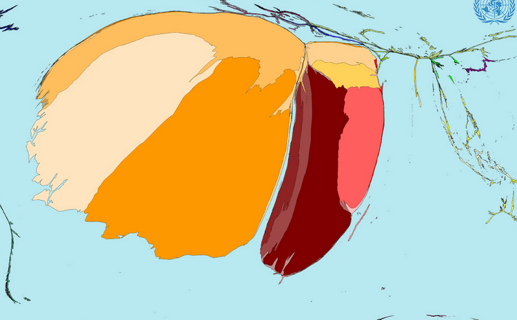
|
The Economist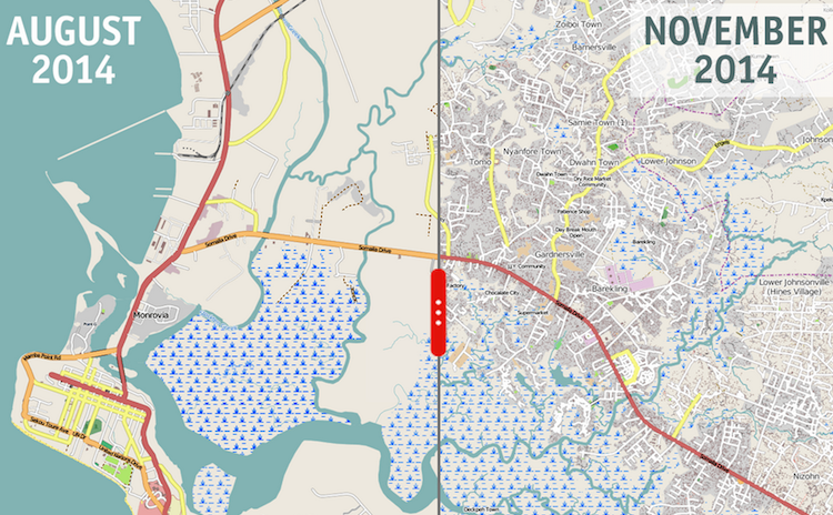
|
MSF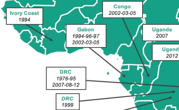
|
National Geographic
|
MapAction
|
|
This collection is maintained in order to:
- Have a centralized place on the web which provides a quick survey of what other folks have created.
- Set the bar for what
outbreak_mapperhas to do better than. - Provide a loose list of micro-features to potentially implement.
- Provide eye candy to this project.
Visualizations on the Web can be classified as interactive or static. With the Web the distinction is not quite binary, rather is it more of a spectrum; for example, is a zoomable map really “interactive”? In the classification used on this page, the answer is no.