Themes - Inktomi93/OrbWeaver GitHub Wiki
Make Orbweaver look the way you want: pick one of the built-in looks, build your own, set a background, change how messages are laid out, and let a character bring its own colors. Everything here lives in Settings, under Appearance, unless a step says otherwise.
Your look is yours. It follows your account to every device you sign in on, and the people you share a room with keep theirs. The one exception is a character's own look, covered at the end.
Pick a look
Open Looks. Every theme sits in one grid: the built-in ones (Hearth, which is the default, Mocha and Light) and any you've made or imported. Pick a card and it applies right away. There's nothing to save.
Each card has a ⋯ menu. On a built-in theme it offers Apply, Duplicate and Export. On one of yours it also offers Edit in builder and a confirmed Delete.
Build your own
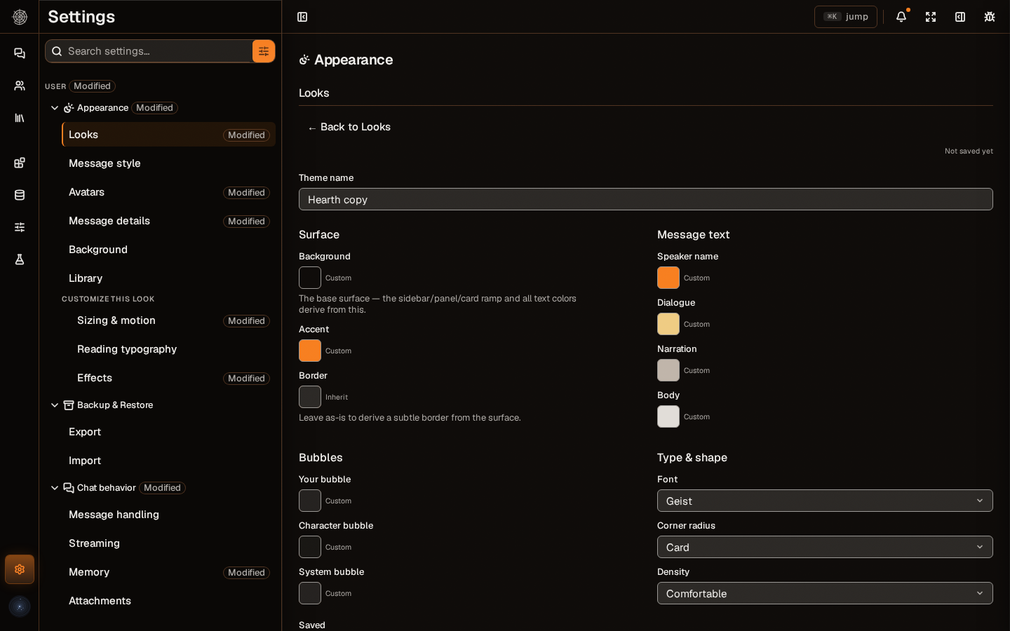
Press New theme from (the button names the look you're on). The builder opens on a copy of that look and saves as you go, so the built-in theme stays as it was. Press Back to Looks when you're done, and apply the new card like any other.
The builder sets the surface, accent and border colors, the colors of message text (speaker name, dialogue, narration, body), the bubble colors, and the font, corner radius and density.
Custom CSS
Press Show advanced theme tools for a live preview with contrast readings (a color that's hard to read is flagged, but saving isn't blocked), a CSS editor, and a list of the variables you can target. Your CSS is part of the theme, so it's duplicated, exported and deleted with it. It applies to your own screen only and is never sent to other people in a room.
position: fixedandposition: stickyare refused, because they can pull an element out over the app's own controls.@importis allowed but flagged, because it loads outside content.
Export, import and move themes
- Export a theme from its ⋯ menu. You get a file you can keep, share or import on another install.
- Import a theme file is the upload button in Looks. It takes a theme exported from Orbweaver or a raw SillyTavern theme file. A theme with the same colors as one you have is skipped; one that shares a name with a different theme lands beside it as "Name 2".
- SillyTavern themes come in with the whole-profile import. They arrive as ordinary themes named "(SillyTavern)", carrying colors only. Custom CSS is left behind, and a text color that wouldn't be readable on its new background is dropped and reported. → Coming from SillyTavern
- Themes are also in a full library export. → Back up and restore
Set a background
Open Background. Pick None or an image in the grid; the bundled scenes are there, along with anything you add. To add one, open Add background and either upload an image or paste a web address. The address is fetched once and saved, so it's never loaded from the web while you read. Remove an image from your library from its ⋯ menu.
Once an image is picked you can set its Fit, Scrim opacity and Image blur. Frosted glass in Effects is the related setting for blurring panels over it.
Backgrounds are images. The picker doesn't take video files.
A host can also give one chat its own background, from the This chat panel under Host controls, Background, or with Set as background on a generated image. A chat's background beats a character's, which beats yours. A chat's background applies while you are the only person in the room. A character's also needs that character to be the only one in the chat.
Change how messages look
Open Message style and pick a Chat display. Each style's one-line description shows in the list as you choose.

The styles are Bubble, Flat, Document, Echo, Whisper, Hush, Ripple and Tide.
The chat display is your own choice. A card can't force it on you, and everyone in a shared room picks theirs. Avatars and Message details & actions in the same place set avatar size and shape, and which details show on each message.
Tune the reading
Open Customize this look, a collapsed section of Appearance that holds your changes on top of whatever theme you applied. It has three groups:
- Sizing & motion: chat width, text size, density, surface elevation and a reduce-motion switch.
- Reading typography: line height, letter spacing, paragraph spacing, speaker name size, message text size and justified text.
- Effects: frosted glass, prose shadow, surface texture (film grain) and accent tinting.
Each setting's help says what it does. To see only what you've changed, type @modified in the settings search. Yes, it's a lot of settings.
Give a character its own look
Open a character and go to its Look tab. Set any of the colors, the font and the corner radius, or press Start from a theme to copy a theme's values in. A Background for the character is set on the same tab. Save as theme goes the other way and copies the card's look into your themes. Both are copies, with no link kept. Changes apply at once, and Reset all to Inherit clears the colors, font and corner radius.
- That character's name and message colors show in every chat, including group and shared rooms. Quoted speech takes the dialogue color only while Color quoted speech (in Message style) is on, which it is by default.
- When you're the only person in a chat with one character, the whole chat takes on the character's look and background.
- A card only supplies colors, font and shape. Density and chat display stay yours.
- If another person is in the room, the whole-chat takeover switches off for everyone.