Get a reference to the GUI object The Dashboard object exposes a GUI class. You can access it like this:
const GUI = Dashboard . GUI or import it
import { GUI } from 'Dashboard' 💁🏻 Wrapped GUI components A wrapped GUI component is a component that is wrapped by an extra element. This is to support components to render for example Icons or other children content inside of them. A wrapped component is marked with (wrapped) in the following documentation.
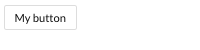
< GUI . Button text = "My button" onClick = { ( ) => { } } />
Attr
Type
Default
Description
onClickfunction
null
On click callback function
textstring
null
Icon text, will render a span text for the icon if declared
classNamestring
null
Custom class
disabledboolean
false
If button should be disabled
spinnerboolean
false
Render spinner icon inside button if true
sizestring
"normal"
Size of button, can be "small", "normal", "large"
submitboolean
false
Will render a submit button if set to true or just declared on the button tag
resetboolean
false
Will render a reset button if set to true or just declared on the button tag
invertedboolean
false
Will render with inverted style if true. For example a button with border without background
primaryboolean
false
Button will get the primary action style
warningboolean
false
Button will get the warning style
textOnlyboolean
false
Display button in a link like fashion
💁🏻 If none of submit or reset is declared button will render as a normal button. If both submit and reset is declared button will be rendered as a submit button. or other children content inside of them. A wrapped component is marked with (wrapped) in the following documentation.
< GUI . Card card = { myCard } />
Attr
Type
Default
Description
classNamestring
null
Custom class
styleobject
null
Custom inline style
widthstring
null
Custom width style
heightstring
null
Custom height style
disabledboolean
false
Disables card if true
onClickfunction
null
On click callback function for click on the whole card, returns passed card object
*GUI.Card takes drag/drop props see: GUI.Wrapper for more details.
Attr
Type
Default
Description
titlestring
null
Mouse over data-tooltip title
statusstring
null
Card handler on left side, Supported status: draft, done, approved, withheld, usable, canceled
statusColorcss color value
null
Custom card handler color
iconreact elemnt / object
null
Valied react element to render on the right side of the card header, if it's an object will use GUI.Icon to be rendered
headerreact elemnt / string
null
Valied react element or string to be rendered on the top section of the card
headlinestring
null
Custom headline will be rendered in the top of the card body
contentreact elemnt
null
Valid react element to be rendered in the body section of the card
imagesarray
null
Array of images url, will be rendered in the right side of card body with a number of images
footerreact elemnt / string
null
Valied react element or string to be rendered on the bottom section of the card
Attr
Type
Default
Description
iconClassstring
null
Name of icon. Dashboard leverage the awesome font set Dripicons by Amit Jakhu . View all available icons here .
onClickfunction
null
On click callback function
const myCardIcon = {
iconClass : 'world' ,
onClick : ( ) => {
// On icon clicked....
}
}
const myCard = {
...
icon : myCardIcon ,
...
} const myCard = {
title : 'My card No: 1' ,
status : 'done' ,
header : myHeaderComponent ,
headline : 'Boomers smugglas in via Helsinborgs hamn och monteras på bilar - "De ska explodera när bilen öppnas"' ,
images : [ 'http://www.url.se/image1.png' , 'http://www.url.se/image2.png' ] ,
footer : 'SVERIGE | NYHET | Mathilda Sigurdardottir'
}
< GUI . Card card = { myCard} onClick = { card => //Do stuff with the card.... }/>
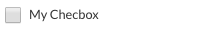
< GUI . Checkbox className = "custom-class" onChange = { checked => { } } />
Attr
Type
Default
Description
onChangefunction
null
On change callback function. Returns checked boolean
classNamestring
null
Custom class
styleobject
null
Custom inline style
checkedboolean
false
Default checked value
labelstring
null
Will render a label component
inlineboolean
false
For display inline
disabledboolean
false
Disables checkbox if true
titlestring
null
Displays a tooltip with title string when hovering the input part
< GUI . ColumnsLayout className = "custom-class" columns = { columns } />
Attr
Type
Default
Description
idstring
null
Id for each column, Column won't be rendered without an id
columnsarray
null
Array encluds cloumns objects
columnsClassstring
null
Custom class will be applied for all columns
rowsClassstring
null
Custom class will be applied for all column's rows
classNamestring
null
Custom class will be applied for ColumnsLayout wrapper
[
{
id : '63a43aa4-29b5-4e84-b0d2-52de5adfd1ef' ,
align : 'left' ,
rows : [
{
id : '12fd54-2gfd5-400e84-b0dddd2-gfdde5a41' ,
content : 'My row content'
}
]
}
]
Attr
Type
Default
Description
idstring
null
Id for each row, Row won't be rendered without an id
rowsarray
null
Array encluds rows objects
contentreact elemnt
null
Valied react element or string
classNamestring
null
Custom class will be applied just for this row
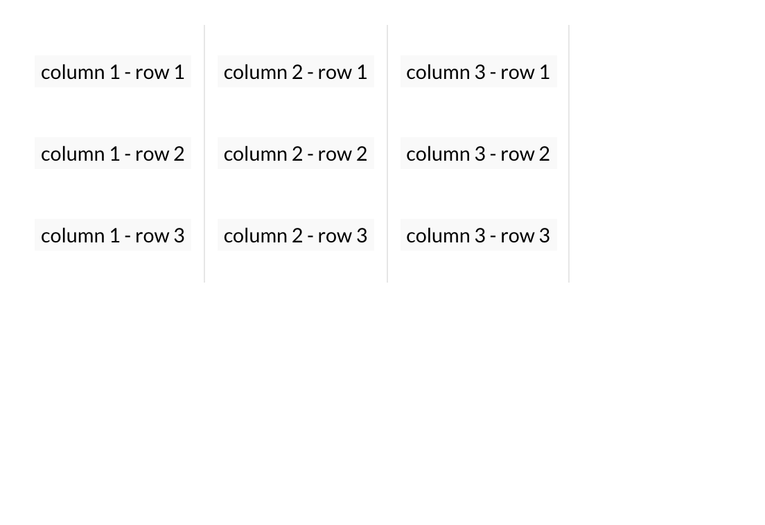
Full ColumnsLayout example const columns = [
{
id : '63a43aa4-29b5-4e84-b0d2-52de5adfd1ef' ,
align : 'left' ,
rows : [
{
id : 'columns-1-rows-1-id' ,
content : 'column 1 - row 1'
} ,
{
id : 'columns-1-rows-2-id' ,
content : 'column 1 - row 2'
} ,
{
id : 'columns-1-rows-3-id' ,
content : 'column 1 - row 3'
}
]
} ,
{
id : 'ffdf35-f3325-00sd-1cxxxa-sd2ffjj39717s' ,
align : 'center' ,
rows : [
{
id : 'columns-2-rows-1-id' ,
content : 'column 2 - row 1'
} ,
{
id : 'columns-2-rows-2-id' ,
content : 'column 2 - row 2'
} ,
{
id : 'columns-2-rows-3-id' ,
content : 'column 2 - row 3'
}
]
} ,
{
id : '12fd54-2gfd5-400e84-b0dddd2-gfdde5a41' ,
align : 'right' ,
rows : [
{
id : 'columns-3-rows-1-id' ,
content : 'column 3 - row 1'
} ,
{
id : 'columns-3-rows-2-id' ,
content : 'column 3 - row 2'
} ,
{
id : 'columns-3-rows-3-id' ,
content : 'column 3 - row 3'
}
]
}
]
< GUI . ColumnsLayout columns = { columns} columnsClass = { 'my-custom-columns-class' } rowsClass = { 'my-custom-rows-class' } / >
< GUI . ConfigCheckbox ref = "configRef" label = "config text" />
Attr
Type
Default
Description
reffunction
null
Use refs callback: this.handleRefs(ref, 'CONFIG_KEY')
classNamestring
null
Custom class
stylestring
null
Custom inline style
checkedboolean
false
Default checked value
labelstring
null
Config name text
inlineboolean
false
For display inline
disabledboolean
false
Disables checkbox if true
Full ConfigCheckbox example constructor ( props ) {
super ( props )
this . state = {
myConfig : props . config . myCheckboxConfig
}
}
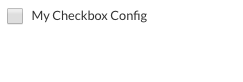
< GUI . ConfigCheckbox ref = "myCheckboxConfig" label = "My Checkbox Config" />
< GUI . ConfigDropDown items = { items } ref = "configRef" />
Attr
Type
Default
Description
reffunction
null
Use refs callback: this.handleRefs(ref, 'CONFIG_KEY')
itemsarray
null
Array of items.
stylestring
null
Custom inline style
classNamestring
null
Custom class
onSelectfunction
null
Return selected item.
defaultSelectedItemobject
null
One of the items in the items array, will be selected at start.
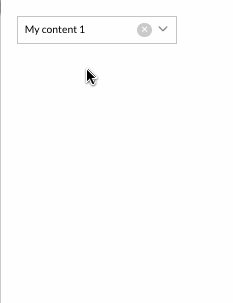
Full ConfigDropDown example const items = [
{
iconClass : 'rocket' ,
iconColor : 'gray' ,
content : 'My content 1' ,
id : 'my-custom-id-1'
} ,
{
iconClass : 'star' ,
iconColor : 'gray' ,
content : 'My content 2' ,
id : 'my-custom-id-2'
}
]
< GUI . ConfigDropDown ref = "myDropDownConfig" defaultSelectedItem = { items[ 0 ] } items = { items} / >
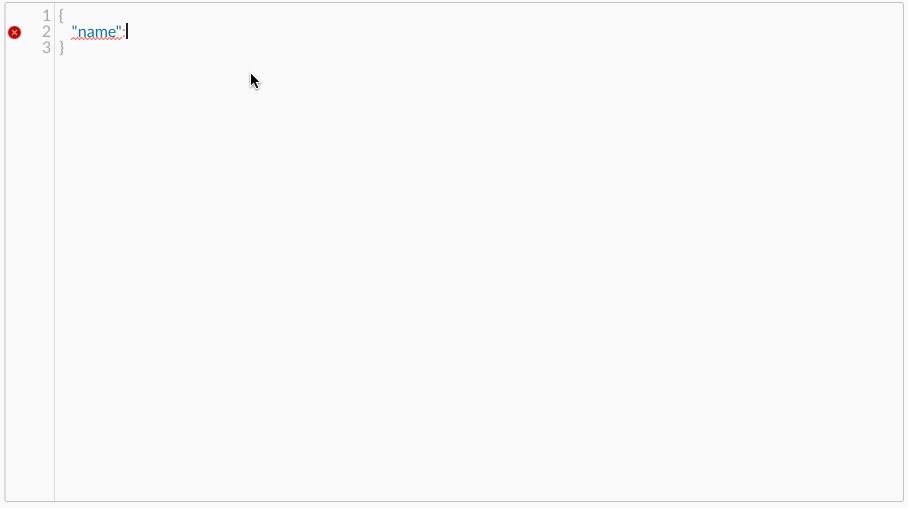
< GUI . ConfigEditor ref = "configEditorRef" />
Attr
Type
Default
Description
reffunction
null
Use refs callback: this.handleRefs(ref, 'CONFIG_KEY')
schemaobject
null
Use schema to validate your config object, available schema constructors 🤓 , for more details see jsonschema GitHub page
jsonboolean
false
If true will get a JSON object instead of a stringify object
namestring
null
ConfigEditor label name
widthstring
'100%'
The hight of the editor. 'px' or '%'
heightstring
'700px'
The hight of the editor. 'px' or '%'
styleboject
null
Custom inline style
classNamestring
null
Custom class
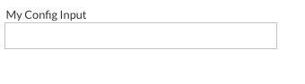
< GUI . ConfigInput ref = "configRef" name = "config text" />
Attr
Type
Default
Description
reffunction
null
Use refs callback: this.handleRefs(ref, 'CONFIG_KEY')
namestring
null
Config name text
valuestring
null
Default config input value
stylestring
null
Custom inline style
classNamestring
null
Custom class
validationarray
null
Config validation can be : 'required', 'alpha', 'numerical', 'alphanumerical', 'email'
< GUI . ConfigInput ref = "myConfig" name = "My Config Input" validation = { [ 'required' ] } />
< GUI . ConfigJsonTree ref = "configRef" name = "config text" value = { } />
Attr
Type
Default
Description
reffunction
null
Use refs callback: this.handleRefs(ref, 'CONFIG_KEY')
namestring
null
ConfigJsonTree name text
stylestring
null
Custom inline style
classNamestring
null
Custom class
readOnlyboolean
false
Read only mode can't be edit values
disabledboolean
false
Disable ConfigJsonTree if it's true
jsonboolean
false
If true will get a JSON object instead of a stringify object
dataobject
null
Set default value for the config json tree
Full ConfigJsonTree example < GUI . ConfigJsonTree ref = "myConfig" name = "My Config JsonTree" />
< GUI . ConfigPassword ref = "configRef" name = "config text" />
Attr
Type
Default
Description
reffunction
null
Use refs callback: this.handleRefs(ref, 'CONFIG_KEY')
stylestring
null
Custom inline style
classNamestring
null
Custom class
namestring
null
Config name text
validationarray
null
Config validation can be : 'required', 'alpha', 'numerical', 'alphanumerical', 'email'
Full ConfigPassword example < GUI . ConfigPassword ref = "myPasswordConfig" name = "My Password Config Input" validation = { [ 'required' ] } />
ConfigSwitchButton (wrapped) < GUI . ConfigSwitchButton ref = "configRef" label = "Config SwitchButton" />
Attr
Type
Default
Description
reffunction
null
Use refs callback: this.handleRefs(ref, 'CONFIG_KEY')
labelstring or object
null
Config label text, {left: 'left text', right: 'right text'}
validationarray
null
Config validation can be : 'required', 'alpha', 'numerical', 'alphanumerical', 'email'
stylestring
null
Custom inline style
classNamestring
null
Custom class
Full ConfigSwitchButton example < GUI . ConfigSwitchButton ref = "mySwitchButtonConfig" label = "My SwitchButton Config Input" validation = { [ 'required' ] } />
< GUI . ConfigTextarea ref = "configRef" name = "config text" />
Attr
Type
Default
Description
reffunction
null
Use refs callback: this.handleRefs(ref, 'CONFIG_KEY')
namestring
null
Config name text
validationarray
null
Config validation can be : 'required', 'alpha', 'numerical', 'alphanumerical', 'email'
stylestring
null
Custom inline style
classNamestring
null
Custom class
Full ConfigTextarea example < GUI . ConfigTextarea ref = "myTextareaConfig" name = "My Textarea Config Input" validation = { [ 'required' ] } />
< GUI . Datalist id = { } options = { } />
Attr
Type
Default
Description
idstring
null
Id to use it in GUI.Input won't render with out an id
stylestring
null
Custom inline style
optionsarray
null
An array with option item objects to display
classNamestring
null
Custom class
Datalist Options item structure {
value : 'my option1' ,
id : '63a43aa4-29b5-4e84-b0d2-52de5adfd1ef'
} const items = [
{
id : "my-custom-id-1" ,
value : "apple"
} ,
{
id : "my-custom-id-2" ,
value : "anything!"
} ,
{
id : "my-custom-id-3" ,
value : "option 1"
}
]
< GUI . Input list = { 'my-input-list-id' } / >
< GUI . Datalist id = { 'my-input-list-id' } options = { items } />
Attr
Type
Default
Description
classNamestring
null
Custom class
onChangefunction
null
On change callback function. Returns current value
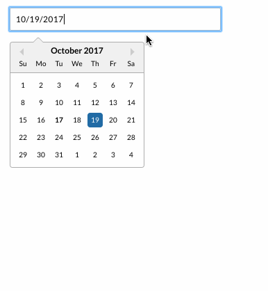
selectedstring or moment object
null
Sets the initial value of the datepicker
iconstring or object
null
Render custom icon with DatePicker
labelstring or object
null
Render custom label with DatePicker
textModeboolean
false
Render DatePicker with the same style and with uneditable mood
readOnlyboolean
false
Disable DatePicker
primaryboolean
false
Primary style for input
onBlurfunction
false
onBlur callback function
onFocusfunction
false
onFocus callback function
const icon = {
position : 'right' ,
iconClass : 'calendar'
}
const label = 'My label text'
< GUI . DatePicker label = { label} icon = { icon} / >
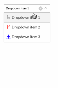
< GUI . DropDown items = { [ ] } />
Attr
Type
Default
Description
itemsarray
null
Array of items.
selectedItemobject
null
One of the items in the items array, will be selected at start.
filterableboolean
false
Will insert Search component if true to enable filtering of items
compactboolean
false
True or false if the dropdown should have a compact layout
maxHeightnumber
300
The max height of the dropdown, px will automatically be appended
onSelectstring, object
-
Will return id for selected item, recieves object reference as second parameter. It is also possible to add a onSelect callback to each item
styleobject
null
Add inlinestyle to the dropdown
keyToggleboolean
false
Toggle between list items with arrow keys, and "Retern" key will select the item
classNamestring
null
Custom class
Name
Returns
Description
isOpenboolean
Check if the dropDown is open or not
{
id : "my-custom-dropdown-id" ,
iconClass : "network-1" ,
iconSize : "large" ,
style : {
color : 'gray'
} ,
content : "dropdown item value"
}
Attr
Type
Default
Description
iconClassstring
null
Icon class for the item.
iconSizestring
small
Icon size for the item.
styleobject
null
To style the item's icon.
const items = [
{
id : "my-custom-dropdown-id-1" ,
iconClass : "network-1" ,
content : "Dropdown item 1" ,
style : {
color : 'gray'
}
} ,
{
id : "my-custom-dropdown-id-2" ,
iconClass : "network-2" ,
content : "Dropdown item 2" ,
style : {
color : 'red'
}
} ,
{
id : "my-custom-dropdown-id-3" ,
iconClass : "network-3" ,
content : "Dropdown item 3" ,
style : {
color : 'blue'
}
}
]
< GUI . DropDown items = { items} / >
DropMenu (wrapped)
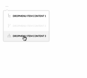
< GUI . DropMenu items = { [ ] } /> Dropmenu is rendered inside a Popover GUI component. It will pass on all props to the Popover so you can also use Popover functionality.
Attr
Type
Default
Description
itemsarray
null
Array of DropMenu items.
compactboolean
true
Array of DropMenu items.
iconClassstring
normal
Class for icon
customIconelement
null
Custom icon element.
iconSizestring
normal
Size of icon: (small, normal or large)
alignstring
center
Align of DropMenu icon, left, center and right.
widthint
auto
Width of DropMenu. px
heightstring
auto
Height of DropMenu, 'to-bottom' or 'auto'
maxWidthint
700
Max width of DropMenu.
maxHightint
300
Max hight of DropMenu, will be ignored if the height='to-bottom'
borderboolean
true
Border of DropMenu.
scrollableboolean
true
Render passed content inside a scrollable wrapper
disabledboolean
false
Disable DropMenu
DropMenu item structure
{
iconClass : "icon class name" ,
id : 'my-drop-menu-custom-id' ,
content : "dropmenu item content" ,
onClick : ( ) => {
//Do Something.
}
}
Prop
Type
Default
Description
idstring
null
Custom id, won't be rendered without an ID
iconClassstring
null
Name of icon. Dashboard leverage the awesome font set Dripicons by Amit Jakhu . View all available icons here .
contentstring or element
null
Can be a string or an element. Pass an element to override the default class
disabledboolean
false
Disable the item
onClickfunction
null
On click callback function for click on the whole item, returns react wrapped event
classNamestring
null
Custom class
Full DropMenu example
const items = [
{
iconClass : "network-1" ,
id : 'my-item-1-id' ,
content : "dropmenu item content 1" ,
onClick : ( ) => {
//Do Something.
}
} ,
{
iconClass : "network-2" ,
id : 'my-item-2-id' ,
content : "dropmenu item content 2" ,
disabled : true ,
onClick : ( ) => {
//Do Something.
}
} ,
{
iconClass : "network-3" ,
id : 'my-item-3-id' ,
content : "dropmenu item content 3" ,
onClick : ( ) => {
//Do Something.
}
}
]
< GUI . DropMenu items = { items} / >
We create a dropmenu with two items. First item defines a custom component for it's title and an on click callback for the whole item. The second item defines a normal text content.
< GUI . Gallery items = { items } />
Attr
Type
Default
Description
itemsarray
null
An array with images or videos urls objects to display
widthstring
'100%'
The width for the gallery
heightstring
'100%'
The height for the gallery
classNamestring
null
Custom class
onClickfunction
null
On click call back function
onPlayfunction
null
On play call back function
onSlidefunction
null
On slide call back function
onPausefunction
null
On pause call back function
showNavboolean
true
Show navigation arrows
showIndexboolean
true
Show images index number
autoPlayboolean
false
Auto play when component did mount
showBulletsboolean
true
Show bullets under images
slideIntervalint
200
Set slide interval
disableSwipeboolean
false
Dispale swipe between images
showThumbnailsboolean
true
Display thumbnails for images and videos
showPlayButtonboolean
true
display play button
thumbnailPositionstring
'bottom'
Thumbnail position: top, bottom, left and right
showFullscreenButtonboolean
false
display full screen button
{
original : 'PATH_TO_FULL_SIZE_IMAGE' ,
thumbnail : 'PATH_TO_THUMBNAIL' ,
description : 'Optional description...' ,
sizes : { width : '200px' , height : '150px' }
}
Prop
Type
Default
Description
originalstring
null
The url for the original image to display it in the gallery
thumbnailstring
null
The url for the thumbnail image to display it in the gallery bar , support youtube thumbnail images
descriptionstring
null
An optional description to display it beside the image
sizesobject
null
An optional size to display the image with specific size
videoboolean
false
If the url was a video should be " true "
embedUrlstring
null
The url for the video to display it in the gallery
const items = [
{
original : 'https://static.ewtest.infomaker.io/wp-content/uploads/sites/2/2017/03/22081303/icon-writer.png' ,
sizes : { width : '150px' , height : '200px' } ,
description : 'IMAGE NUMBER 1' ,
} ,
{
original : 'https://static.ewtest.infomaker.io/wp-content/uploads/sites/2/2017/03/22081344/icon-everyware.png' ,
description : 'IMAGE NUMBER 2' ,
} ,
{
embedUrl : 'https://www.youtube.com/embed/2ul5GTBYCd0' ,
description : 'VIDEO NUMBER 1' ,
video : true
}
]
< GUI . Wrapper style = { { width : '100%' , height : '500px' } } >
< GUI . Gallery items = { items } />
< / G U I .W r a p p e r >
We create a gallery with two pictures and two videos. First two items display a nature pic, And the secound two item a nature videos from youtube.
Header
< GUI . Header text = "My header title" />
Attr
Type
Default
Description
textstring
null
Header text
classNamestring
null
Custom class
directionstring
"ltr"
Text direction, can be "ltr", "rtl"
onClickfunction
null
OnClick callback function
Header example
< GUI . Heading level = "3" text = "My h3 title" />
Attr
Type
Default
Description
levelinteger
2
What kind of heading that will be rendered. Can be 2, 3, 4, 5, 6
textstring
null
Heading text
classNamestring
null
Custom class
directionstring
"ltr"
Text direction, can be "ltr", "rtl"
onClickfunction
null
OnClick callback function
< GUI . Heading level = "3" text = "My h3 title" />
< GUI . HTML htmlValue = { __html } />
Attr
Type
Default
Description
htmlValuestring
null
Dangerously Set InnerHTML value
classNamestring
null
Custom class
const htmlValue = "<h1>Hi there!</h1>"
< GUI . HTML htmlValue = { htmlValue} / >
< GUI . Icon iconClass = "star" onClick = { e => { } } text = "My icon text" />
Attr
Type
Default
Description
iconClassstring
null
Name of icon. Dashboard leverage the awesome font set Dripicons by Amit Jakhu . View all available icons here .
onClickfunction
null
On click callback function, returns react wrapped event
textstring
null
Icon text, will render a span text for the icon if declared
classNamestring
null
Custom class
disabledboolean
false
If icon should be disabled
sizestring
"normal"
Size of button, can be small", "normal", "large"
iconColorstring
"white"
Color of icon, can be e.g "black" or "#333"
textColorstring
"white"
Color of text, can be e.g "black" or "#333"
spinboolean
false
Spiner Icon
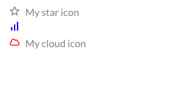
< GUI . Icon iconClass = "star" text = "My star icon" iconColor = { "gray" } />
< GUI . Icon iconClass = "graph-bar" iconColor = { "blue" } / >
< GUI . Icon iconClass = "cloud" text = "My cloud icon" iconColor = { "red" } />
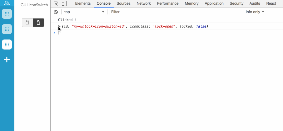
< GUI . IconSwitch icons = { myIcons } onClick = { ( ) => { /* Do something */ } } onChange = { item => { console . log ( item ) } } />
Attr
Type
Default
Description
onChangefunction
null
On change callback function, return the icon OBJ.
onClickfunction
null
On click callback function
classNamestring
null
Custom class
disabledboolean
false
If icon should be disabled
IconSwitch item structure
Attr
Type
Default
Description
iconClassstring
null
Name of icon. Dashboard leverage the awesome font set Dripicons by Amit Jakhu . View all available icons here .
idstring-number
null
An id for the icon, *required won't be displayed with out an id
classNamestring
null
Custom class for the icon
any other custom propertiesany
null
Custom properties will be returned with onChange callback
const icons = [
{
id : 'my-lock-icon-switch-id' ,
iconClass : 'lock' ,
locked : true
} ,
{
id : 'my-unlock-icon-switch-id' ,
iconClass : 'lock-open' ,
locked : false
}
]
< GUI . IconSwitch icons = { icons} onClick = { ( ) => console . log ( 'Clicked !' ) } onChange = { item => console . log ( item ) } / >
< GUI . Webview src = { 'my url src' } />
Attr
Type
Default
Description
frameBorderinteger
0
The border for the frame
onLoadfunction
null
On load callback returns: (event, WebviewRef)
identifierstring
null
Identifier for send and receiving data from/to src web page
onReceivefunction
null
On Receive callback function works same as onMessage returns: receivedData, receivedData should has identifier property same Webview identifier, won't receive any data if the identifier dosen't match
widthstring
100%
The width for iframe
heightstring
100%
The height for iframe
classNamestring
null
Custom class
< Webview src = 'my-src-url' ref = { ref => this . myWebview = ref } />
. . .
const myDataObj = {
// Some data to send ....
}
this . myWebView . sendData ( myDataObj ) const url = "https://www.infomaker.se/"
< GUI . Webview src = { url} height = { "600px" } / >
< GUI . Img src = { 'my url img' } />
Attr
Type
Default
Description
widthstring
null
The width for image
heightstring
null
The height for image
draggableboolean
false
Set draggable prop on img element
onClickfunction
null
On click callback function returns Img src
onErrorfunction
null
On error loading the img src callback
classNamestring
null
Custom class
const url = "https://s3-eu-west-1.amazonaws.com/dashboard-plugin-wiki-screenshots/gui/Infomaker+logo.png"
< GUI . Img src = { url} / >
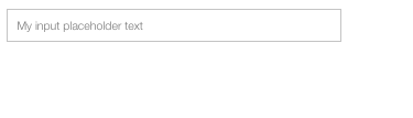
< GUI . Input placeholder = "My input placeholder text" onChange = { value => { } } />
Attr
Type
Default
Description
onChangefunction
null
On change callback function. Returns current value
changeboolean
false
Will trigger onChange once on first render if set to true
onEnterfunction
null
Callback function for enter keypress. Returns current value
placeholderstring
null
Input placeholder text
liststring
null
Input list for GUI.Datalist
classNamestring
null
Custom class
disabledboolean
false
If input should be disabled
autoFocusboolean
false
Boolean if input should get focus on render
iconobject
null
Render custom icon inside input, {iconClass: 'cross', position: 'right'}
labelobject
null
render custom label
textModeboolean
false
If true GUI.Input will be treat as a text element
multipleboolean
false
Allow multiple values in GUI.Input
onClickfunction
null
On click callback function returns click event
uncontrolledboolean
false
Control the input by ref set, get and clear value with: getValue(), setValue() and clear()
onBlurfunction
null
On blur callback function returns blur event
onFocusfunction
null
On focus callback function returns focus event
onKeyPressfunction
null
On key press callback function returns input value
onKeyDownfunction
null
On key down callback function returns an object with pressed key and input value, {key: PRESSED_KEY, value: INPUT_VALUE}
< GUI . Input placeholder = "My input placeholder text" onChange = { value => console . log ( value ) } />
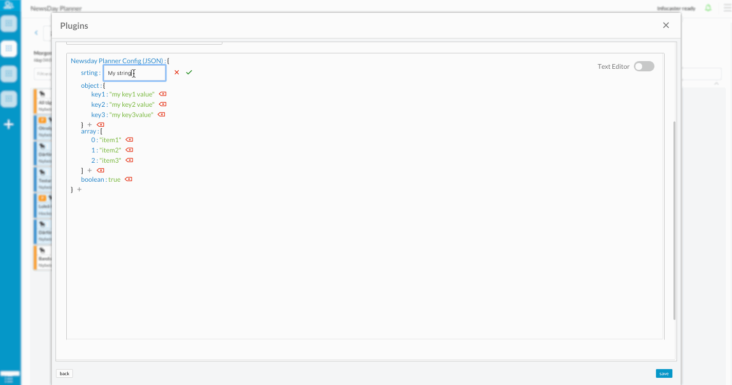
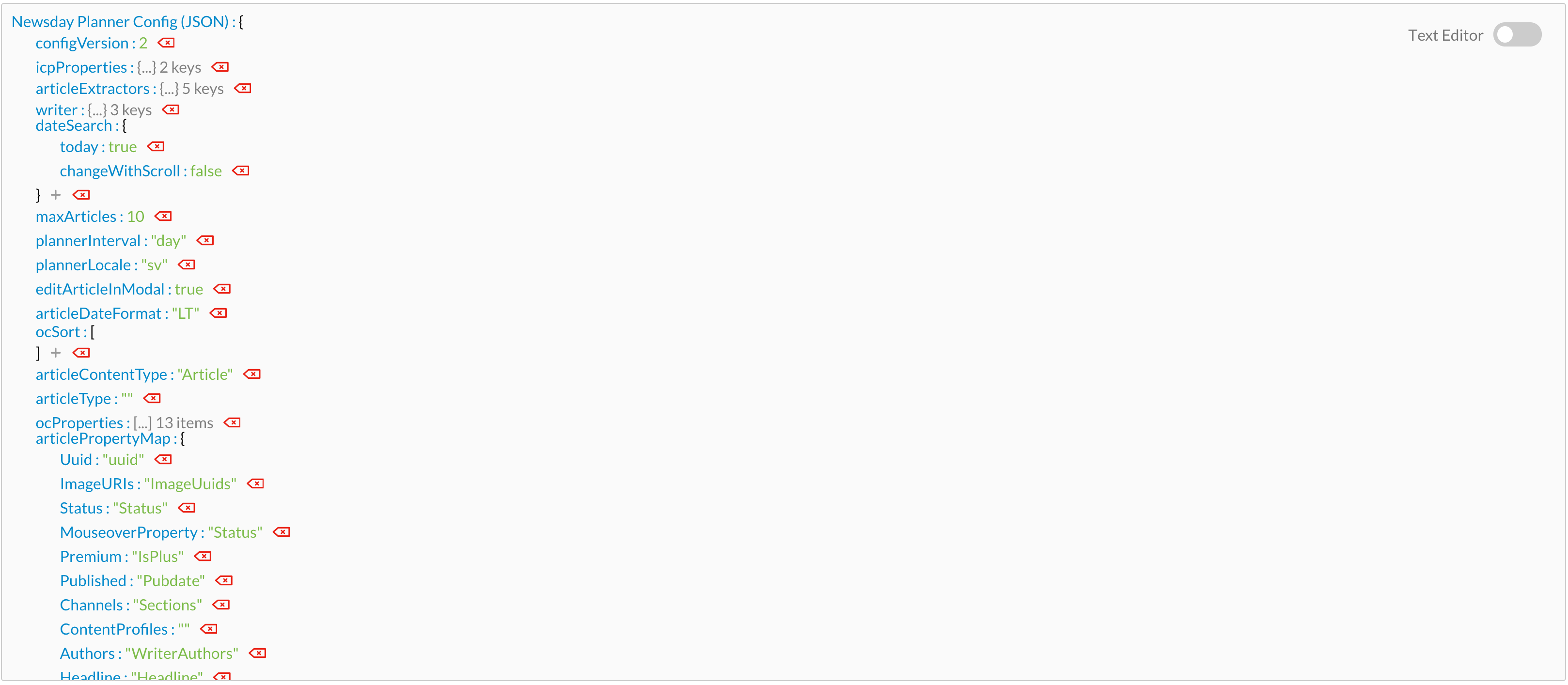
< GUI . JsonTree name = "My JsonTree name" data = { myDataObject } onChange = { value => //Do stuff with modyfied DataObject } />
Attr
Type
Default
Description
namestring
null
JsonTree name text
dataobject
null
JSON object data
stylestring
null
Custom inline style
classNamestring
null
Custom class
readOnlyboolean
false
Read only mode can't edit values
disabledboolean
false
Disable JsonTree if it's true
onChangefunction
null
On change callback function. Returns modyfied data object
const myDataObject = {
srting : 'My string' ,
object : {
key1 : 'my key1 value' ,
key2 : 'my key2 value'
key3 : 'my key3 value'
} ,
array : [
'item1' ,
'item2' ,
'item3'
] ,
boolean : true
}
< GUI . JsonTree name = "Newsday Planner Config (JSON)" data = { myDataObject} / >
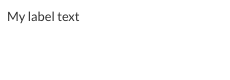
< GUI . Label className = "custom class" htmlFor = { htmlForValue } text = { myText } />
Attr
Type
Default
Description
textstring
null
Label text
htmlForstring
null
HtmlFor value
classNamestring
null
Custom class
const myText = "My label text"
< GUI . Label htmlFor = { 'my-example-input' } text = { myText} / >
Attr
Type
Default
Description
itemsarray
null
Array of list items.
inlineItemsboolean
false
By setting true GUI.List will render as a grid view.
beforeelement
null
A custom element render in the top of the list .
afterelement
null
A custom element render in the bottom of the list .
compactboolean
false
True or false if the dropdown should have a compact layout
ItemClasselement
false
Custom Item component to render the list items with.
classNamestring
null
Custom class
{
id : "2b42d026-e5cb-4731-8fc0-2f87fde06b38" ,
title : "list item title" ,
content : "list item content" ,
image : { src : "list-item-image.png" } ,
author : "list item author"
}
Prop
Type
Default
Description
idstring or integer
null
Id for list item. An item without an id will not be rendered. If your objects don't have an id just call Dashboard.createUUID()
titlestring or element
null
Can be a string or a element. Pass an element to override the default class
contentstring or element
null
Can be a string or a element. Pass an element to override the default class
styleobject
null
Inline style for the item.
imageobject
null
Object with a src and size property representing the image
authorstring or element
null
Can be a string or a element. Pass an element to override the default class
onClickfunction
null
On click callback function for click on the whole item, returns react wrapped event
childrenarray
null
List items rendered as a children inside the item
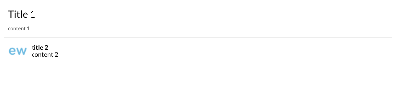
const items = [ {
id : "my-custom-list-id-1" ,
title : 'Title 1' ,
content : "content 1"
} , {
id : "my-custom-list-id-2" ,
title : "title 2" ,
content : < GUI . Header text = "content 2" onClick = { ( ) => { } } /> ,
image : { src : "list-item-image.png" }
} ]
< GUI . List items = { items} / >
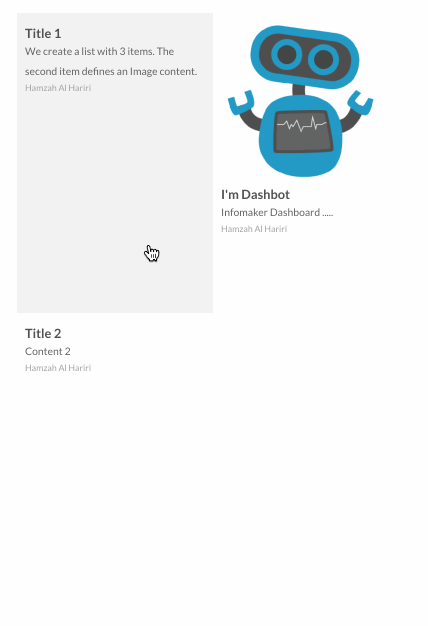
💁🏻 You can also display your list as a grid by passing inlineItems={true}
< GUI . List items = { items } inlineItems = { true } />
< GUI . MarkdownViewer className = "custom class" htmlFor = { htmlForValue } text = { myText } />
Attr
Type
Default
Description
textstring
null
Markdown text
const myMarkdownText = `
# Headline 1
## Headline 2
**Cool bold text**
`
< GUI . MarkdownViewer text = { myMarkdownText} / >
Menu (wrapped)
< GUI . Menu items = { myItems } />
Attr
Type
Default
Description
itemsarray
null
List items to render inside menu
iconClassstring
null
Name of icon. Dashboard leverage the awesome font set Dripicons by Amit Jakhu . View all available icons here .
showTextboolean
false
Show or hide text prop
linkstring
null
Link url text
classNamestring
null
Custom class
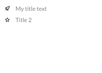
Menu item structure
{
iconClass : 'rocket' ,
id : 'my-menu-item-id' ,
text : 'My title text' ,
showText : true
}
Full menu example
const items = [
{
iconClass : 'rocket' ,
iconColor : 'black' ,
text : 'My title text' ,
link : 'https://www.infomaker.se' ,
showText : true ,
id : "my-custom-menu-id-1" ,
} ,
{
iconClass : 'star' ,
iconColor : 'black' ,
text : 'Title 2' ,
link : 'https://www.google.se' ,
showText : true ,
id : "my-custom-dropdown-id-2" ,
}
]
< GUI . Menu items = { items} / >
< GUI . MultiSelectList className = "custom_class" items = { seletListItems } />
Attr
Type
Default
Description
classNamestring
null
Custom class
itemsarray
null
Multi select array of items
placeholdersrting
null
Text place holdetr in MultiSelectList
noSelectionLabelsrting
null
Fixed text will be displayed if there was no selected items
renderCheckedLabelsboolean
true
Render selected item's labels as a text
clearButtonboolean
true
Display a clear button to deselect all the items
clearPlaceholderstring
Clear
Clear button text
alignstring
left
Align of Popover icon, left, center and right
primaryboolean
false
Use Dashboard primary style
minWidthstring
250px
Set minWidth for MultiSelectList
maxHeightstring
null
Set maxheight for MultiSelectList
styleobject
null
Inline style for MultiSelectList
onClearfunction
null
On clear callback, will fire when clear button is clicked or if all the items deselected
onChangefunction
null
On change callback with two arg: (activeItems, items) activeItems is the selected ones, items is all the items
onItemChangefunction
null
On any item changed will fire, with the changed item
If you have both onChange and onItemChange callbacks both will be fired.
Each item require a uniq uuid to be rendered.
MultiSelectList item structure {
uuid : 'my-item-1' ,
label : 'my item label text' ,
checked : false ,
...ANY_OTHER_PROERTIES
}
you can pass any other custom property with the MultiSelectList item object and it will be passed with callback
const items = [
{
uuid : 'my-item-1' ,
label : 'my label 1' ,
checked : false ,
} ,
{
uuid : 'my-item-2' ,
label : 'my label 2' ,
checked : false ,
}
]
< GUI . MultiSelectList items = { items} / >
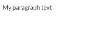
< GUI . Paragraph text = "My paragraph text" />
Attr
Type
Default
Description
textstring
null
Paragraph text, Will try to use children content if text attribute is omitted. Children content should only contain text and no html
classNamestring
null
Custom class
directionstring
"ltr"
Text direction, can be "ltr", "rtl"
< GUI . Paragraph text = "My paragraph text" />
Paragraph example with children content instead of text attribute < GUI . Paragraph >
My paragraph < strong > text</ strong >
< GUI . Paragraph > < GUI . Search className = 'my-class' placeholder = 'search here' /> accept all GUI.Input props
Attr
Type
Default
Description
placeholderstring
null
Paragraph text, Will try to use children content if text attribute is omitted
liststring
null
Input list for GUI.Datalist
classNamestring
null
Custom class
Attr
Type
Default
Description
contentelement
null
Custom element or a react component to be rendered in the popover.
triggerelement
<GUI.Icon iconClass = "dots-2"/>
To trigger a custom element or a react component to display a popover.
arrowboolean
true
Display arrow with the popover.
holdboolean - object
false
An hold functionality to display the popover after hold on the trigger. defualt timeout = 500 ms, hold={{timeout: 2000}}
hoverboolean
false
Open Popover on mouse hover the trigger instead of onClick
onClickfunction
null
OnClick callback function.
alignstring
center
Align of Popover icon, left, center and right.
widthint
auto
Width of Popover.
heightstring
auto
Height of Popover, 'to-bottom' or 'auto'
maxWidthint
700
Max width of Popover.
maxHightint
300
Max hight of Popover, will be ignored if the height='to-bottom'
borderboolean
true
Border of Popover.
useRelativePositionboolean
false
Use position: 'relative' instead of default position: 'fixed'
scrollableboolean
true
Render popover content inside a scrollable component
Name
Returns
Description
isOpenboolean
Check if the popover is open or not
Click and hold the trigger to dipslay popover
< GUI . Popover content = { < MyCustomImportComponent /> } trigger = { < MyCustomPlusIcon /> } hold = { { timeout : 300 } } arrow = { false } />
Hover the trigger to dipslay popover
< GUI . Popover hover content = { < MyCustomMenuComponent /> } trigger = { < MyCustomMenuIconElement /> } />
< GUI . Section title = "my-section" buttons = { [ ] } />
Attr
Type
Default
Description
titlestring
null
Section title.
classNamestring
null
Custom class
headerClassNamestring
null
Custom class for header
buttonsarray
null
Array of GUI.Button rendered in the upper right of the section header. Requires the title prop to be set
minimizedboolean
false
Render a minimized section
toggleableboolean
true
If the section is toggleable or not
< GUI . Section title = "my-title" buttons = { [
< GUI . Button text = "first button" /> ,
< GUI . Button text = "second button" />
] } >
// Section content
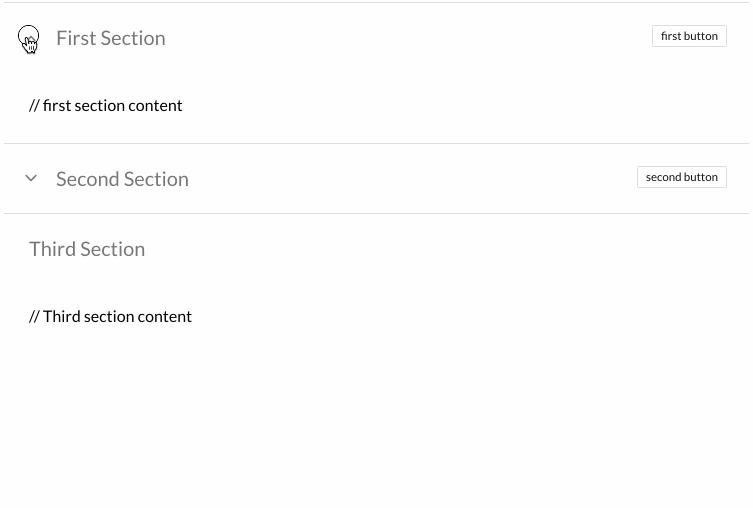
</ GUI . Section > < GUI . Wrapper className = "@plugin_bundle_class" >
< GUI . Section title = "First Section" buttons = { [
< GUI . Button text = "first button" />
] } >
// first section content
</ GUI . Section >
< GUI . Section title = "Second Section" minimized buttons = { [
< GUI . Button text = "second button" />
] } >
// second section content
</ GUI . Section >
< GUI . Section toggleable = { false } title = "Third Section" >
// Third section content
</ GUI . Section >
</ GUI . Wrapper >
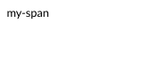
< GUI . Span text = "my-span" />
Attr
Type
Default
Description
textstring
null
Span text
classNamestring
null
Custom class
< GUI . Span text = "my-span" />
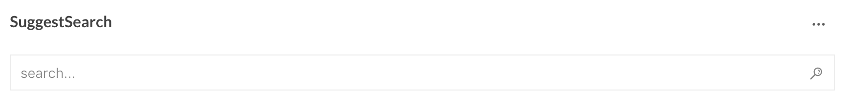
< GUI . SuggestSearch title = { } ocInstance = { } config = { } onSearch = { } cacheKey = { } />
Attr
Type
Default
Description
titlestring
null
A title string represented in upper left corner
ocInstanceobject
null
A instance of LCC open content object
configobject
null
Object containing config for suggest search (see below)
onSearchfunction
null
callback function when a search has occurred
cachekeystring
null
string added to the cache key in order for either have same saved queries for each application or unique ones
Full SuggestSearch example constructor ( props ) {
super ( props )
this . lcc = null
this . ocInstance = null
this . state = {
title : "Example" ,
config : {
suggestFields : [
{
name : 'PubStatus' ,
order : 10
} ,
{
name : 'Tags' ,
order : 15
} ,
{
name : 'Authors' ,
order : 20
}
] ,
suggestLabels : { 'PubStatus' : 'Status' , 'Tags' : 'Tagg' , 'Authors' : 'Författare' } ,
searchOptions : {
start : 0 ,
limit : 10 ,
property : [ 'uuid' , 'PubStatus' , 'Tag' , 'Authors' ] ,
defaultQuery : '*:* NOT PubStatus:draft' ,
filterQuery : 'contenttype:Article' ,
sortField : 'updated' ,
sortAscending : false
} ,
initialSearch : [
{
"value" : "Dans" ,
"field" : "Tags" ,
} , {
"value" : "Mat och dryck" ,
"field" : "Tags" ,
} , {
"value" : "John Doe" ,
"field" : "Authors" ,
"operator" : "AND"
}
]
}
}
}
const LCC_BUNDLE = 'io.infomaker.lcc'
const LCC_GET_LIB = `${ LCC_BUNDLE }
const LCC_LIB = `${ LCC_BUNDLE }
componentDidMount ( ) {
try {
this . ready ( LCC_BUNDLE , ( ) => {
this . on ( LCC_LIB , userData => {
let LCC = userData . LCC
this . lcc = new LCC ( {
plugin : this ,
onLccReadyStateChange : this . onLccReadyStateChange . bind ( this )
} )
this . lcc . start ( )
} )
this . send ( LCC_GET_LIB , { v :1 } )
} )
} catch ( err ) {
console . warn ( err )
}
}
onLccReadyStateChange ( lccReady ) {
this . ocInstance = this . lcc . opencontent ( "my-opencontent-provider" )
}
onSearch ( result ) {
/**
result === {
items: [...],
search: {
start: 0,
limit: 10,
property: [...list of properties to fetch],
q: '(Tags: "Dans" OR Tags: "Mat och dryck") AND Authors: "John Doe" AND contenttype:Article',
sort.indexfield: "updated",
sort.updated.ascending: false
},
suggestionSeach: [{value:"Dans", field:"Tags", operator:null}, {value:"Mat och dryck", field:"Tags", operator:null}, {value:"John Doe", field:"Authors", operator:"AND"}],
totalHits: 0
}
*/
}
render ( ) {
return (
< GUI . SuggestSearch title = { this . state . title } ocInstance = { this . ocInstance } config = { this . state . config } onSearch = { this . onSearch } cacheKey = { "my-cache-key" } />
)
}
< GUI . SwitchButton onChange = { checked => { } } />
Attr
Type
Default
Description
onChangefunction
null
On change callback function
labelstring or object
null
SwitchButton title
classNamestring
null
Custom class
checkedboolean
false
Default value
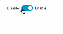
Full SwitchButton example const myLabel = {
left : 'Disable' ,
right : 'Enable'
}
< GUI . SwitchButton label = { myLabel} / >
< GUI . Tabs tabs = { myTabs } />
Attr
Type
Default
Description
classNamestring
null
Custom class.
styleobject
null
Inline style for Tabs component.
borderboolean
false
Render a custom border style around Tabs component.
onSelectfunction
null
OnSelect tab callback function, return: selectedTab, clickEvent.
forceRenderboolean
false
By set it to true all tabs contents will be rendered in the DOM even the not active tabs.
{
id : "2b42d026-e5cb-4731-8fc0-2f87fde06b38" ,
title : "My tab title" ,
content : 'My tab content'
}
Prop
Type
Default
Description
idstring or integer
null
Id for tab item. A tab without an id will not be rendered. If your objects don't have an id just call Dashboard.createUUID() id: Dashboard.createUUID()
titlestring or element
null
Can be a string or a element. Pass an element to override the default class.
contentstring or element or component
null
Can be a string or an element or a component.
styleobject
null
Inline style for the tab.
disabledboolean
false
If it passed true the tab will be rendered in the header but it won't be active and won't be clickable.
you can pass any other custom property with the tab object and it will be passed with onSelect tab callback
example: const tabs = [ { id: 'my-tab-id', title: 'Tab1', content: myTab1Content, myCustomProperty: myCustomProperty } ]
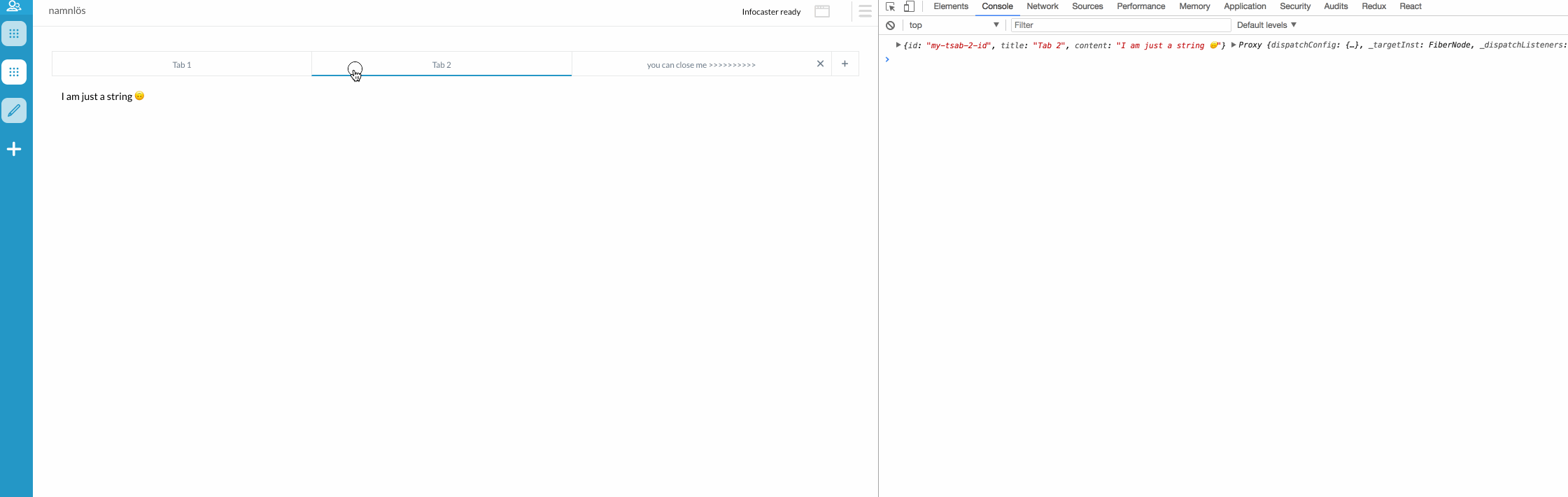
Normal tabs:
tabs : [
{
id : 'my-tsab-1-id' ,
title : 'Tab 1' ,
content : < Tab1 myTitle = { 'i am a custom component inside Tab 1' } />
} ,
{
id : 'my-tsab-2-id' ,
title : 'Tab 2' ,
content : 'I am just a string 🙃'
} ,
{
id : 'my-tsab-3-id' ,
title : 'Tab 3' ,
content : 'tab 3 content'
}
]
< GUI . Tabs tabs = { myTabs} / >
Advanced tabs:
class Tab1 extends React . Component {
constructor ( props ) {
super ( props )
}
render ( ) {
return < GUI . Wrapper >
< GUI . Header text = { this . props . myTitle } />
</ GUI . Wrapper >
}
}
class Application extends Dashboard . Application {
constructor ( props ) {
super ( props )
this . state = {
tabs : [
{
id : 'my-tsab-1-id' ,
title : 'Tab 1' ,
content : < Tab1 myTitle = { 'i am a custom component inside Tab 1' } />
} ,
{
id : 'my-tsab-2-id' ,
title : 'Tab 2' ,
content : 'I am just a string 🙃'
} ,
{
id : 'my-tsab-3-id' ,
title : 'you can close me >>>>>>>>>>' ,
content : 'I am a closeable tab 😎' ,
onClose : newTabs => {
console . log ( newTabs ) //return an Array with the new tabs without the closed one, here you should update you state with the new tabs 😊
}
}
]
}
}
< GUI . Tabs tabs = { this . state . tabs } onSelect = { ( index , event ) => console . log ( index , event ) } onAdd = { ( ) => this . setState ( {
tabs : [
...this . state . tabs ,
{
id : 'my-tab-4-id' ,
title : 'New tab' ,
content : 'NEW TAB 🎉'
}
]
} ) } />
}
< GUI . Textarea onChange = { ( ) => myFunction ( ) } />
Attr
Type
Default
Description
primaryboolean
false
Use Dashboard primary style
placeholderstring
null
Textarea placeholder text
autosizeboolean
false
Auto size textarea element
classNamestring
null
Custom class
onChangefunction
null
OnChange callback function
textModeboolean
false
Render Textarea with the same style and with uneditable mood
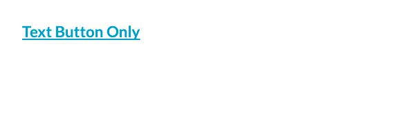
< GUI . TextButton text = { 'Text Button Only' } onClick = { ( ) => { /* Do something... */ } / >
< GUI . Title text = "My h1 title" />
Attr
Type
Default
Description
textstring
null
Title text
classNamestring
null
Custom class
directionstring
"ltr"
Text direction, can be "ltr", "rtl"
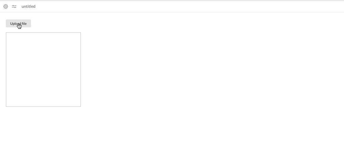
< GUI . UploadButton text = 'Upload file' size = 'large' onSuccess = { file => /* Do something with the file */ } onError = { err => console . log ( err ) } />
Attr
Type
Default
Description
onSuccessfunction
null
On file uploaded success callback, return uploaded file
onErrorfunction
null
On error file uploaded event callback, return the error
parseJsonboolean
false
If the file has a json format
textstring
null
UploadButton text to display
sizestring
normal
Upload Button size
classNamestring
null
Custom class
disabledboolean
false
If button should be disabled
...
< GUI . UploadButton text = 'Upload file' size = 'large' onSuccess = { file => this . setState ( { imgSrc : file } ) } />
< GUI . Img src = { this . state . imgSrc } width = '300px' height = '300px' / >
...
< GUI . WidgetButton text = "My button" />
Attr
Type
Default
Description
onClickfunction
null
On click callback function
textstring
null
Icon text, will render a span text for the icon if declared
classNamestring
null
Custom class
disabledboolean
false
If button should be disabled
< GUI . WidgetIcon iconClass = { 'my-icon-class' } />
Attr
Type
Default
Description
iconClassstring
normal
Name of icon. Dashboard leverage the awesome font set Dripicons by Amit Jakhu . View all available icons here .
onClickfunction
null
On click callback function
styleobject
null
Style that will be applied to the button
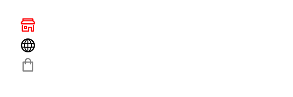
< GUI . WidgetIcon iconClass = { 'store' } iconColor = { 'red' } />
< GUI . WidgetIcon iconClass = { 'web' } iconColor= { 'black' } / >
< GUI . WidgetIcon iconClass = { 'shopping-bag' } iconColor = { 'gray' } />
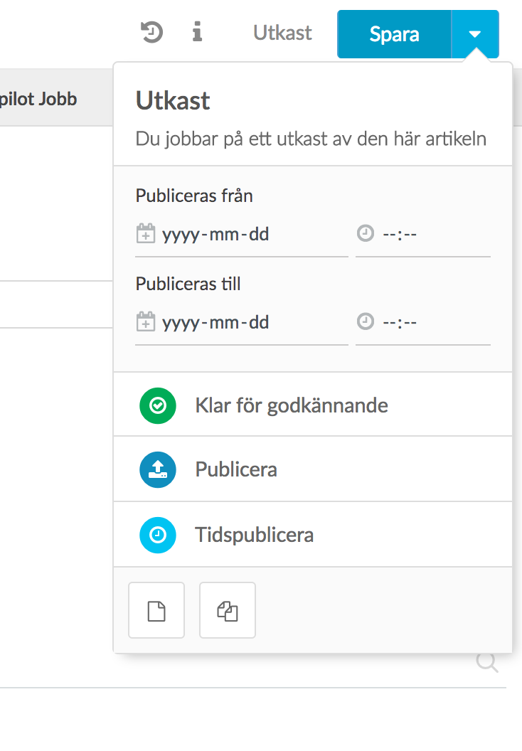
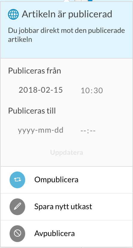
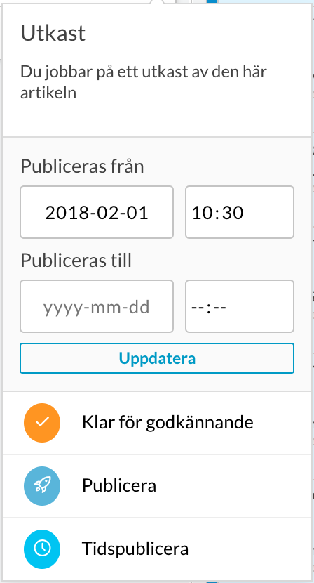
This GUI simulate Writer publish flow menu
< GUI . WriterPublishFlow
article = { article }
writerPublishFlow = { writerFlowConfig }
onFlowClicked = { actions => console . log ( actions ) }
articleHasUpdated = { this . state . articleHasUpdated }
onPubStopChange = { date => console . log ( date ) }
onPubStartChange = { date => console . log ( date ) }
onClose = { ( ) => { } }
/>
Attr
Type
Default
Description
classNamestring
null
Custom class
articleobject
null
Article object structure.
writerPublishFlowobject
null
Writer workflow config, can be found: https://WRITER_ENDPOINT/api/config > plugins[id: se.infomaker.publishflow].data.workflow
onClosefunction
null
On close callback function will be called when GUI.WriterPublishFlow will un mount
onPubStartChangefunction
null
On pubStart date/time value changed
onPubStopChangefunction
null
On pubStop date/time value changed
onFlowClickedfunction
null
On any flow actions clicked, will pass actions object
"se.infomaker.publishflow" is the only plugin supported, please be sure that you have this version in your Writer config or contact the support team
--- All of article item properties are required ---
{
uuid : 'ARTICLE_UUID' ,
status : 'DEFAULT_WRITER_STATUS' , // draft, done, approved, withheld, usable, canceled
hasPublishedVersion : 'WRITER_HAS_PUBLISH_VERSION_VALUE' , // true or false
headline : 'ARTICLE_HEADLINE_VALUE' ,
published : 'ARTICLE_PUBDATE_VALUE' ,
pubStart : 'ARTICLE_PUBSTART_VALUE' ,
pubStop : 'ARTICLE_PUBSTOP_VALUE'
} WriterPublishFlow example
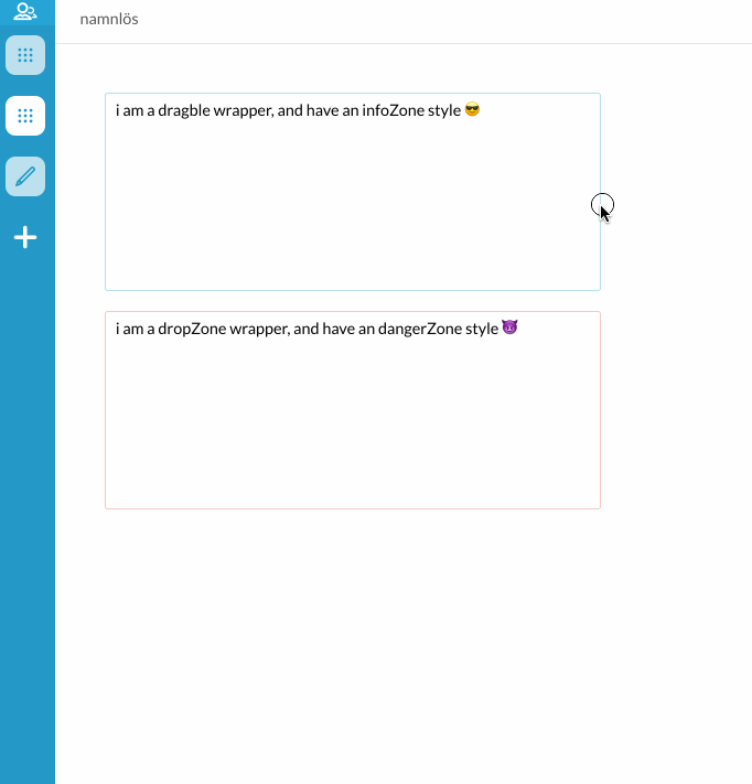
< GUI . Wrapper >
// content
</ GUI . Wrapper >
Attr
Type
Default
Description
classNamestring
null
Custom class
styleobject
null
Style that will be applied to the wrapper.
onClickfunction
null
On click callback function
draggableboolean
false
Set to true to be able to drag
onDragStartfunction
null
On drag start callback function return null
onDragEndfunction
null
On drag end callback function return null
onDragOverfunction
null
On drag over callback function return null
onDragLeavefunction
null
On drag leave callback function return null
onDragfunction
null
On dragging callback function firring while wrapper is dragging
dragDataobject
null
Object include custom data, will be droped on drop wrapper
onDropfunction
null
On drop callback function return dragData object from draged wrapper
infoZoneboolean
false
Custom blue area style
dangerZoneboolean
false
Custom red area style
dropZoneboolean
false
Custom drop area style when an item be dropped in
💁🏻 Use Wrapper to wrap your content when your return multiple children in a render return statement. It is also possible to pass a style object to style the wrapper with, and by this way affect the children.
Each GUI component should have an eventId prop to pass it to GUI-Listener to listen for that GUI component
GUI Components
Events name
Description
Popoveropen, close
Open: to open Popover by dispatching an event with eventName: 'open', Close: to close Popover by dispatching an event with eventName: 'close'
DropMenuclose
Close: to close DropMenu by dispatching an event with eventName: 'close'
DropDownopen, close
Open: to open DropDown by dispatching an event with eventName: 'open', Close: to close DropDown by dispatching an event with eventName: 'close'
this . send ( {
name : 'GUI:Popover' ,
userData : {
eventName : 'close' ,
eventId : 'my-popover-eventId'
}
)
< GUI . Popover eventId = { 'my-popover-eventId' } / >
