5. Art - Historn/Project-1 GitHub Wiki
Content
Mood Analysis
The game art creates a futuristic and colourful environment for the player. The art style is similar to titles such as Cyberpunk, where the colours are bright and vibrant, to denote a modern or futuristic technological theme. The player models are all brightly coloured and adorn technological gadgets such as green neon visors. It feels as though the game plays into its futuristic theme, with fast explosive movement and mechanics, however it pays homage to its retro roots with the score and announcements artwork being very traditional to its time. The game utilizes a bright and flashy colour palette to convey a neo/cyber theme, heavily complemented by the games flashy and rapid gameplay.
Concept Art
Concept artwork could not be found for the title due to the secluded business structure of the Data East video game company who released the title. Upon extensive research it was found that the title was released with little to no build up in terms of advertising or crowd sourcing. With this, the artworks below are simply videogame covers, or in-game captures that capture the essence of the title.
Covers and Flyers
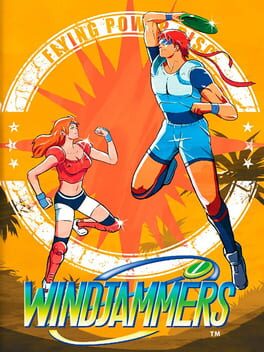
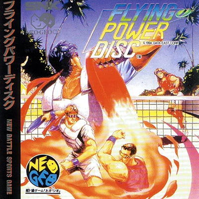
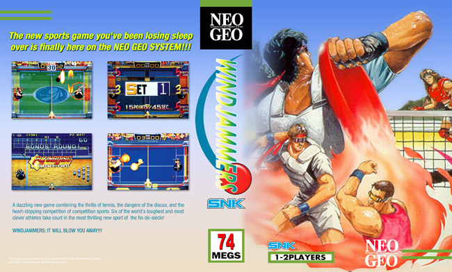 )
)
Sprites
Sprites were captured by using the WinKawaks Emulator which allowed us to run WindJammers. The image was then edited to make the transparent spritesheets and exported as a png using Adobe Photoshop. Here is a link to the sprite library: Here
Level Art
The background art in Wind Jammers is the stadiums that the players will play their match in. Each stadium is consistent in it having two sides for the players to play on, as well as a net, and fan/referee sections. The maps differ, however, in the terrain used for the court, the obstacles present on the courts, and the sections of the goal.
Stage 1
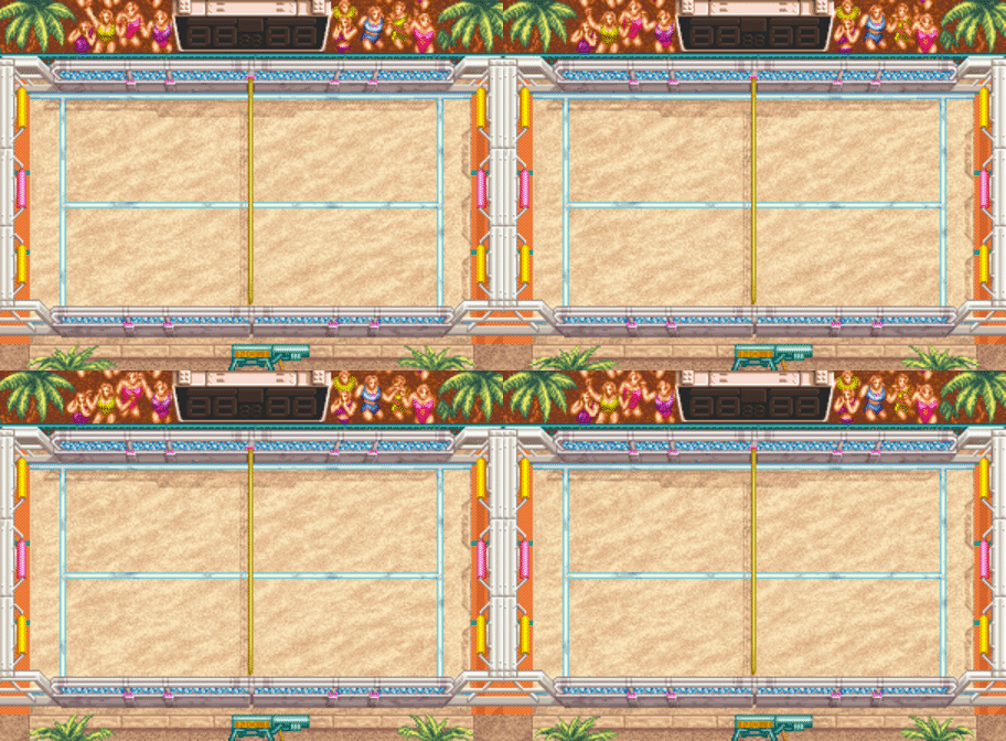
Stage 1 is the Beach map of Wind Jammers. In this scene the arena is a sandy beach map, with a colour palette consisting of lighter shades of yellow, pink, blue, and green. Palm trees also adorn the border areas of the arena, helping to create an outside and free feel to the map. The Palm trees move to indicate a quiet breeze over the map, helping to add to the outdoor ambience. It is a calm map, where the gameplay feels smooth and fun, as any beach volleyball game would.
Stage 2
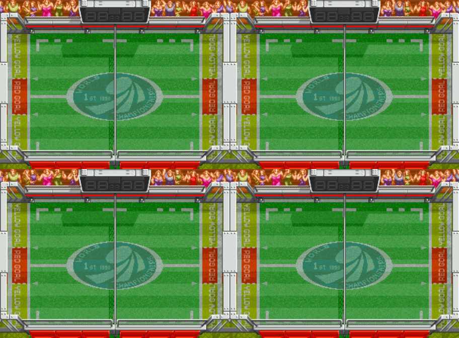
Stage 2 is a turf pitch, decorated with a lawn setting. We can see that the floor is covered with grass and the whole scenario resembles the type of arena one would see for a football or rugby game. The map uses a green, red, and white palette to achieve both the necessary elements of a turf pitch and its painted lines, but also the colour red serves to indicate crucial elements such as high point areas, and map borders. Additionally, the map has a "World Championship" title in the middle, as well as a frisbee logo.
Stage 3
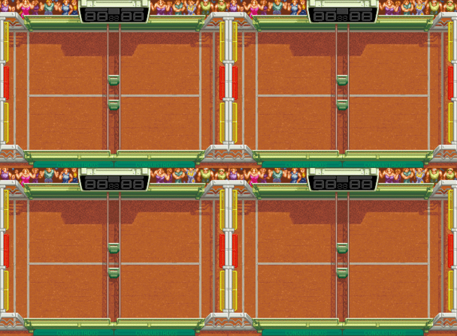
Stage 3 is a clay arena, which appears very similar to a clay tennis court. The colour palette used is full of faded reds, oranges, and yellows, with the complementary colour of green used to act as a natural border to the map. The variance in red and yellow borders in the goal zone serves to indicate the difference in goal points. The arena is similar to all other arenas in terms of fans, and scoreboard.
Return Content
Return Home