User Interface - Highvolt/FEUPdemic GitHub Wiki

The splash screen is fairly simple as it only contains the logo, the team members and an instruction to continue.
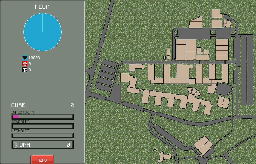
The main screen of the game consists of two noticeable sections: sidebar (left) and map (right).
 |
1. Name of the selected area (or FEUP if none is selected). |
| 2. Pie chart with proportion persons alive, infected and dead. | |
| 3. Number of persons alive. | |
| 4. Number of persons infected. | |
| 5. Number of persons dead. | |
6. Populational density of a selected area: low,medium or high. | |
7. Temperature of a selected area: cold, temperate or hot. | |
8. Technological level of a selected area: primitive, medium or high-tech. | |
| 9. Percentage of cure. | |
| 10. Virus infectivity. | |
| 11. Virus severity. | |
| 12. Virus lethality. | |
| 13. Accumulated DNA points. | |
| 14. Button to access the menu. |
| A | B | C |
|---|---|---|
 |
 |
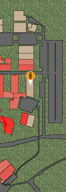 |
- A. Dark gray graphics are roads and not interactive. Light brown elements represent infectable areas.
- B. White border around an area means that it's selected by the player.
- C. The more opaque the red becomes, the more infected an area is.

Each tab contains several upgrades to enhance the disease contamination power.
![]()
[Transmission upgrades list](Disease Upgrades#transmissions)
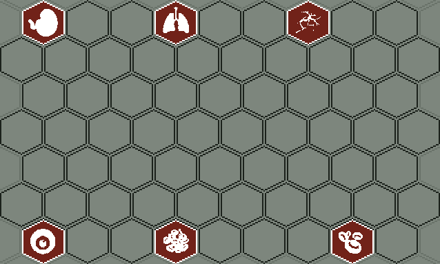
[Symptoms upgrades list](Disease Upgrades#symptoms)

[Resistances upgrades list](Disease Upgrades#resistances)