17 02 Visualization with hierarchical clustering and t SNE - HannaAA17/Data-Scientist-With-Python-datacamp GitHub Wiki
In this chapter, you'll learn about two unsupervised learning techniques for data visualization, hierarchical clustering and t-SNE. Hierarchical clustering merges the data samples into ever-coarser clusters, yielding a tree visualization of the resulting cluster hierarchy. t-SNE maps the data samples into 2d space so that the proximity of the samples to one another can be visualized.
01 Visualizing hierarchies
Hierachical clustering (of voting countries)
- Every country begins in a separate cluster
- At each step, the two closest clusters are merged
- Continue until all countries in a single cluster
- Agglomerative hierarchical cluster
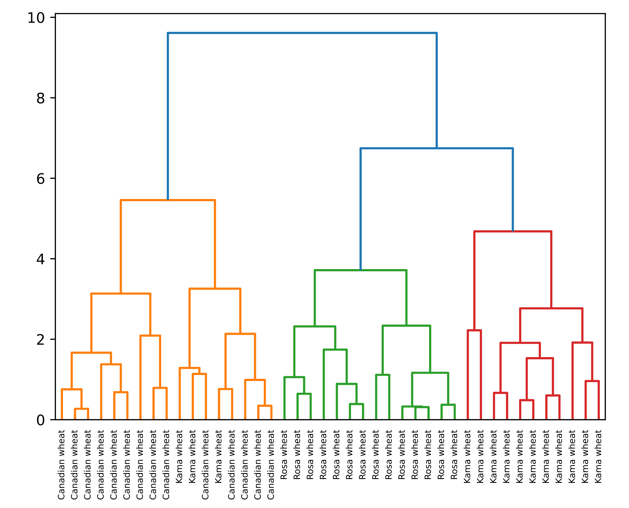
Hierarchical clustering with Scipy
- Given
samples, andlabel_names
# Perform the necessary imports
from scipy.cluster.hierarchy import linkage, dendrogram
import matplotlib.pyplot as plt

# Calculate the linkage: mergings
mergings = linkage(samples, method='complete')

# Plot the dendrogram, using varieties as labels
dendrogram(mergings,
           labels=varieties,
           leaf_rotation=90,
           leaf_font_size=6,
)
plt.show()
02 Cluster labels in hierarchical clustering
- Cluster labels at any intermediate stage can be recovered
- For use in e.g. cross-tabulations
Intermediate clusterings & height on dendrogram
- Height = distance between merging clusters
- Distance is defined by a 'linkage method'
- 'Complete' linkage: max. distance between samples (method = 'complete')
- 'Single' linkage: min. distance
Extracting cluster labels
fcluster()function- Returns a NumPy array of cluster labels
- Align cluster labels with e.g. varieties
# Perform the necessary imports
import pandas as pd
from scipy.cluster.hierarchy import fcluster

# Use fcluster to extract labels: labels
labels = fcluster(mergings, 6, criterion='distance')

# Create a DataFrame with labels and varieties as columns: df
df = pd.DataFrame({'labels': labels, 'varieties': varieties})

# Create crosstab: ct
ct = pd.crosstab(df['labels'], df['varieties'])

# Display ct
print(ct)
varieties  Canadian wheat  Kama wheat  Rosa wheat
    labels
    1                      14           3           0
    2                       0           0          14
    3                       0          11           0
03 t-SNE for 2-dimensional maps
t-SNE for 2-dimensional maps
- t-SNE = "t-distributed stochastic neighbor embedding"
- Maps samples to 2D space (or 3D)
- Map approximately preserves nearness of samples
- Great for inspecting datasets
t-SNE has only fit_transform()
- Simultaneously fits the model and transforms the data
- Can't extend the map to include new data samples
learning rate
- Wrong choice can lead to points bunching together
- Try values between 50 and 200
Different every time
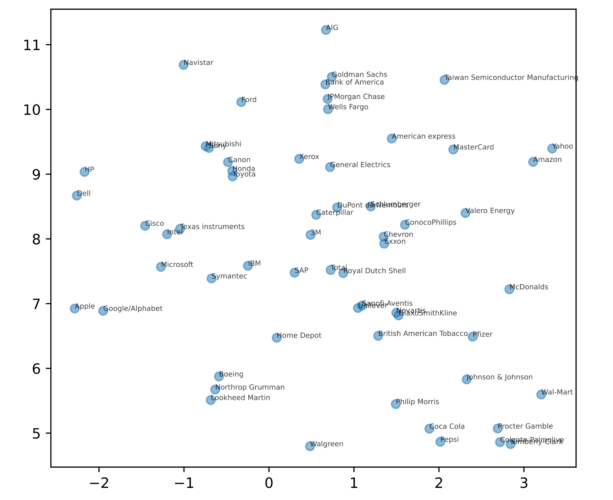
- The axes of a t-SNE plot do not have any interpretable meaning.
- They are different every time t-SNE is applied, even on the same data
# Import TSNE
from sklearn.manifold import TSNE

# Create a TSNE instance: model
model = TSNE(learning_rate = 50)

# Apply fit_transform to normalized_movements: tsne_features
tsne_features = model.fit_transform(normalized_movements)

# Select the 0th feature: xs
xs = tsne_features[:,0]

# Select the 1th feature: ys
ys = tsne_features[:,1]

# Scatter plot
plt.scatter(xs, ys, alpha=0.5)

# Annotate the points
for x, y, company in zip(xs, ys, companies):
    plt.annotate(company, (x, y), fontsize=5, alpha=0.75)
plt.show()