14 Exploratory Data Analysis in Python - HannaAA17/Data-Scientist-With-Python-datacamp GitHub Wiki
Exploratory data analysis is a process for exploring datasets, answering questions, and visualizing results. This course presents the tools you need to clean and validate data, to visualize distributions and relationships between variables, and to use regression models to predict and explain.
01 Read, clean, and validate
02 Distributions
03 Relationships
04 Multivariate Thinking
The first step of almost any data project is to read the data, check for errors and special cases, and prepare data for analysis.
- to see if there's any unusual data:
pounds.value_counts().sort_index() - describe:
pounds.describe() - Replace:
pounds.replace([98,99], np.nan, inplace=True)
- Plot a histogram
import matplotlib.pyplot as plt
plt.hist(birth_weight.dropna(), bins=30)
plt.xlabel('Birth weight')
plt.ylabel('Fraction of births')
plt.show()- Boolean Series and Filtering
~
# Filter full-term babies
full_term = nsfg['prglngth'] >= 37

# Filter single births
single = nsfg['nbrnaliv'] == 1

# Compute birth weight for single full-term babies
single_full_term_weight = birth_weight[full_term & single]
print('Single full-term mean:', single_full_term_weight.mean())

# Compute birth weight for multiple full-term babies
mult_full_term_weight = birth_weight[full_term & ( ~single)]
print('Multiple full-term mean:', mult_full_term_weight.mean())In the first chapter, having cleaned and validated your data, you began exploring it by using histograms to visualize distributions. In this chapter, you'll learn how to represent distributions using Probability Mass Functions (PMFs) and Cumulative Distribution Functions (CDFs).
-
pmf_year = Pmf(gss['year'], normalize=False): a Series - if we set
normalize = True, probability is calculated for each year - Plot a PMF
# Select the age column
age = gss['age']

# Make a PMF of age
pmf_age = Pmf(age)

# Plot the PMF
pmf_age.bar(label='age')

# Label the axes
plt.xlabel('Age')
plt.ylabel('PMF')
plt.show()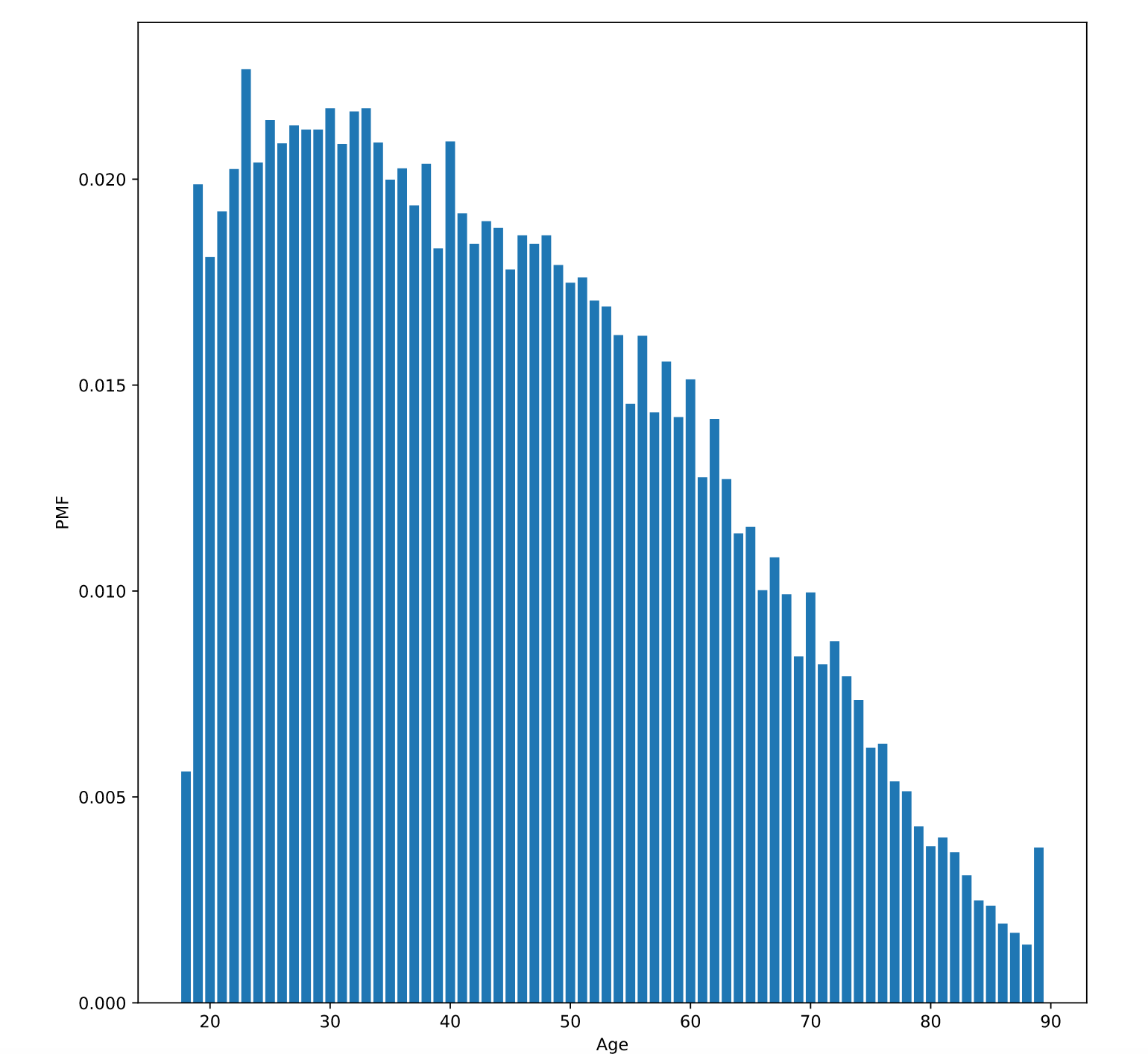
If you draw a random element from a distribution:
- PMF (Probability Mass Function) is the probability that you get exactly x
- CDF (Cumulative Distribution Function) is the probability that you get a value<=x for a given value of x.
- Make a CDF:
cdf = Cdf(gss['age']),cdf.plot() - Evaluate the CDF
-
p = cdf(q): get the probability x <= q -
q = cdf.inverse(p):cdf.inverse(0.75) - cdf.inverse(0.25)is the interquartile
-
- Use CDFs for exploration
- Use PMFs if there are a small number of unique values
- Use KDE if there are a lot of values.
In this chapter, you'll explore relationships between variables two at a time, using scatter plots and other visualizations to extract insights.You'll also learn how to quantify those relationships using correlation and simple regression.
np.random.normal(0, 0.5, size = )
# Select the first 1000 respondents
brfss = brfss[:1000]

# Add jittering to age
age = brfss['AGE'] + np.random.normal(0,2.5, size=len(brfss))
# Extract weight
weight = brfss['WTKG3']

# Make a scatter plot
plt.plot(age,weight,'o',markersize=5,alpha=0.2)

plt.xlabel('Age in years')
plt.ylabel('Weight in kg')
plt.show()- only work with linear relationship
# Select columns
columns = ['AGE','INCOME2','_VEGESU1']
subset = brfss[columns]

# Compute the correlation matrix
print(subset.corr())-
from scipy.stats import linregress, linregress - Compute the linear regression
from scipy.stats import linregress

# Extract the variables
subset = brfss.dropna(subset=['INCOME2', '_VEGESU1'])
xs = subset['INCOME2']
ys = subset['_VEGESU1']

# Compute the linear regression
res = linregress(xs, ys)
print(res)
<script.py> output:
LinregressResult(slope=0.06988048092105019, intercept=1.5287786243363106, rvalue=0.11967005884864107, pvalue=1.378503916247615e-238, stderr=0.002110976356332332)
- Fit the regression line
# Plot the scatter plot
plt.clf()
x_jitter = xs + np.random.normal(0, 0.15, len(xs))
plt.plot(x_jitter, ys, 'o', alpha=0.2)

# Plot the line of best fit
fx = np.array([xs.min(), xs.max()])
fy = res.intercept + res.slope * fx
plt.plot(fx, fy, '-', alpha=0.7)

plt.xlabel('Income code')
plt.ylabel('Vegetable servings per day')
plt.ylim([0, 6])
plt.show()Explore multivariate relationships using multiple regression to describe non-linear relationships and logistic regression to explain and predict binary variables.
import statsmodels.formula.api as smf
from scipy.stats import linregress
import statsmodels.formula.api as smf

# Run regression with linregress
subset = brfss.dropna(subset=['INCOME2', '_VEGESU1'])
xs = subset['INCOME2']
ys = subset['_VEGESU1']
res = linregress(xs, ys)
print(res)

# Run regression with StatsModels
results = smf.ols('_VEGESU1 ~ INCOME2', data = brfss).fit()
print(results.params)
Intercept 1.528779
INCOME2 0.069880
dtype: float64
# Add a new column with educ squared
gss['educ2'] = gss['educ'] ** 2

# Run a regression model with educ, educ2, age, and age2
results = smf.ols('realinc ~ educ + educ2 + age + age2',data=gss).fit()- Make predictions:
results.predict()
# Run a regression model with educ, educ2, age, and age2
results = smf.ols('realinc ~ educ + educ2 + age + age2', data=gss).fit()

# Make the DataFrame
df = pd.DataFrame()
df['educ'] = np.linspace(0, 20)
df['age'] = 30
df['educ2'] = df['educ']**2
df['age2'] = df['age']**2

# Generate and plot the predictions
pred = results.predict(df)
print(pred.head())- Visualizing predictions
# Plot mean income in each age group
plt.clf()
grouped = gss.groupby('educ')
mean_income_by_educ = grouped['realinc'].mean()
plt.plot(mean_income_by_educ, 'o', alpha=0.5)

# Plot the predictions
pred = results.predict(df)
plt.plot(df['educ'], pred, label='Age 30')

# Label axes
plt.xlabel('Education (years)')
plt.ylabel('Income (1986 $)')
plt.legend()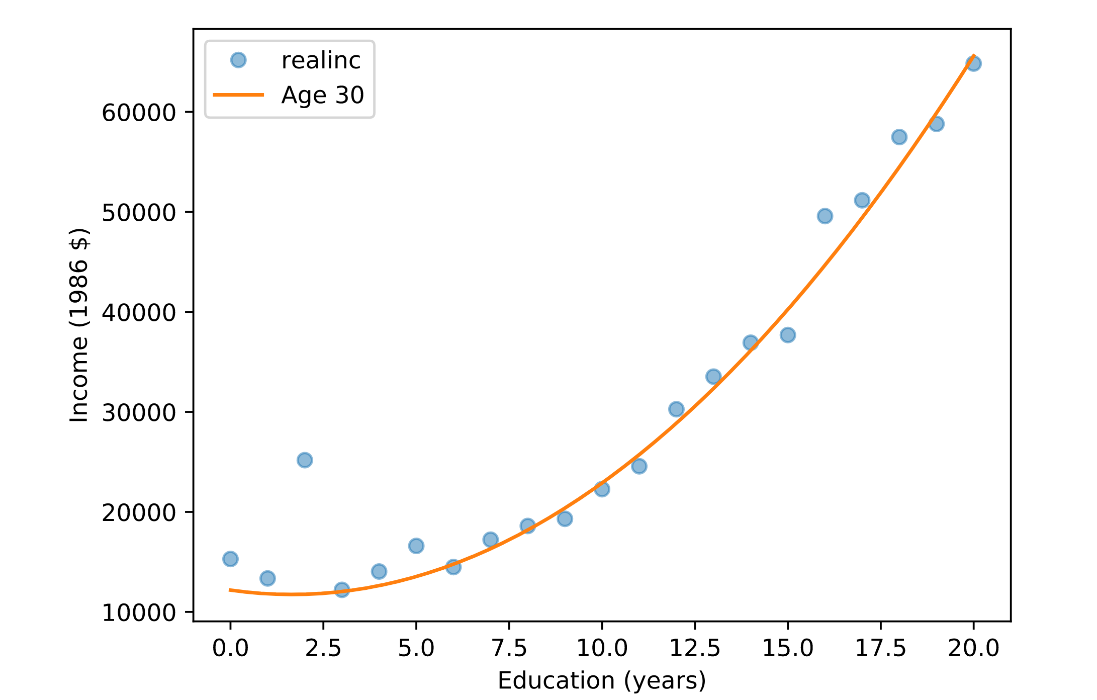
- Categorical variables: sex,race
C(sex) smf.logit(formula, data)
# Recode grass
gss['grass'].replace(2, 0, inplace=True)

# Run logistic regression
results = smf.logit('grass ~ age + age2 + educ + educ2 + C(sex)', data=gss).fit()
results.params

# Make a DataFrame with a range of ages
df = pd.DataFrame()
df['age'] = np.linspace(18, 89)
df['age2'] = df['age']**2

# Set the education level to 12
df['educ'] = 12
df['educ2'] = df['educ']**2

# Generate predictions for men and women
df['sex'] = 1
pred1 = results.predict(df)

df['sex'] = 2
pred2 = results.predict(df)

plt.clf()
grouped = gss.groupby('age')
favor_by_age = grouped['grass'].mean()
plt.plot(favor_by_age, 'o', alpha=0.5)

plt.plot(df['age'], pred1, label='Male')
plt.plot(df['age'], pred2, label='Female')

plt.xlabel('Age')
plt.ylabel('Probability of favoring legalization')