08 04 Creating Plots on Data Aware Grids - HannaAA17/Data-Scientist-With-Python-datacamp GitHub Wiki
Use Seaborn to draw multiple plots in a single figure.
Using FacetGrid, factorplot and lmplot
FacetGrid
- The
FacetGridis foundation for many data aware grids. - It allows the user to control how data is distributed across columns, rows and hue
- Once a
FacetGridis created, the plot type must be mapped to the grid.
Building a FacetGrid
- Pointplot Example
# Create FacetGrid with Degree_Type and specify the order of the rows using row_order
g2 = sns.FacetGrid(df,
             row="Degree_Type",
             row_order=['Graduate', 'Bachelors', 'Associates', 'Certificate'])

# Map a pointplot of SAT_AVG_ALL onto the grid
g2.map(sns.pointplot, 'SAT_AVG_ALL')
- Categorical Example
g = sns.FacetGrid(df, col='HIGHDEG')
g.map(sns.boxplot, 'Tuition', order=['1','2','3'])
- Regression or scatter plots
g = sns.FacetGrid(df, col='HIGHDEG')
g.map(plt.scatter, 'Tuition', 'SAT_AVG_ALL')
factorplot()
- A simpler way to use a
FacetGridfor categorical data - Combines the facetting and mapping process.
sns.factorplot(x='Tuition', data=df, col='HIGHDEG', kind='box')
lmplot()
lmplot()plots scatter and regression plot on aFacetGridsns.lmplot(data=df, x='Tuition', y='SAT_AVG_ALL',col='HIGHDEG', fit_reg=False)
Using PairGrid and pairplot
PairGrid
PairGridshows pairwise relationships between data elements- We only define the columns of data we want to compare.
# Create the same PairGrid but map a histogram on the diag
g = sns.PairGrid(df, vars=["fatal_collisions", "premiums"])
g2 = g.map_diag(plt.hist)
g3 = g2.map_offdiag(plt.scatter)
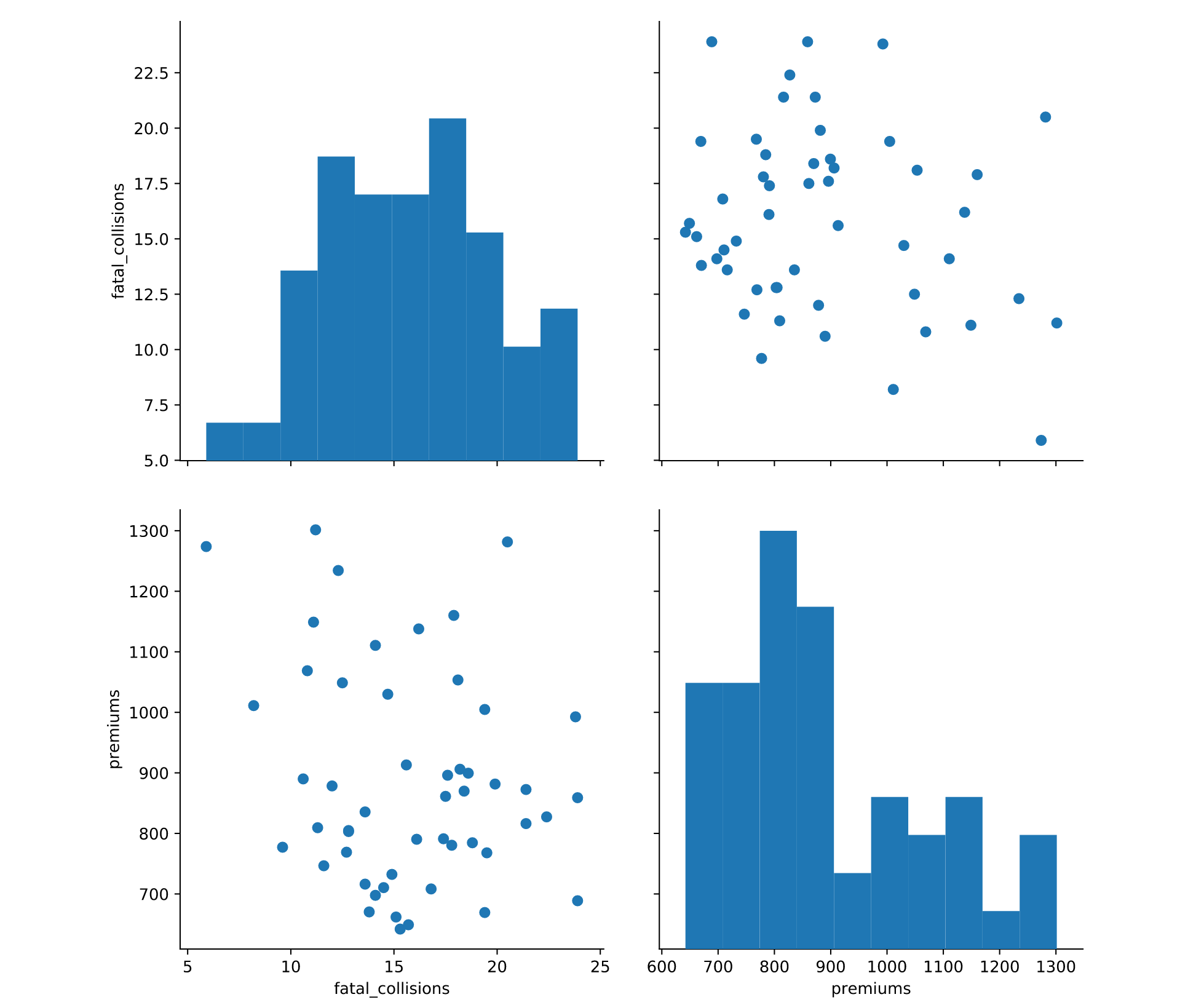
Pairplot
pairplotis a shortcut for thePairGridsns.pairplot(df, vars=["fatal_collisions", "premiums"], kind='scatter', diag_kind='hist')
Customizing a pairplot
sns.pairplot(df.query('BEDRMS < 3'),
             vars=['Fair_Mrkt_Rent',
             'Median_Income','UTILITY'],
             hue='BEDRMS', palette='husl',
             plot_kws={'alpha':0.5})
- One area of customization that is useful is to explicitly define the
x_varsandy_varsthat you wish to examine. Instead of examining all pairwise relationships, this capability allows you to look only at the specific interactions that may be of interest.
Using JointGrid and Jointplot
JointGrid
- Seaborn's
JointGridcombines univariate plots such as histograms, rug plots and kde plots with bivariate plots such as scatter and regression plots.
# Build a JointGrid comparing humidity and total_rentals
sns.set_style("whitegrid")
g = sns.JointGrid(x="hum",
            y="total_rentals",
            data=df,
            xlim=(0.1, 1.0))

g.plot(sns.regplot, sns.distplot)
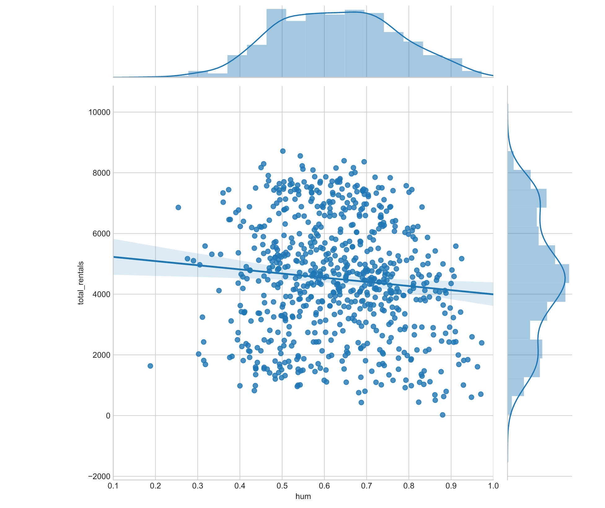
- can also specify the plot type by:
g = g.plot_joint(sns.kedplot),g=g.plot_marginals(sns.kdeplot, shade=True)
jointplot()
# Create a jointplot similar to the JointGrid
sns.jointplot(x="hum",
        y="total_rentals",
        kind='reg',
        data=df)
Customizing a jointplot
# Create a jointplot of temp vs. casual riders
# Include a kdeplot over the scatter plot
g = (sns.jointplot(x="temp",
             y="casual",
             kind='scatter',
             data=df,
             marginal_kws=dict(bins=10, rug=True))
    .plot_joint(sns.kdeplot))