08 03 Additional Plot Types - HannaAA17/Data-Scientist-With-Python-datacamp GitHub Wiki
Categorical Plot Types
Plots of each observation
stripplot
sns.stripplot(data=df, y= , x= , jitter=True)
Amount of jitter (only along the categorical axis) to apply. This can be useful when you have many points and they overlap, so that it is easier to see the distribution. You can specify the amount of jitter (half the width of the uniform random variable support), or just use True for a good default.
swarmplot
sns.swarmplot(data, y=, x= )
Abstract representations
boxplot
sns.boxplot(data=df, y= ,x= )
violinplot: computationally intensive
sns.violinplot(data=df, y= ,x=)
lvplot : hybrid between boxplot and violinplot
sns.lvplot(data=df, y= ,x=)
Statistical estimates
barplot
pointplot
countplot
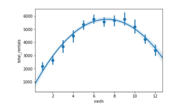
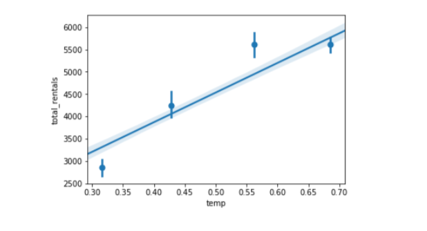
Regression Plot
Plotting with regplot()
sns.regplot(data=df, x, y, marker='+')
Evaluating regression with residplot()
useful for evaluating the fit of a model
sns.residplot(df, x, y)
supports polymoial regression using the order parameter