06 04 Customizing Seaborn Plots - HannaAA17/Data-Scientist-With-Python-datacamp GitHub Wiki
Changing plot style and color
Changing the figure style
- includes background and axes
- Preset options: 'white', 'dark', 'whitegrid', 'darkgrid', 'ticks'
sns.set_style()
Changing the palette
sns.set_palette()- preset or custom palettes
- Diverging palettes: 'RdBu', 'PRGn', 'RdBu_r', 'PRGn_r'
- Sequential palettes: 'Greys', 'Blues', 'PuRd', 'GnBu'
- Custom palettes
custom_palette = ['red', 'green', 'orange', 'blue', 'yellow', 'purple']
sns.set_palette(custom_palette)
Changing the scale
- Figure 'context' changes the scale of the plot element
sns.set_context()- smallest to largest: 'paper', 'notebook', 'talk', 'poster'
Adding titles and labels
FacetGrid vs. AxesSubplot objects
| Object Type | Plot Types | Characteristics |
|---|---|---|
FacetGrid |
relplot(),catplot() |
can create subplots |
| `AxesSubplot | scatterplot(),countplot(),etc. |
single plot |
Adding a title to FacetGrid
g.fig.suptitle()- adujst height :
y=1
g = sns.catplot(x='region', y='Birthrate', data=gdp_data, kind='box')
g.fig.suptitle('New Title', y=1)
Titles for subplots
g.set_titles("This is {col_names}")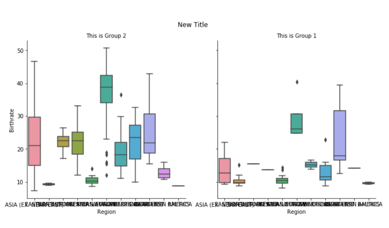
Adding axis labels
g.set(xlabel='X LABEL', ylabel='Y LABEL')
Rotating x-axis
plt.xticks(rotation=90)