06 03 Visualizing a Categorical and a Quantitative Variable - HannaAA17/Data-Scientist-With-Python-datacamp GitHub Wiki
Count plots and bar plots
Categorical plots
- Examples: count plots, bar plots
- Involve a categorical variable
- Comparisons between groups
catplot()
Bar plots
- Displays mean of quantitative variable per category
- Default confidence intervals
sns.catplot(x='day', y='total_bill', data=tips, kind='bar', ci=None)
Creating a Box Plot
- Show the distribution of quantitative data
- See median, spread, skewness, and outliers
- Facilitate comparisons between groups
sns.catplot(x='time', y='total_bill', data=tips, kind='box') - Omit the outliers using
sym=" " - Change the whiskers using
whis=- By default, the whiskers extend to 1.5*the interquartile range
- Make them extend to 2*IQR:
whis=2 - Show the 5th and 95th percentiles:
whis=[5,95] - Show min and max values:
whis=[0,100]
Point plots
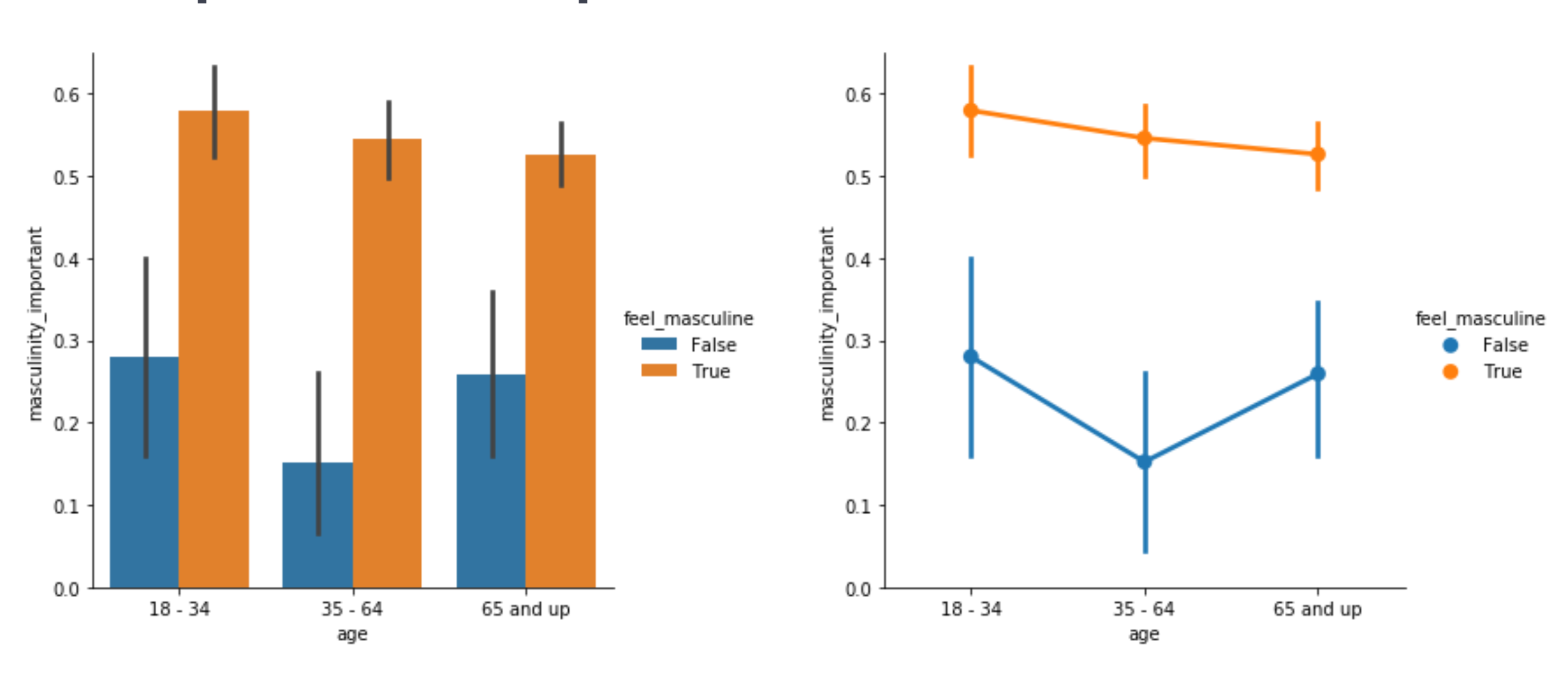
- Points show mean of quantitative variable
- Vertical lines show 95% confidence intervals
- categorical variable on x-axis
sns.catplot(x='age'
            y='masculinity_important',
            data=data,
            hue='feel_masculine',
            kind='point')
- To disconnect the points:
join=False - To display the median instead of mean:
estimator=median- median is more robust to outliers
- Customize the confidence interval, add caps:
capsize=0.2 - Turn off CI:
ci=None