05 04 Sharing your visualization with others - HannaAA17/Data-Scientist-With-Python-datacamp GitHub Wiki
Changing plot style
plt.style.use(): ggplot/default/bmh/seaborn-colorblind/
guildlines
- Dark backgrounds are usually less visible.
- If color is important, consider colorblind-friendly options
- "seaborn-colorblind" or "tableau-colorblind10"
- If print, use less ink: avoid background like ggplot
- It it will be printed in black-and-white, use "grayscale"
Save visualizations
fig.savefig("xxx.png") /.jpg(can also change quality=0-100/.svg- resolution
fig.savefig("xxx.png", dpi= )
- size:
fig.set_size_inches([5,3])
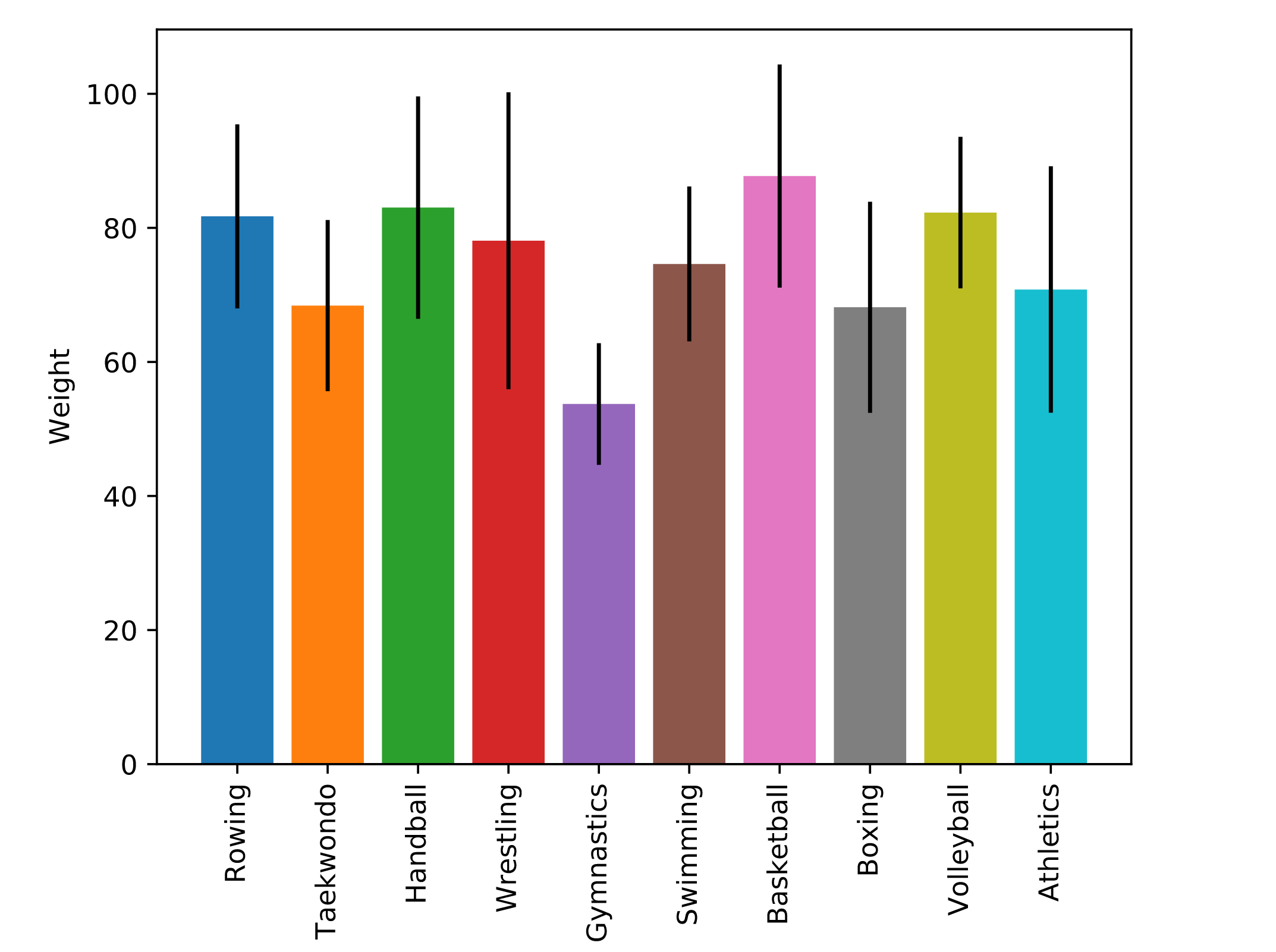
Automating figures from data
get unique values of a column
# Extract the "Sport" column
sports_column = summer_2016_medals["Sport"]

# Find the unique values of the "Sport" column
sports = sports_column.unique()
automate
fig, ax = plt.subplots()

# Loop over the different sports branches
for sport in sports:
  # Extract the rows only for this sport
  sport_df = summer_2016_medals[summer_2016_medals['Sport']==sport]
  # Add a bar for the "Weight" mean with std y error bar
  ax.bar(sport, sport_df['Weight'].mean(),
        yerr=sport_df['Weight'].std())

ax.set_ylabel("Weight")
ax.set_xticklabels(sports, rotation=90)

# Save the figure to file
fig.savefig('sports_weights.png')