05 03 Quantitative comparisons and statistical visualizations - HannaAA17/Data-Scientist-With-Python-datacamp GitHub Wiki
Bar charts
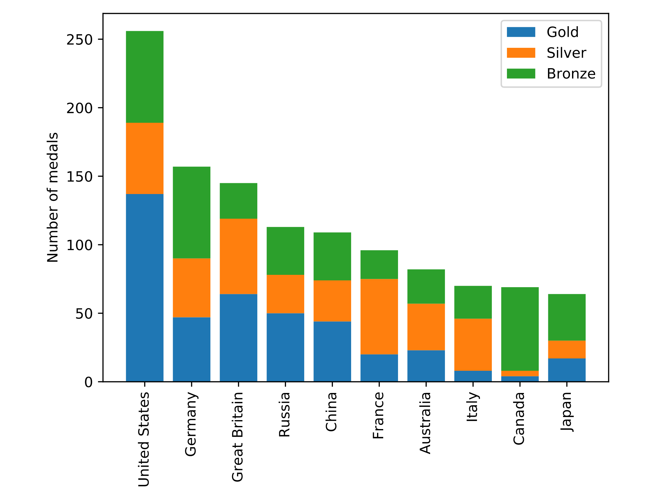
ax.bar(medals.index, medals["Gold"])
Stacked bar charts
# Add bars for "Gold" with the label "Gold"
ax.bar(medals.index, medals['Gold'], label='Gold')

# Stack bars for "Silver" on top with label "Silver"
ax.bar(medals.index, medals['Silver'], bottom=medals['Gold'], label='Silver')

# Stack bars for "Bronze" on top of that with label "Bronze"
ax.bar(medals.index, medals['Bronze'], bottom=medals['Gold']+medals['Silver'], label='Bronze')

ax.set_xticklabels(medals.index, rotation=90)
ax.set_ylabel("Number of medals")

# Display the legend
ax.legend()

plt.show()
Histograms
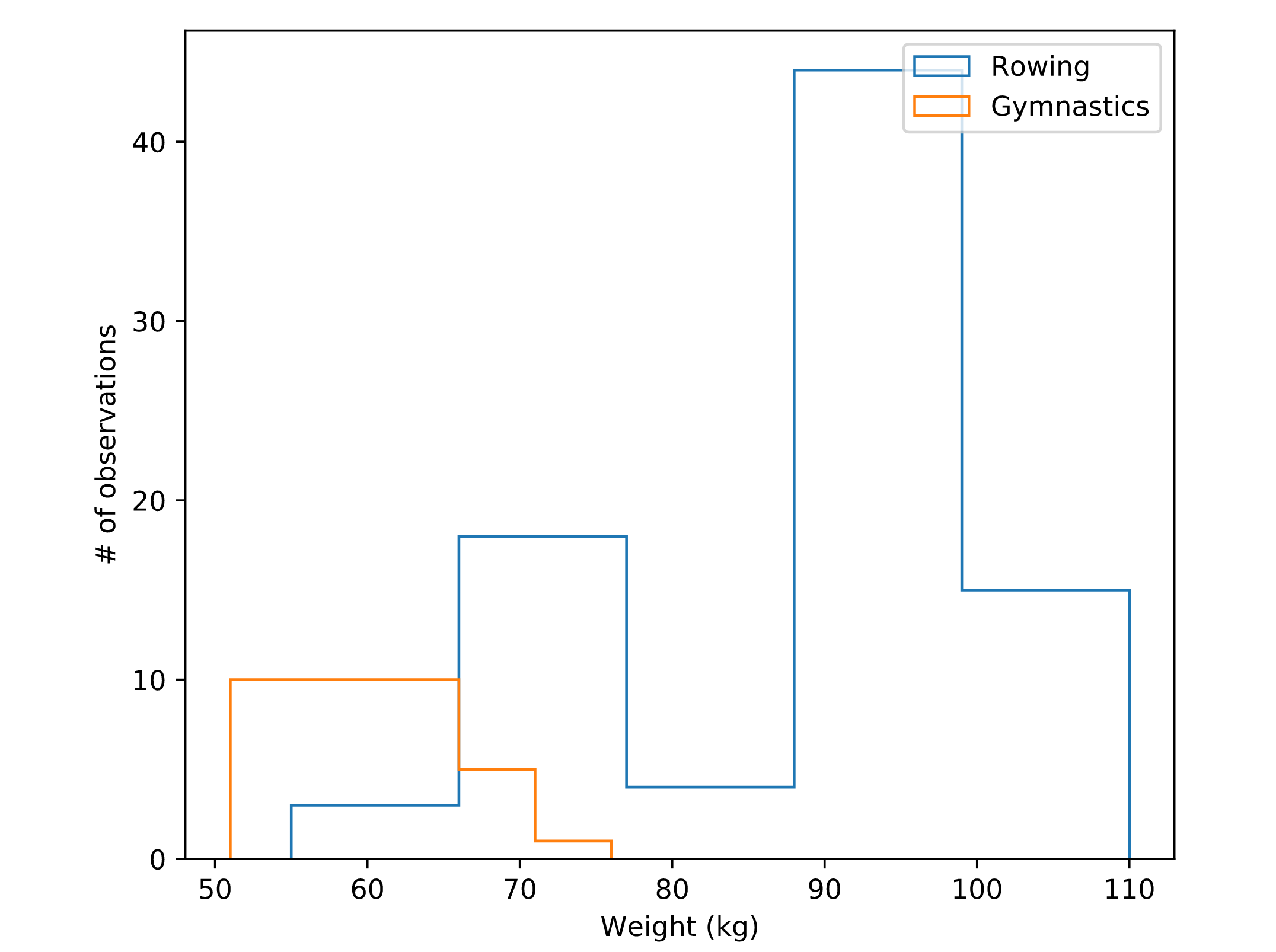
ax.hist(mens_rowing['Height'], label='Rowing', bins=[150, 160, 170, 180, 190, 200, 210], histtype='step')
Step histogram
fig, ax = plt.subplots()

# Plot a histogram of "Weight" for mens_rowing
ax.hist(mens_rowing['Weight'], label='Rowing', bins=5, histtype='step')

# Compare to histogram of "Weight" for mens_gymnastics
ax.hist(mens_gymnastics['Weight'], label='Gymnastics', bins=5, histtype='step')

ax.set_xlabel("Weight (kg)")
ax.set_ylabel("# of observations")

# Add the legend and show the Figure
ax.legend()
plt.show()
Statistical Plotting
Adding error-bars to a bar chart
ax.bar("Rowing", mens_rowing['Height'].mean(), yerr=mens_rowing['Height'].std())
Adding error-bars to a plot
errorbars()method
fig, ax = plt.subplots()

# Add Seattle temperature data in each month with error bars
ax.errorbar(seattle_weather['MONTH'], seattle_weather['MLY-TAVG-NORMAL'], yerr=seattle_weather['MLY-TAVG-STDDEV'])

# Add Austin temperature data in each month with error bars
ax.errorbar(austin_weather['MONTH'], austin_weather['MLY-TAVG-NORMAL'], yerr=austin_weather['MLY-TAVG-STDDEV'])

# Set the y-axis label
ax.set_ylabel("Temperature (Fahrenheit)")

plt.show()
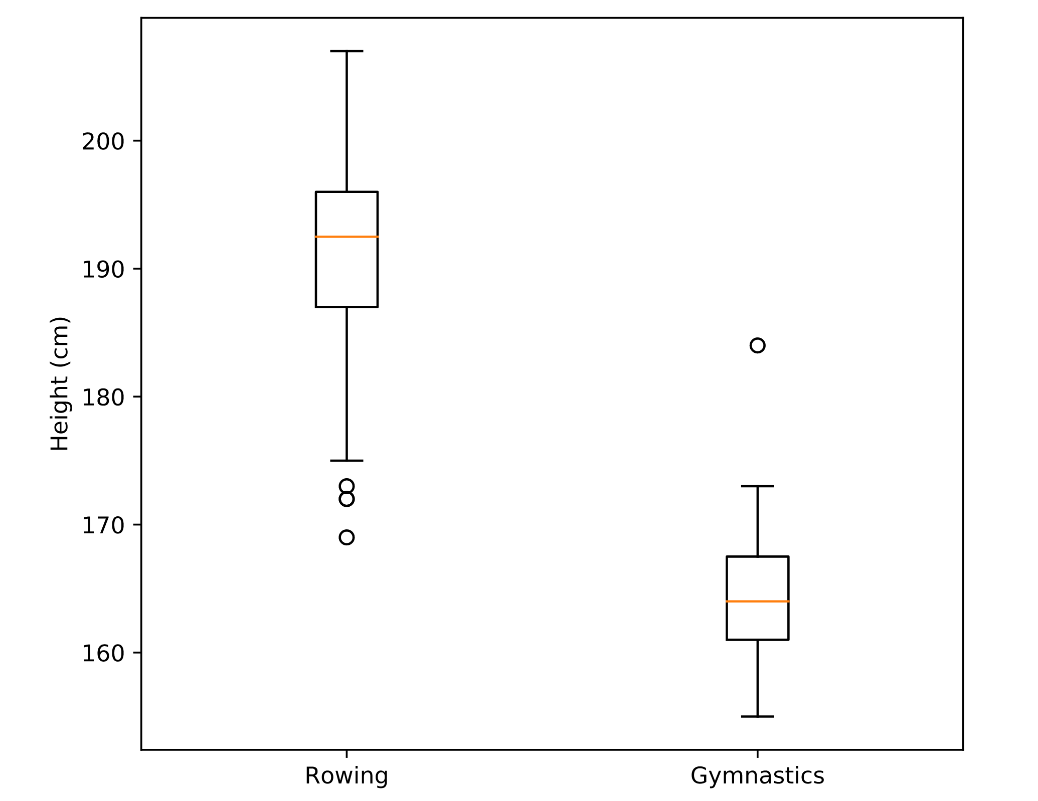
Boxplot
ax.boxplot()- Boxplots provide additional information about the distribution of the data that they represent. They tell us what the median of the distribution is, what the inter-quartile range is and also what the expected range of approximately 99% of the data should be. Outliers beyond this range are particularly highlighted`
fig, ax = plt.subplots()

# Add a boxplot for the "Height" column in the DataFrames
ax.boxplot([mens_rowing['Height'],mens_gymnastics['Height']])

# Add x-axis tick labels:
ax.set_xticklabels(['Rowing','Gymnastics'])

# Add a y-axis label
ax.set_ylabel('Height (cm)')

plt.show()
Scatter plots
- bi-variate comparison
Encoding time in color
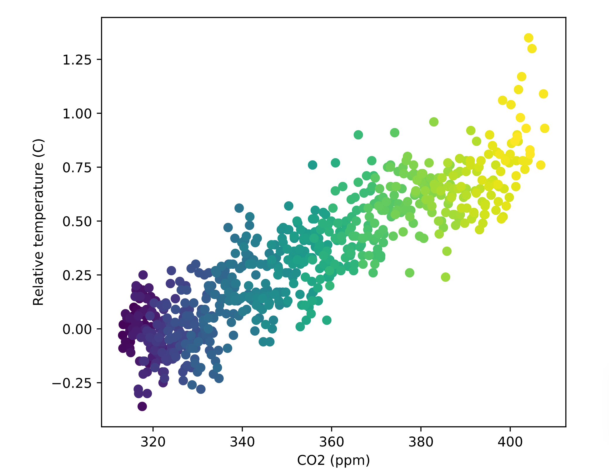
fig, ax = plt.subplots()

# Add data: "co2", "relative_temp" as x-y, index as color
ax.scatter(climate_change['co2'],climate_change['relative_temp'],c=climate_change.index)

# Set the x-axis label to "CO2 (ppm)"
ax.set_xlabel("CO2 (ppm)")

# Set the y-axis label to "Relative temperature (C)"
ax.set_ylabel("Relative temperature (C)")

plt.show()