Plot time-series data
# Import pandas
import pandas as pd

# Read the data from file using read_csv
climate_change = pd.read_csv('climate_change.csv', parse_dates=["date"], index_col="date")

import matplotlib.pyplot as plt
fig, ax = plt.subplots()

# Add the time-series for "relative_temp" to the plot
ax.plot(climate_change.index, climate_change["relative_temp"])

# Set the x-axis label
ax.set_xlabel("Time")

# Set the y-axis label
ax.set_ylabel("Relative temperature (Celsius)")

# Show the figure
plt.show()
using time-index to zoom in
import matplotlib.pyplot as plt

# Use plt.subplots to create fig and ax
fig, ax = plt.subplots()

# Create variable seventies with data from "1970-01-01" to "1979-12-31"
seventies = climate_change["1970-01-01":"1979-12-31"]

# Add the time-series for "co2" data from seventies to the plot
ax.plot(seventies.index, seventies["co2"])

# Show the figure
plt.show()
Plotting time-series with different variables
- 'ax.twinx()`:create a twin Axes object that shares the x-axis
Defining a function that plots time-series data
# Define a function called plot_timeseries
def plot_timeseries(axes, x, y, color, xlabel, ylabel):

  # Plot the inputs x,y in the provided color
  axes.plot(x, y, color=color)

  # Set the x-axis label
  axes.set_xlabel(xlabel)

  # Set the y-axis label
  axes.set_ylabel(ylabel, color=color)

  # Set the colors tick params for y-axis
  axes.tick_params('y', colors=color)
Using a plot function
fig, ax = plt.subplots()

# Plot the CO2 levels time-series in blue
plot_timeseries(ax, climate_change.index, climate_change["co2"], "blue", "Time (years)", "CO2 levels")

# Create a twin Axes object that shares the x-axis
ax2 = ax.twinx()

# Plot the relative temperature data in red
plot_timeseries(ax2, climate_change.index, climate_change["relative_temp"], "red", "Time (years)", "Relative temperature (Celsius)")

plt.show()
Annotating time-series data
ax.annotate("some text", xy=(,), xytext=())
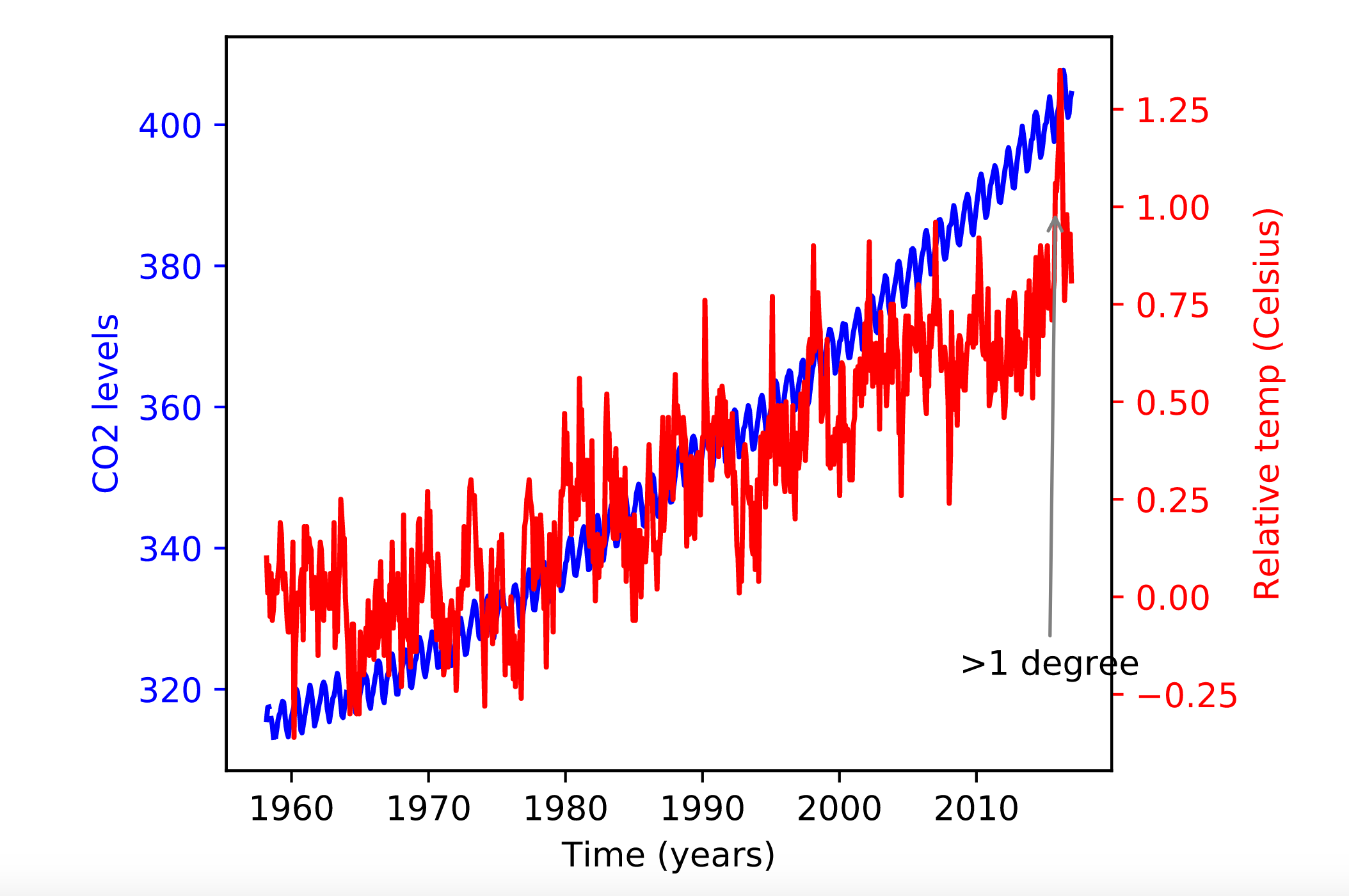
fig, ax = plt.subplots()

# Plot the CO2 levels time-series in blue
plot_timeseries(ax, climate_change.index, climate_change['co2'], 'blue', "Time (years)", "CO2 levels")

# Create an Axes object that shares the x-axis
ax2 = ax.twinx()

# Plot the relative temperature data in red
plot_timeseries(ax2, climate_change.index, climate_change["relative_temp"], 'red', "Time (years)", 'Relative temp (Celsius)')

# Annotate point with relative temperature >1 degree
ax2.annotate(">1 degree", xy=(pd.Timestamp('2015-10-06'),1), xytext=(pd.Timestamp('2008-10-06'),-0.2), arrowprops={"arrowstyle":"->", "color":"gray"})

plt.show()