05 01 Introduction to Matplotlib - HannaAA17/Data-Scientist-With-Python-datacamp GitHub Wiki
Introduction
Using the matplotlib.pyplot interface
- we will use the pyplot interface to create two kinds of objects:
Figureobjects andAxesobjects.fig, ax = plt.subplots()
- Adding data to an Axes object
ax.plot()
Customizing data apperance
- set markers/ colors/ linestyles:
ax.plot(x, y, marker='v', color='r', linestyle='--')
- axis labels and titles
ax.set_xlable(),ax.set_ylabel(),ax.set_title()
Small multiples
- create a
Figurewith 6Axesobjects organized in 3 rows and 2 colums:fig, ax = plt.subplots(3, 2)
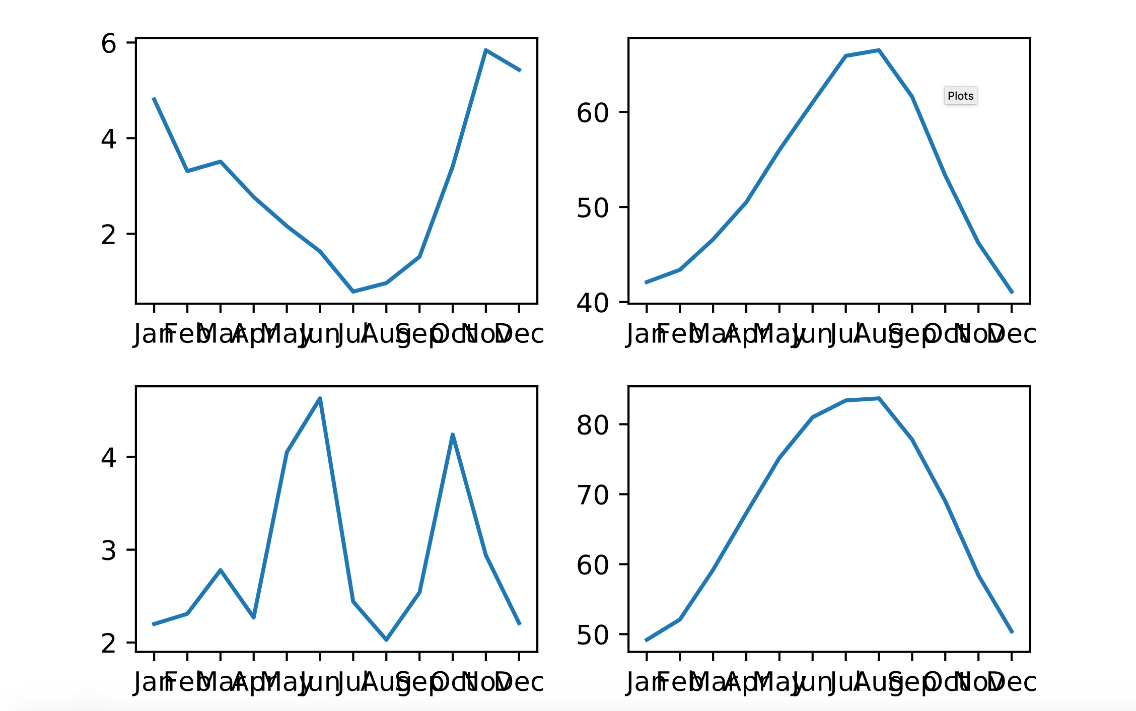
Creating small multiples with plt.subplots
# Create a Figure and an array of subplots with 2 rows and 2 columns
fig, ax = plt.subplots(2, 2)

# Addressing the top left Axes as index 0, 0, plot month and Seattle precipitation
ax[0, 0].plot(seattle_weather["MONTH"], seattle_weather["MLY-PRCP-NORMAL"])

# In the top right (index 0,1), plot month and Seattle temperatures
ax[0, 1].plot(seattle_weather["MONTH"], seattle_weather["MLY-TAVG-NORMAL"])

# In the bottom left (1, 0) plot month and Austin precipitations
ax[1,0].plot(austin_weather["MONTH"], austin_weather["MLY-PRCP-NORMAL"])

# In the bottom right (1, 1) plot month and Austin temperatures
ax[1,1].plot(austin_weather["MONTH"], austin_weather["MLY-TAVG-NORMAL"])
plt.show()
output
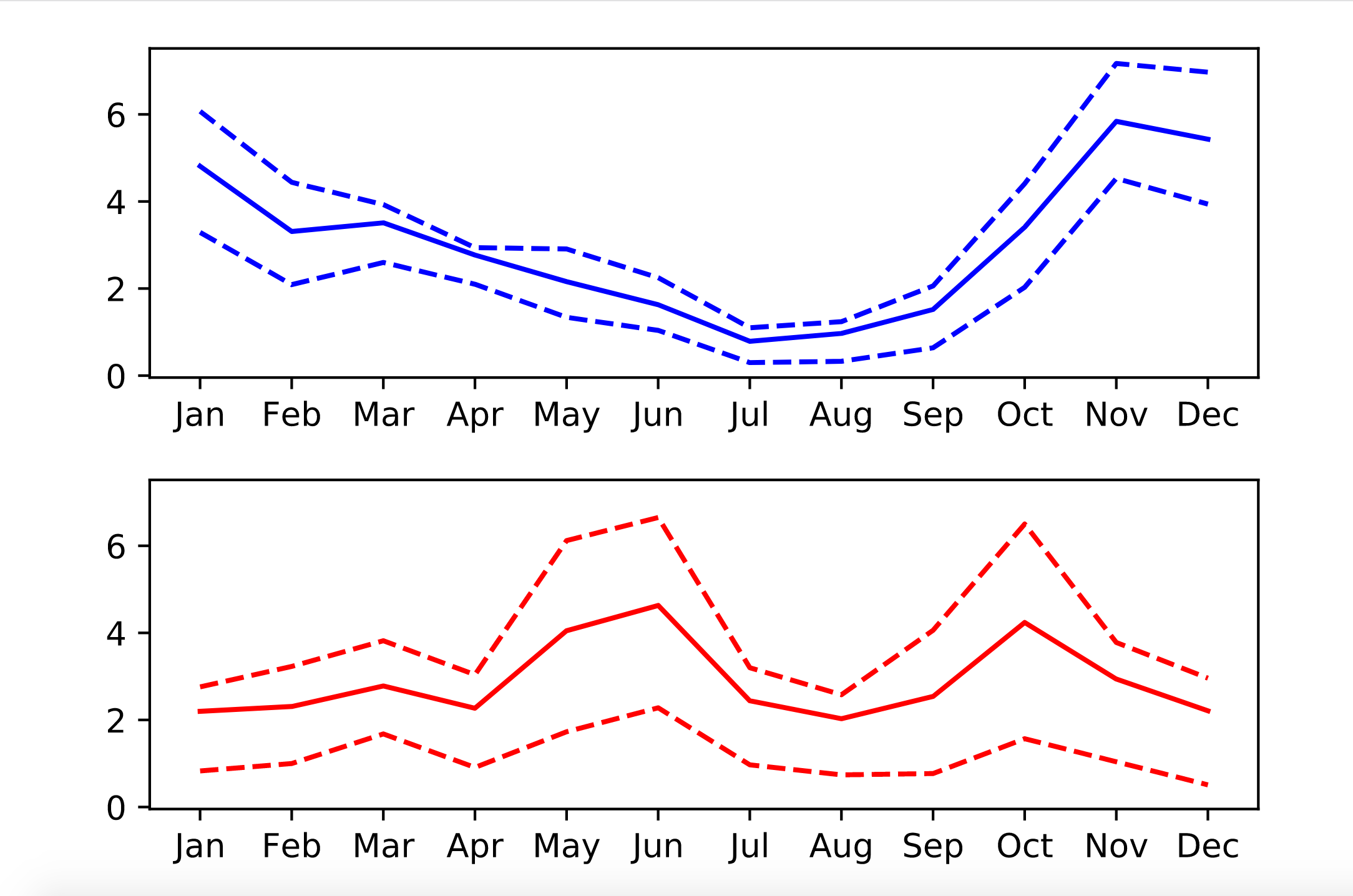
Small multiples with shared y axis
sharey=Truekey-word: to make sure different plots are displayed with the same scale on y-axis
# Create a figure and an array of axes: 2 rows, 1 column with shared y axis
fig, ax = plt.subplots(2, 1, sharey=True)

# Plot Seattle precipitation data in the top axes
ax[0].plot(seattle_weather["MONTH"], seattle_weather["MLY-PRCP-NORMAL"], color = "b")
ax[0].plot(seattle_weather["MONTH"], seattle_weather["MLY-PRCP-25PCTL"], color = "b", linestyle = "--")
ax[0].plot(seattle_weather["MONTH"], seattle_weather["MLY-PRCP-75PCTL"], color = "b", linestyle = "--")

# Plot Austin precipitation data in the bottom axes
ax[1].plot(austin_weather["MONTH"], austin_weather["MLY-PRCP-NORMAL"], color = "r")
ax[1].plot(austin_weather["MONTH"], austin_weather["MLY-PRCP-75PCTL"], color = "r", linestyle = "--")
ax[1].plot(austin_weather["MONTH"], austin_weather["MLY-PRCP-25PCTL"], color = "r", linestyle = "--")

plt.show()
output