02 01 Matplotlib - HannaAA17/Data-Scientist-With-Python-datacamp GitHub Wiki
Basic plots with Matplotlib
line plot
# Print the last item from year and pop
print(year[-1])
print(pop[-1])


# Import matplotlib.pyplot as plt
import matplotlib.pyplot as plt

# Make a line plot: year on the x-axis, pop on the y-axis
plt.plot(year,pop)

# Display the plot with plt.show()
plt.show()
scatter plot
# Change the line plot below to a scatter plot
plt.scatter(gdp_cap, life_exp)

# Put the x-axis on a logarithmic scale
plt.xscale('log')

# Show plot
plt.show
Histogram
- explore dataset
- get idea about distribution
plt.hist(value, bins = )
# Build histogram with 5 bins
plt.hist(life_exp,5)

# Show and clean up plot
plt.show()
plt.clf()

# Build histogram with 20 bins
plt.hist(life_exp,20)

# Show and clean up again
plt.show()
Customization
The choice depends on
- data
- story you want to tell
labels and title
# Basic scatter plot, log scale
plt.scatter(gdp_cap, life_exp)
plt.xscale('log')

# Strings
xlab = 'GDP per Capita [in USD]'
ylab = 'Life Expectancy [in years]'
title = 'World Development in 2007'

# Add axis labels
plt.xlabel(xlab)
plt.ylabel(ylab)


# Add title
plt.title(title)

# After customizing, display the plot
plt.show()
Ticks and Size and Color
# Import numpy as np
import numpy as np

# Store pop as a numpy array: np_pop
np_pop = np.array(pop)

# Double np_pop
np_pop = np_pop * 2

# Update: Specify c and alpha inside plt.scatter()
plt.scatter(gdp_cap, life_exp, s = np_pop, c = col , alpha = 0.8) # col is a list

# Previous customizations
plt.xscale('log')
plt.xlabel('GDP per Capita [in USD]')
plt.ylabel('Life Expectancy [in years]')
plt.title('World Development in 2007')
plt.xticks([1000, 10000, 100000],['1k', '10k', '100k'])

# Display the plot
plt.show()
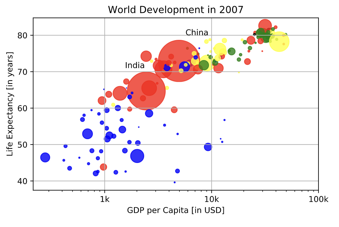
Additional Customization
# Scatter plot
plt.scatter(x = gdp_cap, y = life_exp, s = np.array(pop) * 2, c = col, alpha = 0.8)

# Previous customizations
plt.xscale('log')
plt.xlabel('GDP per Capita [in USD]')
plt.ylabel('Life Expectancy [in years]')
plt.title('World Development in 2007')
plt.xticks([1000,10000,100000], ['1k','10k','100k'])

# Additional customizations
plt.text(1550, 71, 'India')
plt.text(5700, 80, 'China')

# Add grid() call so that gridlines are drawn on the plot
plt.grid(True)

# Show the plot
plt.show()