UG_Special Topics_Working with User Charts - GoldenCheetah/GoldenCheetah GitHub Wiki
CONTENTS
RELATED TOPICS
Formula Syntax and Expressions
Introduction
The user chart was introduced in version 3.6 and can be used on both analysis and trend views. Users can write small, simple formulas and programs to generate data to be plotted.
The user chart provides settings to control how data is visualised (bar, pie, scatter, line) and aesthetics such as size, pen styles and colors.
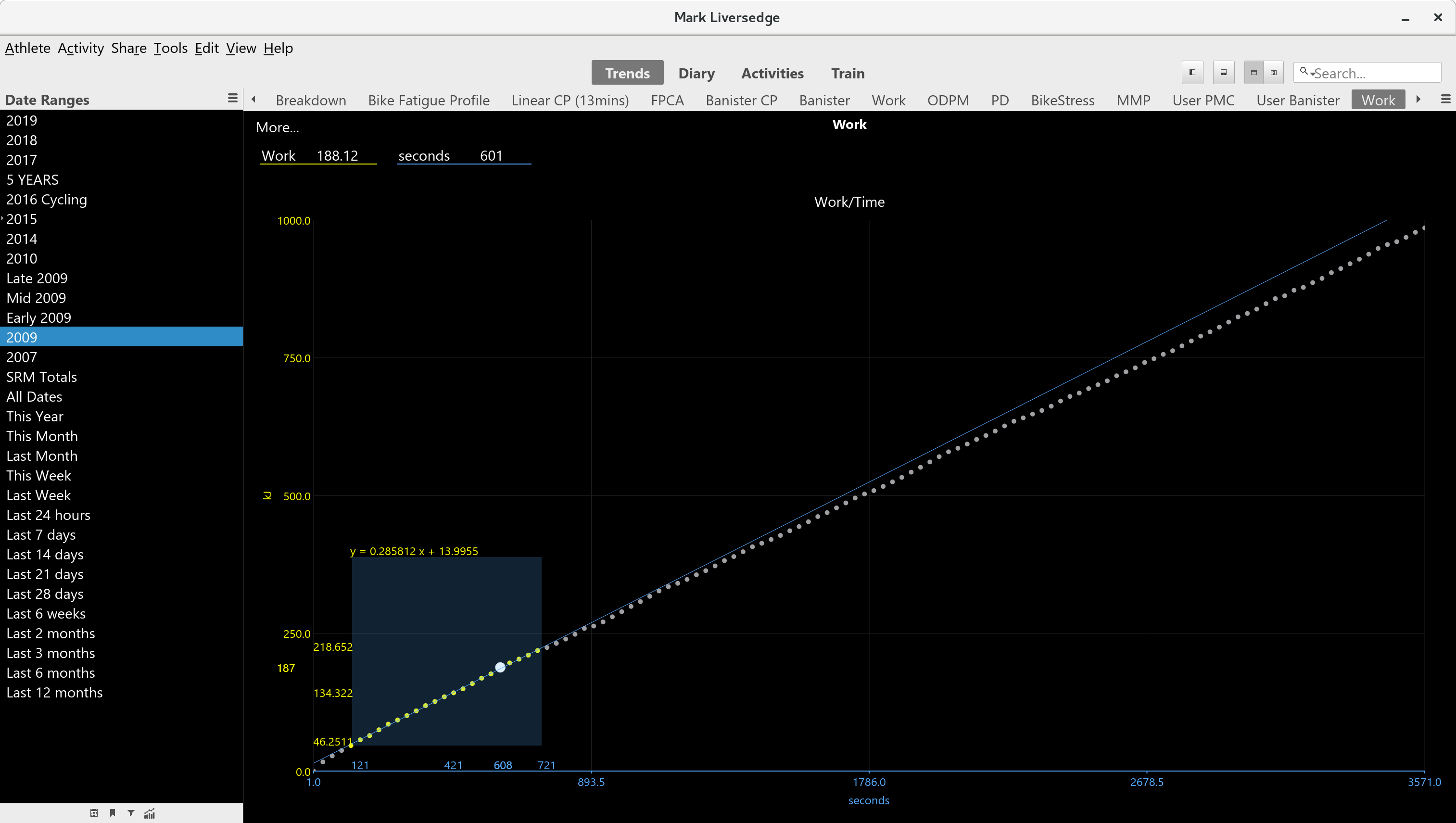
In the chart above (on trends view) the mean max power data has been used to calculate work aggregated over time. The selection rectangle on a scatter plot has been used which calculates a number of statistics, one of which is a linear regression, yielding an estimate of CP and W'.
The chart colors and point size have also been configured, including axis limits and axis type (showing as continuous data, but could have used a time axis instead).
For this chart, the data is prepared by a fairly interesting program:
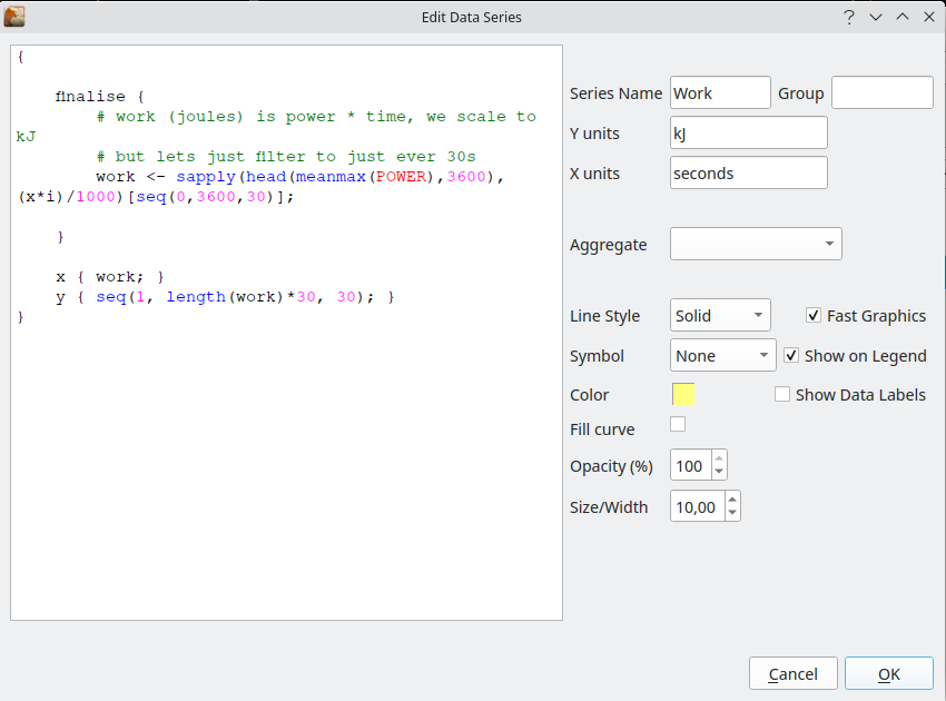
If we ignore a bit of the detail and focus in on the heart of this, you can see that the data is prepared using what looks like a fairly torturous formula:
work <- sapply(head(meanmax(POWER),3600),(x*i)/1000)[seq(0,3600,30)];
This is basically retrieving meanmax power, using the function meanmax(POWER), truncating the data retrieved to the first hour using the function head(..., 3600) and then performing a calculation on each element using the function sapply(..., (x*i)/1000). Lastly the result of this calculation filtered to one point every 30 seconds with a selection at the very end of [seq(0,3600,30)].
At first glance this probably looks like gibberish ... this page is an attempt to explain how some of this works and enable you to develop your own charts. Along the way you will learn a little about functional programming and become familiar with concepts heavily borrowed from both R and Python.
Chart Settings
There are three sets of settings, basic chart settings such as type, series settings such as the formula to prepare data and the color of the curves and lastly, axis settings, such as the range or axis style.
Chart Settings
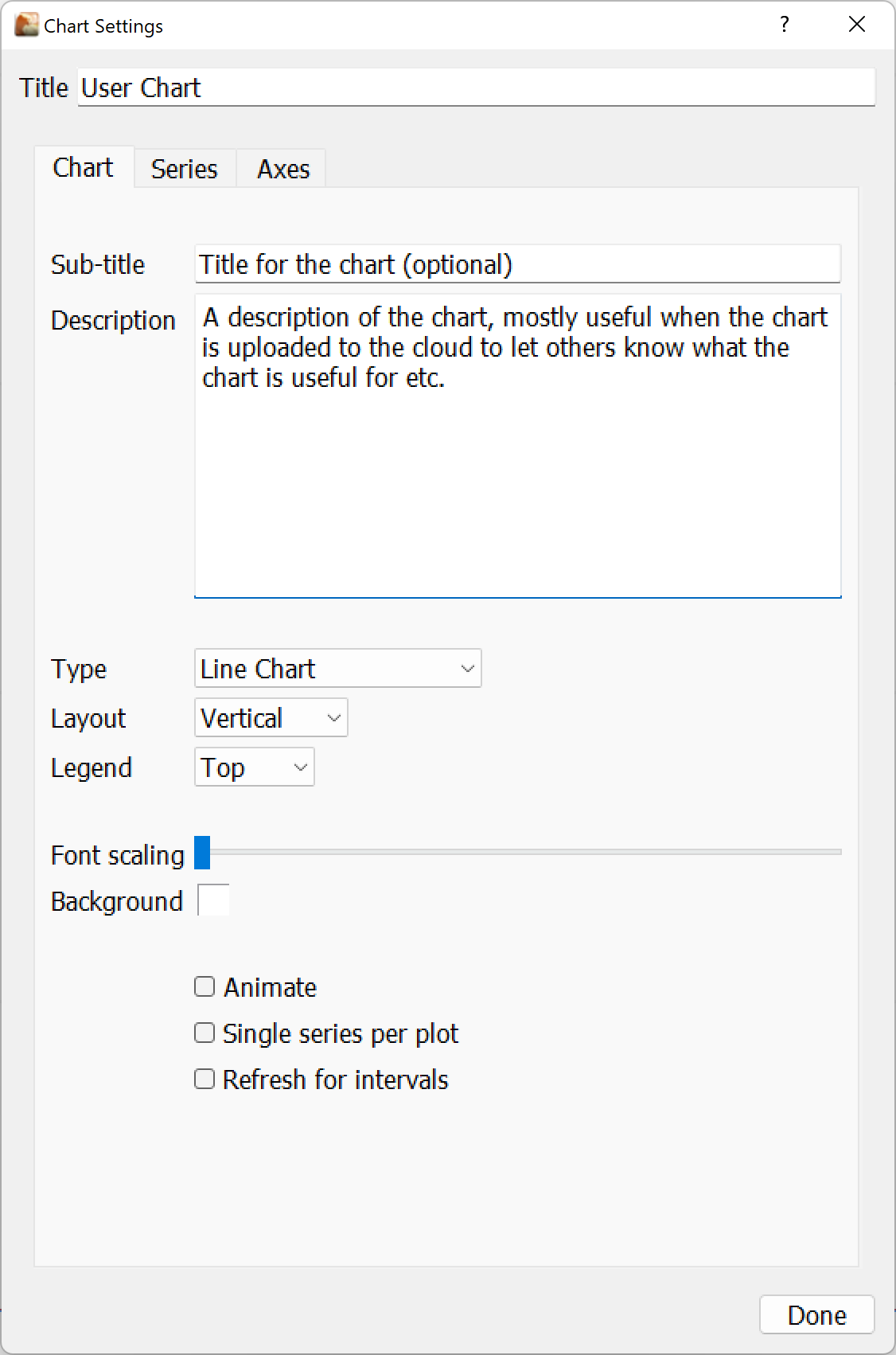
The title will be displayed at the top of the chart, whilst the chart type is one of bar, pie, line and scatter.
The layout direction controls whether separate charts are laid out left to right horizontally or top to bottom vertically. Multiple charts are created when different x-axes are used or series are put into 'groups'.
Each chart will have a separate legend which can be placed at the top, bottom, left or right of the chart. It can also be set to 'none' which hides the legend from view.
Separate plots are created for each X-axis, so if you use the same x-axis for all data series they will be plotted together. You can force each onto its own plot by checking the 'single series per plot' checkbox.
Refresh for intervals option forces the execution of the chart program each time the selected intervals change in Analysis sidebar, it is useful for charts showing data or markers for selected intervals, but otherwise better left disabled for performance reasons.
Font scaling and Background allows to refine these settings for this particular chart, the color can be fixed but also can be one of the standard colors defined in preferences for a better match with the color theme, the same applies to series colors.
Note that each series can also be placed in a group to control this in a more detailed way (series being grouped together with a common group, this is not supported yet but will be developed to support more flexible faceting in the future.
Note: animate setting has been reported to provoke crashes is some setups, if you are experiencing them, please disable animation.
Series Settings
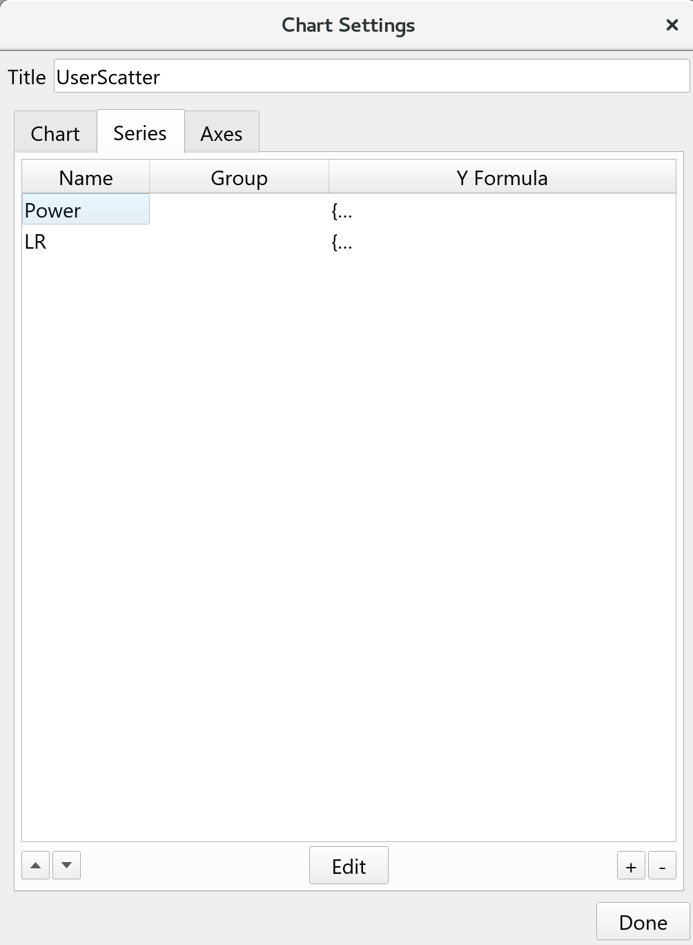
The series tab lists all the series available, they can be created, edited and removed. Additionally the sequence they appear can also be controlled by moving them up and down in the list. Series at the top of the list will be painted before series at the bottom.
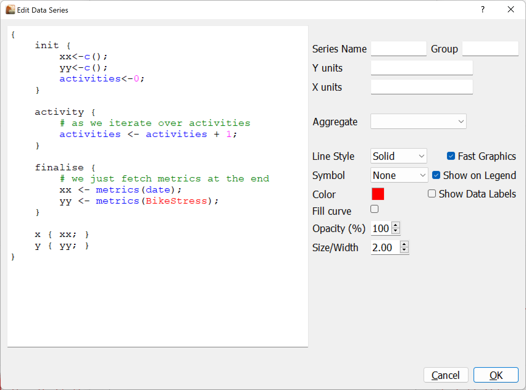
When editing a series you write a small program that fetches and formats the data to plot. This program is described below.
Additionally need to specify the units for the x and y axes along with the main aesthetic options, most of which should be self explanatory and related to the chart type. The Show Data Labels option applies only to Line and Scatter type charts. The Aggregate option (Sum, Average, Peak, Low, etc.) works in pair with the Group By setting for Date type x-axes.
Note that fast graphics means opengl will be used for rendering. This is very fast and highly recommended for plotting sample by sample data. One of the drawbacks of this is the opengl functions used tend to ignore most of the aesthetic options like transparency and datalabels.
Axis Settings
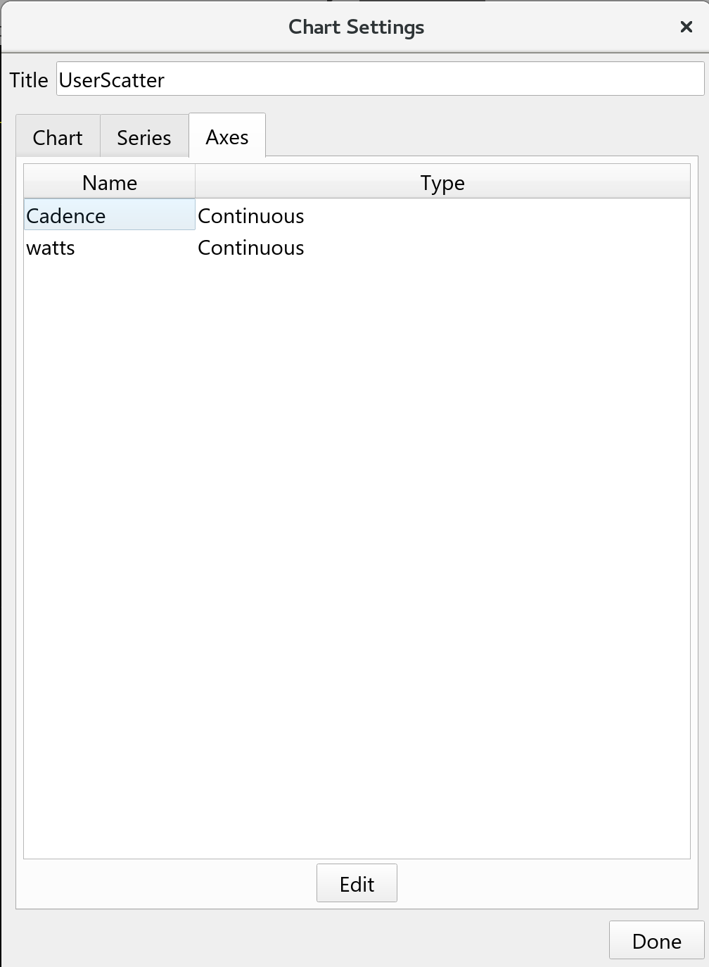
Axes are generated from the series settings; the names you use there will be remembered and listed in the axis list. Each axis will automatically be set to continuous and max/min values will adjust to reflect the data you are plotting. You can override these and maintain them directly.
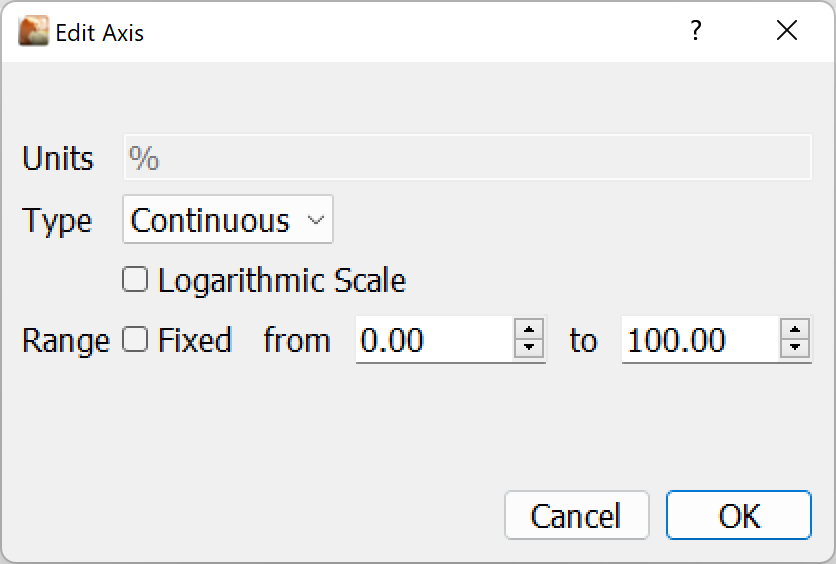
The axis type can be Continuous for normal y data such as power, cadence etc. with an option for a log scale.
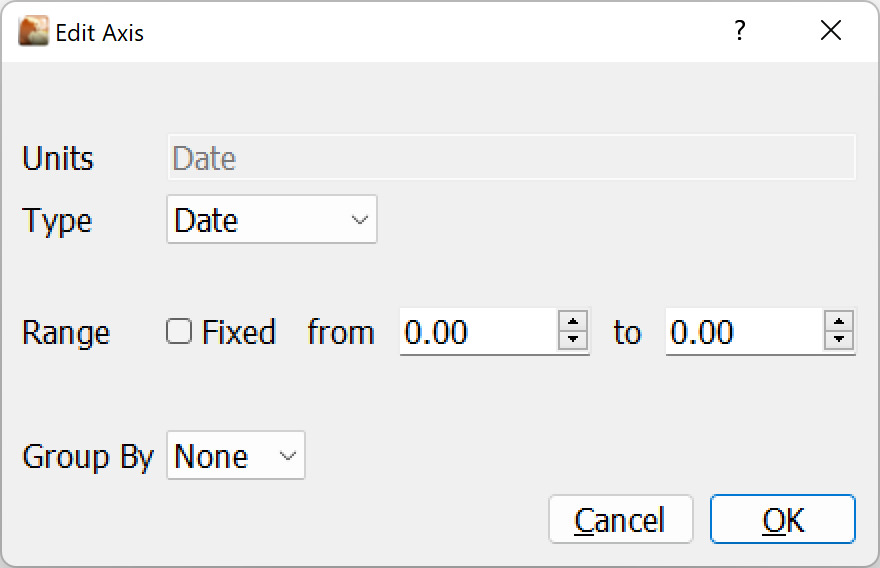
The Date axis will format in dates, and is useful for the trends view, with an option to Group By Days, Weeks, Months or Years; which works in pair with the Aggregate option for the corresponding series.
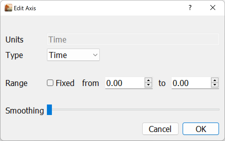
Lastly, the Time view will expect data to be recorded in seconds and will be displayed with a time format eg. 01:23:45, with an optional smoothing to reduce the points in the plot.
NOTE:
- At this point it is not possible to customize major and minor ticks, but this may be added in the future.
- Mixing log scale and date/time axes is not possible at present due to a qt bug.
- A Date and Time axis only works as x-axis in v3.6
The Series Program
{
    init {
        activities<-0;
    }

    activity {
        # as we iterate over activities
        activities <- activities + 1;
    }

    finalise {
        # we just fetch metrics at the end
        xx <- metrics(date);
        yy <- metrics(BikeStress);
    }

    x { xx; }
    y { yy; }
}
The following functions are supported:
init- intialise called at the very startrelevant- return true or false if the series is relevant for this activity/date rangesample- called on analysis view for every data point in the activityactivity- called on trends view for every activity in the date range selectedfinalise- after iterating and before calling x,y (and z,d,t)x- returns the data series x values as a vectory- returns the data series y values as a vectorz- returns the data series z values as a vectorf- returns the filenames for each point as a vector (for click-thru on a scatter trends chart)
Functions: x,y,z and f
In order to retrieve, wrangle and prepare data for a series the user writes a small program. Like the user metrics program there are a number of functions available, and are all optional. If you do not provide an x or y function nothing will be plotted.
There are four functions that are expected to return data, they are called last:
xreturns the x-axis data for all points to plot as avectoryreturns the y-axis data for all points to plot as avectorzreturns an optional set of data to augment the points when hovering over a data point.freturns an optional filename (as returned by the datafilter functionfilename)
NOTE:
z is not currently used, but will be added as an enhancement as development completes.
Typically, when working with activities, x and y will be SECS and a data series like POWER. When working with seasons (on the trends view) x and y might be DATE and a metric like BikeStress.
So, a very simple program on activities view to plot power over time would be as simple as:
{
   x { samples(DATE); }
   y { samples(POWER); }
}
This program uses the samples function to retrieve a vector of all sample data in one go. If it needs to do more, such as work with data and perform calculations to generate x and y data then there are other options available.
For obvious reasons the x,y,z,d and t functions must all return vectors of the same length. Since each element is related to the same data point. ie. x[0], y[0], z[0], d[0] and t[0] are all related to 'point'[0].
Functions: relevant, init and finalise
The init function is always called, regardless of anything else. It is an opportunity to set variables and get ready. Typically it is used to set values to a starting point. It is called before relevant.
The relevant function returns a zero or non-zero value to indicate if this data series is relevant to the plot. For example, if you are plotting power related data and the power series is not present in the activity you might return a zero value. This means that no further processing will take place (and make your plotting a little faster).
Here are a few examples of the data series:
- T - Time
- D - Distance
- S - Speed
- P - Power
- H - Heartrate
- C - Cadence
- N - Torque
- A - Altitude
- G - GPS
- L - Slope
- W - Windspeed
- E - Temperature
- V - "Vector" aka Left/Right pedal data
- O - "Moxy" SMO2/Haemoglobin
- R - Garmin Running Dynamics
In this example, smoothed power is being plotted, but only if POWER is present in the activity:
{
    relevant { Data contains "P"; }

    x { samples(SECS); }
    y { smooth(samples(POWER),sma,centered,25); }
}
The function finalise is called just before calling x,y,z,d and t. This is an excellent opportunity to either finish off calculations (see iterating with the sample or activity function below).
In many cases the finalise function might be the only thing you do (aside from x and y to return the data). If you avoid using iteration, and instead collect data using functions like meanmax. samples and metrics then you should do this in the finalise function.
Here is an example from a trends plot that fits a model to filtered mean-maximal power data to draw a power-duration curve. Note how the program prepares two variables xx and yy, these are the values returned by x and y functions. We will explain the lm and efforts functions later, so don't worry too much about the details at this point.
IMPORTANT: The variables x and i have special meaning (which will be covered below), you should avoid ever using variables with these names as unexpected things will happen !!.
{

    finalise {
        # raw data to fit with, just first 20 minutes
        mmp <- meanmax(POWER);
        len <- length(mmp);
        efforts <- meanmax(efforts);
        secs <- seq(1,1200,1)[efforts]; # limit to first 1200s
        mmp <- mmp[i<1200][efforts];    # limit to first 1200s


        # fit starting values, then LM fit the Morton 3p model to first 20 min data
        cp <- 200; W<-11000; pmax <- 1000;
        fit <- lm((W / (x - (W/(cp-pmax)))) + cp, secs, mmp);

        # success, generate prediction data
        if (fit[0] <> 0) {
            annotate(label, "CP", round(cp));
            annotate(label, "W'", round(W));
            annotate(label, "CV=", round(fit[2]*100)/100, "%");
            xx <- seq(1, len, 1);
            yy <- sapply(xx, (W / (x - (W/(cp-pmax)))) + cp);
        }

    }

    x { xx; }
    y { yy; }
}
Functions: iterating with sample, activity and sapply
When the user chart is present on the Analysis view an additional function sample is called once for each sample in the activity in sequence. i.e. to iterate over activity data points.
When the user chart is present on the Trends view, it will call activity to iterate over each activity in date range selected, in its body the iterated activity becomes the current activity for all functions which use it.
These iteration functions may be useful for collecting data and computing across the activity. In practice this is less likely, since the sapply function also allows you to iterate over activities, samples and any other vectors s.t. measures, intervals, bests, etc.
So for example, these two programs are equivalent (put aside the c() and append() functions we will explain them later).
Iterating with sample()
Plotting power above CP as a data series, collecting the series by iterating.
{
    init { xx <- c(); yy<- c(); }

    sample {
        append(xx, max(0,POWER-config(cp)));
        append(yy, SECS);
    }

    x { xx; }
    y { yy; }
Iterating with sapply()
Plotting power above CP by using sapply with a vector of all data samples. When using sapply the 2nd parameter is an expression to evaluate for each element in the vector. Variables x refer to the value being evaluated and i refer to the index in the vector.
{
    finalise {
        xx <- samples(SECS);
        yy <- sapply(samples(POWER), { max(0, x - config(cp)); } );
    }

    x { xx; }
    y { yy; }
}
Iterating with activity()
Plotting configured Bike CP as a data series by iterating over activities in the selected date range of Trends View:
{
    init { xx <- c(); yy<- c(); }

    activity {
        if (isRide) {
            append(xx, Date);
            append(yy, config(cp));
        }
    }

    x { xx; }
    y { yy; }
}
Alternatively the activities() function allows to apply an expression to a filtered list of activities.
Retrieving curve data
Often you want to avoid recomputing the same data series as you plot, a good example is when plotting models and actuals and wanting to compute the residuals. In this case the curve(series, x|y|z|d|t) function is really handy. It will fetch the data from another curve to avoid having to calculate again.
Here is an example, a plot of normalised residuals for a model fit against bests data, where two other curves are called Model and Bests:
{

    finalise {
        yy <- curve(Model, y);
        res <- curve(Bests, y) - yy;
        sigma <- stddev(res);
        res <- res / sigma;
        annotate(label, "Standard Deviation", sigma);
    }

    x { yy; }
    y { res; }
}
NOTE: You must make sure the curves data you are retrieving is ordered above this series in the series list to ensure it is computed before this curve.
Adding annotations to the chart
It is possible to display label texts next to the legend (and they will follow the legend position wherever you choose to place it).
Within the program you call the function annotate with as many paramters as you like. It will turn each parameter into a text and then join them together with a space.
We saw an example above where the model fit parameter estimates are displayed at the top of the chart with the code:
annotate(label, "CP", round(cp));
annotate(label, "W'", round(W));
annotate(label, "CV=", round(fit[2]*100)/100, "%");
The first parameter, label is just a symbol to say what kind of annotation we are adding. At this point in time we support the following annotation types, others will follow.
annotate(label, "CP ", config(cp), " watts"); # add some labels to the top of the chart
annotate(lr, solid, "red"); # add a linear regression for the current series with style solid and color red
annotate(vline, "Average Cadence", solid, mean(xx)) # add a vertical line for mean xx
annotate(hline, "Average Power", solid, mean(yy)) # add a horizontal line for mean yy
annotate(voronoi, kmeans(centers, 50, xx, yy)); # overlay a voronoi diagram (make sure xx and yy have common dimensions/normalise them)
For example, the following code will add vertical line markers for start and stop of selected intervals in an Activities chart with Time x-axis:
sapply(intervalstrings(name),
       {
           if (intervals(selected)[i]) {
               annotate(vline, x, dot, intervals(start)[i]);
               annotate(vline, x, dash, intervals(stop)[i]);
           }
       });
and this one a vertical line for each event in the current season in a Trends chart with a Date x-axis:
sapply(events(date), { annotate(vline, events(name)[i], solid, x); });
Example Programs
Example using XData
For running activities containing Running Dynamics data, STEPLENGTH is available as an EXTRA XData field, this example plots the sample by sample data with an average annotation:
{
    relevant {
        Data contains "R";
    }

    finalise {
        # we just fetch samples at end
        xx <- xdata("EXTRA", secs);
        yy <- xdata("EXTRA", "STEPLENGTH");
        annotate(label, "AVG", round(mean(yy)));
    }

    x { xx; }
    y { yy; }
}
Example using Intervals in Activities View
The following code plots HR as a percentage of Heart Rate Reserve for the first interval selected in the side bar, or the whole activity when no interval is selected, plus an average line marker:
{
    relevant {
        Data contains "H";
    }

    init {
        HRR<-config(maxhr)-config(rhr);
    }

    finalise {
        # we just fetch samples at end
        sel <- nonzero(intervals(selected));
        start <- length(sel)=0 ? 0 : intervals(start)[sel][0];
        stop <- length(sel)=0 ? length(samples(SECS)) : intervals(stop)[sel][0];
        idx <- seq(lowerbound(samples(SECS),start), lowerbound(samples(SECS),stop), 1);
        xx <- samples(SECS)[idx];
        yy <- 100*(samples(HEARTRATE)[idx]-config(rhr))/HRR;
        annotate(label, "Avg", round(mean(yy)));
        annotate(hline, "HRR% Avg", solid,round(mean(yy)));
    }

    x { xx; }
    y { yy; }
}
Example using Intervals in Trends View
Suppose you have test intervals named "My Test Segment" in this example, may be maximal efforts over the same route or submaximal efforts at a constant heart rate, and you want to plot average power (or speed) over time in a Scatter chart for Trends view, the following code filters intervals in the selected date range and plot the data, with the ability to drill-down to the corresponding activity clicking a data point:
{
    init {
        idx <- nonzero(sapply(intervalstrings(name), x="My Test Segment"));
    }
    x { intervals(date)[idx]; }
    y { intervals(Average_Speed)[idx]; }
    f { intervalstrings(filename)[idx]; }
}
Example using mean maximal power data and configured model parameters
The following code plots 2 series using the same x-axis in seconds, typically using a log scale. The first series is called Power and represents the mean maximal power for the selected ride if used in Activities view or the selected date range in Trends view:
{
    relevant {
        Data contains "P";
    }

    finalise {
        mmp <- meanmax(POWER);
        secs <- seq(1,length(mmp),1);
        multiuniq(mmp,secs);
    }
    x { secs; }
    y { round(mmp); }
}
The second series is the Morton 3 parameters model using Pmax, CP and W' configured athlete's zones:
{
    relevant {
        Data contains "P";
    }

    finalise {
        # Morton 3 param model
        secs <- curve(Power, x);
        model <- config(cp) + config(w')/(secs+config(w')/(config(pmax)-config(cp)));
        annotate(label, "Pmax", config(pmax));
        annotate(label, "CP", config(cp));
        annotate(label, "W'", config(w'));
    }

    x { secs; }
    y { round(model); }
}
BACK: Special Topics: Overview
BACK: Table of contents