UG_ChartTypes_Trends - GoldenCheetah/GoldenCheetah GitHub Wiki
Chart Types: Trends view
The Trends view offers Chart Types which work on a range of activities. The activities which are considered when opening a chart here selected based on the Date Range selected - as well as the actual Search/Filter settings.
Note: Both selection criteria Date Range and Search/Filter can also be configured within a concrete chart of the Chart bar. This means the more general settings of the Side Bar are ignored in such cases.
This is a modern looking fully configurable dashboard introduced in v3.6:
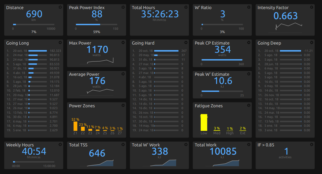
Tiles can be reordered by drag and drop and resized dragging their right/bottom borders. Holding shift key while dragging the right border allows to span several columns. Font sizes are updated automatically when columns are added, removed or resized. Tiles can be removed and configured using the "cog" icon in the upper right:
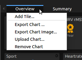
New tiles can be added using the chart menu Add Tile:
which allows to select the type of tile to add:
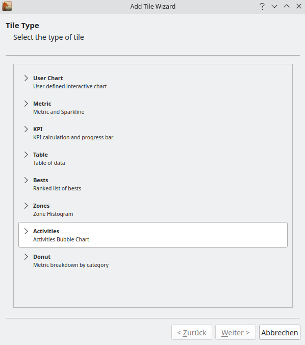
and to configure its settings, which can be just to select a couple of metrics or metadata fields or a more complex formula for others s.t. the KPI tile.
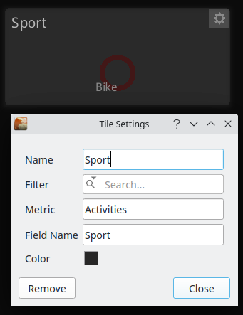
All tiles in Trends Overview allows to set a filter formula to select the activities from the current date range, for example to have tiles specific for one sport.
Embedded user defined interactive chart, see Working with User Charts
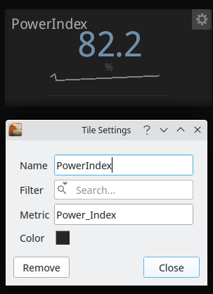
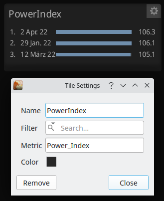
The Metric tile allows to display a builtin or user defined metric aggregated for the current date range according to metric type, with some context consisting of a sparkline with cumulative sum for total type metrics or previous values for other metric types, corresponding to activities in the date range. The metric to be used can be changed in tile configuration with the help of a completer, for the full list and description of available builtin metrics see Metric Reference.
Key Performance Indicator calculation and progress bar:
If you don’t want a progress bar set both limits to 0. For details about how to write formulas see Formula Syntax and Expressions
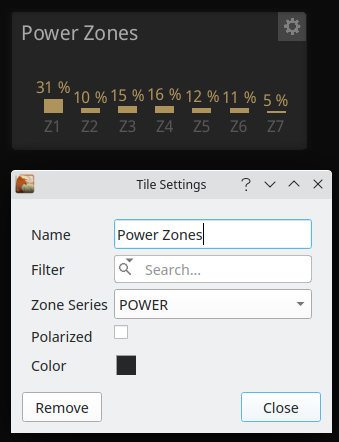
Zone Histogram plotted as a bar chart using default color for the series or a selected one, series can be one of:
- POWER
- HEARTRATE
- SPEED (Pace)
- WBAL
Standard Zones for the sport are used, unless the Polarized checkbox is set to use the 3 zones model.
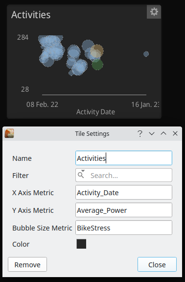
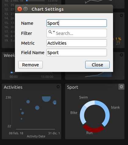
The activities Bubble Chart allows to configure 3 metrics (User defined or built in):
- for the x-axis value
- for the y-axis value
- for the bubble size
Each bubble corresponds to one activity and a click changes to Activities view to see more details, the left arrow in the toolbar can be used to navigate back.
Ranked list of bests based in a configurable metric (User defined or built in) which determines the ordering criteria. A click on one activity changes to Activities view to see more details, and the left arrow in the toolbar can be used to navigate back.
A Donut chart where you can specify a metadata field for the category breakdown, and a metric (User defined or built in) for the percentages calculation.
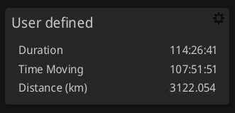
This tile allows to display information in tabular format using the formula language with 2 alternatives:
- Simple: first column is a name with optional units in brackets, second column the corresponding values
- Multi: first row is names, second row units and next rows have the values. First column typically identify an entity s.t. an interval or power zone. Data can be reordered interactively clicking on the column headers, the values can be colored according to a scale, and a click on a row can select an activity in Activities View to drilldown for more details.
Data can be exported to a CSV file using the tile config dialog.
Included legacy programs are intended to replace the tables in deprecated Summary chart:
- Totals, Averages, Maximums and Metrics are simple tables to display a list of metrics
- Zones and Activities are multi tables to display time in zone distributions and activity metrics
When you select one of these the program text box is filled accordingly so you can customize it to your taste, an additional User Defined option shows a template program to get you started with a simple table:
{

# column names, if using metrics then best
# to use metricname() to get correct name for locale
# otherwise it won't translate to other languages
names {
    metricname(Duration,
         Time_Moving,
         Distance,
         Work,
         W'_Work,
         Elevation_Gain);
}

# column units, if using metrics then best
# to use metricunit() function to get correct string
# for locale and metric/imperial
units {
    metricunit(Duration,
         Time_Moving,
         Distance,
         Work,
         W'_Work,
         Elevation_Gain);
}

# values to display as doubles or strings
# if using metrics always best to use asaggstring()
# to convert correctly with dp, metric/imperial
# or specific formats eg. rowing pace xx/500m
values {
    asaggstring(Duration,
             Time_Moving,
             Distance,
             Work,
             W'_Work,
             Elevation_Gain);
}

}
names, units and values are the functions you need to define to return same length vectors of names, units and values respectively.
Multi tables are similar but the values vector is the concatenation of the values vectors for each name/unit, for example the legacy Power Zones table:
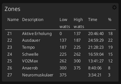
{

# column names, if using metrics then best
# to use metricname() to get correct name for locale
# otherwise it won't translate to other languages
names {
    c("Name","Description","Low","High","Time","%");
}

# column units, if using metrics then best
# to use metricunit() function to get correct string
# for locale and metric/imperial
units {

    c("",
      "",
      zones(power,units),
      zones(power,units), "", "");
}

# values to display as doubles or strings
# if using metrics always best to use asstring()
# to convert correctly with dp, metric/imperial
# or specific formats eg. rowing pace xx/500m
values {

   c( zones(power,name),
      zones(power,description),
      zones(power,low),
      zones(power,high),
      zones(power,time),
      zones(power,percent));
}

}
The Activities legacy program, customized to your current preferred metrics, is a more complete example since it also includes activity drilldown on click using the f function and coloring using the heat function:
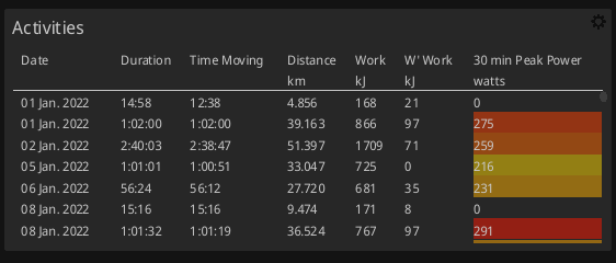
{

# column names, if using metrics then best
# to use metricname() to get correct name for locale
# otherwise it won't translate to other languages
names {
    metricname(date,
         Duration,
         Time_Moving,
         Distance,
         Work,
         W'_Work,
         30_min_Peak_Power);
}

# column units, if using metrics then best
# to use metricunit() function to get correct string
# for locale and metric/imperial
units {
    metricunit(date,
         Duration,
         Time_Moving,
         Distance,
         Work,
         W'_Work,
         30_min_Peak_Power);
}

# values to display as doubles or strings
# if using metrics always best to use metricstrings()
# to convert correctly with dp, metric/imperial
# or specific formats eg. rowing pace xx/500m
values {
    c(metricstrings(date),
      metricstrings(Duration),
      metricstrings(Time_Moving),
      metricstrings(Distance),
      metricstrings(Work),
      metricstrings(W'_Work),
      metricstrings(30_min_Peak_Power));
}

# heat values for coloring the cell
# must be between 0 and 1 where the
heat {
    c(normalize(0,0,metrics(date)),
      normalize(0,0,metrics(Duration)),
      normalize(0,0,metrics(Time_Moving)),
      normalize(0,0,metrics(Distance)),
      normalize(0,0,metrics(Work)),
      normalize(0,0,metrics(W'_Work)),
      normalize(0,300,metrics(30_min_Peak_Power)));
}

# Click thru for the row, we can set the file
# this row represents. In the same way as a user chart.
f {
    filename();
}

}
In a similar way it is possible to tabulate selected metrics for specific intervals, which can be useful to compare performance across a segment in a date range, for example the following program will show date, duration, cadence, hr, power and speed for intervals named "My Test Segment":
{

names {
    metricname(date,
              Duration,
              Average_Cadence,
              Average_Heart_Rate,
              Average_Power,
              Average_Speed);
}

units {
    metricunit(date,
              Duration,
              Average_Cadence,
              Average_Heart_Rate,
              Average_Power,
              Average_Speed);
}

values {
    idx <- nonzero(sapply(intervalstrings(name), x="My Test Segment"));
    c(intervalstrings(date)[idx],
      intervalstrings(Duration)[idx],
      intervalstrings(Average_Cadence)[idx],
      intervalstrings(Average_Heart_Rate)[idx],
      intervalstrings(Average_Power)[idx],
      intervalstrings(Average_Speed)[idx]);
}

f {
    idx <- nonzero(sapply(intervalstrings(name), x="My Test Segment"));
    intervalstrings(filename)[idx];
}
}
In this case default order will be by date, it is possible to use argsort to change it, or just click on the column headers to reorder by that criterium.
The following example allows to tabulate the 20 better values of a best type metric, in this case 5 min Peak Power, together with the date of the achievement and the possibility to click-trough a row to see the activity details:
{

# column names, if using metrics then best
# to use metricname() to get correct name for locale
# otherwise it won't translate to other languages
names {
    c("#",metricname(5_min_Peak_Power), metricname(date));
}

# column units, if using metrics then best
# to use metricunit() function to get correct string
# for locale and metric/imperial
units {
    c("", metricunit(5_min_Peak_Power), "");
}

# values to display as doubles or strings
# if using metrics always best to use asstring()
# to convert correctly with dp, metric/imperial
# or specific formats eg. rowing pace xx/500m
values {

# Preparation and calculation for the column
    power <- round(metrics(5_min_Peak_Power));
    top20 <- tail(argsort(ascend, power),20);

    power20 <- power[top20];
    powerpos20 <- rank(descend, power20);
    date20 <- metricstrings(date)[top20];

# Plot column
    c(powerpos20,power20,date20);
}

# heatmap values are from 0-1 so we use the
# normalize() function to calculate it for the metrics
# in question. When we use normalize(0,0,metric) we
# will always get no heat, you can edit the min
# max values to set the range to set the heat color
heat {
    todayLength <-  metrics(date, today);

    if (length(todayLength) = 1) {
        heatdate <- metrics(date)[top20];
        heattoday <- today;
        heat <- sapply(heatdate,heattoday=x?1:0);

        c(
          normalize(0,3,heat),
          normalize(0,3,heat),
          normalize(0,3,heat)
         );

    } else if (length(todayLength) > 1) {
        powerHead <- metrics(5_min_Peak_Power)[top20];
        heatdate <- metrics(date)[top20];
        heattoday <- today;
        powerMax <- max(powerHead[heatdate[i]=heattoday]);
        heat <- sapply(powerHead,powerMax=x?1:0);

        c(
          normalize(0,3,heat),
          normalize(0,3,heat),
          normalize(0,3,heat)
         );
    }
}

# Click thru for the row, we can set the file
# this row represents. In the same way as a user chart.
f {
    filename()[top20];
}

}
The language used for the programs above is documented in Formula Syntax and Expressions.
The long term metrics provided by the Metrics Trends covers all pre-defined metrics but allows also to add self-defined Best value metrics as well as Estimate metrics.
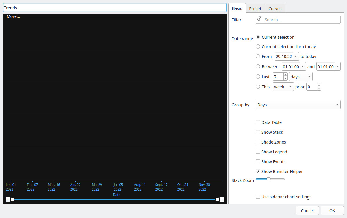
The first screen of the dialog box to add a Metric Trends chart are the basic settings. To ease the configuration, you will see the results of your configuration already in the Preview section on the left side of the dialog box. This simplifies configuration without a lot navigation between the settings and the resulting chart.
-
Filter - define chart specific
Search/Filtercriteria -
Date Range - define chart specific
Date Rangesettings -
Group by- defines the default grouping setting of the metrics - you can interactively change the grouping when displaying the chart -
Data Table- if checked, not curves, but a table with the data / curve values used is shown. Note: table rows are truncated to the shortest data series, unlike the curves plot, there is no zero padding. -
Show Stack- if checked, the different curves are shown separately one above the other (see alsoStack Zoom) -
Shade Zones- if checked / and the chart has a power related metrics - shows the power-zones -
Show Legend- if checked, shows the legend of the curves included in the chart -
Show Events- if checked, shows events (if events are defined) -
Stack Zoom- zooms the diagrams ifShow Stackis checked
GoldenCheetah comes with a number of Presets for your charts - when creating a new Athlete the presets are taken over to the athlete's library - and from that point on, any changes, enhancements of this presets are athlete specific.
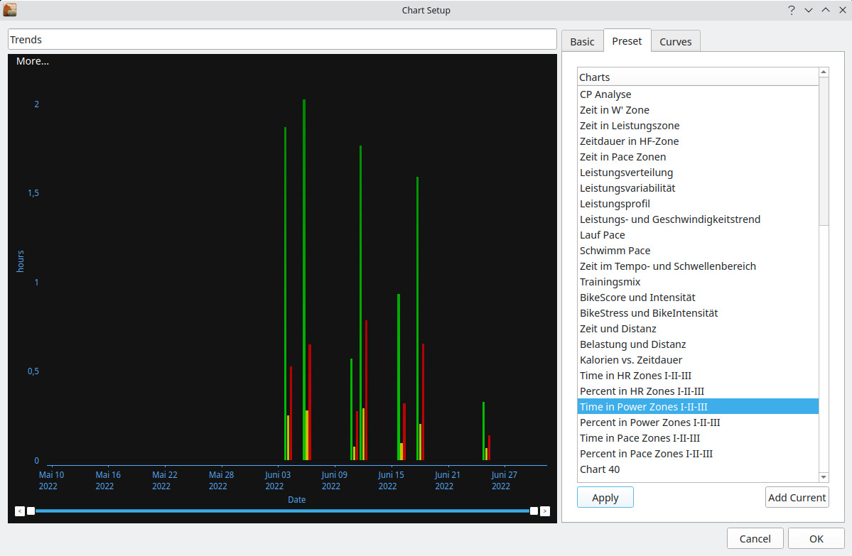
The Presets view of the dialog box is multi-functional, so besides using a Preset to configure a new chart, the dialog box offers a full set of Preset administration functions.
-
Using a preset
-
Apply- applies the settings of the currently selected preset in the list (= takes over theCurvesdefined in thePreset)
-
-
Maintain presets
-
Rename- change the name -
Delete- removes/delete a preset -
Move Up- moves the selected presetupin the list -
Move Down- moves the selected presetdownin the list
-
Note: most preset administrative functions, except for Apply and Add Current, were moved to the hamburger menu in Trends Sidebar Charts pane. See Side Bar - Trends View
- Get more presets
-
Import...- imports an XML File with presets - the imported presets are ADDED to the current preset - the import does not check of duplicates,... (Note: since the file format of the XML is specific to GoldenCheetah and also contains "serialized" for certain configuration settings, manual creation of a valid XML file is not recommended (and will most likely not work)) -
Export...- exports ALL presets available in the list to an XML File (_Note: Only by using theExport...function you get a valid XML file which can be imported to other GoldenCheetah installations. Please observe - since the file format might differ between GoldenCheetah version, you can only expect this to work when using the same GoldenCheetah version.) -
Add current- adds the chart definition (curves, settings,...) you are currently working on, to thePresetlist as a new preset. (Basically this feature provides aCreate Presetfunction using the settings in focus.
-
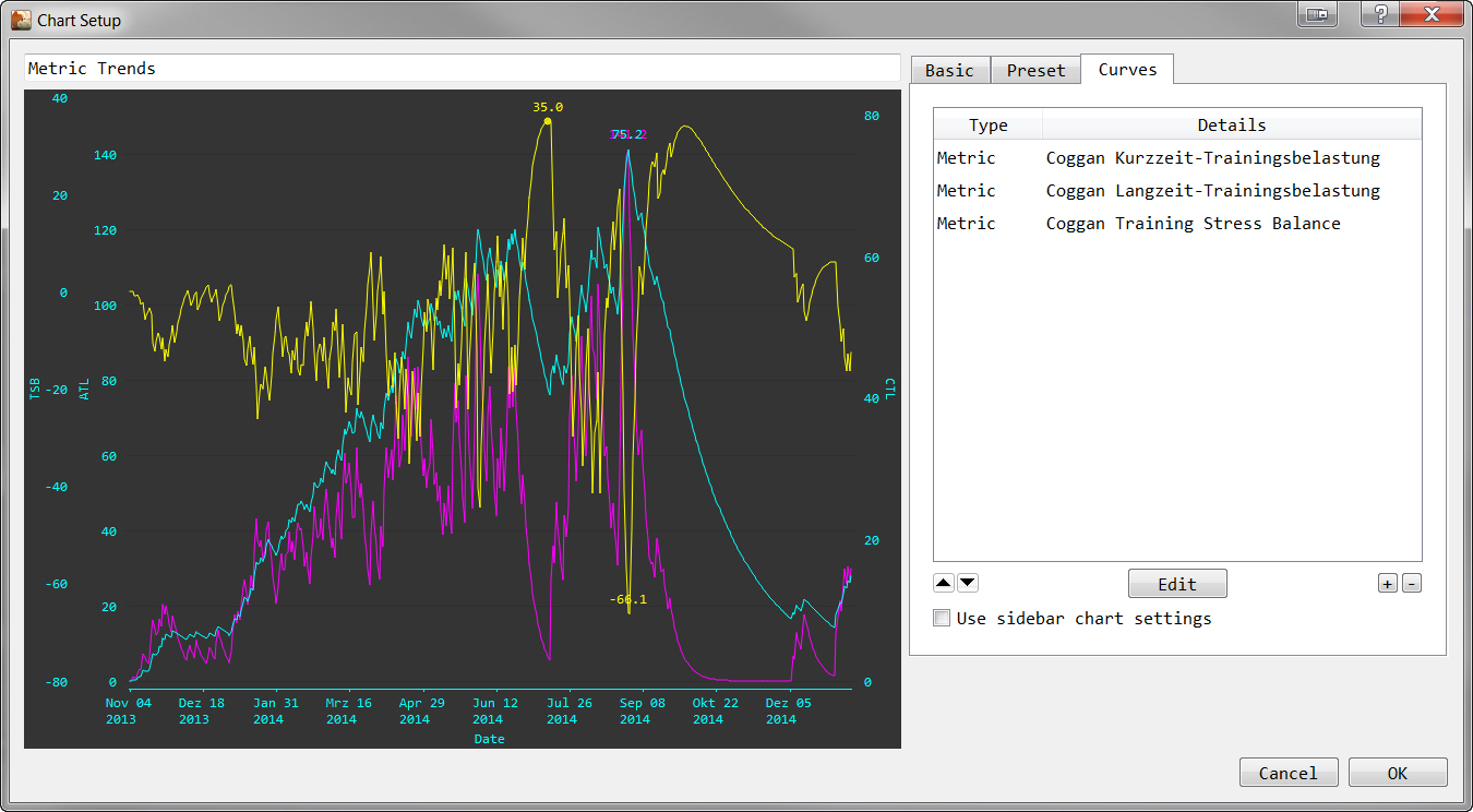
The curves are what is actually shown on the charts. The curves can either come from presets, or are defined here by adding them. Also editing / adjustments of existing curves is possible.
-
Edit- changes the settings of the selected curve -
+- opens the dialog to add a new curve -
-- removes a curve -
Up,Down(orArrows) - move the metric up/down within the list - this is useful mainly in "Stack" view, since the sequence of metrics in this list determines the sequence in the stack -
User sidebar chart settings- if checked, any curve settings are ignored, and the created chart serves as a proxy for the Side Bar - Charts)
A large number of commonly used Metrics are pre-defined in GoldenCheetah and new ones can added as User Metrics. Each metric determines the data to be shown in the curve/diagram. This option also allows to plot numeric metadata fields defined in Data Fields configuration.
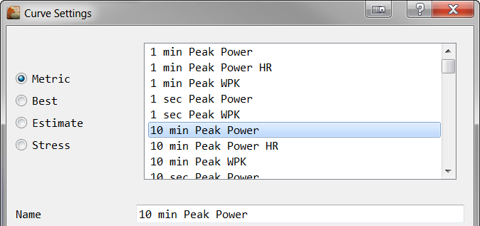
Metrics are computed for each activity and their aggregation method and properties define how the computed values for each activity are combined when there are more than one activity for the aggregation period.
The value will be zero if no activities are included in the aggregation period (Day/Week/Month/Year).
Currently a metric can be used only once in a chart, if you want to plot the same metric using different filters -for example to have separate curves by sport- use a formula containing just the metric name.
For the further settings see: Curve Settings
Bests are user-defined metrics. Best delivers curves which show the best value / for a defined period in time / for a defined data series.
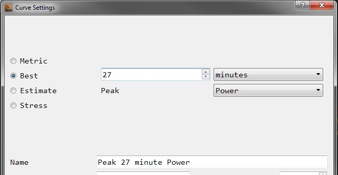
Supported data series are visible in the drop-down list - starting with Power,...
For the further settings see: Curve Settings
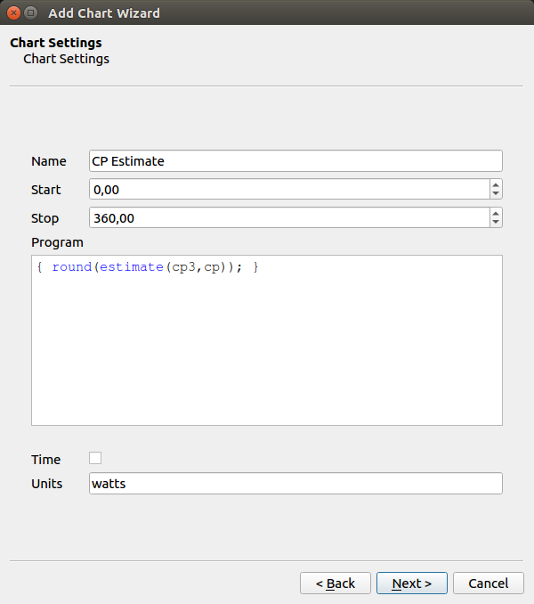
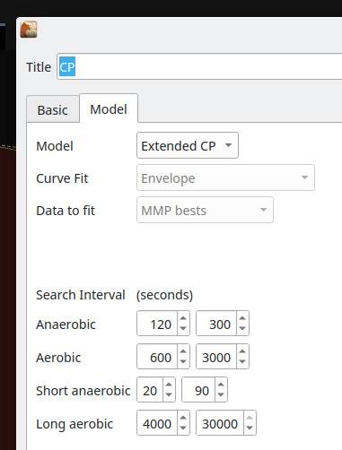
Estimates are metric curves derived based on the CP models.
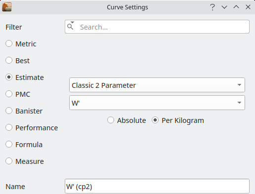
As parameter you need to choose the CP model to use and the data series to estimate on that model. Since not all models support all data series, depending on the selected model, some data series cannot be selected.
Estimates for sports with power data are computed weekly based on the last 6 weeks of data at startup and when new activities are imported. Maximal efforts in the 2-20’ are required for a good fit and extended CP model requires activities longer than 1hr.
For the further settings see: Curve Settings
PMC metrics allows to have user defined stress metric (like Long Term Stress, Short Term Stress, Stress Balance and Stress Ramp Rate) depending on any other metric as an input parameter. So you can e.g. define a Stress Metric which only considers "Duration" if you training as an input parameter - (probably not the best example - but just to illustrate the option).
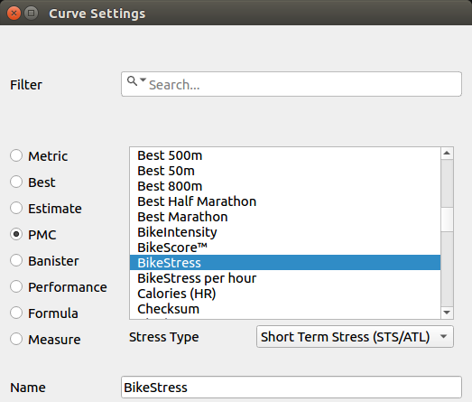
As parameter you need to choose the metric for which the Stress shall be calculated and the Stress Type which shall be calculated for the selected metric.
For the further settings see: Curve Settings
For Banister curves you have to select the curve type, the metric used to quantify training load (BikeStress in this example, but others can be selected s.t. BikeScore, TRIMPS, GOVSS, SwimScore, etc.) and the metric used to quantify performance (Power Index in this example, but it can be any Peak type metric):
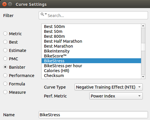
Banister fitting uses all athlete’s activities without filters.
In this case the curve is generated form a formula written in the same language used for filters, see Formula Syntax and Expressions for details and beware all metric values are returned in SI units, independently of unit preferences.
Formulas are computed for each activity and the aggregation method specifies how the computed values for each activity are combined when there are more than one activity for the aggregation period.
The value will be zero if no activities are included in the aggregation period (Day/Week/Month/Year).
NB: Average aggregation is weighted by Duration, so it correctly averages formulas computing averages over duration, but may give unexpected results otherwise. An alternative is to define an average type user metric using the count function to set the averaging base.
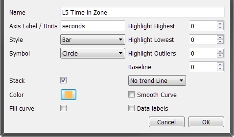
The Curve settings configure how a Metric, Best, Estimate, etc. curve is plotted in your diagram.
-
General
-
Name- is a user defined name for the curve -
Axis Label / Units- is the description shown on the axis labels, curves with the same setting share the same y-axis. If you change units settings after chart creation, s.t. from metric to imperial, this field will not change automatically, and you may need to edit it for consistency. This is on purpose to preserve customizations and translations.
-
-
Style and Color
-
Style- is the plot style (you can have a line, dots, bars,...) -
Symbol- is an additional marker for the single data point - works for the style, where adding a symbol makes sense -
Stack- is special - it works only for curves where the style is set toBarAND you need to define more that one curve where style isBar- when checkingStackfor such 2 or more curves then, there is just ONE bar which contains the different curve data as sections in the bar -
Color- the color to be used for the curve (to select a color, "Mouse-Click" on the color box to open aColor Chooserdialog box -
Fill curve- fills the area "below" the curve with a color shade
-
-
Special Options
-
Highlight Highest- puts markers on the curve for theXhighest values (if0- no point is marked) -
Highlight Lowest- puts markers on the curve for theXlowest values (if0- no point is marked) -
Highlight Outliers- puts markers on the curve for theXoutliers (if0- no point is marked) -
Baseline- sets a value for the curve which is considered as0regarding the Y-Axis scale (Example: If you set 100 as theBaselinefor your TSS curve, any value above 100 will be treated as positive, every value below 100 negative so 150 TSS shows +50 on the Y-Axis, 70 TSS shows -30 on the Y-Axis.) -
Trend Line-No trend LineorLinear TrendorQuadratic Trenddecides if aTrend Linefor the curve data is shown at all, and if yes, how the trend is calculated -
Smooth Curve- makes curves with many small peaks/changes better readable/understandable -
Data labels- if checked, also the value for a data point is shown in the plot
-
The Collection Tree Map is an very useful tool to analyse how your activities distribute - e.g. regarding your "Workout Codes", or equipment (if you maintain it).
What the graphics does is a 2-dimensional map where you can
- define the 2 Dimensions (here called
FirstandSecond) and - define the metrics used to calculate the size of a tree/map-segment.
What GoldenCheetah does is to summarize the selected metrics for all selected activities (Date Range and Filter is considered) and shows for each separate value combination of the configured dimensions, a tile which goes in line with the accumulated metric value for the tile.
Note: Possible dimensions for First and Second are all text fields from the activities - details (as defined in the preferences). So like for Search/Filter only if you maintain data and the values are consistent, you will get useful output here.
Note2: Unlike Search/Filter the field content is treated as Case Sensitive
The example summarizes TSS values, first by Workout Code and second by Keywords (which in the example data was to defined the bicycle used for a workout).
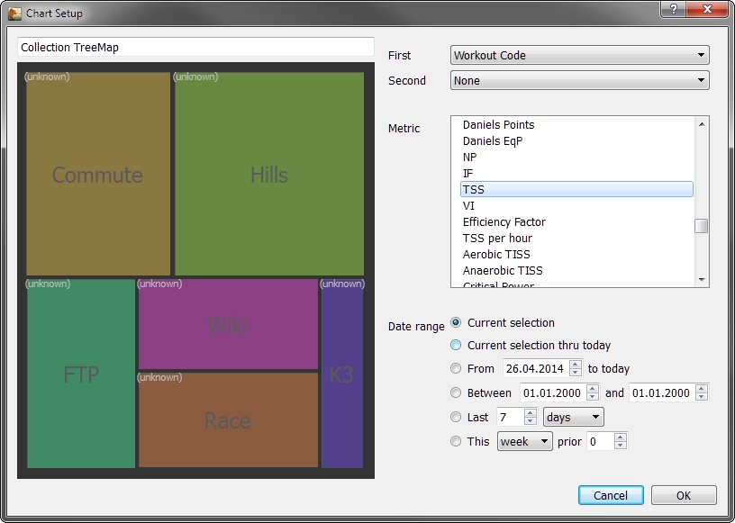
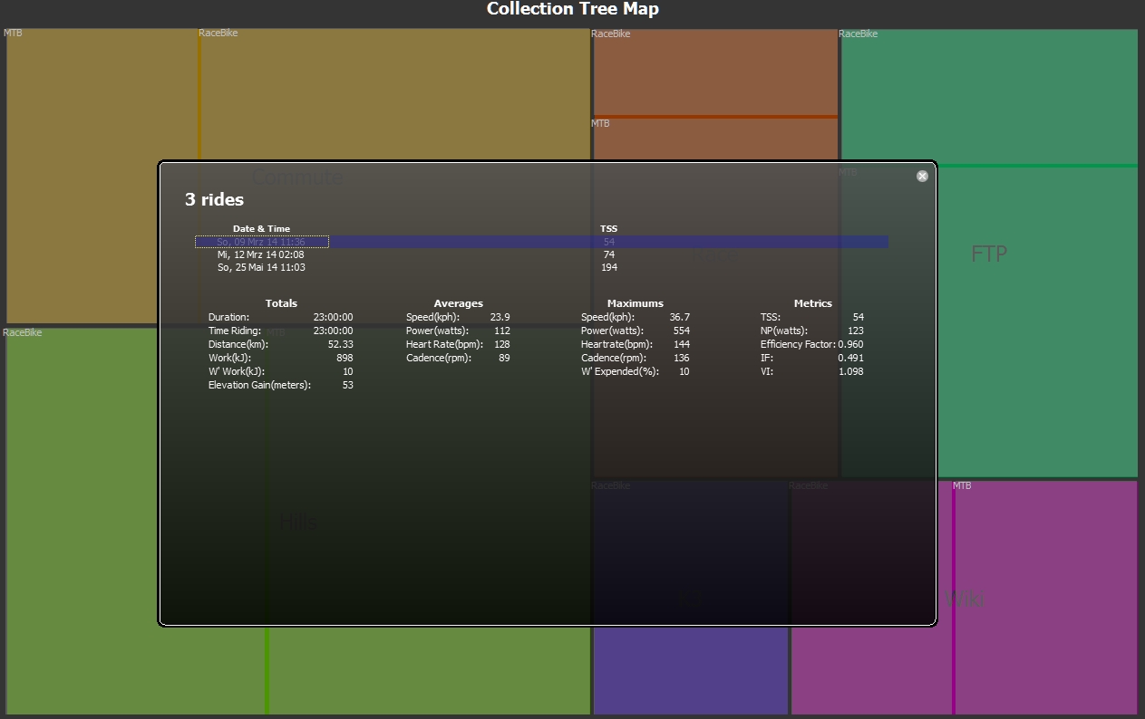
If you do a Mouse-Click on one of the tiles, the list of activities which added up to this tile are shown - together with their metric values. You can scroll through the list to get some activity detail information displayed.
This curve, also called MMP curve is again one of the central and assumed Standard ways for analyzing power. Here only the handling / available option are described.
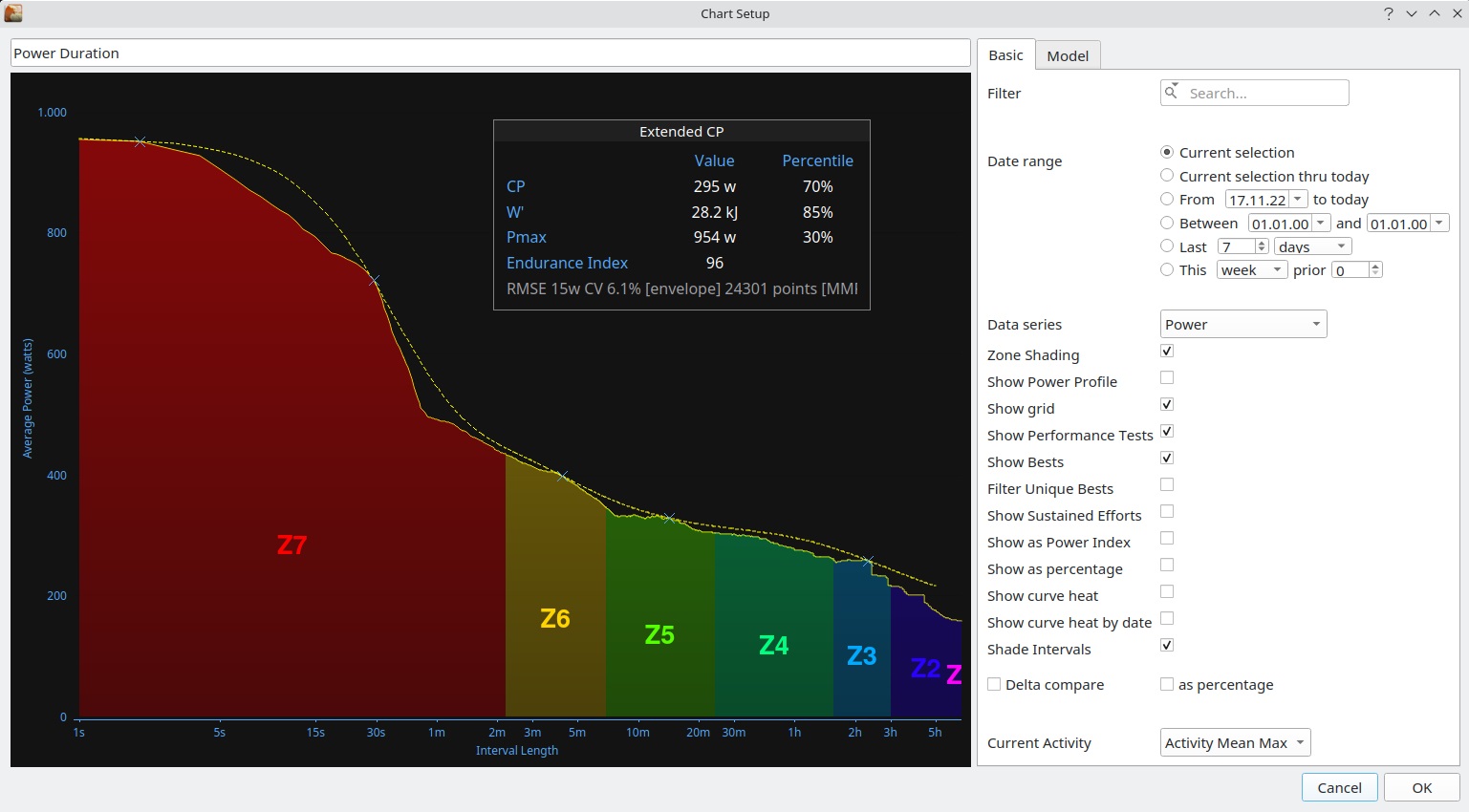
As in most other charts, also here you have several options, and the options partly relate to each other. Knowing which combinations are supported (and also which not) - is important to maximize the use of the chart.
-
Filter - define chart specific
Search/Filtercriteria -
Date Range - define chart specific
Date Rangesettings Note: On theActivities ViewtheDate Rangeparameter are a drop-down list, where you can selectDate Rangewhich are then considered in theBestscalculation. -
Data series- here you have multiple sets of data which can be analyzed in theMMPcurve style. Important to know is that you also need to checkShow Beststo show the curve for any of theData Series- otherwise you might see only theCP Modelcurve (forData Series=Power, or an empty chart for any otherData Series).Veloclinic Plotproduces the W' plot explained in Veloclinic Plot (W' plot). -
Zone Shading- if checked, shows the power zones, along the curve. Only has effect forData Series=Power. -
Show Power Profile- show curves representing percentiles from contributing GC users, coloring separates the central (50%), medium (>50% but < 95% or <50% but >5%), and extremes (>=95% or <=5%). Data used is available at Power Profile Tables -
Show grid- if checked, the plot area get's a grid for easier analysis -
Show Performance Tests- shows the intervals that have been marked as performance tests. Set performance tests -
Show Bests- if checked, shows theMMPcurve (the best value for point of duration of the X-Axis) for theData Seriesselected -
Filter Unique Bests- The best value with the highest power output and the longest duration is filtered out of each activity. The option Sustained efforts and matches using power must be enabled. -
Show Sustained Eofforts- Displayed only when underMenu Bar -> Tools -> Options... -> Intervalsthe option Sustained efforts and matches using power be enabled. - Show as Power Index -
-
Show as percentage- only for single activities on theActivitiesview - if checked, it shows not the absolute values, but the percentage of the actual activity value in relation toBests -
Show curve heat- shows the number of activities, whose maximal power duration is within 10% of the best -
Show curve heat by date- ... -
Shade Intervals- only for single activities on theActivitiesview - shows separate curves for an interval, if you select it on theSide Bar- multiple selection of intervals is possible -
Delta compareandas percentage- Only for compare mode - shows differences with respect to the first item as absolute values or percentages.
You can show the theoretical CP curve, based on one of GoldenCheetah's models, by going to the CP Model tab in the configuration, selecting one of the available models and either using the default parameters (of the model) or adjusting them to your needs.
Note: to use the Extended model you need some activities longer than 1hr to fit the model.
This chart type allows to show the distribution of either Activity Data Samples or Activity Metric in different dimensions.
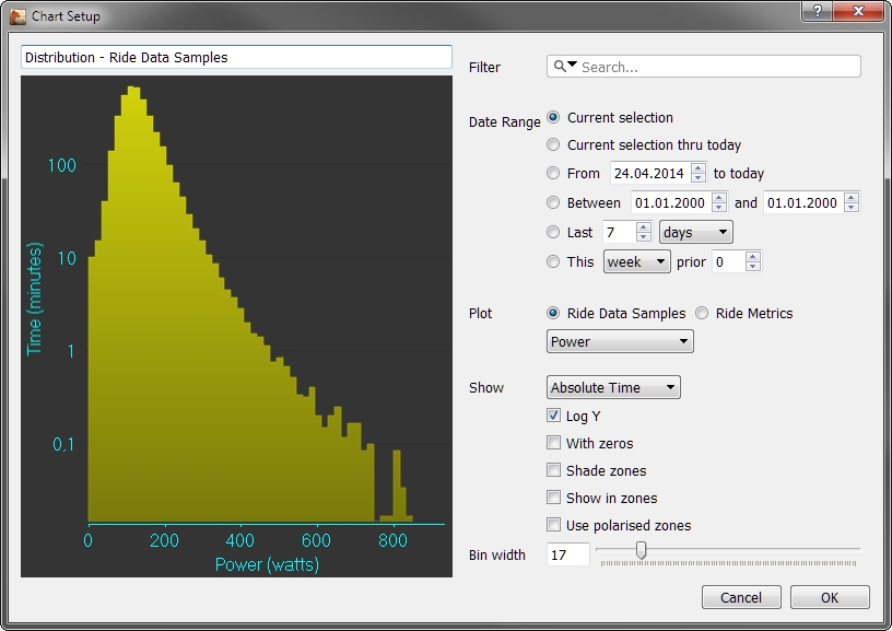
When choosing Activity Data Samples the selected data series applies to the X-Axis, where the time is shown on the Y-Axis:
-
Filter - define chart specific
Search/Filtercriteria -
Date Range - define chart specific
Date Rangesettings -
Plotsection-
Activity Data Sampleshas to be checked for this variant -
Data Series Box- Selection of available activity data series
-
-
Showsection-
Time- select betweenAbsolute TimeorPercentage Time -
Log Y- if checked, shows the time axis (here Y) in logarithmic scale -
With zeros- if checked, also zeros are considered in the plot -
Shade zones- only for single activities on theActivitiesview - if checked, the power and HR zones are shown (available for data series:Power,Watts per KilogramandHeart rate) -
Show in zones- if checked shows the data according to your zone settings (available for data series:Power,Watts per KilogramandHeart rate) -
Use polarized zones- you need to haveShow in zoneschecked as well - if checked, shows forPowerandWatts per Kilogramseries the distribution to 3 fix defined zones (I = 0 to 85% of CP, II = 85 to 100% of CP and III > 100% of CP), forHeartratethe zones are (I - 0 to 90% of LTHR, II - 90% of LTHR to LTHR, III > 100% of CV) and forSpeedthe zones depend on sport: Run (I - 0 to 90% of CV, II - 90% of CV to CV, III > 100% of CV) and Swim (I - 0 to 97.5% of CV, II - 97.5% of CV to CV, III > 100% of CV).
-
-
Bin width- both input field and slider to set the value - defines the X-Size of data range accumulated into one bar of the diagram (the size defined here is not used ifShow in zonesis checked)
Note: Bin width, Shade Zones and Show in Zones are also available in the drop down area on the upper border of the graphics view pane.
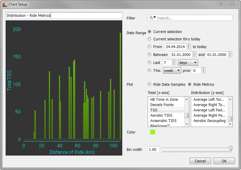
When choosing Activity Metrics you can select both X-Axis and Y-Axis metrics from the provided lists. Besides the metrics the only other parameter is the Color for drawing and the Bin width (like before).
Note: This chart was deprecated for v3.6
A summary chart is chart with fixed structure, which displays a summary about the selected Date Range. Search/Filter settings are considered when creating the charts.
-
Contents Section are:
-
Totals, Average, Maximums, Metrics, Model information - the
Metricsshown are configurable throughPreferences -> Metrics -> Summaryand Model estimates computed weekly, based on the last 6 weeks of data using the CP Extended model, which requires activities with power data longer than 1hr in that period. PMC derived metrics are added automatically using a base metric dependent on activity sport:- BikeStress for all Bike
- GOVSS for all Run
- SwimScore for all Swim
- TriScore otherwise
-
Athlete Best - the fields shown are configurable through
Preferences, results are ordered from best to worst, displayed with the date it happened (today is highlighted) and stress balance (aka TSB) for the day in brackets. -
Power Zones - the power zones as configured in
Preferences, considering theDate Rangesettings (as far as they fit to the date ranges in your power zone settings) for Cycling or Running, displayed only when all the involved activities are Rides or Runs, use a sport filter if you have mixed activities. -
Heart Rate Zones - the heart rate zones as configured in
Preferences, considering theDate Rangesettings (as far as they fit to the date ranges in your heart rate zone settings) for Cycling or Running, displayed only when all the involved activities are Rides or Runs, use a sport filter if you have mixed activities. -
Pace Zones - the pace rate zones as configured in
Preferences, considering theDate Rangesettings (as far as they fit to the date ranges in your pace zone settings) for Running or Swimming, displayed only when all the involved activities are Runs or Swims, use a sport filter if you have mixed activities. -
"##" Activities - activity list - the fields shown are configurable through
Preferences ->Metrics -> Summary`
-
-
Configuration of
Summarychart itself offers:-
Filter - define chart specific
Search/Filtercriteria -
Date Range - define chart specific
Date Rangesettings
-
Filter - define chart specific
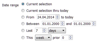
-
Current selection- uses the date range active in theDate Rangespane of theSide Bar -
Current selection thru today- uses the date range active, (like the one before), but limits theto-dateto the current date -
From 'date' to today- starts with the defineddateand ends today -
Between 'from' and 'to'- does what is says -
Lastx(days, weeks, months or years)- goes backward the given time frame -
This (week, month, year) prior 'x'- subtracts a number of (weeks, months, years) from the actual (week, month, year) to define the new date range (e.g. "Thismonthprior3" - means the time range 3 month back - so if it isJuly, date range will beApril).
BACK: Chart Types