UG_ChartTypes_Activities - GoldenCheetah/GoldenCheetah GitHub Wiki
Chart Types: Activities view
The Activities view offers Chart Types which work on a single activity. The activity in focus can be selected in various ways, e.g. through the Side Bar -> Activities pane, but also by selecting a activity on the Navigator or Calendar on the Diary view.
- Overview
- Activity Summary
- Details
- Summary and Details
- Editor
- Performance
- Critical Mean Maximals - similar to
Trends View- for a single activity - Histogram
- Pedal Force vs Velocity
- Heartrate vs Power
- Map
- 2d Plot
- 3d Plot
- Aerolab Chung Analysis
Overview
This is a modern looking dashboard introduced as preview in v3.5, the tiles can be easily rearranged by drag&drop, but the configuration is fixed:
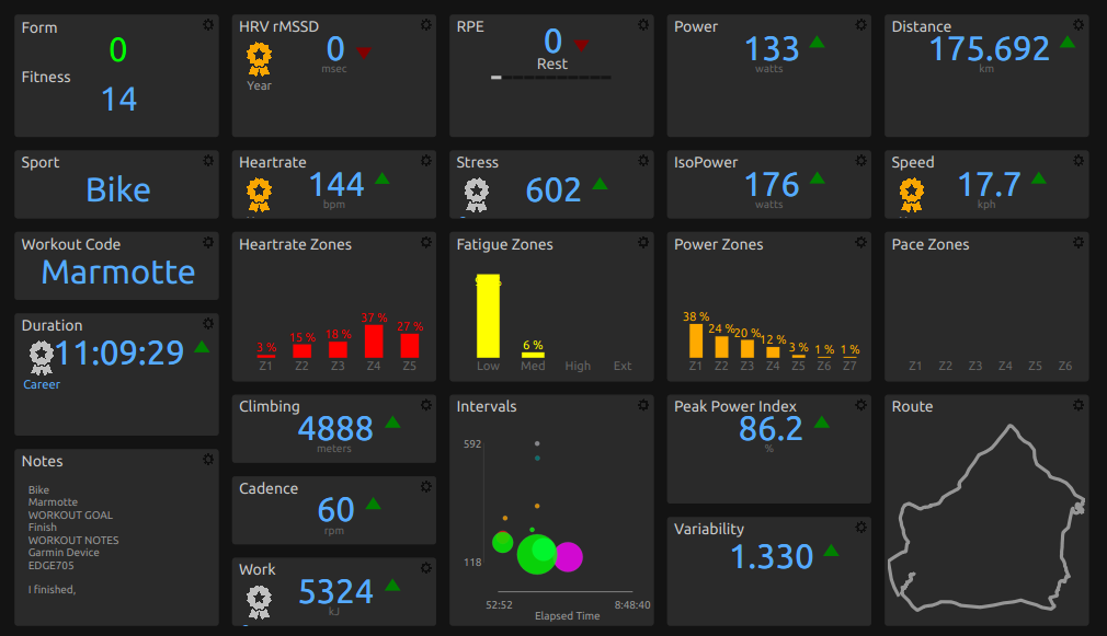
In v3.6 it is fully configurable: Tiles can be reordered by drag and drop and resized dragging their right/bottom borders. Holding shift key while dragging the right border allows to span several columns. Font sizes are updated automatically when columns are added, removed or resized. Tiles can be removed and configured using the "cog" icon in the upper right:
New tiles can be added using the chart menu Add Tile:
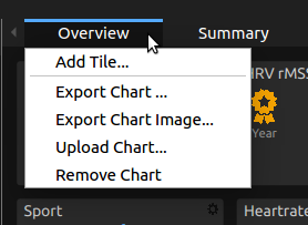
which allows to select the type of tile to add:
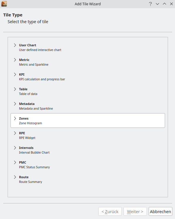
and its settings, which can be a simple metric or metadata field for some tiles, and a more complex formula for others s.t. the KPI or Table tiles:
Overview User Chart
Embedded user defined interactive chart, see Working with User Charts
Overview Metric Tile
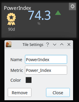
The Metric tile allows to display a builtin or user defined metric computed for the current activity, with some context consisting of a sparkline with values from previous 6 weeks activities of the same sport with min/avg/max values and up/down arrows comparing to average, provided the tile is high enough, plus eventually a gold/silver/bronze medal if the current value is one of the 3 best for the last 30/90/etc. days. The metric can be changed in tile configuration with the help of a completer, for the full list and description of available builtin metrics see Metric Reference. Currently this tile is cannot be used to override the metric value, use Data Tabs for that purpose.
Overview Metadata Tile
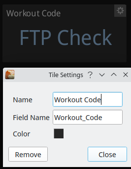
Metadata field value and Sparkline when numeric, for text values rendering depends on field type in Preferences with Textbox types, like Notes, using smaller font and wrap around. Some technical fields (s.t. Start_Date and Start_Time) are not supported but there are built in functions to obtain the same data (s.t. Date and Time) which can be used in KPI tiles formulas. Currently this tile is cannot be used to change the metadata field value, use Data Tabs for that purpose.
Overview RPE Tile
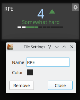
This is an interactive widget to display and change the RPE data field for the current activity using mouse clicks, if you prefer the keyboard use Data Tabs.
Overview Route Tile
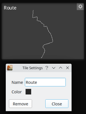
This tile shows a route summary, for more details see the Map chart.
Overview KPI Tile
Key Performance Indicator calculation and progress bar:
If you don’t want a progress bar set both limits to 0. For details about how to write formulas see Formula Syntax and Expressions
Overview Zones Tile
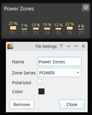
Zone Histogram plotted as a bar chart using default color for the series or a selected one, series can be one of:
- POWER
- HEARTRATE
- SPEED (Pace)
- WBAL
Standard Zones for the sport are used, unless the Polarized checkbox is set to use the 3 zones model.
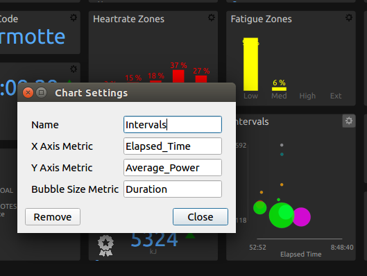
Overview Intervals Tile
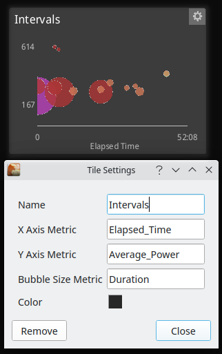
The Intervals Bubble Chart allows to configure 3 metrics (User defined or built in):
- for the x-axis value
- for the y-axis value
- for the bubble size
Each bubble corresponds to one interval and a click selects the interval in the Analysis sidebar to see more details.
Overview PMC Tile
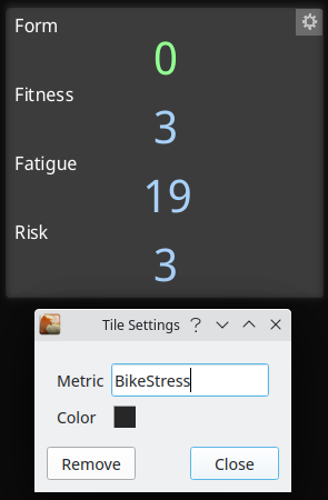
A PMC status summary tile which allows to configure the base metric (User defined or built in) and displays:
- Form (TSB/SB)
- Fitness (CTL/LTS)
- Fatigue (ATL/STS)
- Risk (RR)
For the date of the selected activity.
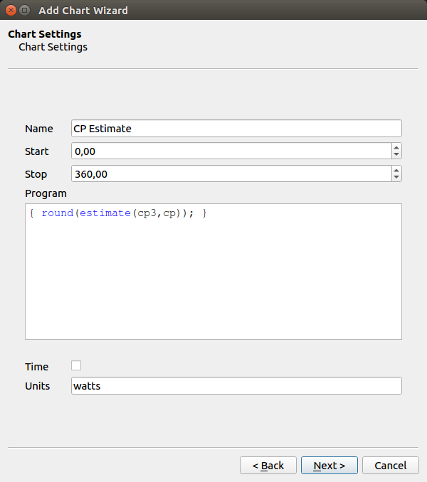
Overview Table
This tile allows to display information in tabular format using the formula language with 2 alternatives:
- Simple: first column is a name with optional units in brackets, second column the corresponding values
- Multi: first row is names, second row units and next rows have the values. First column typically identify an entity s.t. an interval or power zone. Data can be reordered interactively clicking on the column headers, the values can be colored according to a scale, and a click on a row can select an interval in Activities sidebar.
Data can be exported to a CSV file using the tile config dialog.
Included legacy programs are intended to replace the tables in deprecated Summary chart:
- Totals, Averages, Maximums and Metrics are simple tables to display a list of metrics
- Zones and Intervals are multi tables to display time in zone distributions and intervals metrics
When you select one of these the program text box is filled accordingly so you can customize it to your taste, an additional User Defined option shows a template program to get you started with a simple table:
User Defined Example
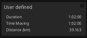
{

# column names, if using metrics then best
# to use metricname() to get correct name for locale
# otherwise it won't translate to other languages
names {
    metricname(Duration,
         Time_Moving,
         Distance,
         Work,
         W'_Work,
         Elevation_Gain);
}

# column units, if using metrics then best
# to use metricunit() function to get correct string
# for locale and metric/imperial
units {
    metricunit(Duration,
         Time_Moving,
         Distance,
         Work,
         W'_Work,
         Elevation_Gain);
}

# values to display as doubles or strings
# if using metrics always best to use asstring()
# to convert correctly with dp, metric/imperial
# or specific formats eg. rowing pace xx/500m
values {
    asstring(Duration,
             Time_Moving,
             Distance,
             Work,
             W'_Work,
             Elevation_Gain);
}

}
names, units and values are the functions you need to define to return same length vectors of names, units and values respectively.
Power Zones Example
Multi tables are similar but the values vector is the concatenation of the values vectors for each name/unit, for example the legacy Power Zones table:
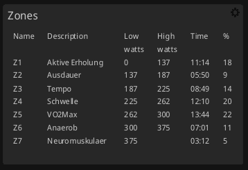
{

# column names, if using metrics then best
# to use metricname() to get correct name for locale
# otherwise it won't translate to other languages
names {
    c("Name","Description","Low","High","Time","%");
}

# column units, if using metrics then best
# to use metricunit() function to get correct string
# for locale and metric/imperial
units {

    c("",
      "",
      zones(power,units),
      zones(power,units), "", "");
}

# values to display as doubles or strings
# if using metrics always best to use asstring()
# to convert correctly with dp, metric/imperial
# or specific formats eg. rowing pace xx/500m
values {

   c( zones(power,name),
      zones(power,description),
      zones(power,low),
      zones(power,high),
      zones(power,time),
      zones(power,percent));
}

}
Intervals Example
The Intervals legacy program, customized to your current preferred metrics, is a more complete example since it also includes interval selection using the i function and coloring using the heat function.
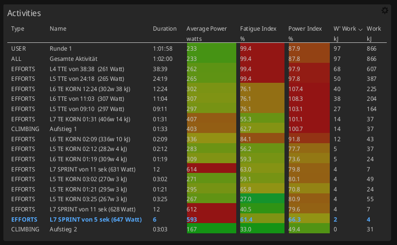
{

# column names, if using metrics then best
# to use metricname() to get correct name for locale
# otherwise it won't translate to other languages
names {
    metricname(type, name,
              Duration,
              Average_Power,
              Fatigue_Index,
              Power_Index,
              W'_Work,
              Work);
}

# column units, if using metrics then best
# to use metricunit() function to get correct string
# for locale and metric/imperial
units {
    metricunit(type, name,
              Duration,
              Average_Power,
              Fatigue_Index,
              Power_Index,
              W'_Work,
              Work);
}

# values to display as doubles or strings
# if using metrics always best to use asstring()
# to convert correctly with dp, metric/imperial
# or specific formats eg. rowing pace xx/500m
values {
    c(intervalstrings(type),
      intervalstrings(name),
      intervalstrings(Duration),
      intervalstrings(Average_Power),
      intervalstrings(Fatigue_Index),
      intervalstrings(Power_Index),
      intervalstrings(W'_Work),
      intervalstrings(Work));
}

# interval names indicate which interval
# the row represents so we can select
# and hover over them
i {
    intervalstrings(name);
}

# heatmap values are from 0-1 so we use the
# normalize() function to calculate it for the metrics
# in question. When we use normalize(0,0,metric) we
# will always get no heat, you can edit the min
# max values to set the range to set the heat color
heat {
    c(normalize(0, 0, intervals(type)),
      normalize(0, 0, intervals(name)),
      normalize(0, 0, intervals(Duration)),
      normalize(0, 500, intervals(Average_Power)),
      normalize(0, 100, intervals(Fatigue_Index)),
      normalize(0, 100, intervals(Power_Index)),
      normalize(0, 0, intervals(W'_Work)),
      normalize(0, 0, intervals(Work)));
}
}
The language used for the programs above is documented in Formula Syntax and Expressions.
Activity Summary
Note: This chart was deprecated for v3.6
A summary chart has a fixed structure, which displays a summary about the current activity you a looking at.
Contents Section are:
-
Totals, Average, Maximums, Metrics, Model information - the
Metricsshown are configurable throughPreferences -> Metrics -> Summaryand Model estimates computed weekly, based on the last 6 weeks of data using the CP Extended model, which requires activities with power data longer than 1hr in that period. PMC derived metrics are added automatically using a base metric dependent on activity sport:- BikeStress for Bike
- GOVSS for Run
- SwimScore for Swim
- TriScore otherwise
-
Power Zones - the power zones used are those valid for the date the activity took place - they are configured in
Preferences -> Athletefor Cycling and Running -
Heart Rate Zones - the heart rate zones used are those valid for the date the activity took place - they are configured in
Preferences -> Athletefor Cycling and Running -
Pace Zones - the pace zones used are those valid for the date the activity took place - they are configured in
Preferences -> Athletefor Running and Swimming.
Note: if you don't see time in Power/Heart Rate/Pace Zones check the corresponding sport-specific zone ranges and ensure there is one active for the date of the activity.
Details
Note: in v3.6 Details has been renamed Data and includes Editor as Raw Data tab
The activity Details allow to view, change and enter activity specific data. Some of the fields are pre-populated based on the activity file data (e.g. Start Date and Start Time).
The fields available in Details are mainly determined by the configuration done in Preferences->Data Fields
Here the Workout Tab as an example to show the relationship between configuration and input fields:
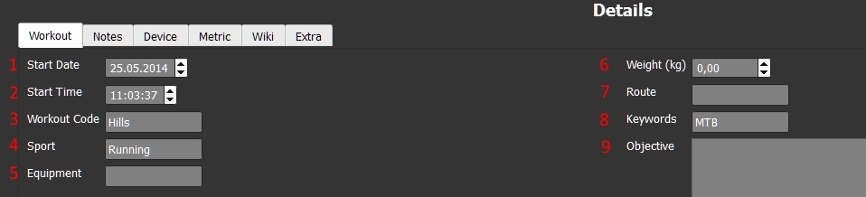
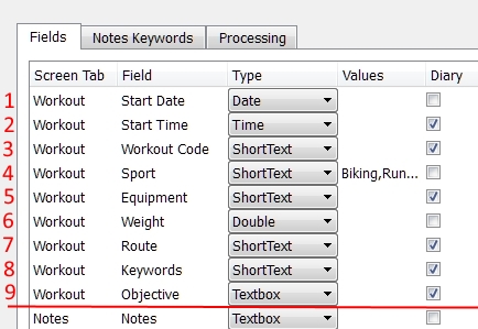
Note: The sequence of the Tabs on the Details screen and the sequence of the fields per Tab is exactly the sequence of the field and tabs in the configuration. When adding a field to the configuration, GoldenCheetah needs a few seconds to re-check / adjust it's internal structures and to re-create the screens (by adding the new field).
Note: GoldenCheetah comes with a set of field preferences, which already contain a number of additional fields for activity specific data, as well as a proposal on fields for the Metric tab. Since for some of these field specific logic is implemented in GoldenCheetah, it is NOT recommended to remove any of the pre-defined fields, as it might cause unexpected behavior.
Metric Tab
The Metric tab is pre-populated with a number of metrics (as defined in the Preferences->Data Fields).
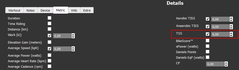
To enter or overwrite a Metric value, please check the check-box next to the metric to open the input field for this metric. Only if you then input a value different to 0, this value will be taken as the metric value for this activity (and overwrite any value coming from your activity data).
Extra Tab
The Extra Tab is a set of built in Read Only fields plus metadata fields present in the selected activity and not defined in Data Fields configuration or defined with an empty Screen Tab, which are not available to be used in filters. You do not find the Extra Tab in the list of Tabs in Preferences->Data Fields, but you find fields like Calendar Text or Data in the list (without an specific Tab assigned).
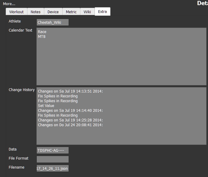
Some important fields are:
Calendar Text- generated text which also appears in theDiaryview -CalendarchartChange History- log of changes done to the activity fileData- info which data series are available for the activity (each character represents a data series)T- timeD- distanceS- speedP- powerH- heart rateC- cadencesN- torqueA- altitudeG- GPSL- slopeW- wind speedE- temperatureV- left/right balance
- ... other fields are self-explanatory
Summary and Details
Note: this chart was deprecated in v3.6
Combines Summary and Details in one chart.
Editor
Note: in v3.6 Editor has been moved to Raw Data tab in Details
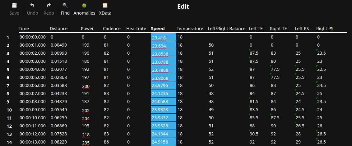
The Editor chart provides all the activity file data in a spreadsheet/list format. The default view contains columns for all data series captured from your head-unit, as well as any data series derived.
As the name states, it does not only display the data, but you can also Edit the data here. The multiple options available in the Editor chart are described here:
If you are new to GoldenCheetah, there is a tutorial from version 2.0 which may help: http://www.youtube.com/watch?v=Jw65ynZZ5YI&feature=player_embedded
Icon Functions
![]()
Save- saves the activity data (with all changes/adjustments done)Undo- if active, there have been changes done to the activity series data (shown in the editor), those changes are reverted - if there are multiple changes done separately - then can be undone separately by pressingUndomultiple timesRedo- if active, you have beenUndoing changes before - they can be re-applied beRedoFind- opens aSearchdialog box - which allows to find specific values or value ranges in the series data - you can define search rules, the values to search and the data series to search in. As a result you get a list of search hits in the dialog box and the values fulfilling the search criteria are marked (with a different background color) in theEditordata list. "Mouse-Click" on a result line in the dialog box, moves the data view to the specific search hit.Anomalies- when choosing, GoldenCheetah does a number consistency analysis on the available data points / data series. The analysis performed and their messages are:Invalid recording gap- there are missing samples, dependant on the recording interval. See below.Distance goes backwards- like the description saysSuspiciously high cadence- cadence detected is above 150Suspiciously high heartrate- heart rate detected is above 200Suspiciously high speed- speed detected is above 100Out of bounds value- either latitude or longitude have invalid valuesNon-zero torque but zero cadence- like the description saysData spike candidate- uses theFix Power Spikes...analysis and configuration settings to find power data spikesSpeed inconsistent with Distance/Time- this warning means speed doesn`t match the change of distance for the sample, and this can provoke inconsistencies in speed/pace metrics, s.t. average speed/pace being different from peak speed/pace for the same interval duration. It can be ignored if you are not interested in the possible anomalies, or fixed using Fix Speed from Distance with Moving Average seconds set to recording interval.
Anomalies are listed in a Dialog box - "Mouse-Click" on a text line in the dialog box, moves the data view to the specific anomaly in the editor data list.
Missing samples or gaps in recording will generally lead to metrics that are misleading. We strongly recommend you do not use Garmin Smart Recording on Garmin devices, but if you do please set the Garmin Smart Recording preference to remove these gaps. If they are due to automatic pausing (e.g. at traffic stops) we would suggest you disable this feature or use the tool Fix Gaps in Recording to remove them.
First Column - Context Menu
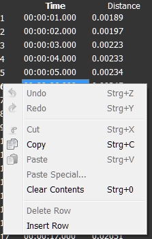
Undo,Redo- see above
Cut- cuts the selected data section to the clipboard -Cutis only available if you have selected COMPLETE rowsCopy- copies the selected data section to the clipboard -Copyworks for any selection of cellsPaste- pastes the clipboard data at chosen place -Pastedoes not care for data consistency - (e.g. you can paste power values to the latitude cell)Paste Special- is aimed mainly to paste data from outside GoldenCheetah (e.g. from an Excel Spreadsheet) to a data series - you have different settings to tell GoldenCheetah how this data is structured (quite similar toPaste Specialfeatures in other software products)Clear Contents- sets the cell in the marked data section to0
Delete Row- deletes the current or the selected range of rowsInsert Row- inserts an empty row at the current selection
Column Header - Context Menu
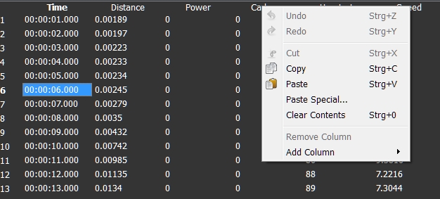
Undo,Redo- see above
Cut,Copy,Paste,Paste Special,Clear Contents- see above
Remove Column- removes the selected columnAdd Column- opens a list of the available columns - only columns which are not yet visible on the editor chart can be added
Data area - Context Menu
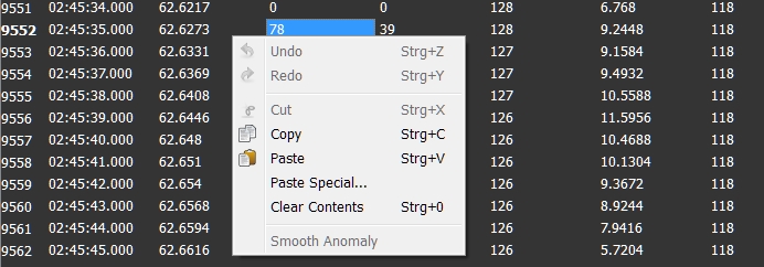
Undo,Redo- see above
Cut,Copy,Paste,Paste Special,Clear Contents- see above
Smooth Anomaly- re-calculates the value of the selected cell as the average of the neighbors (previous and next data point in time)
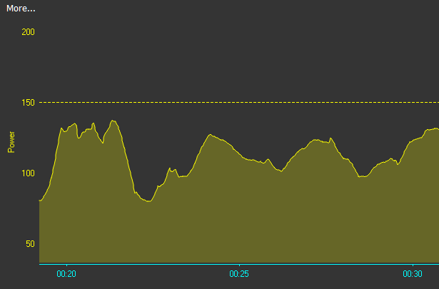
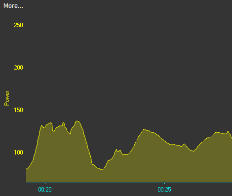
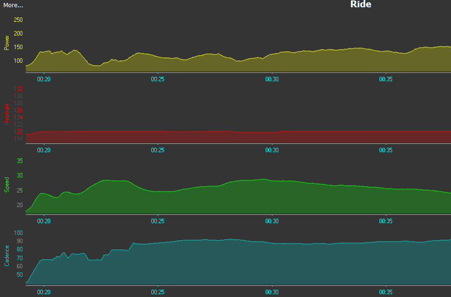
Performance
This chart type provides all the graphs for your activity data series. In addition to data series which are captured by the head-unit directly, GoldenCheetah also delivers some derived series like Delta series and User Data series, defined via formulas, for customization and access to XData.
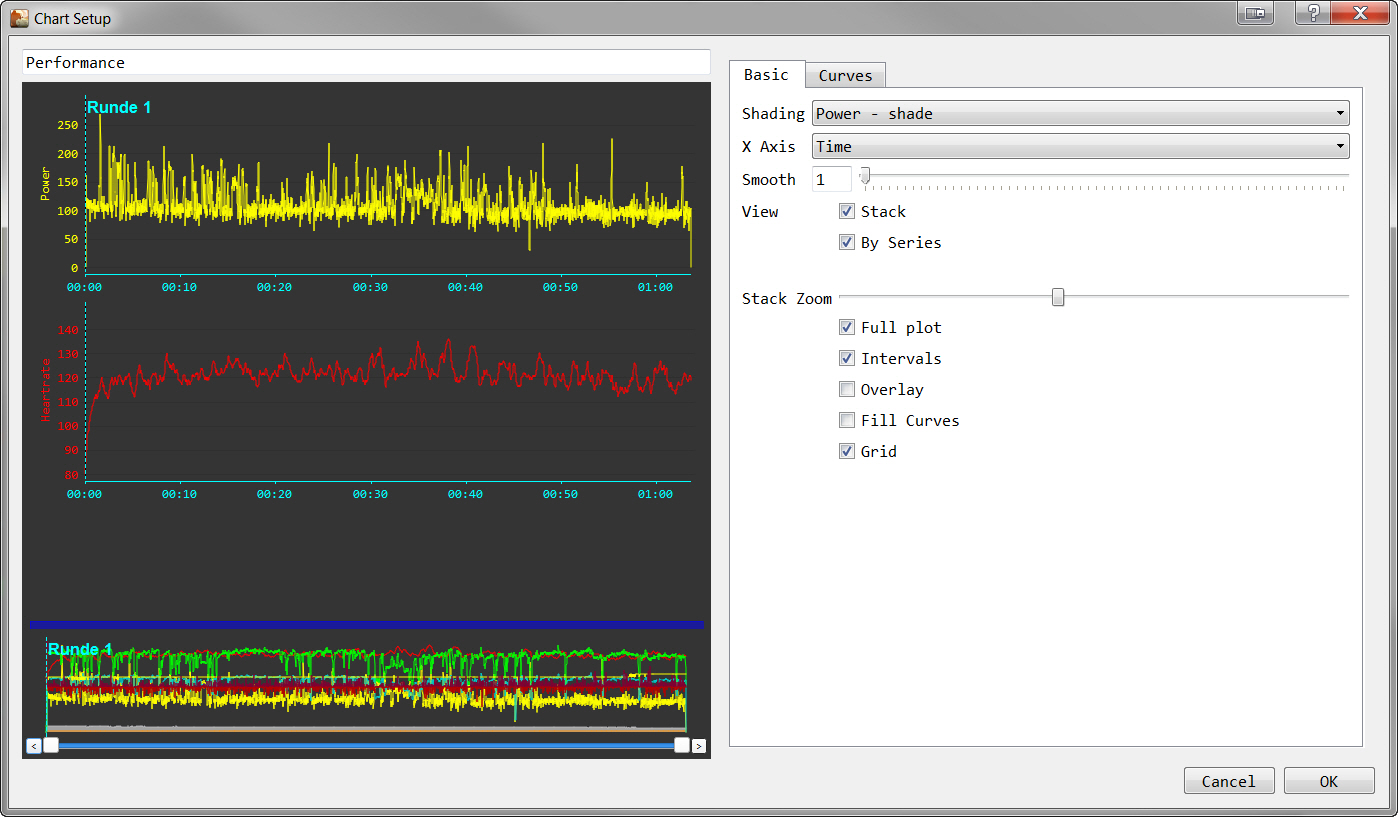
Performance Basic
-
Basic Settings
Shading- here you select if, and how your power data curve is shown. Shading is based on power zones for the sport and date of the selected activity.X-Axis- choose if your activity X-Axis is plottedby timeorby distanceSmooth- smooths the graphs - the value set here is used for all curves
-
View Settings
-
Stack,By Series- if
Stackis NOT checked - theBy Seriessetting is ignored and all curves are plotted in one diagram - if
Stackis checked andBy Seriesis checked - all curves are plotted in separate diagrams one above the other - if
Stackis checked andBy Seriesis NOT checked - all curves are plotted in one diagram, and the X-Axis is stretched over multiple lines
- if
-
Stack Zoom- zooms the Y-Axis sizes for all diagrams (only takes effect ifShow Stackis checked) -
Full Plot- if checked, in addition to the curves, an additional diagram (containing all the curves of the activity data series) is displayed at the lower border of theActivitiesview - with this you also get the ability to zoom into the X-Axis - the button for zooming are below theFull Plotcurve -
Overlay- if checked, it adds a small overlay window to the diagram, in which selected interval data is displayed -
Grid- if checked, it adds a grid to the chart
-
Performance Curves
- Data series settings
Delta Series- predefined delta series (calculated as '(Current_data_point_Value - Previous_data_point_Value) / (Time_between_the_data_points)')Left/Right- Left leg / Right leg dependent data series (only provided by some power meter / head-unit combinations today)Data Series- you can check the data series available from your head unitMetrics- predefined metrics which use the data series and calculate data along the complete activity
User Data Curves
User Data allows to chart custom data series defined by the user:
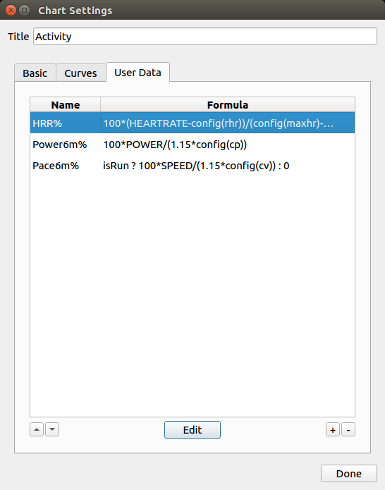
User Data series are computed sample by sample using a formula which can use standard sample data -s.t. POWER-, XData -s.t XDATA("EXTRA", "RESPIRATIONRATE", sparse)-, configuration -s.t. config(cp)- and builtin or user metrics -s.t. Average_Power-. The formula can be any type of expression including a code block, see Formula Syntax and Expressions for details.
When all values are zero the User Data series is not displayed for the activity, similar to standard series when data is not present.
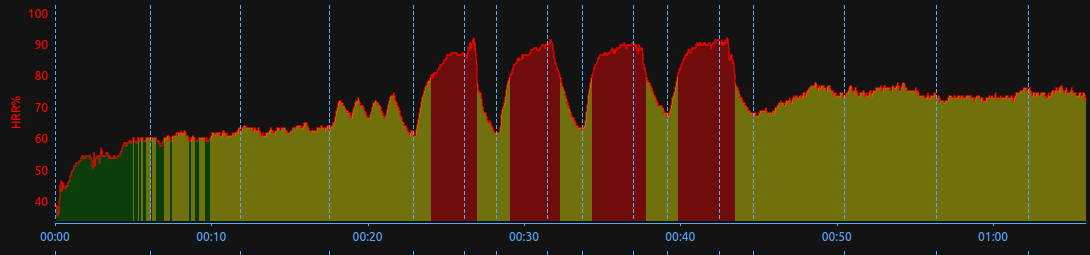
The following example plots HR as a percentage of HR reserve (HR max-HR rest) with zone coloring:
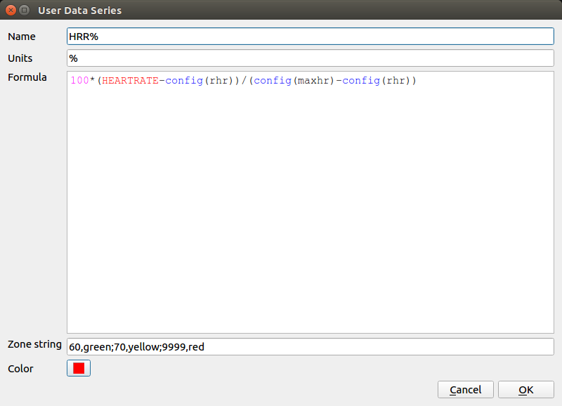
Units are the label of y-axis and it is not shared with standard or other user data curves.
Color is the line color and Zone string can be used to define upper values and associated colors for shading a curve, the format is:
lim,colorname;lim,colorname;
where lim is an upper value and colorname is either a #rgb string or any color name such as red,green, blue etc from the list of SVG color keyword names provided by the World Wide Web Consortium.
e.g: 60,green;80,yellow;9999,red
which will shade points <60 green, <80 will be yellow and then <9999 will be red:
Special Features of the Performance chart
- References line - for power and power related charts, you can add references lines to your chart
You can create a reference line via Mouse-Click (Hold) and Drag from the Y-Axis label area. You can also do a Double-Click on this area to open a dialog box to + (add) and - (remove) references lines.
Note: References Lines are not supported for any non-power related chart like e.g. Heart Rate.
Mouse-Click (Hold) and Drag
Double-Click
- Scaling Y-Axis - by
Single Mouse-Clickinto the Y-Axis label area, you get two sliders handles which you can drag (up and down) to change the scale of the Y-Axis of that specific chart (only inStackedmode). This setting is not persistent, if you want to fix the Y-Axis scale you can use the new User Chart.
Single Mouse-Click
- Interactive marking of intervals - can be done be
Mouse-Click (Hold) and Dragin the charts - the intervals is valid/visible for all curves - the feature works independent of stack-view active or not
Mouse-Click (Hold) and Drag
- Show single curves - (only in non-stacked mode) - by
Mouse-Overon a Y-Axis label for a curve, only this particular curve is shown on the chart
Mouse-Over
- Zoom into curves - (only in non-stacked mode) - allows to select rectangle plot areas to zoom in - zooming can be done multiple times
Shift + Left Mouse Button - to select an area and zoom in when releasing
Right Mouse Button - to zoom out 1 level
Crtl + Right Mouse Button - to zoom out to full view
Exhaustion points
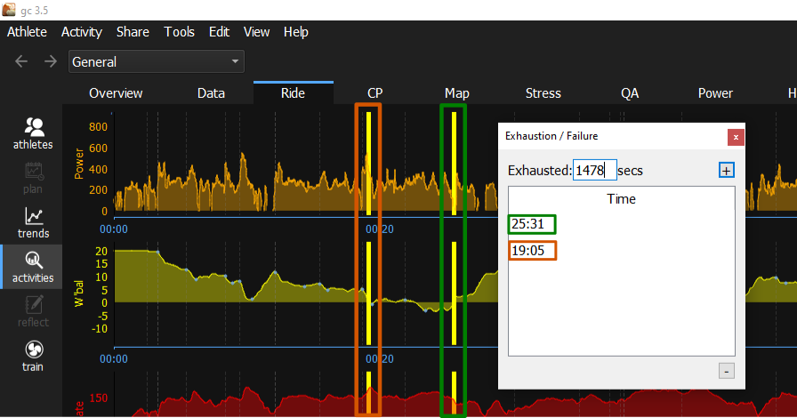
- for power and power-related charts, you can add an exhausted point to your chart.
You can create an Exhaustion point by clicking and holding the left mouse button on the X-axis label. A yellow vertical line will appear. Move the mouse to the Exhaustion point and release the left mouse button.
Double click on the X axis label to open a dialogue box. In the box dialogue you can + (add) and - (remove) the exhausted point.
The modified activities must be saved to permanently retain the exhaustion point.
Activities for which an exhaustion point has been set can be found with the filter command To_Exhaustion.
The filter Date contains "P" AND Minimum_W'bal < 1 can be used to find the activities with the highest exhaustion.
The exhaustion points can be analysed using the CP and W' solver.
The picture shows the dialogue box with two exhaustion points set.
Critical Mean Maximal
Similar to Trends View - for a single activity
Histogram
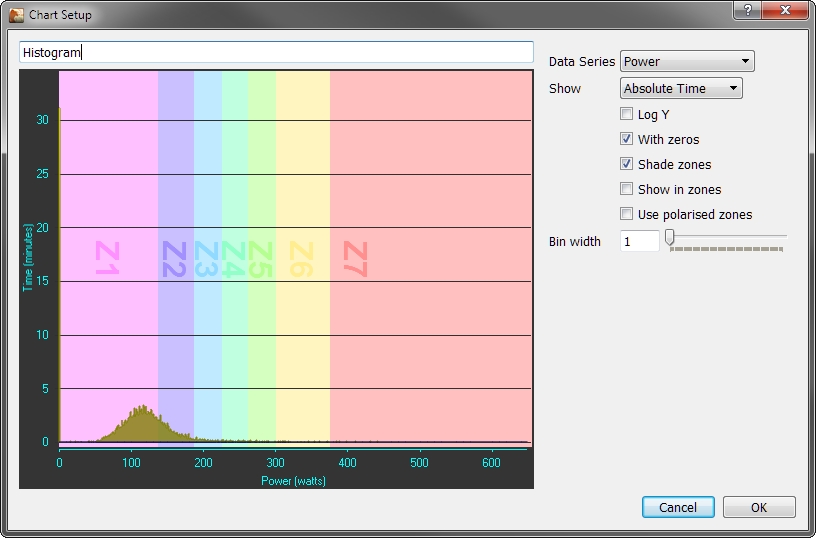
-
Data Series Box- selection of activity data series to be analysed -
Time- choose betweenAbsolute TimeorPercentage Time -
Log Y- if checked, shows the time axis (here Y) in log scale -
With zeros- if checked, also zeros are considered in the plot -
Shade zones- if checked, the power and HR zones are shown (available for data series:Power,Watts per KilogramandHeartrate) -
Show in zones- if checked shows the data according to your zone settings (available for data series:Power,Watts per KilogramandHeartrate) -
Use polarized zones- you need to haveShow in zoneschecked as well - if checked, shows forPowerandWatts per Kilogramseries the distribution to 3 program defined zones (I = 0 to 85% of CP, II = 85 to 100% of CP and III > 100% of CP), forHeartratethe zones are (I - 0 to 90% of LTHR, II - 90% of LTHR to LTHR, III > 100% of CV) and forSpeedthe zones depend on sport: Run (I - 0 to 90% of CV, II - 90% of CV to CV, III > 100% of CV) and Swim (I - 0 to 97.5% of CV, II - 97.5% of CV to CV, III > 100% of CV). -
Bin width- both input field and slider to set the value - defined the X-Size of data range accumulated into one bar of the diagram (the size defined here has no influence ifShow in zonesis checked)
Note: Bin width, Shade Zones and Show in Zones are also available in the drop down area on the upper border of the graphics view pane.
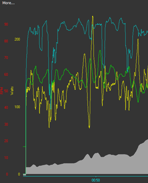
Pedal Force vs Velocity
This chart provides a so called Quadrant Analysis of Pedal Force vs Pedal Velocity.
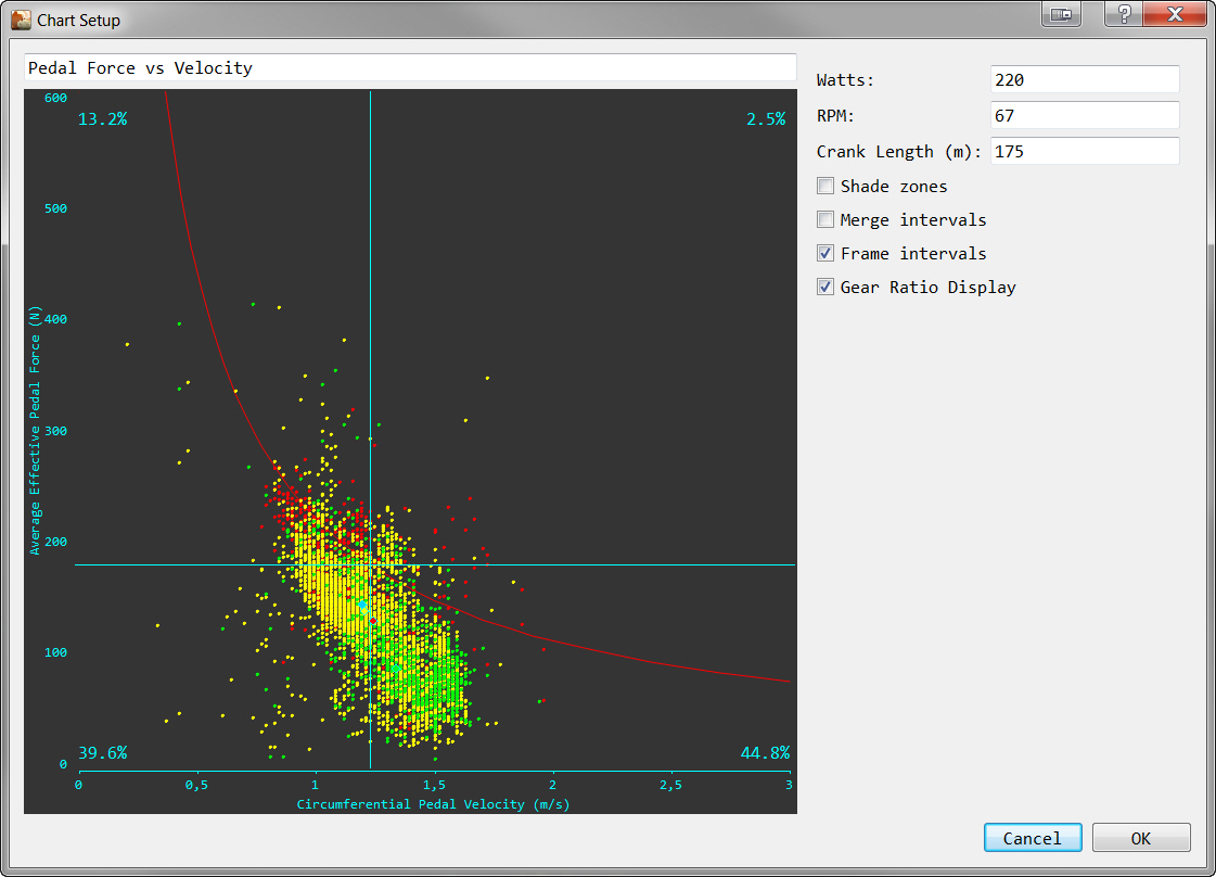
-
Definition of the quadrants is done by the input of
WattsandRPMWatts- a curve through the chart which is reflects the entered powerRPM- the cadence for which the curve is split into quadrants
-
Crank Length- determines the correct values and scale for the X-Axis (defaulted from yourPreferences -> Athletedata) -
Shade Zones- if checked, the power zones are shown -
Merge Intervals- if checked (andFrame Intervalis NOT checked) - shows the intervals selected in theSide Barbut not the complete data points -
Frame Intervals- if checked - shows all data points - and highlights the intervals selected in theSide Bar
Heartrate vs Power
This chart shows the distribution of HR and the distribution of power for the whole activity (on X-Axis (Power) / on Y-Axis (Heart Rate) - along with the HR/Power data points during the activity.
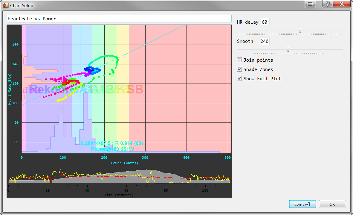
The distribution of HR and Power is shown proportional, but not with a specific scale. The mouse-over information on the bars is only relevant for the dimension (Power or Heart rate) of the axis. The seconds value is of no means.
The set of colored points / the colored line in the center of the chart shows the development of the Power/Heart rate relationship over the time of the activity. The determination approach and the relation to the chart parameters is outlined here:
-
Power/Heart rate data points for the plot are
Smooththe activity data points (every second) are first "smoothed" by calculating the moving average value over the time period (in seconds) defined in this parameter- Only data points where the heart rate is above 50 and power is between 50 and 500 watts are further considered
HR Delayshifts the heart rate by the given value (in seconds) - that means for a data point recorded at second in the rade "X" the heart rate from second `X+HR Delay" is assigned- To reduce the number of data points shown on the plot, only every 10th point is plotted
-
Other chart parameters are:
Join Points- if checked, instead of single data points they are plotted as a complete lineShade Zones- if checked, adds the power zone shadingShow Full Plot- if checked, also the activity (power and heart rate curves only) are shown at the bottom of the view
-
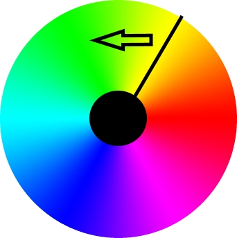
The coloring of the power/heart rate plot (along the activity time) follows a special logic. The available data points are segmented into 36 subsequent groups. Each group is assigned a separate color, which is determined from an HSV color code. The HSV coloring covers all colors in a "circle style". Each segment of the activity data points segment is plotted in a color of the circle (see HSV colors) - starting at
Yellowand moving by an angle of 10 degrees (direction seeArrow) to determine the color for each new segment.
The Power@150 value is estimation of your PWC150 value based on activity data. PWC150 (Physical Work Capacity at HR 150) is a measure in diagnostics - it follows a tiered test protocol but ends with the HR of its name (here 150). For further details, please use the search engine of your choice with the given key words.
Map
If GPS data is available and there is an Internet connection, the activity is shown on a Google Map or an Open Street Map.
From v3.5 the Map chart defaults to OSM, due to a change in Google Maps licencing you need to register your own API key and configure it in chart options if you want to use them with full resolution.
The functionality provided on the maps differs on what Google or OSM is offering (e.g. multiple views, zoom, rotate). GoldenCheetah itself adds capabilities to:
- Create new intervals: Mouse-Click (Hold) and Drag over the track creates a new interval on release
- Show Start/End point of the track - special icons for start/end point of track appears
- Show Intervals - by marking one or more interval in the
Side Bar-Intervalspane, the part of the track belonging to the intervals ishighlighted. The start points of all intervals are always marked in a track - and you can alsoMouse-Clickon the markers tohighlightand interval. - Color - the color of the track gives an indication about the Power Zone you have been riding a certain track - colors are the same as the color shading of the power curves over a background yellow line.
- Ignore any Power Shading Zones and always draw the red line (Hide Shaded Zones, new in v3.6)
- Remove the route background yellow line (Hide Yellow Line, new in v3.6)
OSM Tile Servers
Tile servers names and usage policies can change over time, and they can offer different functionality for different regions, so you may need to change this configuration if maps are not working as you expect.
You can select one of the preconfigured OSM Tile Servers of add the ones you prefer, a list can be found in https://wiki.openstreetmap.org/wiki/Tile_servers.
In v3.5 you can configure the URL prefix only, for example: https://a.tile.opentopomap.org
In v3.6 the full URL is also accepted, so you can use Tile servers requiring registration embedding your personal apikey there, see the provider documentation for details. For example to use Thunderforest OpenCycleMap the URL looks like: https://tile.thunderforest.com/cycle/{z}/{x}/{y}.png?apikey=<your-apikey-here>
2d Plot
The 2d Plot - also called Scatter Plot - displays the activity data as a collection of points, each having the value of data series determining the position on the X-Axis and the value of the other data series determining the position on the Y-Axis.
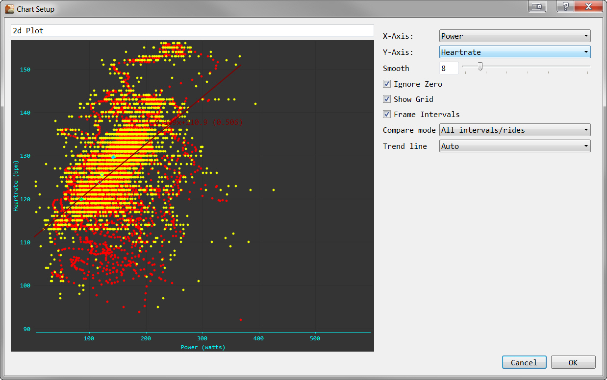
X-Axis- drop-down list box with the available data series (e.g. Power,...)Y-Axis- drop-down list box with the available data series (e.g. Power,...)Ignore Zero- if checked, data points which are0are not plottedShow Grid- if checked, a grid is displayed in the plot areaFrame Intervals- if checked, and you select one or more intervals in theSide Bar, the data points belonging to the interval are highlighted
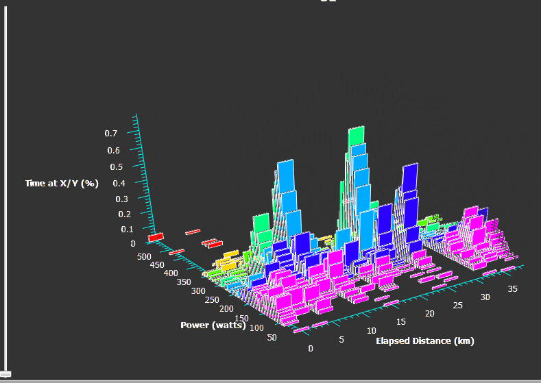
3d Plot
This chart was deprecated for v3.5
The 3d Plot displays the activity data in a 3d graphics - which you can zoom and rotate.
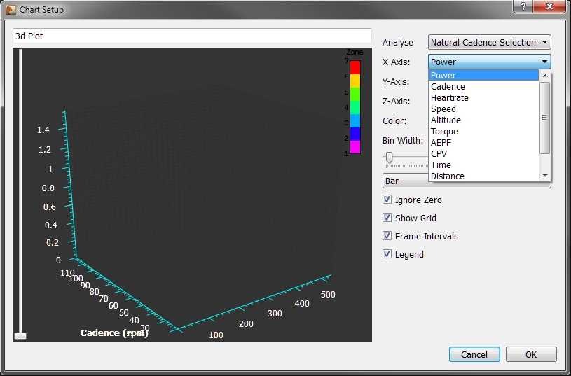
Analyse- offers a number of default-settings for X,Y,and Z-Axis which you can use - the settingUser Definedis the option to defined the Axis individually (after applying a default setting, you can still change the Axis settings as well)X-Axis- drop-down list box with the data series (e.g. Power,...)Y-Axis- drop-down list box with the data series (e.g. Power,...)Z-Axis- drop-down list box with the data series (e.g. Power,...)Color- drop-down list box with the data series (e.g. Power,...) - can be considered as a 4th dimension of the chartGraphic Type- drop-down list box to choose the visualization variant (Bar,Grid,SurfaceorDots)Bin Width- both input field and slider to set the value - which is the width of the plotted chart segmentsIgnore Zero- if checked, data points which are0are not plottedShow Grid- if checked, a grid is displayed in the plot areaFrame Intervals- if checked, and you select one or more intervals in theSide Bar, the data points belonging to the interval are highlightedLegend- if checked, the legend for the chart is shown
You can rotate the 3d graphics in all 3 directions with you mouse. As well as adding an layer to the Z-Axis:
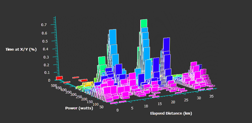
You can add an analysis layer to the Z-Axis:
Aerolab Chung Analysis
The Aerolab chart provides a tool to use the Robert Chung`s Virtual Elevation method to derive CdA and CRR from a power file.
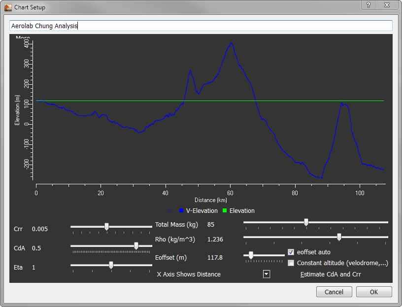
For the theory on this, sample test protocols for the power/activity file you need for an analysis see Dr Chung's document describing the theory and practice of Virtual Elevation.
BACK: Chart Types