Dataviz Course 2018 - GiovanniDw/frontend-data GitHub Wiki
Data Visualization Course 2018
- Data Visualization Course 2018
Intro to Javascript 2018
Input
index.js
import { getCars } from './getCars';
import { generateReport } from './generateReport';

document.getElementById('message-element').textContent = 'Loading...';

getCars().then((cars) => {
 const message = generateReport(cars, 2000);
 document.getElementById('message-element').textContent = message;
});
getCars.js
const carsJSON = `[
  {
    "year": 2000,
    "make": "Honda",
    "model": "Accord",
    "price": 2800
  },
  {
    "make": "Nissan",
    "model": "Leaf",
    "year": 2012,
    "price": 1800
  },
  {
    "make": "Ford",
    "model": "F150",
    "year": 2009,
    "price": 1950
  },
  {
    "make": "Chevrolet",
    "model": "Trailblazer",
    "year": 2009,
    "price": 1550
  },
  {
    "make": "Honda",
    "model": "Pilot",
    "year": 2003,
    "price": 2200
  }
]`;
const cars = JSON.parse(carsJSON);

export const getCars = () =>
 new Promise((resolve) => {
  setTimeout(() => resolve(cars), 2000);
 });
generateReport.js
import { formatCar } from './formatCar';

export const generateReport = (cars, maxPrice) =>
 cars
  .filter((car) => car.price < maxPrice)
  .map(formatCar)
  .join('\n');
formatCar.js
export const formatCar = (car) => {
 const { year, make, model, price } = car;

 return `${year} ${make} ${model}: $$${price}`;
};
Output
2012 Nissan Leaf: $1800
2009 Ford F150: $1950
2009 Chevrolet Trailblazer: $1550
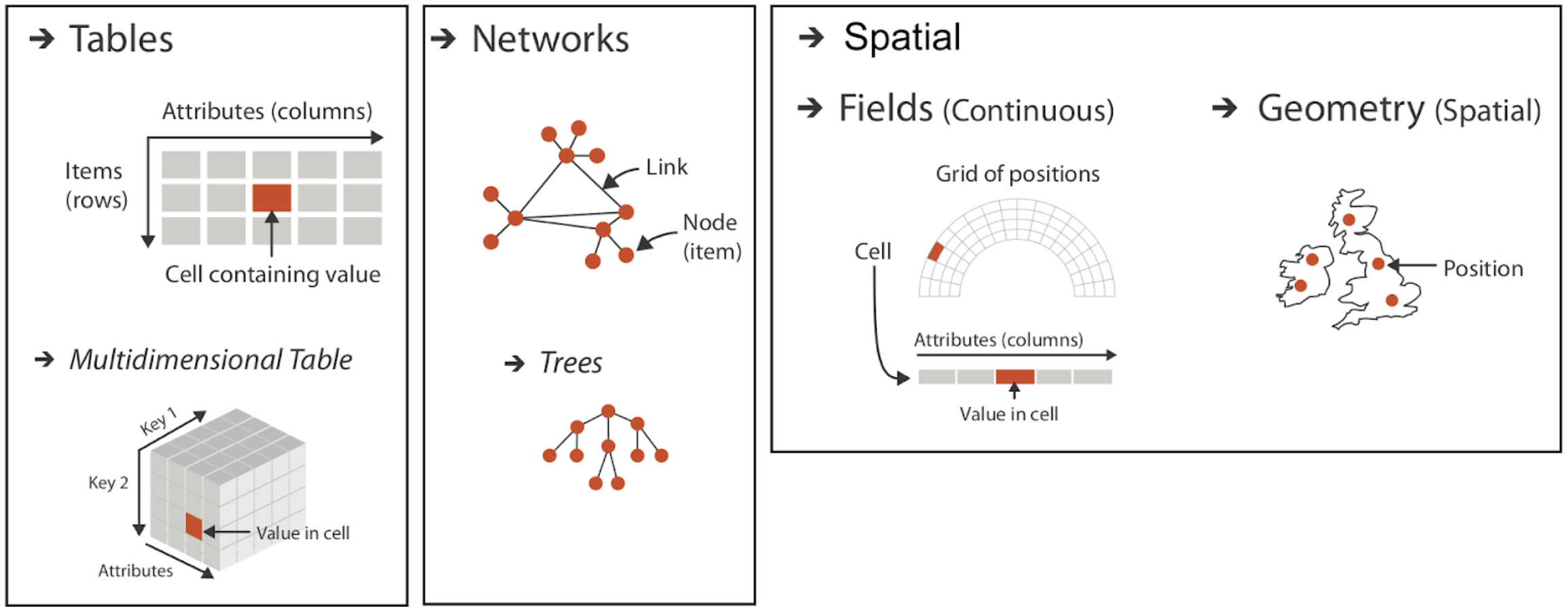
Inputs for Data Visualization
Dataset Types
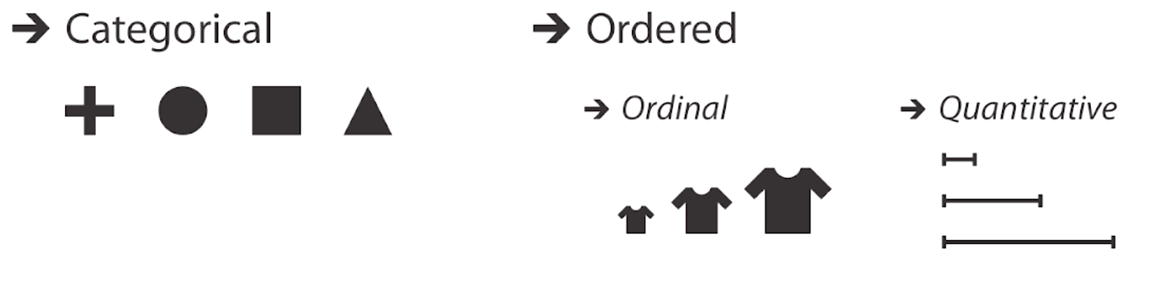
Attribute Types
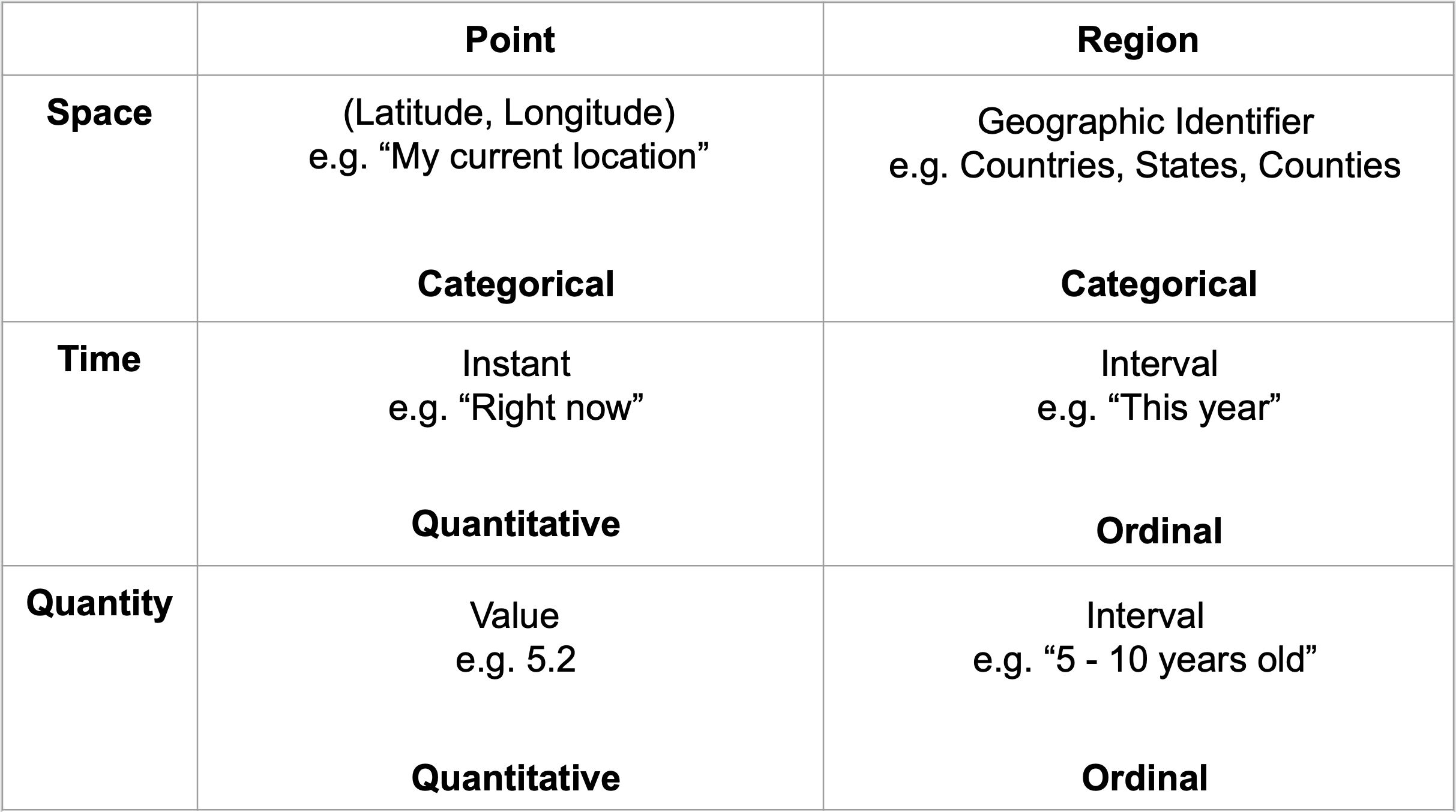
Special Cases
Making a Bar Chart
Representing a data table in javascript
const svg = select('svg');

const width = +svg.attr('width');
const height = +svg.attr('height');

csv('./static/data/Provincies_PenR.csv').then((data) => {
 data.forEach((d) => {
  d.PenR = +d.PenR;
 });
 render(data);
});
Creating rectangles for each row
const xScale = scaleLinear()
 .domain([0, max(data, xValue)])
 .range([0, innerWidth]);

const yScale = scaleBand()
 .domain(data.map(yValue))
 .range([0, innerHeight])
 .padding(0.2);
Using linear and band scales
const xScale = scaleLinear()
 .domain([0, max(data, xValue)])
 .range([0, innerWidth]);

const yScale = scaleBand()
 .domain(data.map(yValue))
 .range([0, innerHeight])
 .padding(0.2);
The margin convention
const margin = { top: 20, right: 50, bottom: 20, left: 100 };
const innerWidth = width - margin.left - margin.right;
const innerHeight = height - margin.top - margin.bottom;
Adding Axes
const yAxis = axisLeft(yScale);
yAxis(g.append('g'));
=
const yAxis = axisLeft(yScale);
g.append('g').call(yAxis);
g.append('g').call(axisLeft(yScale));
Uploading Datasets
Data Table Summary
import { select, csv, csvFormat } from 'd3';

const kilobytes = data =>
  Math.ceil(csvFormat(data).length / 1024);

const body = select('body');

csv('data.csv').then(data => {
  body
    .append('pre')
      .text([
        `${data.length} rows`,
        `${Object.keys(data[0]).length} columns`,
        `${kilobytes(data)} KB`
      ].join(', '));

  body
    .append('pre')
      .text('First 10 rows:');

  body
    .append('pre')
      .text(JSON.stringify(data.slice(0, 10), null, 2));
});
Auto MPG Summary
import { select, csv, csvFormat } from 'd3';

const kilobytes = data =>
  Math.ceil(csvFormat(data).length / 1000);

const body = select('body');

csv('https://vizhub.com/curran/datasets/auto-mpg.csv')
  .then(data => {
    body
      .append('pre')
        .text([
          `${data.length} rows`,
          `${Object.keys(data[0]).length} columns`,
          `${kilobytes(data)} kB`
        ].join(', '));

    body
      .append('pre')
        .text('First 10 rows:');

    body
      .append('pre')
        .text(JSON.stringify(data.slice(0, 10), null, 2));
  });
Customizing Axes of a Bar Chart with D3.js
Formatting Numbers
bl.ocks.org/mstanaland/6106487
Starting number: 1500
d3.format(",") : 1,500
d3.format(".1f") : 1500.0
d3.format(",.2f") : 1,500.00
d3.format("s") : 1.5k
d3.format(".1s") : 2k
d3.format(".2s") : 1.5k
function(d) { return "$" + d3.format(",.2f")(d); } : $1,500.00
d3.format(",.2%") : 150,000.00%
Removing unnecessary lines
g.append('g')
  .call(axisLeft(yScale))
  .selectAll('.domain, .tick line')
  .remove();
Adding a visualization title
g.append('text')
  .attr('y', -5)
  .text('PenR Capaciteit Profincies')
Adding axis Labels
const xAxisG = g.append('g').call(xAxis)
  .attr('transform', `translate(0,${innerHeight})`);

 xAxisG.select('.domain').remove();

 xAxisG.append('text')
  .attr('y', 40)
  .attr('x', innerWidth / 2)
  .attr('fill', 'black')
  .text("PenR Capaciteit");
Making Tick Grid Lines
xAxisG.append('text')
 .attr('class', 'axis-label')

g.append('text')
  .attr('class', 'title')
.tick text {
    fill: #757575;
}

.tick line {
    stroke: #E0E0E0;
}

.axis-label {
 font-size: 1.2em;
 fill: #757575;
}

.title {
 font-size: 1.5em;
 fill: #424242;
}
Making Scatter Plot
import { select, csv, scaleLinear, extent, scalePoint, axisLeft, axisBottom, format, text } from 'd3';

const svg = select('svg');

const width = +svg.attr('width');
const height = +svg.attr('height');

 // d.capacity = +d.capacity;
 // d.minimumHeightInMeters = +d.minimumHeightInMeters;
 // d.openingTimes = +d.openingTimes;
 // d.id = +d.id;

const render = data => {
 const title = "Capaciteit Vs Heights";

 const xValue = (d) => d.capacity;
 const xAxisLabel = 'Capaciteit'

 const yValue = (d) => d.minimumHeightInMeters;
 const circleRadius = 10;
 const yAxisLabel = "Min Hoogte";


 const margin = { top: 50, right: 50, bottom: 50, left: 100 }
 const innerWidth = width - margin.left - margin.right;
 const innerHeight = height - margin.top - margin.bottom;

 const xScale = scaleLinear()
  .domain(extent(data, xValue))
  .range([0, innerWidth])
  .nice();

 const yScale = scaleLinear()
  .domain(extent(data, yValue))
  .range([innerHeight, 0])
  .nice()

 const g = svg.append('g')
  .attr('transform', `translate(${margin.left},${margin.top})`);

 const xAxis = axisBottom(xScale)
  .tickSize(-innerHeight)
  .tickPadding(15);

 const yAxis = axisLeft(yScale)
  .tickSize(-innerWidth)
  .tickPadding(10);

 const yAxisG = g.append('g').call(yAxis);
 yAxisG.selectAll('.domain').remove();

 yAxisG
  .append('text')
  .attr('class', 'axis-label')
  .attr('y', -93)
  .attr('x', -innerHeight / 2)
  .attr('fill', 'black')
  .attr('transform', `rotate(-90)`)
  .attr('text-anchor', 'middle')
  .text(yAxisLabel)

 const xAxisG = g.append('g').call(xAxis)
  .attr('transform', `translate(0,${innerHeight})`);

 xAxisG.select('.domain').remove();

 xAxisG.append('text')
  .attr('class', 'axis-label')
  .attr('y', 40)
  .attr('x', innerWidth / 2)
  .attr('fill', 'black')
  .text(xAxisLabel);

 g.selectAll('circle').data(data)
  .enter().append('circle')
  .attr('cy', d => yScale(yValue(d)))
  .attr('cx', d => xScale(xValue(d)))
  .attr('r', circleRadius)

 g.append('text')
  .attr('class', 'title')
  .attr('y', -5)
  .text(title)

}

csv('./static/data/OpenParking_PnR.csv').then(data => {
 data.forEach(d => {
  d.capacity = +d.capacity;
  d.minimumHeightInMeters = +d.minimumHeightInMeters;
  d.openingTimes = +d.openingTimes;
  d.id = +d.id;
 })
 console.log(data)
 render(data)
})