AusYCSEC 2022 Express Course: Exploring petabytes of coastal data with Digital Earth Australia – from the comfort of your browser - GeoscienceAustralia/dea-notebooks GitHub Wiki
Digital Earth Australia
Digital Earth Australia (DEA) is a program of Geoscience Australia, an agency of the Australian Government. We create free and open satellite data products for the benefit of Australia.
In the coastal space, this includes annual shoreline and coastal erosion mapping along the entire Australian coastline, extent and elevation maps of Australia's intertidal zone, annual mangrove extent and canopy cover data, and specially-processed satellite imagery that reveals how Australia's coastal environments change between low and high tide.

Express Course structure
- 13:30 – 14:00 AEST Part 1: Exploring data with DEA Maps
- 14:00 – 14:10 AEST Part 2: DEA Coastlines
- 14:10 – 14:15 AEST Break (optional: register for DEA Sandbox)
- 14:15 – 14:45 AEST Part 3: Analysing data in the cloud with the DEA Sandbox
Part 1: Exploring data with DEA Maps
Digital Earth Australia (DEA) Maps is a website for interactive map-based access to DEA's satellite data products.
1A. Getting started with DEA Maps
To explore the data available on DEA Maps:
- Launch DEA Maps: https://maps.dea.ga.gov.au/. A pop-up window will appear:

- Click
Take the tour. A series of pop-up tips will appear explaining how to use the main features of DEA Maps. ClickNextto proceed to the next tip, then finallyFinishto complete the tour.

- Once the tour is complete, experiment with scrolling and zooming in and out of the map (use your mouse wheel, double click, or click the
+or-buttons on the top right). For this example, zoom in to Roebuck Bay, Western Australia.
Note: You can also zoom to a location by typing into the
Search for locationsbox on the top-left, then clicking on your location in the drop-down menu. Try this with "Roebuck Bay".

1B. Adding satellite data to the map
We can now add our first data to the map. In this example, we will load satellite imagery from the Copernicus Sentinel-2 satellites, which have captured imagery at 10 metre resolution since 2015:
- Click
Explore map dataon the top-left. This will bring up a view of the DEA data catalogue.

- First, click on
Satellite datato open this folder, then click on the DEA Surface Reflectance (Sentinel-2) product. This will show you a preview of the data we are about to load. When you are ready, clickAdd to the map.

- The DEA Surface Reflectance (Sentinel-2) product will now be added to the "workbench" on the left of the screen. At this point, satellite data may not display on the map - this may be because there were no Sentinel-2 images captured over this location on the selected day. To filter our satellite data to all images captured at this location, click
Filter by location, then click on the map. You will see the filter applied in blue in the workbench on the left.

- Sentinel-2 satellite data will now appear on the map. To view imagery for a different date, select a new time by clicking on the date in the workbench, or drag the time slider along the bottom of the map window.

Note: The time slider can also be used to animate satellite imagery. Click the arrow "Play" button to the left of the time slider, and control the speed of the animation using the "Play faster" and "Play slower" buttons.
Changing styles
Data on DEA Maps often contains multiple layers for each product that can be visualised to reveal important information about the Australian coastal zone. To view these layers:
- Load a satellite dataset into your workbench and filter it to your location (e.g. follow the Adding satellite data to the map instructions example above). Click the white box below
Stylesto bring up a list of available styles for the dataset.

- From this menu, click
False colour - Green, SWIR, NIR. This will display a false colour view of the satellite imagery that uses wavelengths of light that are invisible to the human eye (near and short-wave infrared). For example, water is highlighted in deep blue, while growing vegetation is shown in bright green.
Task: Zoom in to locate a mangrove forest north-east of Broome, and compare how mangrove vegetation appears in
Simple RGBandFalse colour.

Going further back in time with Landsat
Sentinel-2 imagery goes back to 2015. However, to understand Australia's changing coastal environments, we often need longer-term data that covers recent decades. For this, we can use lower resolution (30 metre) data from the Landsat satellites which have captured regular data over Australia since 1986:
- Follow the Adding satellite data to the map instructions above, but this time select the DEA Surface Reflectance (Landsat) product. Once it is added to the map, use the "Filter by location" tool to filter the satellite data to Roebuck Bay.

- Use the date selector on the workbench or the timeline slider beneath the map to explore Landsat imagery from 1986 to 2022. The imagery will appear lower more pixelated than Sentinel-2 imagery due to the lower resolution (30 metre vs 10 metre pixels); to compare the imagery, try toggling the DEA Surface Reflectance (Landsat) layer on and off using the checkbox on the workbench:

Note: Some imagery between 2003 and 2022 will be affected by horizontal stripes of missing data, due to an instrument failure on Landsat 7.
1C. Controlling for tide
As you explored different satellite images from across the past few decades, you may have noticed these capture the coastline across a wide range of tide conditions. For example, at low tide Sentinel-2 and Landsat capture large areas of exposed tidal flats that are completely obscured at high tide. The effect of tide can make it extremely difficult to monitor coastal environments using satellite imagery - but by combining satellite data with information from tide modelling, we can provide powerful new insights into our coastlines.
- First click
Remove allto clear our map workbench:

- As before, click
Explore map datato open the data catalogue, but this time navigate toSea, ocean and coast, thenDEA High and Low Tide Imagery (HLTC). Click on DEA Low Tide Imagery (Landsat) product and then clickAdd to the map, then repeat this process for the DEA High Tide Imagery (Landsat) product.

Comparing low and high tide data using the Compare tool
The two products we have loaded into our workbench provide clean, cloud-free data of how the coastal zone appears at the lowest and highest 20% of tides. To compare them, we can use the built-in Compare tool:
- On the right of the map, click the
Comparebutton:

- A screen splitter will appear at the centre of the map. The workbench has also updated with orange labels to show that one of our layers will now be shown on the
Leftof the screen, and the other layer shown on theRight. Using your mouse, you can now grab the screen splitter in the centre of the screen, and swipe from side to side to compare our low and high tide imagery side-by-side:

Task: Using the instructions under Changing styles, swap the styles of our low and high tide imagery to
False colouror any other option in the list, then compare them using the screen splitter.
DEA Intertidal Elevation
As you compare the DEA Low Tide Imagery (Landsat) and DEA High Tide Imagery (Landsat) products, you will have seen how they clearly highlight the area of the coastline between low and high tide: the intertidal zone.
Using a similar approach of filtering satellite data from specific ranges of the tide, we can isolate the extents of the intertidal zone from low to high tide. Additionally, by attributing each pixel with modelled tide heights, we can also estimate the exact height at which each pixel is exposed and inundated by tidal flows. This underpins the DEA Intertidal Elevation product, which provides data on the elevation and extent of Australia's intertidal zone at continental scale.
- To load intertidal data, click
Explore map data, then navigate toSea, ocean and coast, thenDEA Intertidal (ITEM, NIDEM). When ready, click on the DEA Intertidal Elevation (Landsat), thenAdd to the map.

- Intertidal elevation data should now have been added to the map. Depending on your preference, set this layer to show on either the
LeftorRightof the splitter, or set it toBothto show on both sides:

- Click on the yellow-green-blue intertidal pixels to obtain an estimate of the elevation of each pixel relative to Mean Sea Level:

1D. Sharing, exporting, downloading
DEA Maps allows you to easily create print-friendly views of satellite data for sharing outside the interactive website. It also allows you to create custom "share links" which preserve the exact layers you have loaded into the map.
Creating a share link
-
Load one or more satellite datasets into your workbench (e.g. follow any of the instructions above). Click
Share / Printat the top-right of the map. -
Click
Copyto copy a customised share link to your clipboard. When opened, this link will contain an identical view of the map containing all the layers you have loaded into the map.

Downloading a high quality image
- After clicking
Share / Printat the top-right of the map, clickDownload map (png)to download the current map view as a PNG image file.

Exporting data
Note: This method is suitable for exporting small areas of data (e.g. 10 x 10 km). For larger data loads, please use the DEA Sandbox instead (see Part 2)
To export data directly from DEA Maps for use in GIS software:
- Load a dataset into your workbench. Click the three vertical dots on the dataset (
Show more actions), then clickExport.

-
Follow the instructions in the pop-up by clicking twice on the map to draw a rectangle. When done, press
Download extent. -
Data for this extent will be downloaded to your PC as a georeferenced GeoTIFF file. This data can now be loaded into GIS software like QGIS or ArcGIS.

Part 2: DEA Coastlines
The previous examples demonstrate how tide modelling can be compared with satellite imagery to learn more about the extent and topography of the intertidal zone. Information about tides can also be used to help map how Australia's coastline has changed over the past three decades. By controlling for the effects of tide, we can more accurately identify hotspots of coastal erosion and growth through time captured in satellite imagery.
The DEA Coastlines product combines satellite data with tidal modelling to map the position of the Australian coastline at mean sea level annually since 1988. To explore the data:
-
Close the previous DEA Maps tab, and visit the custom DEA Maps story map: https://maps.dea.ga.gov.au/story/DEACoastlines
-
When the map loads, follow along with the story map using the
Nextarrow. The map will automatically zoom in to explain each of the layers that make up the DEA Coastlines data product.

- When you have completed the story map, click
Explore map data, thenSea, ocean and coast, thenDEA Coastlines, thenSupplementary layersto explore additional coastal data that can be loaded into the map:

- For example, we could load in Primary compartments data from the
Australian Coastal Sediment Compartmentssubfolder, and show these sediment compartments over the top of our coastal change data:

BREAK - 5 minutes
Get registered on the DEA Sandbox (see below), explore DEA Maps, or ask questions!
Part 3: Analysing data in the cloud with the DEA Sandbox
3A. Registering for the DEA Sandbox
The Digital Earth Australia (DEA) Sandbox is a learning and analysis environment for getting started with DEA data and our Open Data Cube. As well as a Beginner's guide, it includes worked examples for loading DEA's satellite data and coastal products.
Follow the instructions here to register for the Digital Earth Australia Sandbox. A verification code will be sent to the email address you register with.

After signing in, the DEA Sandbox will prepare an interactive environment for you. All necessary software is provided as part of this environment, so no additional installation or configuration is required.
3B. Getting started with the DEA Sandbox
The DEA Sandbox runs "Jupyter Notebooks", which can include interactive Python code or widgets. These "notebooks" often include a mixture of code and supporting documentation.
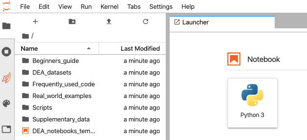
The Sandbox interface consists of the main work area (right-hand panel), the left sidebar (containing a file browser and other useful features), and a menu bar along the top. The main work area is where Jupyter notebooks will be displayed once opened. By default, the Launcher is displayed, which allows you to create new files.
To open your first Jupyter Notebook:
- On the file browser on the left, double click on
DEA_datasets, then double click onDEA Coastlines.ipynb. The notebook will appear on the main work area on the right:

- Jupyter Notebooks work by "running" cells containing code. To run a cell, scroll down and click inside the box beneath
Load packages. This cell will load in code that we need for our analysis. When ready, click the small arrow above the notebook (▶), or typeShift enter.

- The empty
[ ]to the left of the cell will first change to an asterisk[*]to show the cell is running, then change to a number[1]that tells you that the cell has run successfully:

- Follow along with the content in the notebook, starting with
Loading DEA Coastlines dataand pressingShift-Enter(or the ▶ button) to run cells. These sections show how to load DEA Coastlines data for a specific lat-lon box.
3C. Extracting coastal change using the interactive DEA Coastlines app
- Once you have had some practice running cells, proceed to the
DEA Coastlines analysis toolssection. This section includes an interactive analysis tool for extracting coastal change data from DEA Coastlines using an interactive map. Read the instructions underExtract shoreline data by coastal transect, then run the cell containingdeacoastlines.transect_app()to launch the interactive app:

- Zoom in on the map and use the
Draw a polylinetool on the left to draw a transect so that it crosses through a set of shorelines (see example below). Transects should be drawn in a consistent direction, e.g. starting on land and finishing over water. This ensures that results can be compared between transects.
![]()
- Press
Finishwhen you are happy with the line, then pressExtract shoreline data. A graph will appear below the map showing distances along the transect to each annual shoreline (distances will be measured from the start of the transect line you drew above).
Extracting coastal data along multiple transects
- We can also extract coastal change information in bulk for a dataset containing multiple coastal transects. To try this functionality, download one of these transect files to your PC:
- Under the
Advancedheading, clickUpload. Locate one of the files above on your PC, then clickOpen.

- The map will automatically zoom to the extent of the transect data. Once you are ready, press
Extract shoreline data. The resulting graph will now contain data on coastal change across the past 30 years for every transect in the dataset.

3D. Other useful notebooks and apps
Interactive apps (no coding required):
- Real_world_examples > Exporting_satellite_images.ipynb: An interactive app for exporting high quality images of satellite imagery
- Real_world_examples > Generating_satellite_animations.ipynb: An interactive app for exporting time-series satellite imagery animations
Code notebooks:
- DEA_datasets > DEA_High_and_Low_Tide_Imagery.ipynb: Introduction to loading data from the DEA High and Low Tide Imagery products
- Frequently_used_code > Tidal_modelling.ipynb: Example code for combining satellite data with tide modelling
- Real_world_examples > Coastal_erosion.ipynb: Example code for extracting custom shoreline data from Landsat imagery
- Real_world_examples > Intertidal_elevation.ipynb: Example code for generating intertidal elevation data from Landsat imagery
Useful resources
- DEA website
- DEA technical user guide
- DEA Jupyter Notebooks Github repository
- Open Data Cube Slack channel (super helpful for any technical questions)
Or get in touch directly! [email protected]