Lesson 08 Compose GUI ‐ Makeover - FranGarc/LearningPath GitHub Wiki
Topic: Compose GUI - Makeover.
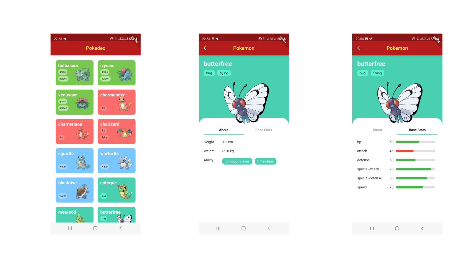
We'll give a makeover to our current GUI by
- Using higher res pokemon images
- Changing the list for a grid
- Adding Tabs to make the detail cleaner
This is an example of the described GUI, but don't let it limit your designs.
Task: GUI Makeover.
Think of a look and feel you're aiming at. Old school gameboy color in-game pokedex-like? A more modern and clean design? Something entirely different? Choose your theme and use it to create your newly designed GUI
Requisites
High Res Images
The sprites object in the pokeapi json contains the following:
- Four back and four front rather small (96*96 px) sprites. PNG format.
- A "versions" object, which contains per-generation per-game versions of the sprites. PNG format.
- An "other" object that contains:
- a dream_world object, containing Dream World versions of the sprite. (only the first 649 pokemon have this ). SVG format.
- a "home" object, which contains Pokemon Home versions of the sprites. PNG format
- an "official_artwork" object, which contains official artwork for the pokemon in question. PNG format.
Check all these objects for several pokemon, making sure you get a good idea of which ones will have urls for the list of pokemon you're pulling from the API. If you're using the whole list of (at the time of writing) 1292 pokemon, you want to make sure you know about this, since the closer to the end the more likely most of these objects won't have an URL.
You'll need to include the objects you decide to work with in your Entity/DTO models.
Grid instead of List
Instead of a list of rows, we'll give grid a go.
- Redesign the (or just create a new) List Item so now it has a more squared proportions. Have it use the image you prefer from those we mentioned earlier.
- Use a grid with at least 2 columns and some padding. If you like a more Instagramesque grid, try to make it so.
- Remember that tapping on one of these new elements will have to take you to the Detail screen.
The Tab is in the Detail
- We'll have a background whose color will depend on at least one of the types of the pokemon.
- We'll use one of the larger images to make it take a larger portion of the screen - the sprites we were using felt really small for some pokemon or, if you manage to stretch them to make them bigger, very pixelated. However, we'll be forced to use the sprites when there's no larger image, so you'll need a way to make sure there's always a fallback URL (the one pointing to the front_default sprite is the only one that's present throughout the whole list)
- The bottom half(-ish) will contain two tabs, one with general information (Abilities, height, weight, etc) and other with the Stats
- The color for the stats will be different for those whose value is under 77 (average value of the 6 average base stat values according to https://pokemon.fandom.com/wiki/Statistics).
Extra
- Like our Entity and DTO models, we can have UI models that are specific to the UI layer and are mapped from Entity models. These UI models will have whatever we actually need in the UI: transformation of Height and Weight, getting the color from the Type, or how to decide which sprite to use (if this sprite is null/empty, then use that one, otherwise this other one, or this default).
- You can add another option to navigate the tabs (besides the default "tap on the tag"): swiping.
Tips & Advice.
- If you opt for the SVG format sprites, you'll need to do a bit of additional research, since coil needs different code for these than for PNG.
Research terms.
- LazyGrid
- TabRow
- ScrollableTabRow
- Draggable