9. Example Graphics - DianaCarolinaVergara/SNPs_pipeline GitHub Wiki
Example of some graphics with vcfR and CoMutPlotter
I found some examples of amazing graphics in published papers. Links below each graphic.

Fig 1 Heatmap of read depth (DP). Each column is a sample and each row is a variant. The color of each cell corresponds to each variant’s read depth (DP). Cells in white contain missing data. Marginal barplots summarize row and column sums. The matrix was extracted from the VCF data with the function vcfR::extract.gt() and the plot generated with vcfR::heatmap.bp().)

Fig 2 Chromoqc plot showing the one supercontig in the pinfsc50 data set after filtering on read depth (DP) and mapping quality (MQ).

Fig 3 Violin plot of read depth (DP). A numeric matrix was produced from the VCF file with the function vcfR::extract.gt().

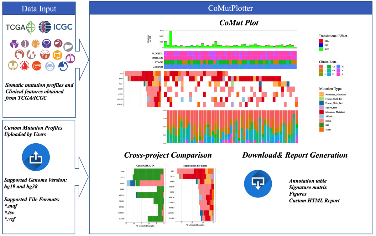
Fig 4. The matrix in the center of the figure represents individual mutations in patient samples, color-coded by type of mutation, for the significantly mutated genes.

CoMutPlotter
And I found an interesting way to generate new plots
(http://tardis.cgu.edu.tw/comutplotter/comutplotter_tutorial/index.html)
This is a visual summary of mutational landscapes in cancer cohorts. This summary plot can inspect gene mutation rate and sample mutation burden with their relevant clinical details, which is a common first step for analyzing the recurrence and co-occurrence of gene mutations across samples.