Chakra UI - DevelopingSpace/starchart GitHub Wiki
Chakra UI is a library that simplifies the process of creating the front-end of their website, by providing them with tools that are both easy to learn, and implement
The snippet below displays the simplicity of creating a UI directly from the components
import * as React from "react";
import { Box, Center, Image, Flex, Badge, Text } from "@chakra-ui/react";
import { MdStar } from "react-icons/md";
export default function Example() {
return (
<Center h="100vh">
<Box p="5" maxW="320px" borderWidth="1px">
<Image borderRadius="md" src="https://bit.ly/2k1H1t6" />
<Flex align="baseline" mt={2}>
<Badge colorScheme="pink">Plus</Badge>
<Text
ml={2}
textTransform="uppercase"
fontSize="sm"
fontWeight="bold"
color="pink.800"
>
Verified • Cape Town
</Text>
</Flex>
<Text mt={2} fontSize="xl" fontWeight="semibold" lineHeight="short">
Modern, Chic Penthouse with Mountain, City & Sea Views
</Text>
<Text mt={2}>$119/night</Text>
<Flex mt={2} align="center">
<Box as={MdStar} color="orange.400" />
<Text ml={1} fontSize="sm">
<b>4.84</b> (190)
</Text>
</Flex>
</Box>
</Center>
);
}The image below is the output for the snippet above

Unlike before, where developers have to spend a considerable amount of times aligning the contents of a card. Now they are able to directly influence the UI from the components itself. This also lessen the time spent of newer developers when it comes to working with the front-end's UI
The library provides its developers a multitude of pre-made components, that can cut developer's time when designing the front-end
The library provides its users the ability to send alert notifications through the use of the alert component
<Alert status='error'>
  <AlertIcon />
  <AlertTitle>Your browser is outdated!</AlertTitle>
  <AlertDescription>Your Chakra experience may be degraded.</AlertDescription>
</Alert>
Other features such as forms are also available. This can range from a simple button to a select form
<Select placeholder='Select option'>
  <option value='option1'>Option 1</option>
  <option value='option2'>Option 2</option>
  <option value='option3'>Option 3</option>
</Select>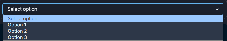
Having pre-made components helps developers managing their time, and also allows newly contributors to apply changes to each component's design
According to chakra-ui, the size of the component themes are one of the major factors for large initial JavaScript payload.
With the release of v2.4.2, developers can now select the components that they want the theme to be allocated towards, simply by using extendBaseTheme
import { ChakraBaseProvider, extendBaseTheme } from '@chakra-ui/react'
// `@chakra-ui/theme` is a part of the base install with `@chakra-ui/react`
import chakraTheme from '@chakra-ui/theme'

const { Button } = chakraTheme.components

const theme = extendBaseTheme({
  components: {
    Button,
  },
})

function App() {
  return (
    <ChakraBaseProvider theme={theme}>
      <Component {...pageProps} />
    </ChakraBaseProvider>
  )
}
There are a myriad more of features presented by the library. Down below are the list of all features it provides, and their respective description
| Feature | Description |
|---|---|
| Style Props | Stylize component by simply passing props |
| Gradient | Transitioning between two or more color |
| Color Mode | Allow developers to set up the color mode of an application between dark, light, system, or custom
|
| CSS Variables | Automatically converts theme tokens to CSS variables so the developer don't have to |
| Semantic Tokens | Values of tokens are changed depending on the environment they are in |
| Responsive Styles | Provides objects and array to contain values for a more responsive styles |
| Chakra Factory | An object of chakra enabled JSX elements, and a function that provides custom component's to receipt chakra styled props |
| CLI | TBD |
| Global Styles | Provides a global stylize for any elements globally. Developers can also manually stylize elements from other libraries |
| Layer Styles | Save stylizes re-usable attributes to the layerStyle prop |
| Text Styles | Store attributes for stylizing text components such as h1, h2 towards the textStyle prop |
The sx Prop |
TBD |
| RTL Support | Provides support for different style of reading |