Research - DanielvandeVelde/Matcher GitHub Wiki
This will consist on some tech research that has been done during the project.
Mostly used to keep a clean look on what things I've considered, although more about that can be read in the 'process' part of the wiki.
It will also hold some information on the research of my first feature, the registration-form.
This will be some design, some UI, some UX and other patterns.
This is some research on the libraries I'm using.
It's always good to explain what I'm using, why I'm using it, alternatives and to show that I know what it does/can do for me.
The templating engine of my choice is Handlebars.
This is a well thought out decision but for a rather strange reason.
I've used EJS before, even wrote a little tutorial on it.
I've used Pug before in a team project I did.
But, I have never really used Handlebars even though I've heard a lot about it.
So that means this would be the perfect opportunity to try something new and see if I like it.
Handlebars is a templating engine which means in dynamically generates HTML pages thanks to some minimal logic such as variables that will set up the content.
It's an extension of Mustache which is fully logic-less, Handlebars isn't since it adds helpers such as if and each which are of course very helpful.
Mongoose is an Object Data Modeling library and will help me manage my MongoDB Atlas database.
MongoDB is a database that stores... data documents with a dynamic structure.
All these documents are saved inside a collection, which I then can address to access them.
It is not an SQL database and very flexible with the data I can store in it.
For example JSON-like objects that can be different almost every time.
Mongoose however will help me specify default values, required fields and other good stuff.
It also has options that let me convert Strings to lowercase, uppercase or Numbers to min/max values even the ability to push items into an array.
I might not use any of them, but I wanted to mention them to show how powerful Mongoose is.
It will let me define schemas, create a model based on them and then map that to the MongoDB database.
Then I can access those through Mongoose and query, edit, save or delete these easier.
Passport is authentication middleware to authenticate requests.
That's pretty much it.
I've used express-session before, but from my research it seems like a lot of people are using passport now.
I see no reason not to try it out.
Pretty much the same as I said with passport.
I used argon2 in the past, but looking at what other people are using I'm finding a lot of bcrypt/bcryptjs.
Technically it's just password hashing.
After looking how I could use Google Maps I figured out that there's no way to do so without setting up payment details.
I therefore went looking for alternatives and found HERE, Mapbox and Leaflet.
Leaflet seems to be an open-source library that would be great for my needs, it even has a little quick-start guide to get me going.
The only thing I need for it is MapBox key that I can get for free without giving any information (or billing info) so that's the way I'm headed.
I had body-parser but apparently that was outdated.
I thought I needed something like multer but since I don't use any multiforms I'm good with just express'.
I have done some research that started out pretty simple although I did run into some obstacles.
Of course I started my research by entering the phrase 'Best datingsites' on Google and clicking the search-button.
I found two interesting websites that I somehow know by name.
One of these is Eharmony and the other is OKCupid.
I believe these are among the most popular websites and they both have won many awards for a whole bunch of things.
What I was interested in was how their pages looked, what patterns they used, what things I saw I believed I could do better and anything other inspiration.
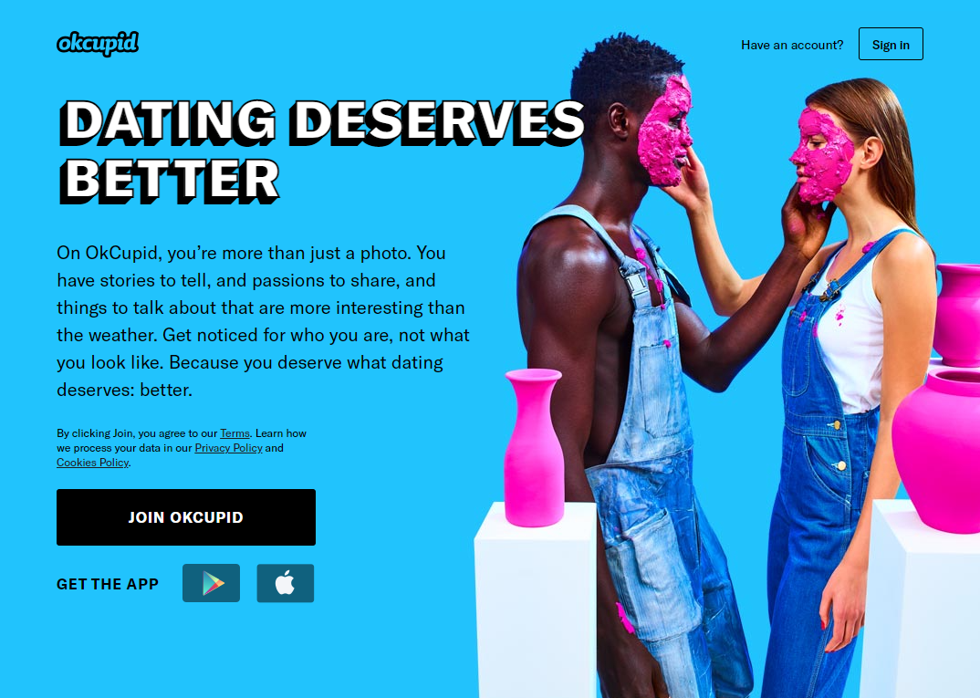
OKCupid is the first of the sites I looked at.
I really liked their simple homescreen that conveyed just the right information.
Their homescreen changes from a bright blue (as pictured) to green and pink showing different happy couples or attractive people.
I myself don't find this particularly interesting, but happy & attractive people are a good way to sell your product.
OKCupid has a simple header: the logo in the top left and a log-in on the top right.
Most of their users are probably there to log in, so it's a good pattern to have.
I myself will probably show both 'register' as well as 'log-in' links for my purpose, but I see the design pattern there.
They have an interesting contrasting 'slogan' kind of thing going on with the white text in a playful font-family.
The text below that is a small explanation of what the website is, what it's purpose is and what it wants to do for you.
This seems like a good place to explain what the website is, tell the user that you understand their problem and then explain how you solved it.
The giant button below that to sign up is a good call-to-action as well and definitely something I'm using in my application.
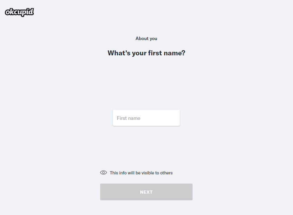
I find this page one of the most difficult and weirdest decisions by OKCupid that I've found during my research.
Everything in this page is grey.
The OKCupid logo is still visible, but since we're on the register procedure all other buttons are gone.
Instead of a label for the input, a question is asked from the user.
There's also a placeholder that tells the user what should go in that input-field.
This is a good pattern, the combination of label and placeholder is always necessary in my opinion and something that I will use in my application as well.
Telling the user that information that he enters in the form is sometimes used and visible to others and sometimes isn't can be very important based on the type of information the user gives.
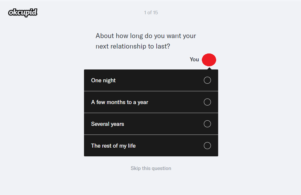
During the registration the user gets different sections of different questions.
As seen at the top of the screen the user is on question 1 of 15.
The section I was in at the moment of this screenshot was 2 out of 3, that was hidden from the user to not overload them with all the information they have to fill in after finishing the different parts.
The question is still visible but after they asked me to upload a picture, there is now an image of my face present (red circle)
This is supposed to be me answering the questions (by selecting the button that applies to me).
I'm assuming somewhere in testing they found that this worked best to get people to answer better or more truthfully, but that's only speculation.
The option to skip the question is also present.
I'm guessing this is because these questions are for the matching-algorithm and therefore not required, just recommended for the best possible match.

This image is taken after I answered my part of the question (see image before this one)
Instead of matching someone who gives the same answer, they ask what their perfect match would say.
This is a very easy way of implementing a good matching system that relies on answers already given by the users.
For some reason I see someone casually asking the database to "grab the people that answered these answers to these questions and the user vice versa and sort them by how many they got correct".
The 'this is important to me' is also a nice feature, makes you feel like you have an impact on how important the questions are instead of them all weighing the same.
I don't see myself implementing this since my concept isn't going this direction but I do see the value in this way of registration and ability to match.
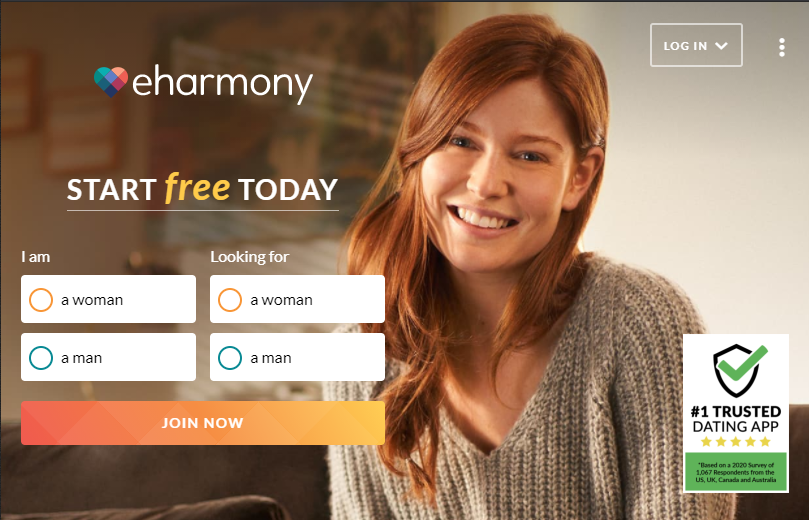
Eharmony was the second website I took a look at.
Their homescreen (image above) is very nice since it already lets the user enter some information before moving on to the creating of their account.
This way the user has already entered information, made some progress and might as well finish signing up.
What I am missing which is great in the OKCupid website is that the slogan/tagline is just 'Start free today' which is in my opinion not a very good start.
The fact that it's free is nice, but it's not a reason to sign up.
It's also missing a small piece of information about the site, a reason to sign up.
Or maybe it's because they're such a well known and seen as a good website that people will sign up without needing any further explanation.
For my application I think it's important to state what my Unique Selling Point is and make the user interested in signing up.
The header is similar to that of OKCupid, the logo is on the main screen instead and logging in is the main functionality.
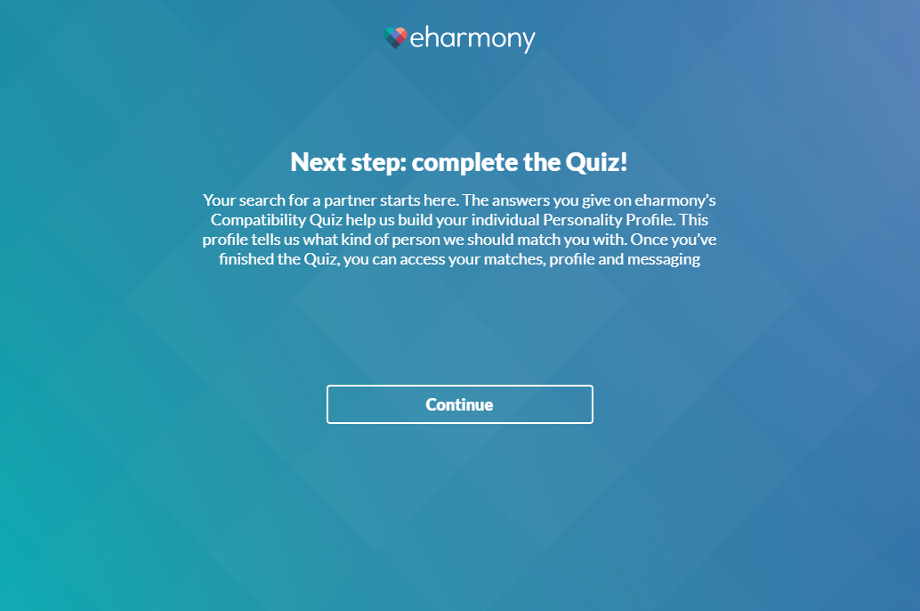
Eharmony starts their signing up with a little quiz.
I personally am already put off by this as a first screen but I guess it's a necessary evil in finding your soulmate.
Calling this a quiz instead of first creating an account or registering seems a bit strange, but there's probably a good reason for this.
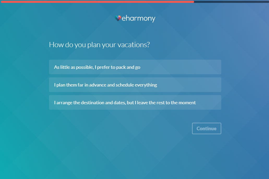
While feeding the algorithm information about my personal preferences there's a bar at the top moving along with the progress I'm making.
This is in my opinion a better solution than OKCupid had with the '1/15 questions'.
Even though this is more abstract and you never really know how much more you need, it feels nicer to fill a bar than to get to that 15 out of 15.
A big thing to note as well and OKCupid had this as well is that 1 question is shown at a time with different inputs.
The important parts are that it's phrased as a question and that the options are all visible at the same time.
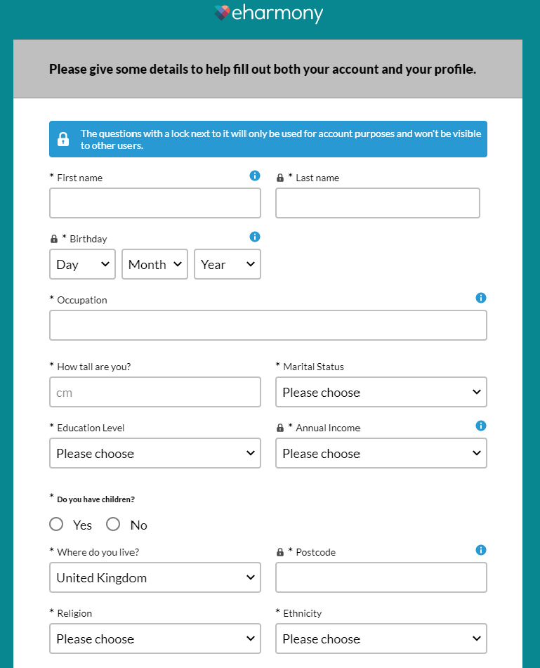
And finally we arrive to this behemoth of a form (that I cut short).
Since we already went through ~30 minutes (yes, that long) of entering our personal preferences and sharing our most intimate secrets with the algorithm it's time to fill out this form.
I think you can consider this sunken cost and for most people it's too late to turn back and they'll enter this form since they've come this far anyway.
This form has a lot more personal information such as ethnicity, annual income, religion and even how tall you are.
These have nothing to do with all the nice 'What's your ideal vacation spot?' questions the user was asked earlier.
But enough ranting about the bad, what can I take from this.
I really hate the clashing grey background with black text out of nowhere about entering details.
I'm assuming showing the form with a title would be good enough.
What I like about this is the blue message stating that not all information will be shared with other users.
I feel like this is a nice way to show users you value privacy to some degree and that they don't have to worry of other users seeing this private information.
Another thing I don't like is the constant use of the asterisk everywhere.
All fields are apparently required, so you don't need an asterisk in front of every label, just state that the user needs to fill out every single field.
Small things like the 'Do you have children?' question being in a different font can be seen as a small mistake.
I dislike the 'Please choose' everywhere and still entering the wrong information as default on the 'Where do you live?' question.