User Interface Document - ChillChiliStudio/Order227 GitHub Wiki
Main Index
Introduction
In this document we will specify how the User Interface will be and how it is composed.
Following our Art Bible and Game Universe explained in GDD, we have decided to choose the artistic style of Command & Conquer Red alert 2. We will modify and use its User Interface assets according to our necessities. In some cases we have already chosen some sprites of Red Alert 3.
Referring to the main screens and all the navigation flow, we have designed a few and easy screens to make the process fast and simply following basic design rules but while keeping the military mood and the style of the age in which the game is ambiented.
Technical Guidelines
In matters of technical subjects, the User Interface will be structured as a big factory, starting from the base of a simple class (UI element), with basic functions like Draw(), onTop( )or Update(). All the elements of User Interface will be defined on his own class (Button, Panel, Label...) and with its own functions, inheriting the basic ones from UI_Element Class. All the UI Elements will be created through a factory that will be determined at the Scene and setup there, choosing the adequate type and action. When a UI Element is created, automatically will be placed into a list and this will be iterated in the scene to update each time the user interacts with it.
You can visually see the User Interface UML pretty detailed in the Code Organization UML section of the Technical Design Document.
Artistic Guidelines
We know that the User Interface must be as fluid and as understandable as possible so the player know what to do in a fast way almost without thinking, which means that our objective is to leave a dynamic gameplay while the player doesn’t spends much time understanding the interface and can use it without breaking its experience. In order to accomplish this, we have to think on a intuitive, dynamic and fast User Interface.
We will follow the game’s realistic style in which the player has to feel in command of its troops with the remoteness enough as to feel secure and out of danger (like remotely commanding), so the most clever is to feel the User Interface as a commanding machine.
Also, the artistic thread of the game is to follow a communist iconic style (red colors, symbols of workers and people empowerment as well as symbols of fight against capitalism…) as well as a russian style (fonts similar to cyrillic alphabet, sensation of toughness...). So we must keep loyal to these kind of elements as well as to be realistic in time subject. If the game is ambiented in mid 70s-80s, all the screens must feel as an ancient computer and stylized in that period inside areas of militarism, espionage and intelligence along with a serious and formal style as well as hierarchized context and social area with serious colors (grey scales). This is for the aspect of the User Interface and how the player feel that it is remotely controlling everything through a screen in a command site.
The next images are concept examples of how we will do the User Interface. This next gif is to show how the Main Menu is thought to be.

This one for the in-game interface (only seen the HUD, the UI Control Bar for the whole game).
And this one for the pause screen, in which the game is seen paused in the background and on the top and lighted, the pause panel.
For space and time reasons (and as they are many), we are not going to publish all UI sprites here. Instead, if you want to see them, we have all the assets that we will use in Order 227: Not a Step Back here.
User Interface
In order for the reader to understand the whole UI and the screens flow, we have done a Navigation Map of all screens. As told, they are few and easy screens to make the Player Experience fast and simply following basic design rules. We will explain each screen downwards.
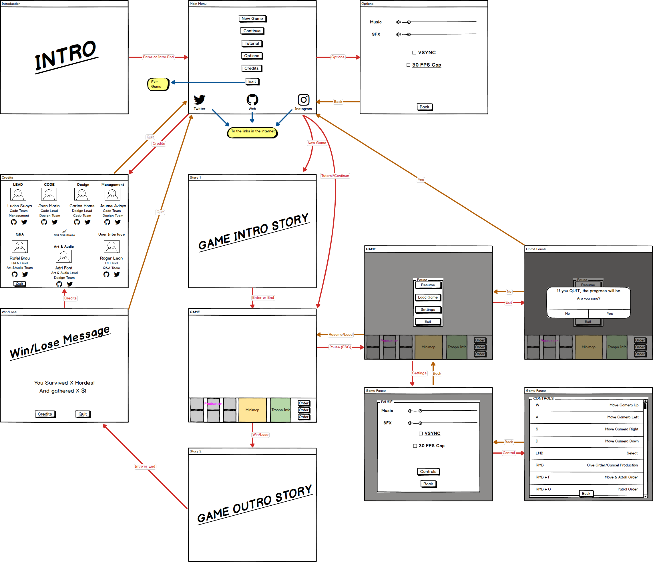
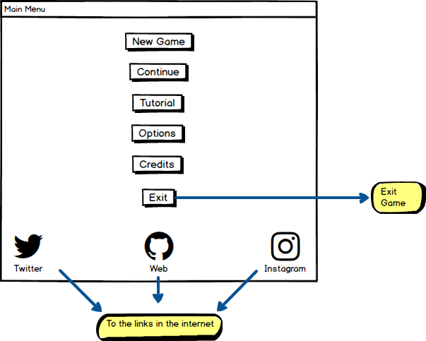
Main Menu Screen
Main menu counts with 9 buttons being three of them links to our social networks and web and another to exit the game. Other 3 are to go in-game (begin a new game, continuing an old one saved or going to the tutorial), which are in the main menu and no in another screen in order to not to interrupt the process of pressing - play, contributing to speed, and understanding that the user, with one read, will almost always know what are those three buttons for even arriving to ignore them and go directly. Finally there are two buttons for Options and Credits, which lead to 2 different screens. We thought on puting the Credits buttons inside the Options screen, but we didn’t wanted to make invisible the developers of the game.
Settings Screen
This is a simple screen to modify the game’s volume (of music and FX), to active/unactive the VSYNC and the framerate cap. Also, a button to go back the Main Menu.
Credits Screen
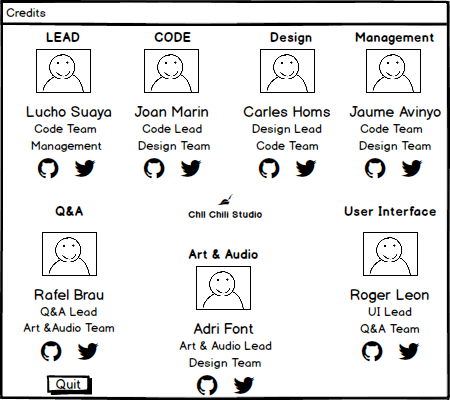
This is simply a screen in which each team member appears with its name, its responsibilities, a picture of him and links to personal github and twitter. Also, there’s an image of Chill Chili logo and a button to go to Main Menu.
Tutorial
For time reasons, we will include a very basic tutorial consisting on a screen for the player learn fastly how to play and how the game works.
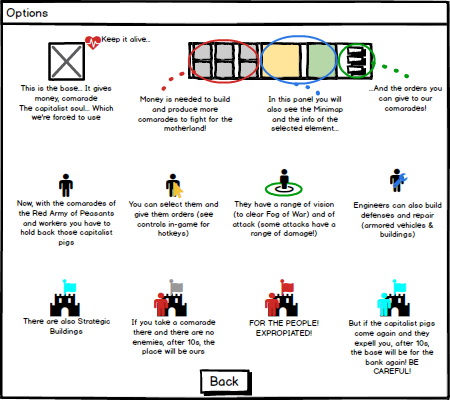
The objective is to make the player know how to play in a efficient, fast and understandable way while keeping it simple and easy to develop. The basics of the game is taught through images so the player learn the first steps and, through its experience and time playing, learns deeper on how to assimilate the game mechanics to finally master them thanks to challenge.
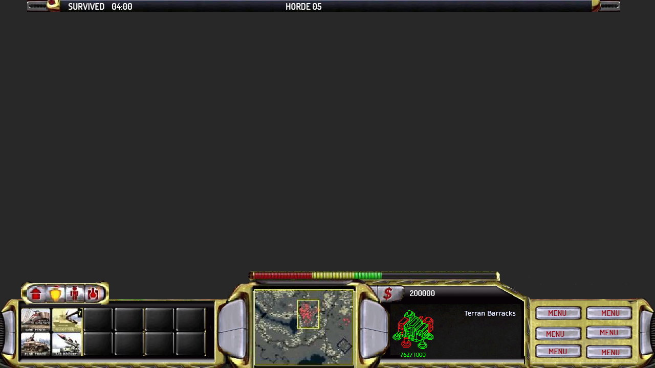
In-Game Interface (Heads Up Display)
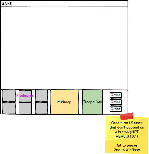
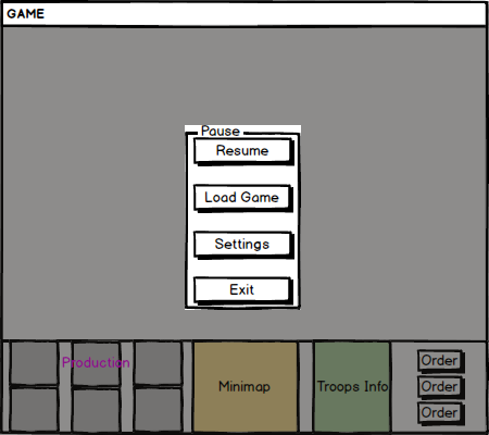
In order to satisfy all our desires to have a good player experience, we have redistributed all the Red Alert 2 in-game User Interface in order to easily control all the troops (and know its status) and make the player feel comfortable through all the UI elements while playing. We can see at the bottom, a control panel so the player feels the control. This bar has, at its left, a place to the player to know which elements can be produced, in the middle a minimap to have the control and the intelligence over the terrain, along a little screen in which information of selected troops or buildings selected (name, quantity of units selected, life, money income if any), will be shown. Finally, at the right, the orders available to give to the selected troops will be shown.
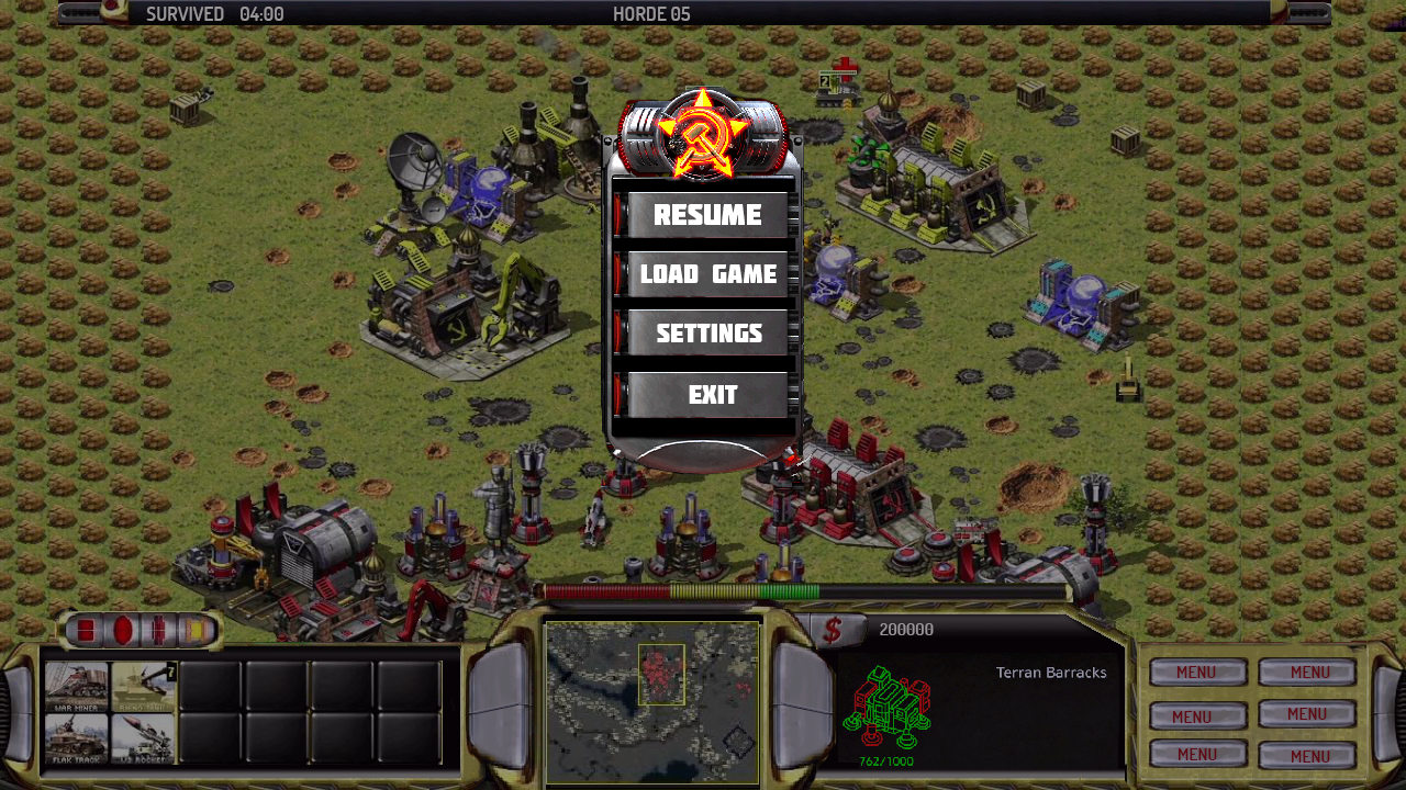
Pause Screen
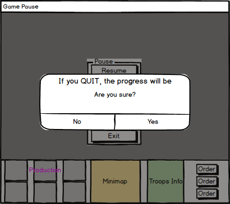
This screen is accessed by pressing ESC key in the game and will show different options. First of all, the option to resume the game, then an option to load the last saved game (they both lead to the in-game screen again, unpausing it), also another to go to the pause settings menu and finally an option to leave the game and go to the Main Menu screen.
This last one (Quit) has a confirmation message like this:
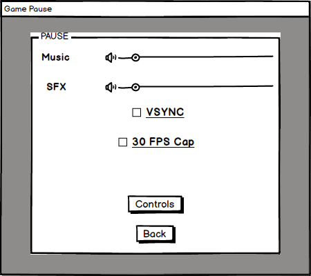
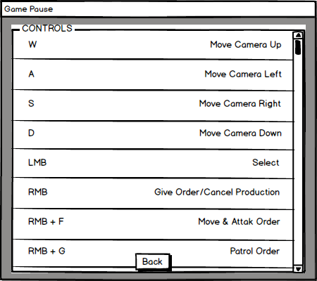
The settings screen of the pause menu is pretty similar to the options one. It contains two sliders to modify the game volume, two options to active/unactive the VSYNC and framerate cap, a button to see the controls and a button to go back to the pause menu.
The controls buttons leads to a screen like the next.
Win/Lose Screens
In this case, both win and lose screens will be the same but changing the message, since the important matter to make the player feel like he won/lost are the story screens. From here, there’s the option to leave to Main Menu or to go to credits screen.

Narrative Screens
These narrative screens will be before playing a new game (not when clicking on continue or tutorial) in the case of the intro screen and after playing (the outro one). They will show the general story of the game (you can read it at Story & Narrative Structure section of the Game Design Document). For an early version of the game (Alpha), the story will be shown as text with animation or drawings. For a later version, these can be cinematics or more advanced animations.
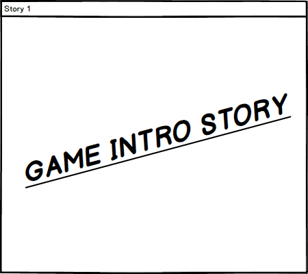
They just have to summarize the story explained at the GDD, which is not very long. Of course, the outro screen will show something depending on if the user has won or lost.