Progress Widget - Chase-William/LilWidgets GitHub Wiki
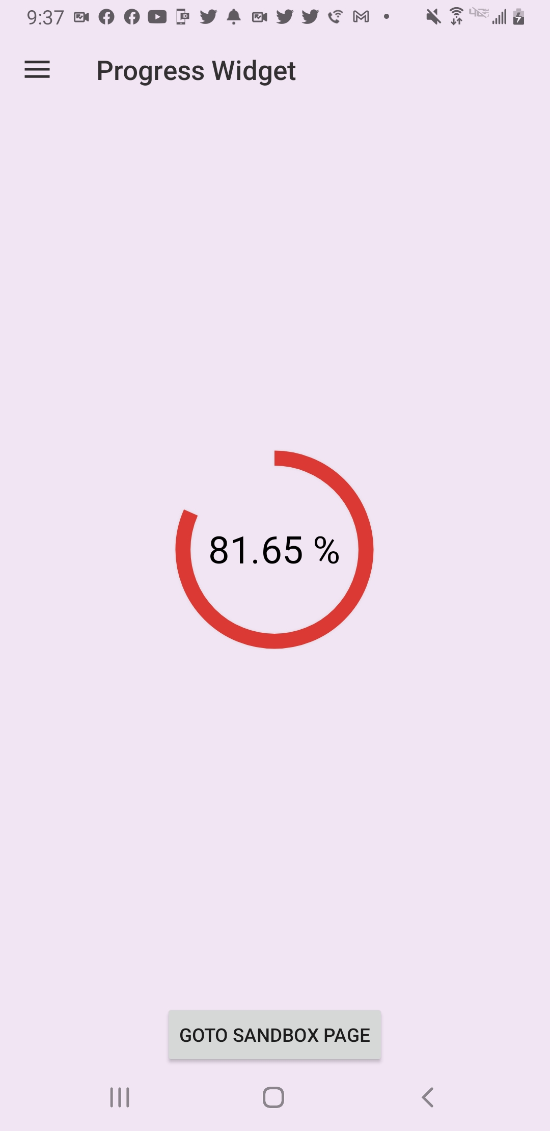
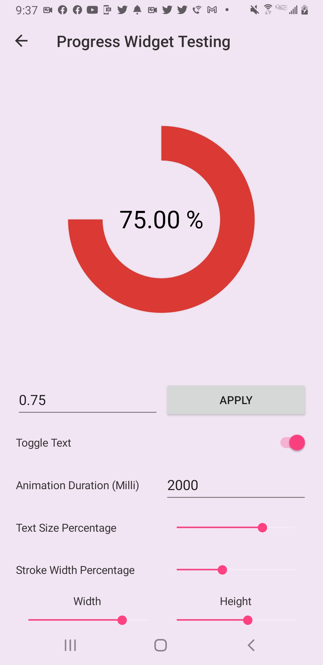
| Progress Widget Example Page | Progress Widget Test Page |
|---|---|
 |
 |
The Progress Widget is designed to show a percentage of a goal or objective. This can be anything from a quiz score where the user attained a 90%, or even a loading bar where the loading process’s progress can be given.
A simple example of implementing the Progress Widget into your xaml is as follows:
<lilWidget:ProgressWidget PercentProgressValue="0.65"
                          TextColor="#323031"
                          BackArcColor="#FFC857"
                          ProgressArcColor="#DB3A34"/>
Here we are providing a percent value to be displayed while also overriding the default colors for the text and arcs.
A more customized implementation would look as follows:
<lilWidget:ProgressWidget HorizontalOptions="FillAndExpand"
                          VerticalOptions="FillAndExpand"
                          PercentProgressValue="0.65"
                          StrokeWidth="20"
                          TextMargin="70"
                          Margin="40"
                          TextColor="#323031"
                          BackArcColor="#FFC857"
ProgressArcColor="#DB3A34"/>- PercentProgressValue
- ProgressArcColor
- BackArcColor
- ShadowColor
- IsTextVisible
- Duration
- StrokeWidthPercentage
- TextColor
- TextSizePercentage
The PercentProgressValue property determines the percentage (1.0 to 0.0) that is displayed. Changing this property will trigger the animation to start.
The ProgressArcColor property determines the color of the arc that is displaying the PercentProgressValue's value.
The BackArcColor property determines the color of the backing arc. The backing arc is the arc that is positioned directly behind the progress arc.
The ShadowColor property determines that color of the shadow used around the arcs.
The IsTextVisible property determines the visibility of the percentage text in the center of the widget.
The Duration property determines the time it takes in milliseconds for the animation to go from 0% to 100%. This means that if the duration is set to 2000 milliseconds and the PercentProgressValue changes by 50%; It will only take 1000 milliseconds to complete the animation.
The StrokeWidthPercentage property determines the width of the arcs relative to its container.
A percentage is used because it provides a simpler way of setting the size of the view. Once set, the percentage will never need to be updated from within the view. Whereas if a width in DPI was used, an implementation for the target width (WidthRequest) and actual width (Width) would be needed which can be seen in the standard Xamarin.Forms controls. A ratio would also need to be taken that would be used when changing the views bounds so the width could remain relative to the limiting dimension of the widget. This would keep the desired look and was how this project was originally implemented. After much thought and consideration, it was decided simpler is just sometimes better.
The TextColor property determines the color of the percentage text displayed in the center of the widget.
The TextMargin property determines the margin/spacing used on the left and right sides of the percentage text. This property takes a float instead of the Thickness type because the top and bottom cannot be defined and the left and right margins will always be the same value.
Below is a visual guide of how some of the more convoluted properties impact the UI.
