Popover - AppDaddy-Software-Solutions-Inc/framework-markup-language GitHub Wiki
<POPOVER/> : ViewableWidget
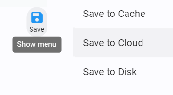
The <POPOVER/> widget allows a user to open and display a popover option by tapping an icon. The POPOVER items should be related to the icon. POPOVER takes two or more ITEM children placing them in a build-in button list.
Popover does not remain open after click or tap on an button item, consider a
MODALif you need to click or tap multiple options
| Name | Type | Default | Description | Req |
|---|---|---|---|---|
| label | string | "" | Open button label | |
| icon | icon | more_vert | Open button icon | |
| enabled | bool | true | Popover interactable | |
| data | datasource id | n/a | Populate the Popover from a datasource | |
| color | color | grey | Color of icon/label |
| Name | Type | Default | Description | Req |
|---|---|---|---|---|
| onclick | event | n/a | Event to call on click/tap | ✔ |
| label | string | "" | Item button label | ✔ |
<FML>
    <CENTER>
        <BOX layout="column" center="true" height="400" width="100%">
            <BOX height="200" width="300" color="#F1F5F7" valign="between">
                <INPUT value="" lines="5" width="300" />
                <ROW valign="center" halign="end" width="300">
                    <POPOVER color="blue" icon="save" label="Save">
                        <ITEM label="Save to Cache" onclick=""></ITEM>
                        <ITEM label="Save to Cloud" onclick=""></ITEM>
                        <ITEM label="Save to Disk" onclick=""></ITEM>
                    </POPOVER>
                </ROW>
            </BOX>
        </BOX>
    </CENTER>
</FML>Using a popover to allow for multiple similar options