BARCHART - AppDaddy-Software-Solutions-Inc/framework-markup-language GitHub Wiki
The BARCHART framework element displays a graphical representation of a dataset.
The BARCHART outputs a graph displaying X and Y data points in a range of visual configurations.
Attributes :: VisibleWidget (inherited attributes)
| Name | Type | Default | Description | Req |
|---|---|---|---|---|
| id | string | n/a | id of the chart | ✔ |
| type | string | n/a | pie/cartesian, only required for pie charts | |
| showlegend | string | bottom | display legend (can be set false) top / bottom /left / right | |
| horizontal | bool | false | Swap the orientation of the axis (not for pie charts) | |
| animated | bool | false | animates the chart |
The y axis (sometimes referred to as the measure axis, usually vertical) must be numeric
Requires
SERIESchild(ren)
| Name | Type | Default | Description | Req |
|---|---|---|---|---|
| type | string | "bar" | Sets the series type bar/line/pie | ✔ |
| name | string | n/a | The display name of the series in the legend | ✔ |
| data | string | n/a | Data for the series from a Datasource | ✔ |
| x | Map | n/a | Binding to 'x' values from the Datasource's data rows | ✔ |
| y | Map | n/a | Binding to 'y' values from the Datasource's data rows | ✔ |
| label | string | y value | pie/bar series labels can be an eval, bound to the data rows or set to label="" to show nothing |
|
| color | Color | preset | Colors the series | |
| stroke | int | varies | Sets the size of the line on a line series |
|
| radius | int | varies | Sets the size of the plot point on a line series |
|
| stack | string | none | Identifier for which stack the series belongs to (stacked bar only) | |
| group | string | none | Identifier for which group the series belongs to (grouped bar only) | |
| showline | bool | true | Shows the line, can be set to false to make a plot series (line series only) | |
| showpoints | bool | true | Shows the points, can be set to false for a smooth line (line series only) | |
| showarea | bool | false | Graphically highlights the area below the line (line series only) |
The SERIES outputs a dataset plotting its X and Y data points within a CHART element. It has multiple settings to configure how it graphs the visual data for both cartesian and pie charts. When using multiple series within a cartesian chart they will be placed as layers with the first SERIES being the bottom layer and the last SERIES being the top layer. Aside from some restrictions you can use multiple SERIES in the same CHART and the SERIES type can be mixed as well, for example you could have a line series over a bar series.
- Choose a series type that best displays the type of information supplied as a whole for all the series, or combine two types that show alternate data that correlates to each other. Be aware of which series will work together.
- Use a series type that fits the space of your graph and data, series with more data or labels should use less intrusive graphing styles to leave room for labels and small series should use larger styles to enhance readability of the data.
- Ambiguity should be kept to a minimum through legends and labels
- Be conscious your data is visible with the ordering of series layers and place
labelseries types last so they overlay the series they are mapping. - Consider using a custom
TOOLTIPfor labels that are too big. - Name each series so it can be clearly displayed in the legend.
- A pie chart type
CHARTcan only have a singleSERIESchild - A bar chart type can only have multiple series if each series defines how to stack and/or group them together
- The y value(s) must be a numeric data type
-
SERIESrequires an assigneddataattribute to reference and plot data - If the
XAXISis a type of time and there is multiple bar series, they cannot be stacked, only grouped. - If the
XAXISis a type of time and you have a bar series it is not possible to show labels.
| Name | Type | Default | Description | Req |
|---|---|---|---|---|
| type | string | XAXIS: category / YAXIS: numeric | numeric/category or *date/time/datetime (only for XAXIS) |
|
| format | string | n/a | ISO 8601 (only for XAXIS when date/time/datetime) |
|
| labelrotation | int | 0 | Rotate the tick labels | |
| title | string | "" | Give the axis a title | |
| min | datetime/num | n/a | Sets the minimum value the axis will show | |
| max | datetime/num | n/a | Sets the maximum value the axis will show | |
| interval | (datetime/num) | n/a | Suggests the interval between ticks | |
| labelvisible | bool | true | Show/hide the axis tick labels | |
| labelsize | int | 12 | fontsize of the axis tick labels | |
| truncate | bool | false | (*only Y Axis) Allows the axis to start at a number based on the chart data instead of 0 (zero) |
The XAXIS/YAXIS are required children of CHART, it conveys the scope of the data within the chart to the user by giving visual control over how SERIES data is plotted in relation to the axes.
- Use
labelrotationon theXAXISwhen you have longer labels, recommended value being between -90(vertical) and -30. See (examples).
YAXISmust be numerictype="numeric".XAXISwith a type of date / time / datetime must have datetime ISO 8601 formatted point data (ie: 2021-11-21T21:21:21) See examples.
| Name | Type | Default | Description | Req |
|---|---|---|---|---|
| color | Color | transparent | color of the label range | |
| anchor | string | center | placement on the cross axis: start/end/center | |
| position | string | auto | placement on the main axis auto/inside/outside/margin | |
| direction | string | auto | label direction horizontal/vertical/auto | |
| label | string | '' | Center label text | |
| labelcolor | Color | theme | Color of the label text | |
| labelsize | int | 12 | Size of the label text | |
| startlabel | string | '' | Start label text | |
| endlabel | string | '' | End label text | |
| x | num/datetime | n/a | x axis point of a label | |
| x1 | num/datetime | n/a | x axis start range of a label | |
| x2 | num/datetime | n/a | x axis end range of a label | |
| y | num | n/a | y axis point of a label | |
| y1 | num | n/a | y axis start range of a label | |
| y2 | num | n/a | y axis end range of a label |
LABELs are optional children of CHART, they draw a label on the chart, it serves the purpsoe of annotating a point or range from the chart axis. If you supply a range on an axis it will can highlight the range, it can also be used to add additional information about a chart AXIS.
- Use
LABELs to highlight an section of the chart or to add additional axis information, they can be derived from a databroker like axis ticks which can be useful for providing more information along an axis.
A label is axis bound and can only contain plot values for x or x1 + x2 or y or y1 + y2.
You can bind to the selected point data which updates each time a user selects a new data point by: {mychartid.selected.mydatafieldkeyfromadatasource}
You can also bind to point values with {mychartid.selected._id/_x/_y/_label} as long as the name doesn't collide with the datasource data keys.
Dataset, click to expand
<DATA id="DB1">
    <VALUE>
        <![CDATA[<SET>
            <COORD>
                <x>1</x> <x2>January</x2> <x3>2010-07-20 20:18:04Z</x3> <y>3</y> <y2>1</y2>
            </COORD>
            <COORD>
                <x>2</x> <x2>February</x2> <x3>2011-07-20 20:18:04Z</x3> <y>5</y> <y2>3</y2>
            </COORD>
            <COORD>
                <x>3</x> <x2>March</x2> <x3>2012-07-20 20:18:04Z</x3> <y>4</y> <y2>2</y2>
            </COORD>
            <COORD>
                <x>4</x> <x2>April</x2> <x3>2013-07-20 20:18:04Z</x3> <y>8</y> <y2>6</y2>
            </COORD>
            <COORD>
                <x>5</x> <x2>May</x2> <x3>2014-07-20 20:18:04Z</x3> <y>7</y> <y2>9</y2>
            </COORD>
            <COORD>
                <x>6</x> <x2>June</x2> <x3>2015-07-20 20:18:04Z</x3> <y>7</y> <y2>5</y2>
            </COORD>
            <COORD>
                <x>7</x> <x2>July</x2> <x3>2016-07-20 20:18:04Z</x3> <y>10</y> <y2>8</y2>
            </COORD>
            <COORD>
                <x>8</x> <x2>August</x2> <x3>2017-07-20 20:18:04Z</x3> <y>11</y> <y2>13</y2>
            </COORD>
            <COORD>
                <x>9</x> <x2>September</x2> <x3>2018-07-20 20:18:04Z</x3> <y>10</y> <y2>8</y2>
            </COORD>
            <COORD>
                <x>10</x> <x2>October</x2> <x3>2019-07-20 20:18:04Z</x3> <y>9</y> <y2>7</y2>
            </COORD>
            <COORD>
                <x>11</x> <x2>November</x2> <x3>2020-07-20 20:18:04Z</x3> <y>11</y> <y2>9</y2>
            </COORD>
            <COORD>
                <x>12</x> <x2>December</x2> <x3>2021-07-20 20:18:04Z</x3> <y>14</y> <y2>12</y2>
            </COORD>
        </SET>]]>
    </VALUE>
</DATA>
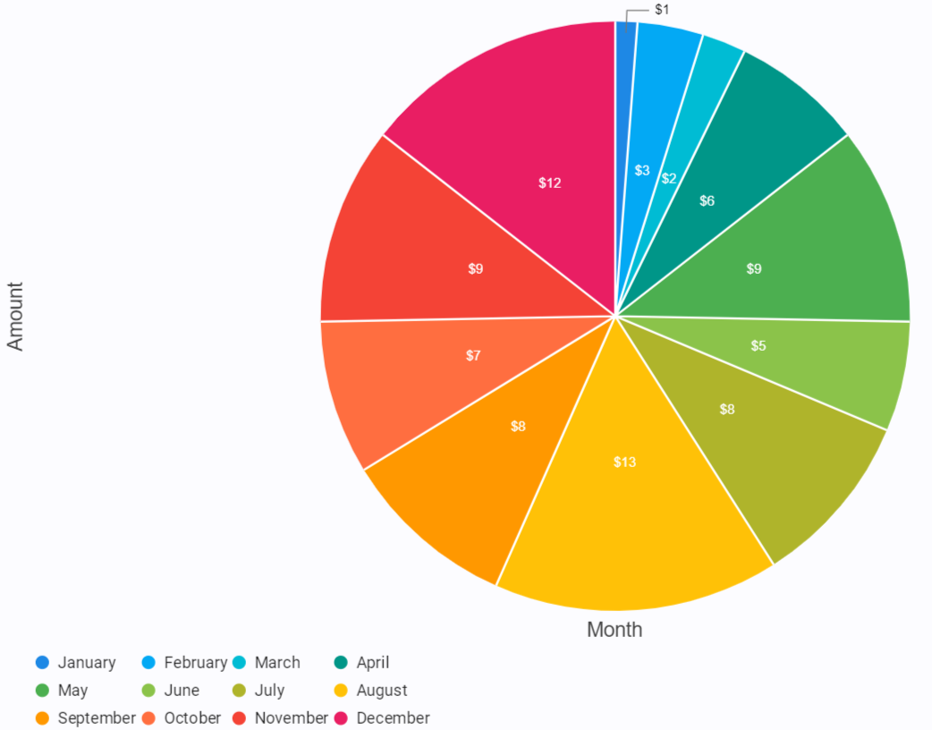
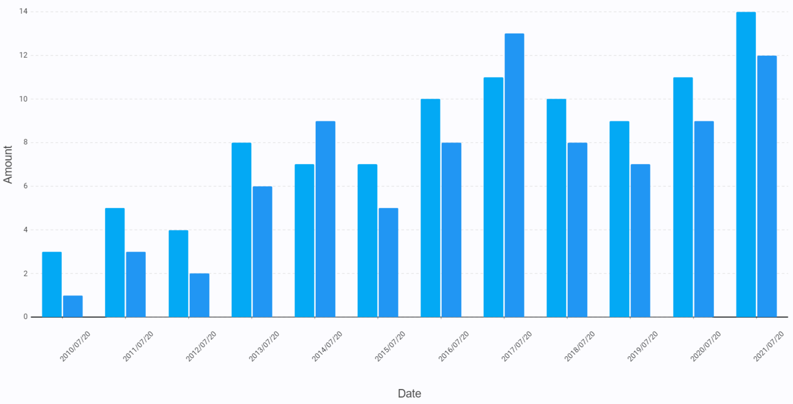
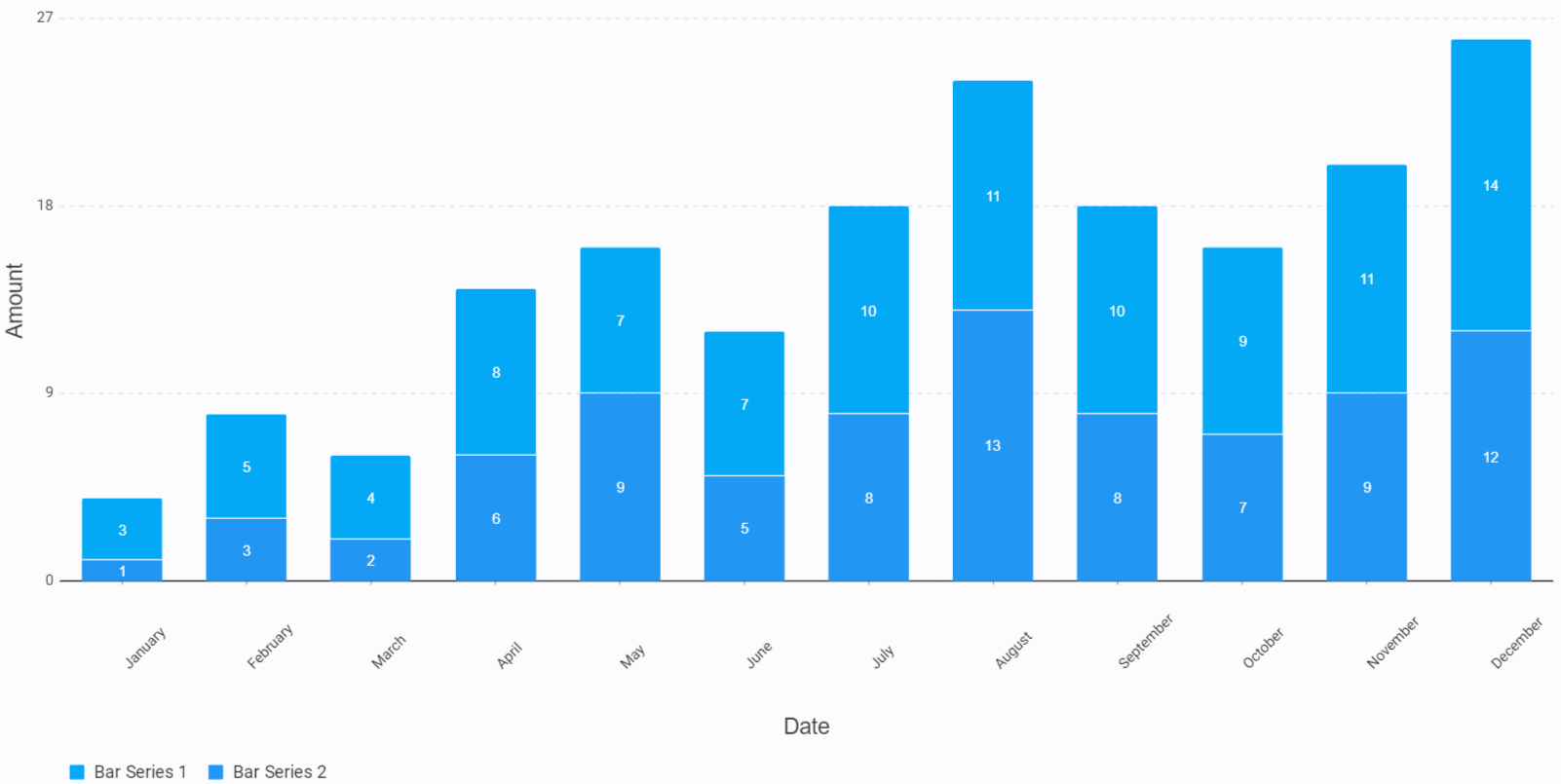
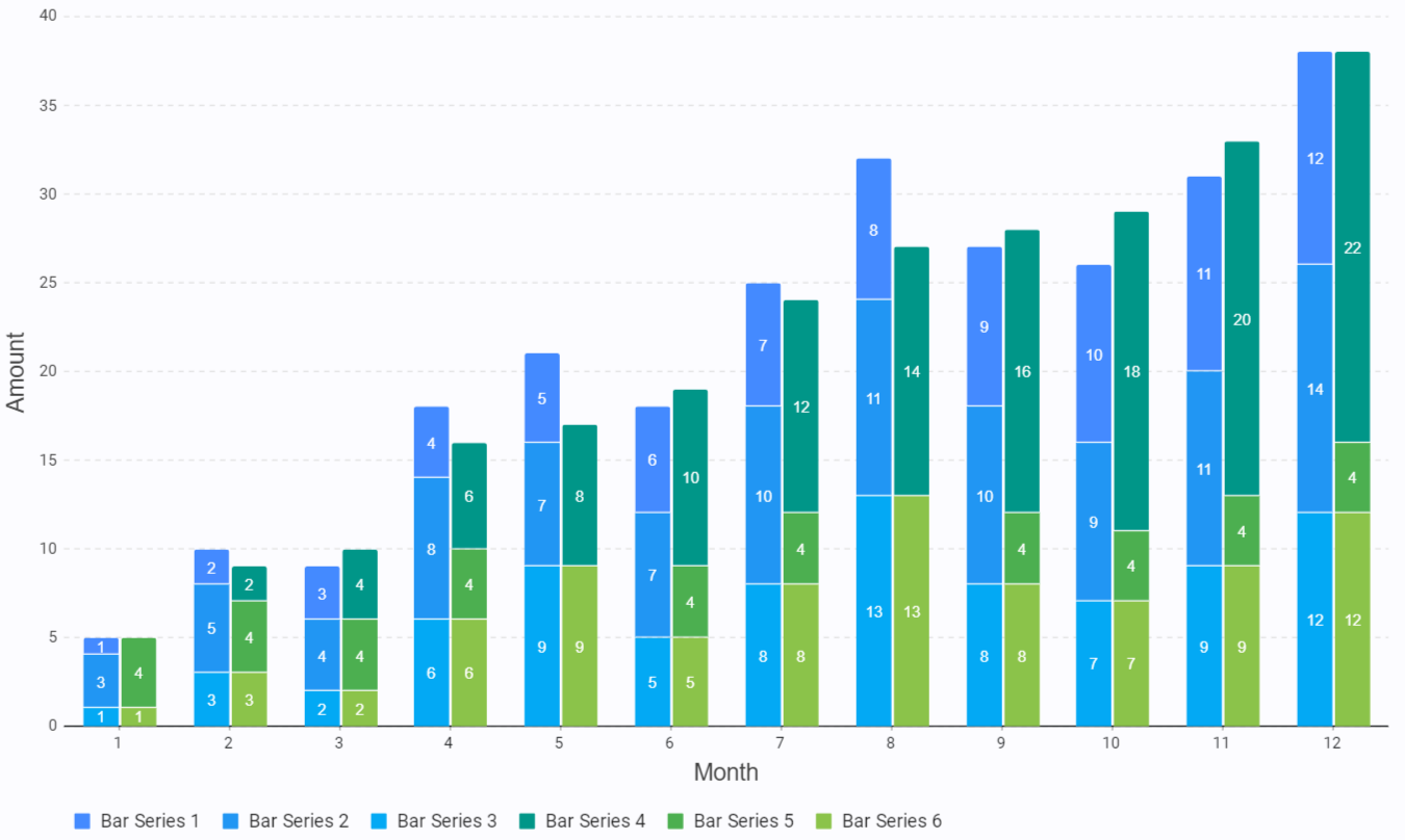
All figures shown below are derived from this data for consistency.
<CHART id="testchart" type="pie" showlegend="bottom">
	<XAXIS type="category" title="Month" />
	<YAXIS type="numeric" title="Amount" />
	<SERIES name="Pie Series 1" type="pie" data="DB1" x="{data.x2}" y="{data.y2}" label="${data.y2}" />
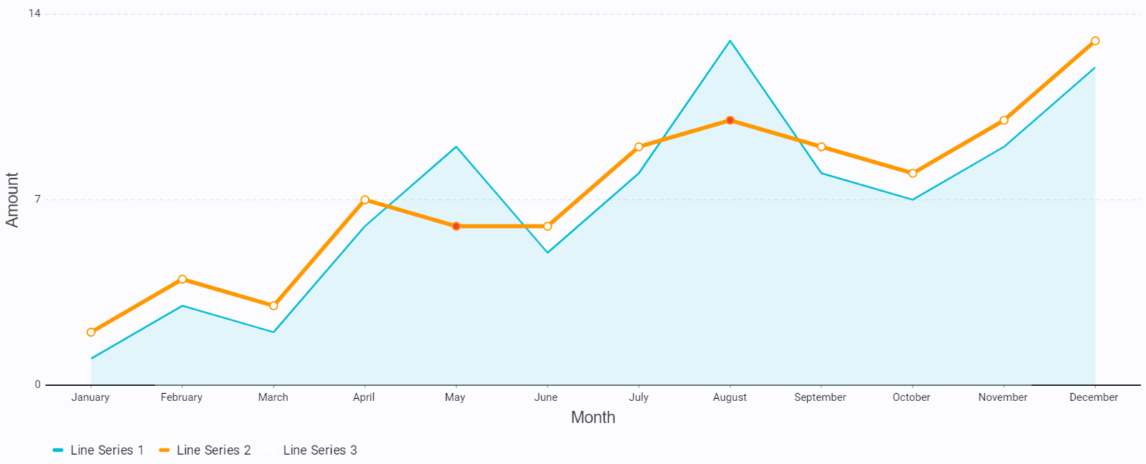
</CHART><CHART id="examplechart" showlegend="true">
<XAXIS type="category" title="Month" />
<YAXIS type="numeric" title="Amount" />
<SERIES id="ls1" name="Line Series 1" type="line" data="DB1" x="{data.x2}" y="{data.y2}" color="cyan" stroke="2" showarea="true" showpoints="false" />
<SERIES id="ls2" name="Line Series 2" type="line" data="DB1" x="{data.x2}" y="={data.y} - 1" color="orange" stroke="4.5" radius="5"/>
<SERIES id="ls3" name="Line Series 3" type="line" data="DB1" x="{data.x2}" y="={data.y} - 1" color="={data.y} < {data.y2} ? 'red' : 'white'" showline="false" radius="3.5"/>
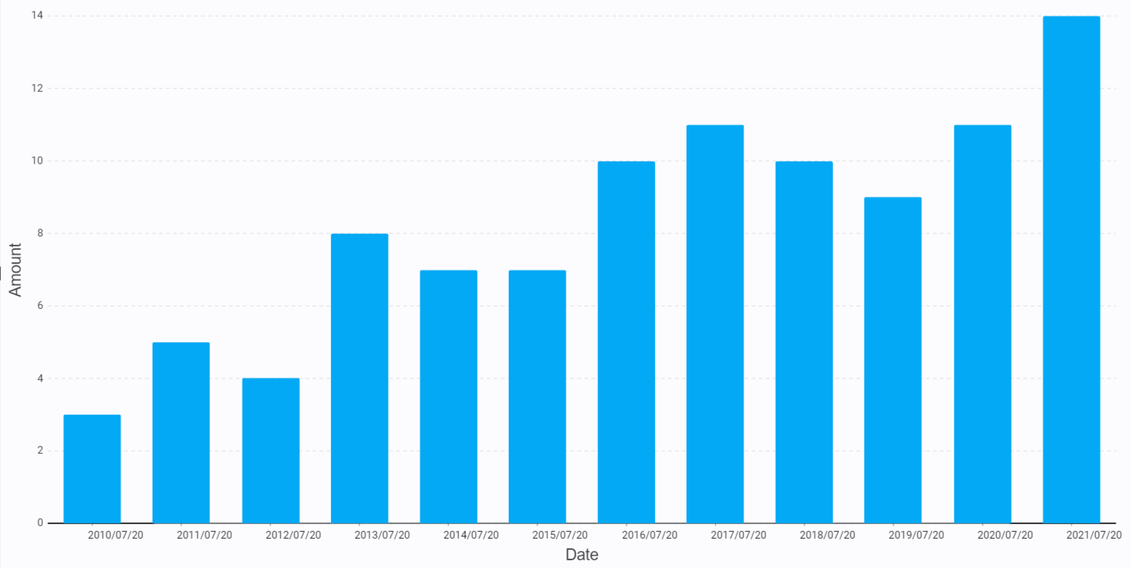
</CHART> <CHART id="examplechart" showlegend="false">
<XAXIS type="time" format="yyyy/MM/dd" title="Date"/>
<YAXIS type="numeric" title="Amount" />
<SERIES id="s1" name="Bar Series 1" group="1" type="bar" data="DB1" x="{data.x3}" y="{data.y}" color="lightblue" />
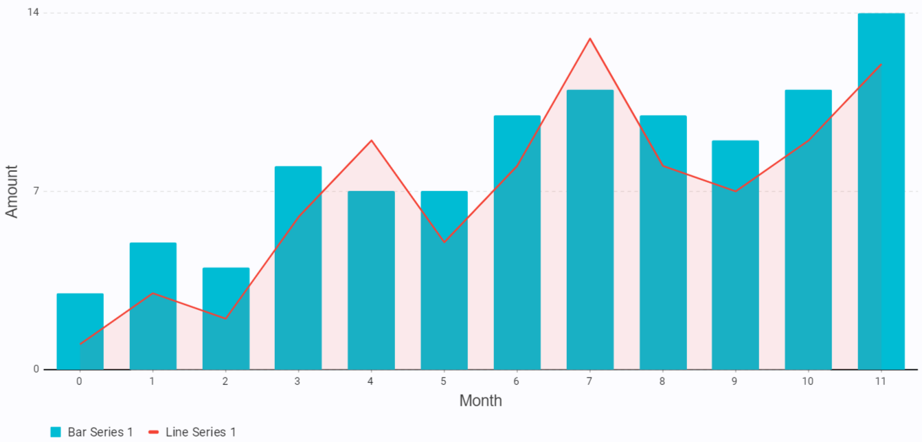
</CHART><CHART id="examplechart" showlegend="true">
<XAXIS type="numeric" title="Month" />
<YAXIS type="numeric" title="Amount" />
<SERIES name="Bar Series 1" type="bar" data="DB1" x="={data.x} - 1" y="{data.y}" color="cyan" stroke="1" />
<SERIES id="ls1" name="Line Series 1" type="line" data="DB1" x="={data.x} - 1" y="{data.y2}" color="red" stroke="2" showarea="true" showpoints="false" />
</CHART><CHART id="examplechart" showlegend="false">
<XAXIS type="time" format="yyyy/MM/dd" title="Date" labelrotation="-45" />
<YAXIS type="numeric" title="Amount" />
<SERIES id="s1" name="Bar Series 1" group="1" type="bar" data="DB1" x="{data.x3}" y="{data.y}" color="lightblue" />
<SERIES id="s2" name="Bar Series 2" group="1" type="bar" data="DB1" x="{data.x3}" y="{data.y2}" color="blue" />
</CHART><CHART id="examplechart" showlegend="true">
<XAXIS type="category" format="yyyy/MM/dd" title="Date" labelrotation="-45" />
<YAXIS type="numeric" title="Amount" />
<SERIES id="s1" name="Bar Series 1" stack="1" type="bar" data="DB1" x="{data.x2}" y="{data.y}" color="lightblue" label="{data.y}" labeled="true" />
<SERIES id="s2" name="Bar Series 2" stack="1" type="bar" data="DB1" x="{data.x2}" y="{data.y2}" color="blue" label="{data.y2}" labeled="true" />
</CHART><CHART id="examplechart" showlegend="true">
<XAXIS type="category" title="Month" />
<YAXIS type="numeric" title="Amount" />
<SERIES stack="1" group="3" name="Bar Series 1" type="bar" data="DB1" x="{data.x}" y="{data.x}" color="blueaccent" stroke="1" />
<SERIES stack="1" group="3" name="Bar Series 2" type="bar" data="DB1" x="{data.x}" y="{data.y}" color="blue" stroke="1" />
<SERIES stack="1" group="3" name="Bar Series 3" type="bar" data="DB1" x="{data.x}" y="{data.y2}" color="lightblue" stroke="1" />
<SERIES stack="2" group="4" name="Bar Series 4" type="bar" data="DB1" x="{data.x}" y="=({data.x} - 1) * 2" color="teal" stroke="1" />
<SERIES stack="2" group="4" name="Bar Series 5" type="bar" data="DB1" x="{data.x}" y="={data.y} - {data.y2} + 2" color="green" stroke="1" />
<SERIES stack="2" group="4" name="Bar Series 6" type="bar" data="DB1" x="{data.x}" y="{data.y2}" color="lightgreen" stroke="1" />
</CHART>