My year on Spotify
This post is a guide on how to make a tag timeline plot using your personal Spotify data and tag it with Last.fm API in the programming language R.
When I released the first post about ggbump people commented that it
was similar to a plot that Last.fm uses to show top music tag over time.
My year on Spotify is a plot heavily inspired by the tag timeline
plots made by Last.fm. Unfortunately I could not find a good source for
how it looks to include in this post. Below is the final plot:
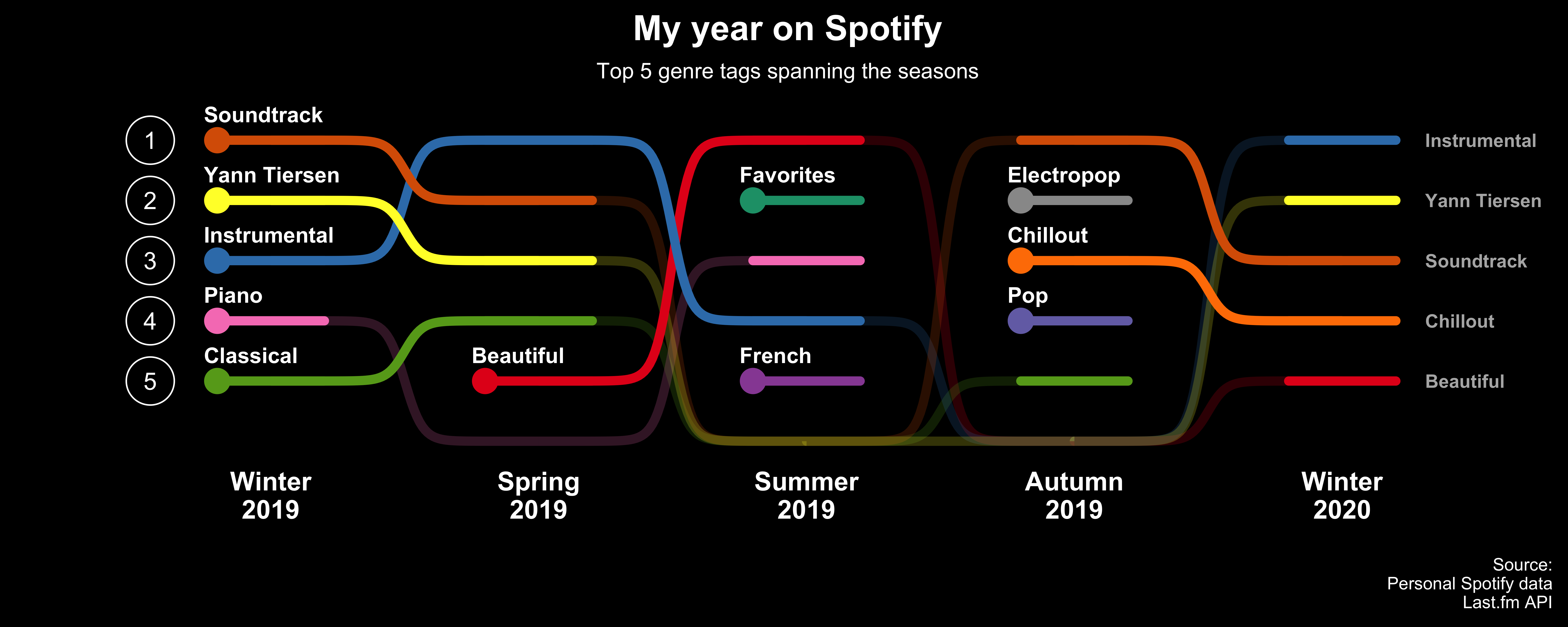
It is an interesting way to see how you music streams change over time. I was amazed how obvious it is that I started to learn to play piano by starting with the soundtrack to Amelie de Montmartre by Yann Tiersen.
The plot uses my personal spotify streams which can be downloaded from Spotify, it took a couple of days for the data to arrive. I used this guide to download my streaming history.
In wanted to do the new plot in ggplot2 with geom_bump. It was
substantially harder than I thought. Mainly because the Last.fm plot was
more advanced than I anticipated. Look how the non top 5 ranked tags are
to be placed below the top 5 in high transparency.
Below is steps I took to create the data set and the plot.
Import the relevant packages. Since ggbump is not on CRAN yet you need
to install it from Github.
if(!require(pacman)) install.packages("pacman")
if(!require(ggbump)) devtools::install_github("davidsjoberg/ggbump")

pacman::p_load(padr, hablar, jsonlite, ggbump,
               httr, xml2, lubridate, tidyverse)
# Import the stream data from Spotify which are in JSON-format.
# Create a month variable by flooring the stream date column.
df <- bind_rows(
  as_tibble(fromJSON("StreamingHistory0.json")),
  as_tibble(fromJSON("StreamingHistory1.json"))
) %>%
  mutate(month = ymd_hm(endTime) %>% as.Date() %>% floor_date("month"))

knitr::kable(head(df), "markdown")
| endTime | artistName | trackName | msPlayed | month |
|---|---|---|---|---|
| 2019-02-26 16:48 | Claude Debussy | Debussy : Suite bergamasque : III Clair de lune | 80914 | 2019-02-01 |
| 2019-02-27 10:39 | Nobuo Uematsu | Zanarkand (Final Fantasy X) | 267145 | 2019-02-01 |
| 2019-02-27 10:44 | Nobuo Uematsu | Zanarkand (Final Fantasy X) | 274680 | 2019-02-01 |
| 2019-02-27 10:46 | Austin Wintory | To Know, Water | 118406 | 2019-02-01 |
| 2019-02-27 10:53 | Russell Brower | The Sin’dorei | 34370 | 2019-02-01 |
| 2019-02-27 10:53 | Eminence Symphony Orchestra | Laputa: Castle In the Sky Suite | 400157 | 2019-02-01 |
To tag the data I used the Last.fm api that can give you the top tags of most songs. You need an API-key for the API. To get the key and read the terms of of service visit Last.fm’s website.
There are 3397 songs in the Spotify data. In order to use the Last.fm API less I chose the somewhat arbitrary condition that I needed to have listened to a song more than 7 times on any given month to include the song in the final data set. After filtering the songs to be tagged are 96 which makes the API calls substantially fewer.
# Choose which songs to tag
get_tags_list <- df %>%
  group_by(artistName, trackName, month) %>%
  summarise(n = n()) %>%
  ungroup() %>%
  arrange(-n) %>%
  filter(n > 7)

# API path
path <- "HTTP://ws.audioscrobbler.com/2.0/"

# Get the data through the API
# Generates a dataframe with multiple tags for each songs
tags_df <- map2_dfr(get_tags_list$artistName,
                    get_tags_list$trackName,
                    function(x, y) {
  request <- GET(url = path,
                 query = list(
                   method = "track.gettoptags",
                   track = y,
                   artist = x,
                   autocorrect = 1,
                   api_key = "<your-api-key>")
  )

  # Sleep for 10 seconds to be kind to the API
  Sys.sleep(10)

  # Extract the top 20 tags for each song
  tags <- content(request, "text") %>%
    as.character() %>%
    read_xml() %>%
    xml_find_all(".//toptags/tag/name") %>%
    xml_text() %>%
    .[1:20]

  # Create a data frame with the tags
  tibble(artist = x,
         song = y,
         tags = unique(tags))
}
)
In order to rank the tags the the number of streams need to be collapsed to month and tag.
# Do a filtering join to only include songs that were taged.
mg <- df %>%
  semi_join(tags_df, by = c("artistName" = "artist",
                            "trackName" = "song"))

# Summarise the data to the number of streams per month, artist and song.
mg <- mg %>%
  group_by(month, artist = artistName, song = trackName) %>%
  summarise(n_streams = n()) %>%
  ungroup()

# Join the tags on artists and song.
# Makes the data frame longer since there are multiple tags per song.
mg <- mg %>%
  left_join(tags_df, by = c("artist", "song")) %>%
  drop_na()

# Marke the tags nice with title case
# Summarise number of stremas per tag and month. Implicitely dropping songs and artist.
mg <- mg %>%
  mutate(tags = str_to_title(tags)) %>%
  group_by(month, tags) %>%
  summarise(streams_value = sum_(n_streams)) %>%
  ungroup() %>%
  arrange(-streams_value)

knitr::kable(head(mg), "markdown")
| month | tags | streams_value |
|---|---|---|
| 2019-04-01 | Instrumental | 580 |
| 2019-04-01 | Soundtrack | 532 |
| 2019-03-01 | Yann Tiersen | 508 |
| 2019-04-01 | Yann Tiersen | 497 |
| 2019-03-01 | Instrumental | 488 |
| 2019-03-01 | Soundtrack | 478 |
Since the plot is showing ranking over time I needed to rank the tags.
# Pad the tags in order to get a streams value of 0 for months when I did not listen to that tag.
rk <- mg %>%
  pad("month", end_val = max(mg$month), group = "tags") %>%
  mutate(streams_value = if_na(streams_value, 0L))

# Create one season variable in text and one in numeric to be used for a discrete x axis..
rk <- rk %>%
  mutate(season_txt = case_when(
           month(month) %in% c(12)  ~ paste("Winter", year(month) + 1, sep = "\n"),
           month(month) %in% c(1:2) ~ paste("Winter", year(month), sep = "\n"),
           month(month) %in% c(3:5) ~ paste("Spring", year(month), sep = "\n"),
           month(month) %in% c(6:8) ~ paste("Summer", year(month), sep = "\n"),
           month(month) %in% c(9:11) ~ paste("Autumn", year(month), sep = "\n")),
         season_num = case_when(
           month(month) %in% c(12)  ~ paste0(year(month) + 1, 1),
           month(month) %in% c(1:2) ~ paste0(year(month), 1),
           month(month) %in% c(3:5) ~ paste0(year(month), 2),
           month(month) %in% c(6:8) ~ paste0(year(month), 3),
           month(month) %in% c(9:11) ~ paste0(year(month), 4)))

# Collapse data to season.
rk <- rk %>%
  group_by(tags, season_txt, season_num) %>%
  summarise(streams_value = sum_(streams_value)) %>%
  ungroup()

# Create a x axis variable with the season variable from format `20191, 20192` to `1, 2` etc.
rk <- rk %>%
  left_join(rk %>%
              distinct(season_num) %>%
              mutate(order = rank(season_num)), by = "season_num")

# Rank the streams value per.
# Ranks above 5 will be set to 6 and tags the never reached top 5 are removed.
rk <- rk %>%
  group_by(order) %>%
  mutate(rank = rank(-streams_value, ties.method = "random")) %>%
  ungroup() %>%
  group_by(tags) %>%
  mutate(any_top_5 = any(rank <= 5)) %>%
  ungroup() %>%
  mutate(rank = if_else(rank > 5,
                        6L,
                        rank)) %>%
  filter(any_top_5 == TRUE)

# Find first and last season for each tag. Remove observations if outside that span.
rk <- rk %>%
  group_by(tags) %>%
  mutate(first_top5 = min_(order[rank <= 5]),
         last_top5 = max_(order[rank <= 5]),
         d_first_top5 = if_else(order == first_top5,
                                1,
                                0)) %>%
  filter(!is.na(first_top5),
         order >= first_top5,
         order <= last_top5) %>%
  ungroup()

# Create groups for the "active" top 5 tags.
# This is needed to supress geom_bump to draw lines more than to the next season.
rk <- rk %>%
  arrange(tags, order) %>%
  group_by(tags) %>%
  mutate(lag_zero = if_else(lag(rank) %in% c(6, NA) & rank <= 5, 1, 0, 0)) %>%
  ungroup() %>%
  mutate(group = cumsum(lag_zero))

# Select the columns needed for the plot
rk <- rk %>%
  select(tags, season_txt, order, rank, first_top5, last_top5, d_first_top5, group)

knitr::kable(head(rk %>% mutate(season_txt = str_replace(season_txt, "\n", " "))), "markdown")
| tags | season_txt | order | rank | first_top5 | last_top5 | d_first_top5 | group |
|---|---|---|---|---|---|---|---|
| Beautiful | Spring 2019 | 2 | 5 | 2 | 5 | 1 | 1 |
| Beautiful | Summer 2019 | 3 | 1 | 2 | 5 | 0 | 1 |
| Beautiful | Autumn 2019 | 4 | 6 | 2 | 5 | 0 | 1 |
| Beautiful | Winter 2020 | 5 | 5 | 2 | 5 | 0 | 2 |
| Chillout | Autumn 2019 | 4 | 3 | 4 | 5 | 1 | 3 |
| Chillout | Winter 2020 | 5 | 4 | 4 | 5 | 0 | 3 |
Before starting ggplotting I create a color palette to be used. Since my
data set have more tags than my preferred palette Set1 in
RColorBrewer i combine it with Dark2 and draw a random sample of
colors from them.
# Make a palette by drawing pseudo random colors from `RColorBrewer`
set.seed(42)
custom_palette <- c(RColorBrewer::brewer.pal(9, "Set1"),
                    RColorBrewer::brewer.pal(5, "Dark2")) %>%
  sample(n_distinct(rk$tags))
The main structure of the plot is geom_bump from ggbump. The first
layer is the ranking lines over the season including the seasons when it
was not among the top 5 tags.
p <- rk %>%
  ggplot(aes(order, rank, color = tags, group = tags)) +
  geom_bump(smooth = 15, size = 2, alpha = 0.2) +
  scale_y_reverse()

p

The next layer adds the lines during the seasons the tags where top 5.
p <- p +
  geom_bump(data = rk %>% filter(rank <= 5),
            aes(order, rank, group = group, color = tags),
            smooth = 15, size = 2, inherit.aes = F)

p

The next layer is to create the starting point for each tag and add an extra segment line to add some “span” to tags that were only top 5 during one season. Also extends the start and end of the plot.
p <- p +
  geom_point(data = rk %>% filter(d_first_top5 == 1),
             aes(x = order - .2),
             size = 5) +
    geom_segment(data = rk %>% filter(rank <=5),
               aes(x = order - .2, xend = order + .2, y = rank, yend = rank),
               size = 2,
               lineend = "round")

p

And the last changes to make it beautiful requires quite some code. Basically it does:
-
Add text labels to the x-axis
-
Adds text to the first data point for each tag. Also adds text to top 5 tags in the last season.
-
Creates a black background and removes most theme features like grid lines.
-
Add titles and source information.
-
Adds a y-axis manually.
p +
  scale_x_continuous(breaks = rk$order %>% unique() %>% sort(),
                     labels = rk %>% distinct(order, season_txt) %>% arrange(order) %>% pull(season_txt),
                     expand = expand_scale(mult = .1)) +
  geom_text(data = rk %>% filter(d_first_top5 == 1),
            aes(label = tags, x = order-.2),
            color = "white",
            nudge_y = .43,
            nudge_x = -.05,
            size = 3.5,
            fontface = 2,
            hjust = 0) +
  geom_text(data = rk %>% filter(order == max(order)),
            aes(label = tags),
            color = "gray70",
            nudge_x = .31,
            hjust = 0,
            size = 3,
            fontface = 2) +
  cowplot::theme_minimal_hgrid(font_size = 14) +
  theme(legend.position = "none",
        panel.grid = element_blank(),
        plot.title = element_text(hjust = .5, color = "white"),
        plot.caption = element_text(hjust = 1, color = "white", size = 8),
        plot.subtitle = element_text(hjust = .5, color = "white", size = 10),
        axis.line = element_blank(),
        axis.ticks = element_blank(),
        axis.text.y = element_blank(),
        axis.title.y = element_blank(),
        axis.text.x = element_text(face = 2, color = "white"),
        panel.background = element_rect(fill = "black"),
        plot.background = element_rect(fill = "black")) +
  labs(x = NULL,
       title ="My year on Spotify",
       subtitle ="Top 5 genre tags spanning the seasons",
       caption = "\nSource:\nPersonal Spotify data\nLast.fm API") +
  scale_colour_manual(values = custom_palette) +
  geom_point(data = tibble(x = 0.55, y = 1:5), aes(x = x, y = y),
            inherit.aes = F,
            color = "white",
            size = 10,
            pch = 21) +
  geom_text(data = tibble(x = .55, y = 1:5), aes(x = x, y = y, label = y),
             inherit.aes = F,
            color = "white")

If you do your own timeline plot, let me know how it looks!