A handy guide on how to not make noisy textures - actioninja/Revival GitHub Wiki
If you can't see the images, something's screwed with cubeupload. I'm trying to work out a better solution for image hosting without just stuffing them on this repo.
So I was surprised to see someone still updating SMPs revival, but I had some problems with what I was seeing with it.
I set up a comparison of some old SMP made textures and some of the new non-SMP textures.
 Can you tell which one is a non SMP texture?
In case you don't see it, see if you can see it here:
 Pretty obvious which ones are non SMP.
"I can tell, but I don't know why" you may say. Or "They don't match the style," or "the colors look weird."
While some of it comes down to some color choice that could be better, a large part comes from the color palette. In case you are unfamiliar with the concept of a color palette in relation to pixel art, a palette is a reference of every color used in a single sprite or texture.
For pixel art, you generally want to limit your palette as much as possible if you want to get a solid look. Gradients are nasty, use color blocks as much as possible and it will look great. You also generally want to choose high contrast colors. Your highlight should be light, your shading color dark, you midtone should pop, etc. There's a lot more to this than just what I'm saying here, if you're really interested there's a lot of better resources for pixel art than a lame PSA/callout post.
So if something is wrong with the palette, what is it? Let's look at some SMP textures in aseprite, the palette of the texture is shown on the left hand panel:
 This is the redstone block, and as you can see, it has a very limited palette. For this detailed design, only six unique colors were used.
 Similar can be said for the lapis block. Again, only six colors for a detailed and well shaded design.
 Again for the dispenser, we have a detailed and expressive design with very limited color choice. Eight colors total were used to make the dispenser. I would also like to point out the use of a solid color for the separation lines on the panel. It looks completely fine, not everything needs a lot of color variation to look good.
Now, let's look at one of the non SMP textures previously shown, the purpur block:
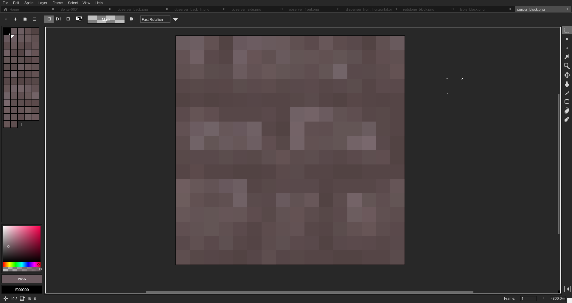 Oof. Now that's a palette that needs to be limited a lot. The purpur block uses a whopping 66 colors. Some of them are so similar that they practically can't even be distinguished. The darkest color is also very similar to the lightest color.
Then there's the observer:
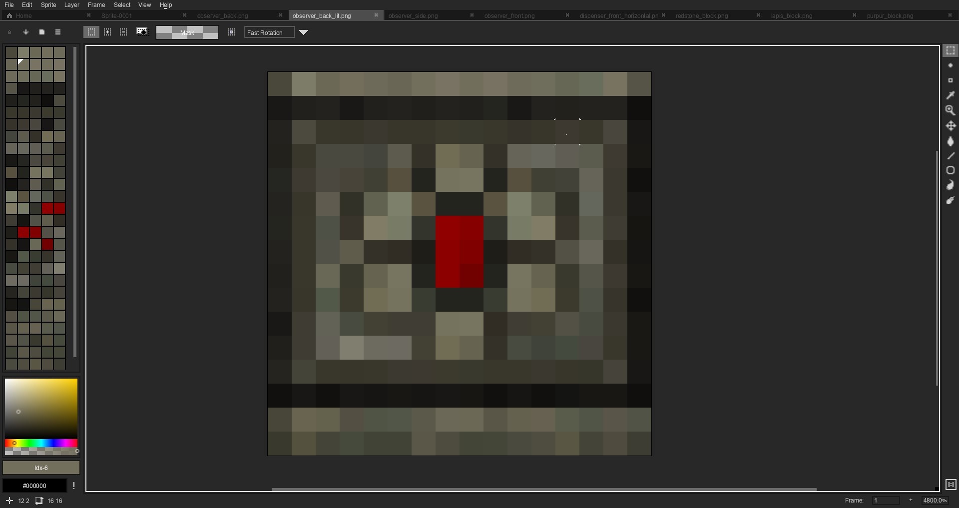 Yikes.
The observer uses a whopping 137 colors to not really do much with them. There are only 256 pixels total in a 16x16 texture, on average only about two pixels share the same color. The observer generally has less of a problem with contrast, but more of a problem with color choice. All the colors just have a bit too much green in them. Makes it look weird when placed next to other stone colors.
Yikes.
The observer uses a whopping 137 colors to not really do much with them. There are only 256 pixels total in a 16x16 texture, on average only about two pixels share the same color. The observer generally has less of a problem with contrast, but more of a problem with color choice. All the colors just have a bit too much green in them. Makes it look weird when placed next to other stone colors.
So if you have to manually mix new colors, where are these mystery colors coming from?
Well there's a source of pure evil that loves to add a bunch of new hideous colors to a perfectly good texture.
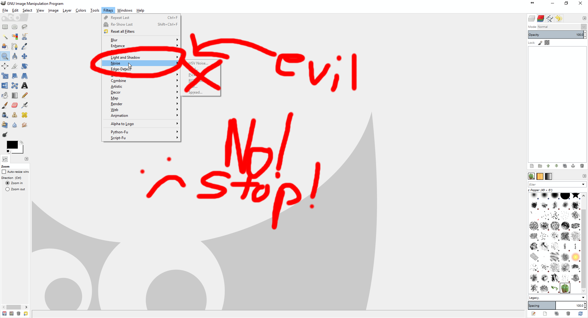 THE NOISE FUNCTION!
That's gimp, but photoshop has an equivalent function that is equally horrible to pixel art.
THE NOISE FUNCTION!
That's gimp, but photoshop has an equivalent function that is equally horrible to pixel art.
This shit's evil, don't touch it ever. If you ever find yourself wanting to use noise when making revival textures, you are doing something seriously wrong.
So why is this important?
Two reasons:
- Limited palettes look better on pixel art. Especially when the pack already follows pixel art convention
- You can't palette swap with large palettes. Some stuff looks the same as other stuff with a different color. Like in the base pack, glowstone, redstone, and sugar all use exactly the same texture with a different color palette. Simple swaps like that are impossible with large palettes.